
Heavyweight. Paper specimen archive.
- Design tools
- Light theme
- 6 colors
- 1 typeface
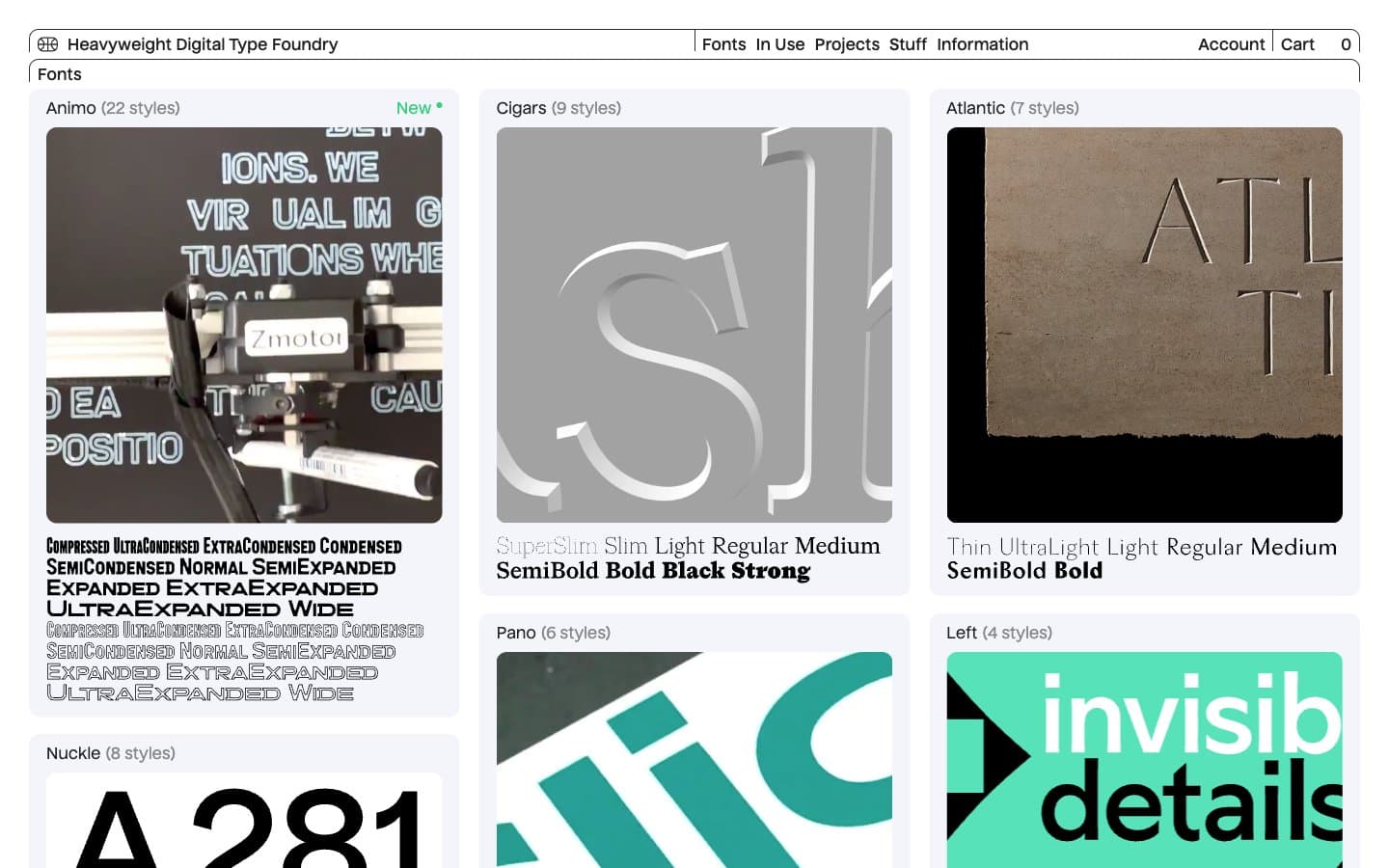
Heavyweight treats its typefaces as museum objects: each card presents a photographic specimen of large type set in physical space, filling the card edge-to-edge. The surrounding chrome dissolves into a thin navigation bar, hairline borders, and a single custom sans (Nuckle) at just 14–16px — letting the specimens carry every visual decision. The palette is near-monochrome: cool off-white canvas (#f3f5fa), white card surfaces, near-black ink (#222222), with a single vivid mint green (#39d17f) reserved exclusively for new-release tags. An unusual 11px card radius sits between editorial and soft-modern, and the 3-column grid breathes with comfortable 12px gaps while the dense specimen coverage keeps the page visually full.
Heavyweight design system

Accent1
Green outline accent for tags, dividers, and focused UI edges. Do not promote it to the primary CTA color
Neutrals5
Primary text, structural borders, card frames, button outlines. Near-black (not pure #000) so it reads as ink rather than void against the cool canvas
Secondary borders, nav dividers, subtle structural lines. One shade softer than Press Black for hierarchy between primary and secondary framing
Secondary text — style counts, descriptive labels, helper copy. Creates a tertiary information layer below the primary font names
Page background, the base surface everything sits on. Cool off-white with a faint blue cast — distinct from pure white so the white cards read as elevated without needing shadows
Card surfaces, specimen containers, navigation background. Creates the canvas → card elevation step through surface contrast alone
Try a pairing
Pick any two colors from the palette to check whether text stays readable on top.
Aa
Press Black on New Mint
8.03 : 1 contrast
- Body textPasses AA 4.5
- Large textPasses AA 3
- StrictPasses AAA 7
More DESIGN.md files. Same web, different personalities.

099 SUPPLY
Design tools
70Materia
Design tools
Aaply
Design tools
Anacuna
Design tools
Andrei Rybin
Design tools
Artboard
Design tools
Awwwards
Design tools
B—Line
Design tools
Brand
Design tools
Canva
Design tools
Claude Type
Design tools
Control
Design tools


