
GUSTAVO Faria ©. Editorial monograph on white paper.
- Design tools
- Light theme
- 5 colors
- 3 typefaces
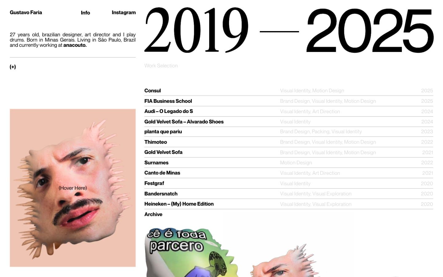
Gustavo Faria's portfolio operates as a printed monograph on white paper: an editorial spread where one massive serif date range dominates the right column while a compact bio and portrait anchor the left. The system is almost aggressively monochrome — four grays/black on white, no decorative color, no shadows, no rounded corners. Typography does all the heavy lifting: a custom display serif at 125-142px creates scale contrast against 16px system body text, and negative letter-spacing tightens the display letters into a single confident statement. Content is organized as a work selection table — project name, category, year — separated by hairline rules. The atmosphere is that of an art director's contact sheet: restrained, intentional, every element earning its space.
GUSTAVO Faria © design system

Accent1
Warm surface wash behind portrait and select portfolio imagery — the only chromatic surface, used sparingly as atmospheric punctuation
Neutrals4
Display text fill, link borders, maximum contrast elements
Primary text, hairline borders, structural rules — softer than pure black, reduces glare for long reading
Hairline borders, dividers, input outlines, and card edges on light surfaces. Do not promote it to the primary CTA color
Page canvas, card surfaces — the foundational surface on which all content sits
Try a pairing
Pick any two colors from the palette to check whether text stays readable on top.
Aa
Ink Black on Flesh Peach
13.21 : 1 contrast
- Body textPasses AA 4.5
- Large textPasses AA 3
- StrictPasses AAA 7
More DESIGN.md files. Same web, different personalities.

099 SUPPLY
Design tools
70Materia
Design tools
Aaply
Design tools
Anacuna
Design tools
Andrei Rybin
Design tools
Artboard
Design tools
Awwwards
Design tools
B—Line
Design tools
Brand
Design tools
Canva
Design tools
Claude Type
Design tools
Control
Design tools


