
Gt-america. Type foundry press sheet.
- Design tools
- Light theme
- 4 colors
- 10 typefaces
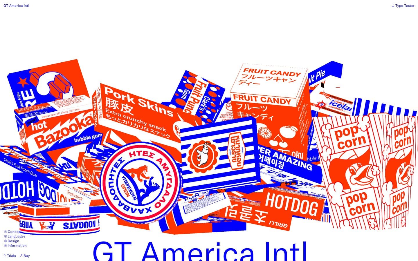
GT-America is a type specimen for its own typeface — a site that treats the letterform as the primary interface. The canvas is pure white; the navigation is a single line of black micro-type. The whole page is structured around display-size typography (up to 900px) that swallows the viewport, with the brand's signature duotone — electric blue (#0000ff) and hot orange-red (#ff3500) — used to create product illustrations, test strips, and section dividers. Everything else (spacing, components, shadows) is suppressed in favor of the type. Components are functional minimums: pill buttons, hairline inputs, no card elevation. The system feels like a type foundry press sheet printed on white stock — the letters are loud, the chrome is invisible.
Gt-america design system

Brand2
Primary brand color — display headings, section rules, outlined action borders, form field borders, large-type stamps. The dominant chromatic voice on the page, used wherever the brand needs to announce itself
Secondary brand color — the duotone partner to Electric Cobalt, used in the product mockup illustrations and as a filled action accent. Reads as warm against the cool blue, creating a two-color print-poster tension
Neutrals2
Navigation text, footer text, fine metadata labels, small caps, SVG fill in the specimen imagery. Used sparingly — only for utility type under ~16px where the massive display type doesn't dominate
Page background, card surfaces, input fills, text on dark/colored fills. The entire canvas — there is no off-white or gray alternative
Try a pairing
Pick any two colors from the palette to check whether text stays readable on top.
Aa
Stock White on Electric Cobalt
8.59 : 1 contrast
- Body textPasses AA 4.5
- Large textPasses AA 3
- StrictPasses AAA 7
More DESIGN.md files. Same web, different personalities.

099 SUPPLY
Design tools
70Materia
Design tools
Aaply
Design tools
Anacuna
Design tools
Andrei Rybin
Design tools
Artboard
Design tools
Awwwards
Design tools
B—Line
Design tools
Brand
Design tools
Canva
Design tools
Claude Type
Design tools
Control
Design tools


