
Good Glyphs. Type so large it behaves as architecture, not text.
- Design tools
- Light theme
- 3 colors
- 2 typefaces
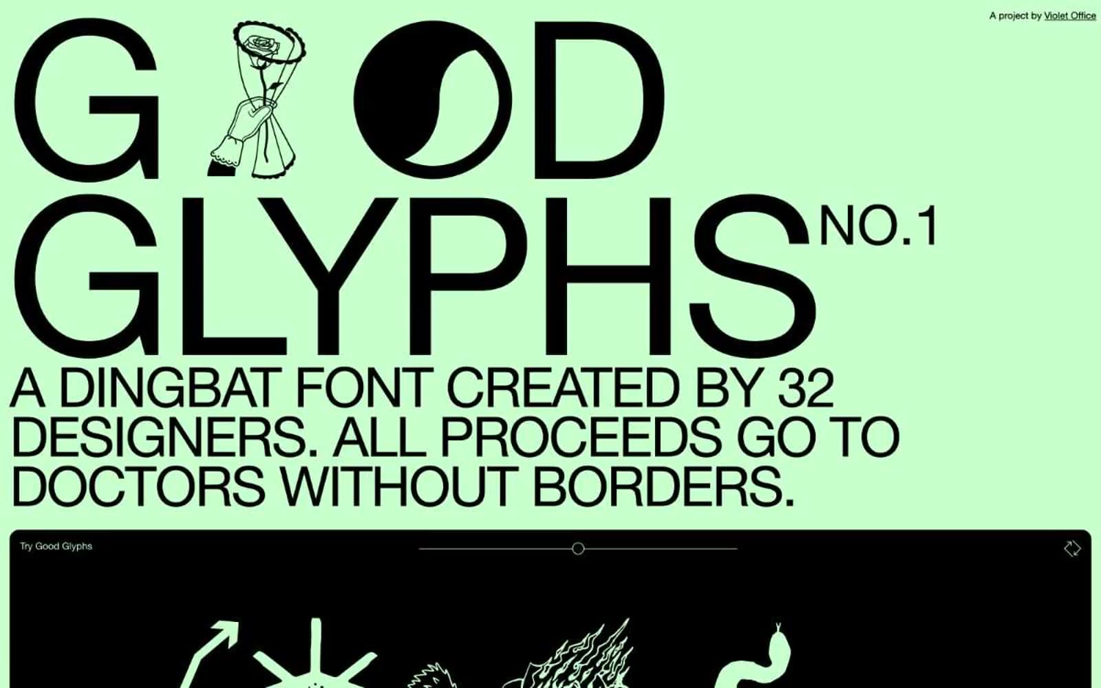
Good Glyphs treats the whole page as a printed charity poster: one mint-green canvas, one black ink, and type so large it functions as architecture rather than text. The system is anti-UI — there are no neutral grays, no semantic colors, no shadows, no gradients. A single soft celadon green (#c7ffcd) carries the entire chromatic load while pure black handles every stroke, border, label, and filled element. The signature move is the 288px display: the brand name itself becomes a graphic object, set tight with negative tracking so the letterforms lock into a wall of ink. Surfaces alternate between full-bleed mint and full-bleed black bands, producing a poster-strip rhythm rather than card-based hierarchy. Everything is built on a 4px base unit with tight 7–14px paddings; the only radii are 14px (soft cards) and a fully pill-shaped 140px for all interactive controls. Components feel stamped rather than designed: borders are always solid 1px black, text is always 13–14px, and the only moment of color contrast is white-on-black glyph artwork inside the dark showcase band.
Good Glyphs design system

Brand1
Page canvas, full-bleed section backgrounds, the site's only color. Washes the entire light theme
Neutrals2
All text, all borders, all filled elements, icon strokes, footer background, the black showcase band. The structural dark
Input field borders and input text — functionally identical to Ink Black, kept as a token for form-state flexibility
Try a pairing
Pick any two colors from the palette to check whether text stays readable on top.
Aa
Ink Black on Pledge Mint
18.61 : 1 contrast
- Body textPasses AA 4.5
- Large textPasses AA 3
- StrictPasses AAA 7
More DESIGN.md files. Same web, different personalities.

099 SUPPLY
Design tools
70Materia
Design tools
Aaply
Design tools
Anacuna
Design tools
Andrei Rybin
Design tools
Artboard
Design tools
Awwwards
Design tools
B—Line
Design tools
Brand
Design tools
Canva
Design tools
Claude Type
Design tools
Control
Design tools


