
Glyphs. A letterpress workshop under neon light.
- Design tools
- Light theme
- 14 colors
- 1 typeface
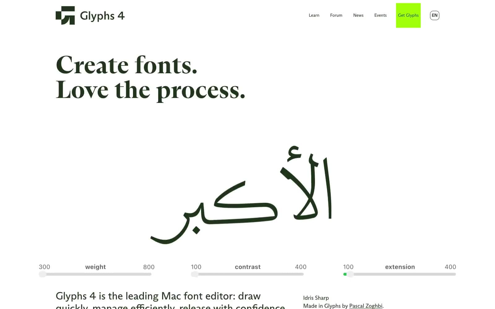
Glyphs combines a white editorial canvas with oversized, high-contrast serif lettering and exposed type-design mechanics: Bézier handles, giant translucent glyphs, and application canvases remain visible rather than being hidden behind product mockups. The palette works in loud rectangular blocks—acid lime, cyan, orange, mustard, and deep cherry—while the surrounding page stays predominantly white and quietly spaced. One custom typeface spans every role, making navigation, editorial display copy, and UI annotations feel like outputs from the same font-making environment.
Glyphs design system

Brand3
Deep plum feature-panel surface, large editorial headings, borders, and orange-on-cherry controls
Default editorial text, navigation text, logo mark, and linework over the white canvas
Purchase and conversion surfaces, highlighted end-cap sections, and active outlined-action borders — the fluorescent green punctuates otherwise paper-and-ink layouts
Accent6
Secondary feature panels, tutorial links, oversized decorative glyphs, and circular action controls against Cherry Ink
Warm feature-card surface and colored editorial emphasis
Feature-card surface, product-canvas outlines, and vector-tool overlays; its technical blue makes the editor imagery read as live workspace material
Text and small labels on lime and cyan feature surfaces
Text and borders on mustard feature surfaces
Dark technical text within cyan-oriented editor and list content
Neutrals5
Black utility text, compact headings, and neutral controls
Neutral utility-control backgrounds
Soft green-tinted list and skip-link surface
Pale tinted card surface and soft alternate content band
Page canvas, navigation surface, product-canvas interiors, and reversed text on dark feature panels
Try a pairing
Pick any two colors from the palette to check whether text stays readable on top.
Aa
Paper on Cherry Ink
13.78 : 1 contrast
- Body textPasses AA 4.5
- Large textPasses AA 3
- StrictPasses AAA 7
More DESIGN.md files. Same web, different personalities.

099 SUPPLY
Design tools
70Materia
Design tools
Aaply
Design tools
Anacuna
Design tools
Andrei Rybin
Design tools
Artboard
Design tools
Awwwards
Design tools
B—Line
Design tools
Brand
Design tools
Canva
Design tools
Claude Type
Design tools
Control
Design tools


