
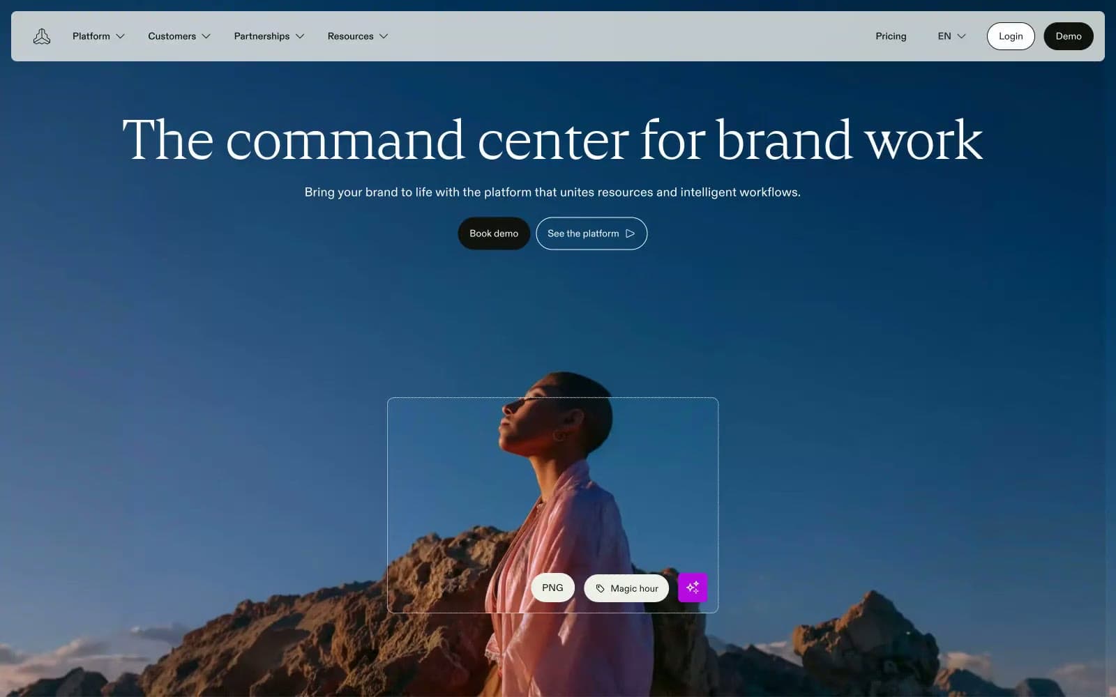
Frontify. A museum catalog rendered in cream and ink, where a single warm orange acts as the only raised voice in an otherwise hushed room.
- Design tools
- Light theme
- 11 colors
- 4 typefaces
Frontify operates as an editorial brand-management workspace: a warm cream canvas (#f0f0eb) holds white card surfaces and dark teal hero moments, with a single vivid orange (#ff3b00) acting as functional punctuation rather than decorative color. Typography carries the identity — a high-contrast serif display face (Cranny) sets an editorial, near-print tone at 40–96px, while a clean grotesque (ABC Diatype) handles all interface text at 14–18px with positive tracking. The system avoids heavy shadows and gradients, relying on warm neutrals, hairline borders, and comfortable 8px-base spacing to create a calm, considered density. Components feel lightweight: 8px card radii, pill buttons at 24–40px, ghost controls, and image-forward compositions where brand assets become the hero content.
Frontify design system

Brand1
Gray outline accent for tags, dividers, and focused UI edges.
Accent1
Sole chromatic accent — highlights, active tags, icon fills, decorative punctuation. Used sparingly to make functional moments feel switched on against the warm monochrome
Neutrals9
Primary text, hairline borders across all surfaces, filled button background — the structural neutral that carries nearly all interface weight
Body-level borders, secondary text on warm surfaces
Secondary card text, muted card labels
Icon strokes, secondary borders, muted decorative elements
Light hairline borders on neutral surfaces
Subtle background fills, body section dividers
Secondary card surface, subtle background fills behind grouped content
Page canvas, hero section dividers, large surface fills — warm cream replaces stark white to soften the entire interface
Card surfaces, elevated panels, button text on dark fills — pure white reserved for objects sitting on the cream canvas
Try a pairing
Pick any two colors from the palette to check whether text stays readable on top.
Aa
Gallery White on Deep Teal
15.31 : 1 contrast
- Body textPasses AA 4.5
- Large textPasses AA 3
- StrictPasses AAA 7
More DESIGN.md files. Same web, different personalities.

099 SUPPLY
Design tools
70Materia
Design tools
Aaply
Design tools
Anacuna
Design tools
Andrei Rybin
Design tools
Artboard
Design tools
Awwwards
Design tools
B—Line
Design tools
Brand
Design tools
Canva
Design tools
Claude Type
Design tools
Control
Design tools


