
Fonts In Use. White gallery wall for letterforms.
- Design tools
- Light theme
- 5 colors
- 2 typefaces
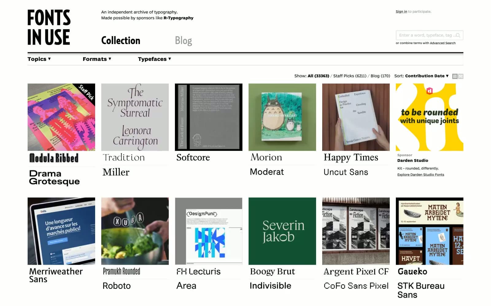
Fonts In Use operates as a typographic museum: an editorial archive where the interface is deliberately invisible so the letterforms being catalogued can speak. Every surface is white or near-white, every stroke is black, and the only typographic personality comes from the custom BentonSansRE UI sans and RelayCond display — never from decoration. The 5-column thumbnail grid functions as the page's primary content unit, each card pairing a photographic evidence image with a live sample of the typeface it documents (Baste, Proxima Nova, Zilla Slab…). Density is compact and newspaper-like rather than spacious-SaaS: tight vertical rhythm, 5px gaps, hairline 2px radii on controls, no shadows, no gradients, no accent color. The whole system reads as a printed specimen sheet rendered for the screen — restrained, factual, anti-decoration.
Fonts In Use design system

Neutrals5
Primary text, all borders, logo wordmark, nav links, search input border — the sole ink color in the entire system
Muted helper text, secondary metadata, disabled nav — 7.4:1 contrast against white still passes AAA
Input borders, subtle dividers — the lightest functional border tone
Alternate row striping, search input fill, subtle list separators — a barely-there warm gray for differentiation
Light supporting surface for subtle backgrounds and section separation. Do not promote it to the primary CTA color
Try a pairing
Pick any two colors from the palette to check whether text stays readable on top.
Aa
Paper on Carbon
21.00 : 1 contrast
- Body textPasses AA 4.5
- Large textPasses AA 3
- StrictPasses AAA 7
More DESIGN.md files. Same web, different personalities.

099 SUPPLY
Design tools
70Materia
Design tools
Aaply
Design tools
Anacuna
Design tools
Andrei Rybin
Design tools
Artboard
Design tools
Awwwards
Design tools
B—Line
Design tools
Brand
Design tools
Canva
Design tools
Claude Type
Design tools
Control
Design tools


