
Flutterwave Design. Warm editorial magazine on cream paper.
- Design tools
- Light theme
- 8 colors
- 3 typefaces
Flutterwave Design operates as a warm editorial canvas — cream paper (#fff9f1) instead of clinical white, with a single golden amber accent (#f5a623) acting like a highlighter stroke across otherwise monochrome content. Headings opt for deep midnight indigo (#12122c) rather than pure black, giving text a velvet weight against the warm ground. Typography is compact and confident: a bold display cut (Millik) at 60px carries the hero, while Moderat handles everything from 12px captions to 22px subheads with uniformly tight tracking. Layout breathes like a magazine spread — generous vertical section gaps, centered max-width container, illustration-driven cards in a horizontal carousel and 3-column grid. Components stay small and unfussy: 5px radius everywhere, no shadows, thin borders, color reserved for content art rather than chrome.
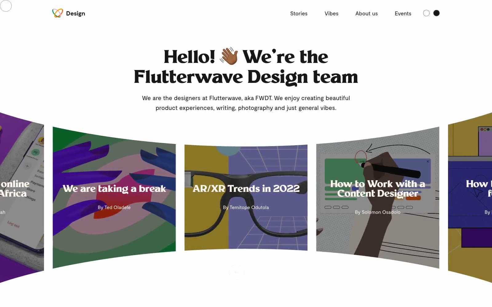
Flutterwave Design design system

Brand2
Display headings, link text, heading borders — deep violet-black replacing pure black for warmth and brand character
Primary action fill, logo heart mark, highlighter accents — the single warm punctuation color in an otherwise cool monochrome system
Accent1
Accent section band backgrounds (Vibes, features) — warm wash that breaks cream monotony without introducing a new hue
Neutrals5
Hard borders on icons, nav emphasis, button outlines where maximum contrast is needed
Primary text, body copy, icon strokes, hairline borders — the dominant ink across the system
Tertiary surface, subtle background blocks, inactive dividers
Muted card backgrounds, disabled surfaces, secondary fills
Primary page canvas, card surfaces, nav background — the warm ground tone every screen sits on
Try a pairing
Pick any two colors from the palette to check whether text stays readable on top.
Aa
Cream Paper on Midnight Indigo
17.48 : 1 contrast
- Body textPasses AA 4.5
- Large textPasses AA 3
- StrictPasses AAA 7
More DESIGN.md files. Same web, different personalities.

099 SUPPLY
Design tools
70Materia
Design tools
Aaply
Design tools
Anacuna
Design tools
Andrei Rybin
Design tools
Artboard
Design tools
Awwwards
Design tools
B—Line
Design tools
Brand
Design tools
Canva
Design tools
Claude Type
Design tools
Control
Design tools


