
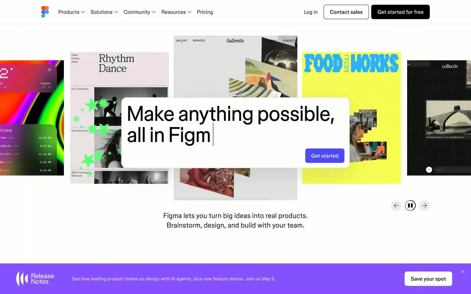
Figma. Monochrome chassis for chromatic chaos.
- Design tools
- Light theme
- 6 colors
- 2 typefaces
The interface operates as a strict, high-contrast structural container that entirely defers visual dominance to user-generated content. A stark #000000 on #ffffff palette forms the baseline, eschewing subtle grays in favor of absolute maximum contrast for primary boundaries and text. Typographic hierarchy relies almost purely on size and aggressive negative tracking rather than color variation, turning large text strings into dense graphical blocks. The border-radius logic enforces a severe dichotomy: 50px extreme pills for global navigation elements clashing intentionally against completely sharp 0px corners on content containers.
Figma design system

Brand1
Localized primary CTA within utility panels—a singular interruptive color defining the focal execution point
Accent1
Decorative sweeps, loading indicators, and active cursor visuals
Neutrals4
Primary typography, global solid button backgrounds, outlined button strokes
Secondary author text, localized component subtext, placeholder values
Subtle hair-line dividers and inactive input field bounds
Page background, floating toolbars, elevated panel bases
Try a pairing
Pick any two colors from the palette to check whether text stays readable on top.
Aa
Absolute Canvas on Context Action Violet
5.72 : 1 contrast
- Body textPasses AA 4.5
- Large textPasses AA 3
- StrictFails AAA 7
More DESIGN.md files. Same web, different personalities.

099 SUPPLY
Design tools
70Materia
Design tools
Aaply
Design tools
Anacuna
Design tools
Andrei Rybin
Design tools
Artboard
Design tools
Awwwards
Design tools
B—Line
Design tools
Brand
Design tools
Canva
Design tools
Claude Type
Design tools
Control
Design tools


