
Dribbble. A quiet white room where one magenta spotlight circles each piece.
- Design tools
- Light theme
- 11 colors
- 1 typeface
Dribbble reads as a curated gallery wall for creative work: white canvas, near-black typography, and one unmistakable magenta accent that marks every brand moment. The system is compact and image-first — large rounded thumbnails fill a 4-column grid while chrome stays minimal and quiet. Dark solid buttons with 8px radii carry primary actions, while the pink appears as small functional punctuation for search, PRO badges, and highlights rather than flooding large surfaces. Typography uses Mona Sans at relatively tight line heights, producing a dense scannable rhythm that lets the submitted work carry the visual weight.
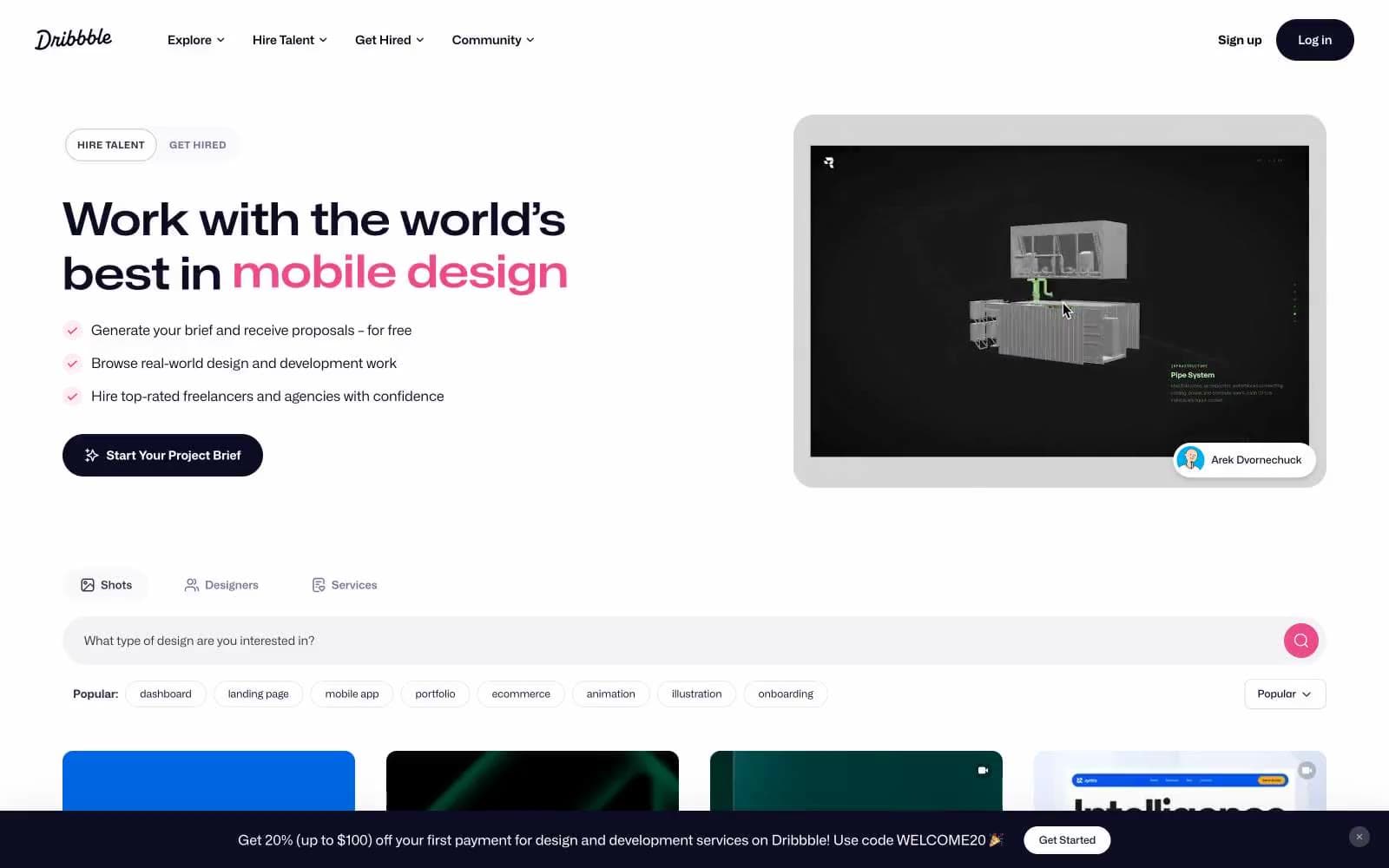
Dribbble design system

Brand1
Brand signature accent — search submit button, PRO badge, logo mark, active heart, hover pulses — one vivid magenta against the monochrome canvas makes the brand unmistakable at any size
Neutrals10
Navigation bar fill, darkest text tokens, logo wordmark — slightly cooler and deeper than Midnight Ink for the fixed header band
Primary text, filled primary buttons, dark surface fills, icon strokes — a near-black with a cool blue undertone that reads warmer than pure black against white
Faint dark surfaces, tag backgrounds, low-key dark UI wells — bridges the gap between the deep nav black and the lighter grays
Supporting neutral for secondary UI, dividers, and muted labels. Do not promote it to the primary CTA color
Lower-emphasis dark text, link hover in dense lists, designer name secondary line — a washed dark for tertiary copy on white
Secondary/muted body text, helper labels, view-count and heart-count numbers — carries the dense meta layer beneath thumbnails
Tertiary text, placeholder text, disabled icons, checkbox idle state — the lightest readable neutral
Hairline borders, divider lines, input outlines, card edges on hover — a cool-tinted off-white that reads as a boundary, not a fill
Soft surface fill, input field backgrounds, hover wells, secondary panels — the only off-white surface that sits above the page canvas
Page canvas, card surfaces, button text on dark fills, input text — the dominant surface of the entire product
Try a pairing
Pick any two colors from the palette to check whether text stays readable on top.
Aa
Deep Plum on Dribbble Pink
5.70 : 1 contrast
- Body textPasses AA 4.5
- Large textPasses AA 3
- StrictFails AAA 7
More DESIGN.md files. Same web, different personalities.

099 SUPPLY
Design tools
70Materia
Design tools
Aaply
Design tools
Anacuna
Design tools
Andrei Rybin
Design tools
Artboard
Design tools
Awwwards
Design tools
B—Line
Design tools
Brand
Design tools
Canva
Design tools
Claude Type
Design tools
Control
Design tools


