
Discover. A near-black wordmark, a whisper of coral, and everything else recedes.
- Design tools
- Light theme
- 6 colors
- 1 typeface
Fonts Ninja is a near-monochrome gallery for letterforms, where the only chromatic note is a single warm coral that punctuates action. The canvas is near-white and stays quiet; type is the protagonist, presented at extreme scale and paired with generous negative space. Cards are soft-cornered white panels floating on a barely-there shadow, and every interactive element earns its color — most UI is ink-on-paper, and the coral appears only when something wants to be clicked. Density is compact but the layout breathes because margins are large and rhythm is measured in 10px and 24px increments rather than tight 4-8px stacks.
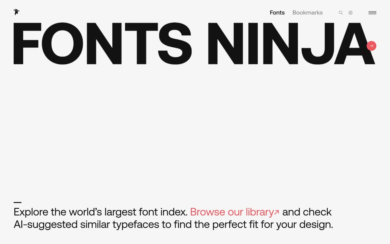
Discover design system

Brand1
Filled CTA backgrounds (action buttons, filter pills), inline text links, notification dot, hover/focus glow. The sole chromatic accent — one warm red against matte white creates urgency without aggression
Neutrals5
Dark borders and separators for elevated surfaces and inverted UI. Do not promote it to the primary CTA color
Primary text, card borders, icon strokes, hairline dividers. A warm near-black chosen over #000 to soften contrast against white without losing authority
Secondary body text, de-emphasized metadata, inactive nav borders, helper copy
Ambient shadow tint, muted background washes, subtle surface elevation. Carries the 0.16-alpha shadow that lifts cards off the canvas
Hairline borders, dividers, input outlines, and card edges on light surfaces. Do not promote it to the primary CTA color
Try a pairing
Pick any two colors from the palette to check whether text stays readable on top.
Aa
Obsidian on Signal Coral
6.18 : 1 contrast
- Body textPasses AA 4.5
- Large textPasses AA 3
- StrictFails AAA 7
More DESIGN.md files. Same web, different personalities.

099 SUPPLY
Design tools
70Materia
Design tools
Aaply
Design tools
Anacuna
Design tools
Andrei Rybin
Design tools
Artboard
Design tools
Awwwards
Design tools
B—Line
Design tools
Brand
Design tools
Canva
Design tools
Claude Type
Design tools
Control
Design tools


