
Craftwork. Designer's atelier with one acid-green lamp.
- Design tools
- Light theme
- 14 colors
- 1 typeface
Craftwork is a clean, light-canvas marketplace language built on near-monochrome neutrals — white cards on #f9f9f9 paper, deep black text, hairline gray borders — with one acid-green (#cafc00) accent that acts as a visual highlighter for premium and brand moments. A geometric humanist sans (Euclid Circular A) carries the typography, running from whisper-tight 72px display headlines (ls ≈ -0.069em) down to compact 14–16px body text, creating a density that feels editorial rather than spacious. Components sit lightly on the surface: 10px rounded cards, 9999px pill nav buttons, and shadows so subtle they read as paper texture rather than elevation. The remaining two accents — vermillion #f54911 and magenta #c42df9 — appear only as decorative punctuation in icons, tags, and illustration, never competing with the green for attention. The overall rhythm is compact and content-forward, prioritizing catalog density over generous white space.
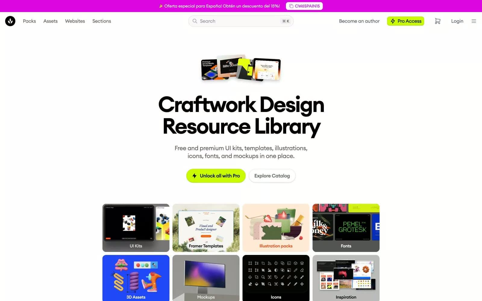
Craftwork design system

Brand1
Brand accent — the singular chromatic highlight. Marks the Pro Access pill in the nav, the primary upgrade button, and occasional pill highlights. The only color allowed to carry brand meaning at full saturation
Accent2
Secondary accent — warm red-orange for emphasis text, decorative borders, and small brand moments. Never used for backgrounds at scale
Tertiary accent — vivid pink for icons, decorative strokes, and illustration pops. Functions as a tertiary tag color in the brand palette
Neutrals11
Primary text, heading strokes, and the dominant interface color. Carries body copy, icons, and high-contrast borders
Dark surface fill for active states, dark buttons, and inverted sections
Near-black for specific UI borders and text where pure black reads too harsh against warm grays
Secondary dark surface — slightly softer than Obsidian for cards that need depth without going fully black
Secondary text, muted icons, and secondary button text. The workhorse mid-gray for body copy that should recede
Tertiary text, placeholder copy, and disabled icon strokes
Cool-leaning gray for subtle borders and muted helper text
Hairline borders, dividers, and input outlines. The thinnest structural line in the system
Secondary surface for inset panels, section dividers, and soft background washes
Page canvas — the dominant background across the entire site. Slightly warm, never pure white
Light supporting surface for subtle backgrounds and section separation. Do not promote it to the primary CTA color
Try a pairing
Pick any two colors from the palette to check whether text stays readable on top.
Aa
Ink Black on Acid Green
17.44 : 1 contrast
- Body textPasses AA 4.5
- Large textPasses AA 3
- StrictPasses AAA 7
More DESIGN.md files. Same web, different personalities.

099 SUPPLY
Design tools
70Materia
Design tools
Aaply
Design tools
Anacuna
Design tools
Andrei Rybin
Design tools
Artboard
Design tools
Awwwards
Design tools
B—Line
Design tools
Brand
Design tools
Canva
Design tools
Claude Type
Design tools
Control
Design tools


