
Zara. Pure white space, hairline frames, editorial imagery as the only color.
- Commerce
- Light theme
- 3 colors
- 1 typeface
Zara's design system is editorial minimalism pushed to its logical extreme: a flat, monochromatic canvas where the interface deliberately recedes so editorial photography can carry the entire brand experience. The palette is essentially binary — pure black on pure white with a single mid-gray for secondary text — and the only decorative typographic moment is the ZARA wordmark itself, a high-contrast didone-style serif that functions as a logo, not as a heading font. UI typography is unusually compact (11–16px) and uses a single neutral sans-serif, giving every screen the look of a fashion magazine page. Components are borderless or use hairline strokes, with zero shadows, zero gradients, and zero rounded corners — the design language of a gallery wall, not a software product.
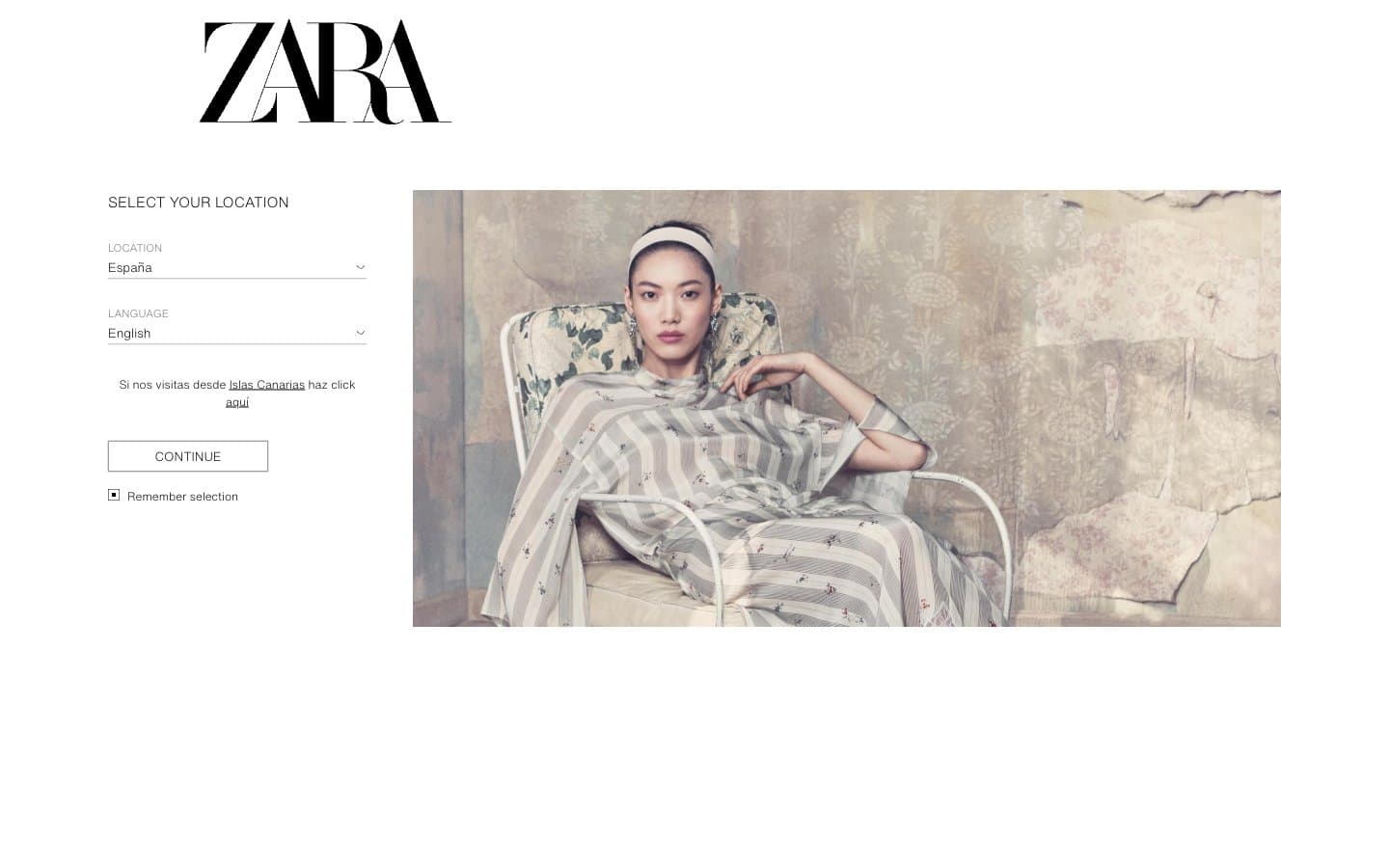
Zara design system

Neutrals3
Primary text, icons, hairline borders, button outlines, checkbox marks, form labels
Secondary/helper text, placeholder text, disabled labels — the only mid-tone that breaks the binary
Page backgrounds, form surfaces, image backgrounds — the silent stage on which all content sits
Try a pairing
Pick any two colors from the palette to check whether text stays readable on top.
Aa
Canvas on Ink
21.00 : 1 contrast
- Body textPasses AA 4.5
- Large textPasses AA 3
- StrictPasses AAA 7
More DESIGN.md files. Same web, different personalities.

High Protein
Commerce
Hopper
Commerce
2.AG
Commerce
A-WARE
Commerce
AATHER
Commerce
Abel
Commerce
Acme Cups New Zealand
Commerce
Acne Studios
Commerce
Adam Lippes
Commerce
Adanola
Commerce
Advene
Commerce
Aevi Wellness
Commerce


