
Aevi Wellness. Nordic apothecary, weightless type.
- Commerce
- Light theme
- 6 colors
- 7 typefaces
Aevi Wellness reads like a Nordic editorial spread translated into e-commerce: generous product photography overlapping a warm off-white canvas, whisper-weight typography that gives headlines room to breathe, and a single muted slate-blue accent that appears only where the brand needs to signal action or section shift. The palette is almost entirely achromatic — warm near-black text (#231f20), pure white surfaces, and a powder-blue band (#d5e0ea) that structures the page into editorial chapters. Components are barely-there: ultra-thin hairline borders, 2px corner radii on most elements, and 60px pill buttons for primary actions. The overall feel is clinical-luxury — the products themselves are the visual subject, and the interface stays out of their way.

Aevi Wellness design system

Brand2
Section bands, card borders, decorative dividers — the brand's secondary canvas, used to segment the page into editorial chapters without introducing contrast
Primary action buttons, active states — the single chromatic accent; its low saturation keeps it feeling clinical rather than commercial
Neutrals4
Icon fills, occasional heavy borders — used sparingly for graphical weight when maximum contrast is needed
Primary text, hairline borders, card outlines, icon strokes — near-black with a warm undertone that softens the high-contrast text against white
Muted helper text, secondary metadata, low-priority labels — only when a softer reading level is needed without leaving the achromatic palette
Page background, card surfaces, text on dark blocks — the dominant canvas, never off-white or cream
Try a pairing
Pick any two colors from the palette to check whether text stays readable on top.
Aa
True Black on Powder Blue
15.68 : 1 contrast
- Body textPasses AA 4.5
- Large textPasses AA 3
- StrictPasses AAA 7
More DESIGN.md files. Same web, different personalities.

High Protein
Commerce
Hopper
Commerce
2.AG
Commerce
A-WARE
Commerce
AATHER
Commerce
Abel
Commerce
Acme Cups New Zealand
Commerce
Acne Studios
Commerce
Adam Lippes
Commerce
Adanola
Commerce
Advene
Commerce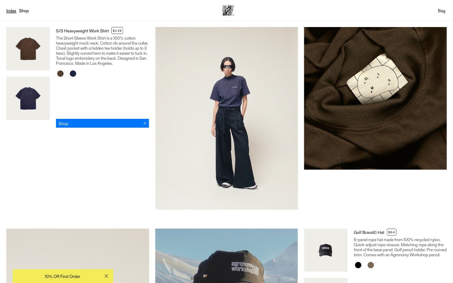
Agronomy Workshop
Commerce


