
Advene. A gallery catalog that happens to sell handbags.
- Commerce
- Light theme
- 13 colors
- 4 typefaces
Advene reads as an art-gallery catalog printed on warm parchment: a luxury accessories brand whose interface behaves like an editorial spread rather than a storefront. The canvas is a muted stone-warm gray (#dfe0db) rather than clinical white, and the entire palette is pulled from natural pigments — oxblood, olive, sage, buttercream — with a single unexpected electric blue for outlined actions. Typography is a single humanist serif (Signifier) at restrained sizes, paired with a widely-tracked monospace (Pitch) for micro-labels, creating a tension between book-like body text and almost architectural small caps. Layout is full-bleed and split-screen, sections are separated by generous air rather than dividers, and imagery is treated as artwork — halftone dots, oversized letterforms, and tight portrait crops that bleed edge-to-edge. The overall effect is restrained, expensive, and deliberate: nothing is decorative, everything earns its space.

Advene design system

Brand1
Red accent for outlined action borders, linked labels, and lightweight interactive emphasis.
Accent4
Secondary accent for borders and subdued interactive elements where oxblood would overpower
Soft champagne surface for the announcement bar and decorative letterform washes
Lightest cream tint for subtle washes and hover states on yellow surfaces
Outlined action border only — the one break in the earth-tone palette, used for ghost pill buttons that need to read as interactive without filling
Neutrals8
Primary text, hairline borders, icon strokes — the dominant ink of the system
Deep surface for inverted sections and dark text on light cream backgrounds
Nav text, secondary text where pure black feels too heavy
Muted body text, inactive states, dividers and borders at lower hierarchy
Earthy neutral surface for product swatches and muted backgrounds — sits between canvas and accent
Primary page canvas — the warm stone-gray ground that replaces clinical white throughout the entire site
Elevated card and section surface, one step lighter than the canvas
Nav background, pill button fills, card surfaces needing maximum contrast against the stone canvas
Try a pairing
Pick any two colors from the palette to check whether text stays readable on top.
Aa
Pure White on Oxblood
13.23 : 1 contrast
- Body textPasses AA 4.5
- Large textPasses AA 3
- StrictPasses AAA 7
More DESIGN.md files. Same web, different personalities.

High Protein
Commerce
Hopper
Commerce
2.AG
Commerce
A-WARE
Commerce
AATHER
Commerce
Abel
Commerce
Acme Cups New Zealand
Commerce
Acne Studios
Commerce
Adam Lippes
Commerce
Adanola
Commerce
Aevi Wellness
Commerce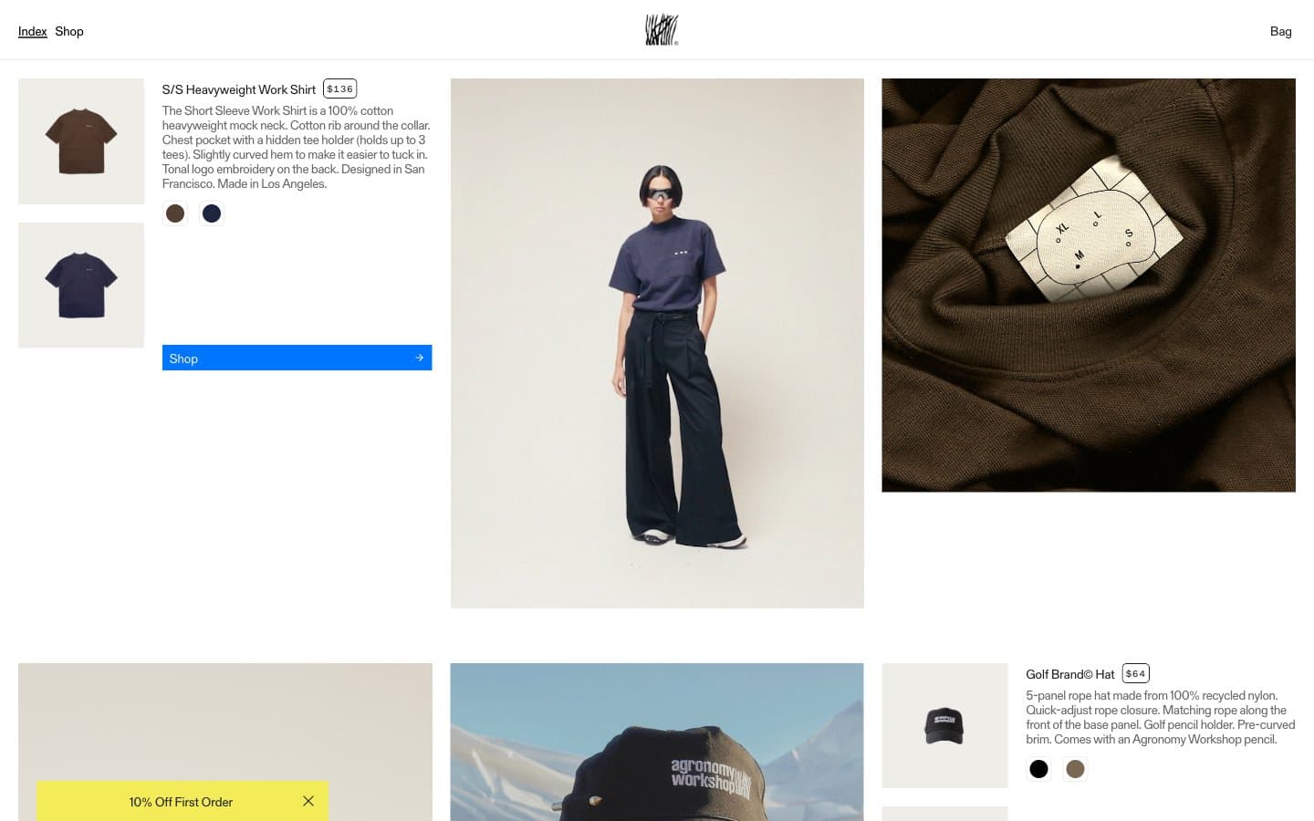
Agronomy Workshop
Commerce


