
Adam Lippes. A Vogue spread where the layout grid, not the color palette, is the only decoration.
- Commerce
- Light theme
- 9 colors
- 3 typefaces
Adam Lippes is a monochrome editorial atelier built on cream paper (#fefcf8) with Optima typography and full-bleed fashion photography. The interface is deliberately restrained: zero chromatic accents, zero decorative gradients, near-zero corner radii — the photographic plate IS the design. Product imagery carries all visual weight inside a dense five-column grid; UI chrome recedes behind hairline rules and uppercase tracked nav. Buttons are stark black fills or ghost outlines against the warm canvas, and the only tonal shifts between pages come from the photography itself, never from UI chroma.

Adam Lippes design system

Neutrals9
Primary text, hairline rules, filled action buttons, icon strokes, and nav borders. The structural ink of the system
Deep alt-black for button borders, dark badges, and high-contrast text on white surfaces where pure black feels too harsh
Button border accent — a near-black used for refined button outlines
Badge and secondary text — sits between Graphite and Carbon for mid-emphasis labels
Secondary text and icon color — a softened black for less critical copy and outline button borders
Body text secondary and subtle borders — warm-leaning gray that pairs with the cream canvas without going cold
Light neutral action fill for buttons on dark surfaces.
Primary page background — warm off-white, the entire site sits on this paper-like canvas rather than pure white
Alternate surface for product cards, input fields, and crisp overlays that need to separate from Bone Canvas
Try a pairing
Pick any two colors from the palette to check whether text stays readable on top.
Aa
Press White on Onyx Black
21.00 : 1 contrast
- Body textPasses AA 4.5
- Large textPasses AA 3
- StrictPasses AAA 7
More DESIGN.md files. Same web, different personalities.

High Protein
Commerce
Hopper
Commerce
2.AG
Commerce
A-WARE
Commerce
AATHER
Commerce
Abel
Commerce
Acme Cups New Zealand
Commerce
Acne Studios
Commerce
Adanola
Commerce
Advene
Commerce
Aevi Wellness
Commerce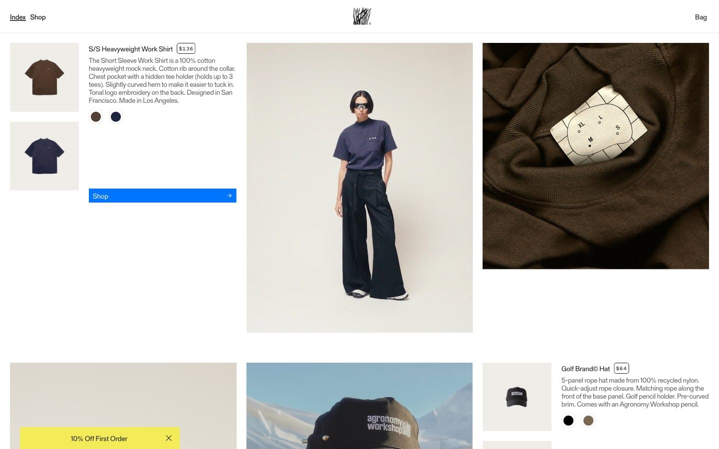
Agronomy Workshop
Commerce


