
Woven. Ink on cream parchment.
- Commerce
- Light theme
- 5 colors
- 4 typefaces
Woven is an editorial whisky label with a parchment-on-press feel: warm cream canvases, a single dark ink color for every text and hairline border, and generous tracking that lets type breathe like a luxury magazine masthead. The entire interface is monochrome — zero chromatic accent — so product photography (amber bottles, foil caps, liquid) becomes the only color the eye ever sees. Layouts are spacious and centered, with uppercase navigational micro-copy stacked in narrow columns and section headings set far apart from their content. Components stay flat and quiet: white product cards with hairline borders, underlined text links, ghost controls, and no shadows or gradients — the cream surface is the elevation.
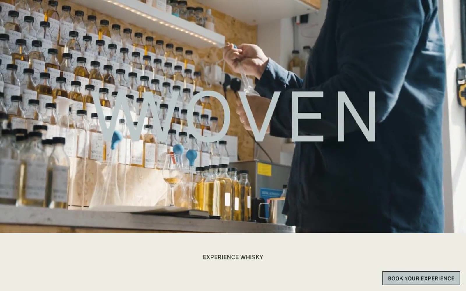
Woven design system

Neutrals5
Primary text, all hairline borders, footer ink, and the near-black that forms every structural line on the page
Secondary body text, subdued borders, and the muted text layer that sits between primary ink and background
Subtle surface differentiation beneath cards and secondary panels — barely warmer than the cream canvas
Page canvas, footer surface, and dominant background — the warm off-white that gives the entire site its editorial, paper-like feel
Product card surfaces, alternating section backgrounds, and high-contrast text on dark or photographic surfaces
Try a pairing
Pick any two colors from the palette to check whether text stays readable on top.
Aa
Pure White on Ink Black
15.72 : 1 contrast
- Body textPasses AA 4.5
- Large textPasses AA 3
- StrictPasses AAA 7
More DESIGN.md files. Same web, different personalities.

High Protein
Commerce
Hopper
Commerce
2.AG
Commerce
A-WARE
Commerce
AATHER
Commerce
Abel
Commerce
Acme Cups New Zealand
Commerce
Acne Studios
Commerce
Adam Lippes
Commerce
Adanola
Commerce
Advene
Commerce
Aevi Wellness
Commerce


