
Woset. A quiet, warm-gray room where one golden accent is the only color allowed on the walls.
- Commerce
- Light theme
- 5 colors
- 4 typefaces
Woset reads as a curated art-supply shop rendered as a gallery wall: soft warm-gray canvas (#e5e7eb), monochrome black-on-gray chrome, and a single golden-yellow accent (#ecca53) that activates filter pills and key actions. Typography anchors on Macan, a geometric sans used at a whisper-tight -0.04em tracking — the 95px display headline is the loudest element on the page, then everything collapses to a quiet 15px body. The product grid trades glossy photography for hand-drawn illustrations in a generous 3-column layout with no card borders, no drop shadows, and 30px pill-radius controls. The system is intentionally restrained: one warm color, one typeface, zero elevation — every screen should feel like a well-lit page in a stationery boutique.
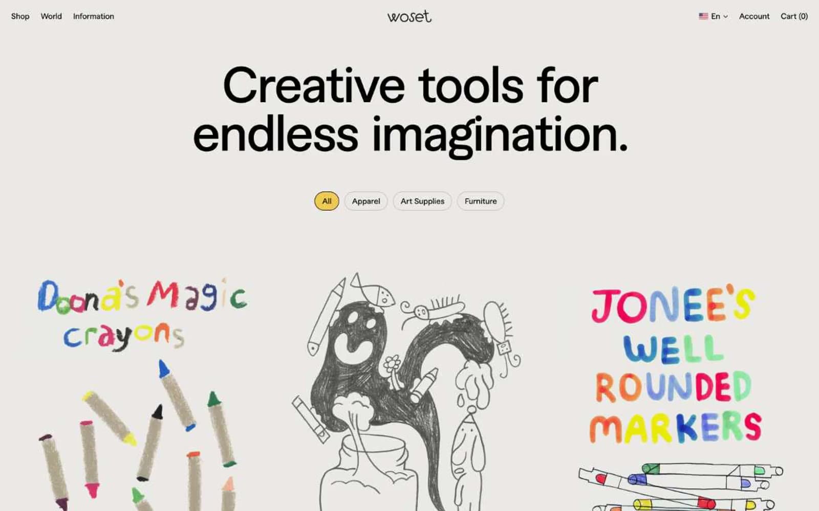
Woset design system

Brand1
The sole chromatic accent — active filter pills, selected nav states, and the only place a UI element may be filled with color. The warmth against Soft Pebble creates an almost-handmade yellow, not a digital primary
Neutrals4
Primary text, nav labels, icons, and the default state of unselected interactive controls. Carries all typographic and chrome weight in the system
Muted helper text — product prices, secondary metadata, and any label that should recede behind the primary content
Hairline borders and dividers on buttons and structural elements — just visible enough to define edges without ever competing with text
Page canvas, card surfaces, and the dominant background tone — a warm-leaning gray that reads as handmade paper rather than digital white
Try a pairing
Pick any two colors from the palette to check whether text stays readable on top.
Aa
Carbon Ink on Sunlit Marigold
13.14 : 1 contrast
- Body textPasses AA 4.5
- Large textPasses AA 3
- StrictPasses AAA 7
More DESIGN.md files. Same web, different personalities.

High Protein
Commerce
Hopper
Commerce
2.AG
Commerce
A-WARE
Commerce
AATHER
Commerce
Abel
Commerce
Acme Cups New Zealand
Commerce
Acne Studios
Commerce
Adam Lippes
Commerce
Adanola
Commerce
Advene
Commerce
Aevi Wellness
Commerce


