
Walden. Every product is a stone, every pixel is moss and silence.
- Commerce
- Light theme
- 7 colors
- 3 typefaces
Walden is a meditation and ritual-object brand whose interface behaves like a quiet gallery wall. The canvas is pure white; nearly every surface, border, and control is rendered in warm grayscale, with no chromatic accent anywhere in the system. Type is small, tight, and lowercase-leaning, and the only structural cues are hairline strokes in stone-gray (#d3cec5) — no drop shadows, no elevation tricks, no gradients. Full-bleed nature and product photography carries the entire emotional load, so the chrome around it must stay almost invisible. Components feel handmade, not templated: a 2px button radius, a 16px max radius on cards, and 1px inset rings as the only shadows in the system.
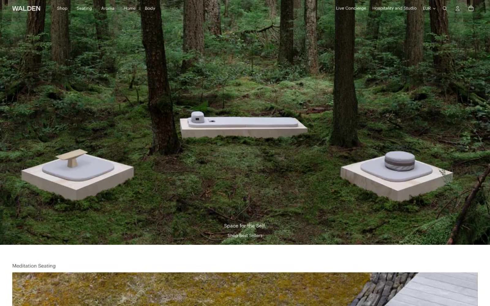
Walden design system

Neutrals7
Occasional deep text and body borders — reserved for the few headings and rules that need absolute black, used sparingly to avoid competing with Sumi
Filled button backgrounds, active state borders, highest-emphasis text — the near-black ink, warmer than pure black, used when a control must be pressed or selected
Primary text, default borders, link underlines, icon strokes — the workhorse gray that carries almost every label and divider in the system
Secondary text, muted metadata, tertiary borders — used for captions, helper copy, and inactive states where Charcoal would be too heavy
Lightest separator, disabled borders, placeholder strokes — the quietest gray, visible only when something must be outlined but not announced
Hairline borders, inset focus rings, soft separator lines — the warm gray that makes every edge feel like a seam in paper or stone, not a UI stroke
Page canvas, nav background, card surfaces, button text — the absolute ground of the interface
Try a pairing
Pick any two colors from the palette to check whether text stays readable on top.
Aa
Paper White on Lampblack
21.00 : 1 contrast
- Body textPasses AA 4.5
- Large textPasses AA 3
- StrictPasses AAA 7
More DESIGN.md files. Same web, different personalities.

High Protein
Commerce
Hopper
Commerce
2.AG
Commerce
A-WARE
Commerce
AATHER
Commerce
Abel
Commerce
Acme Cups New Zealand
Commerce
Acne Studios
Commerce
Adam Lippes
Commerce
Adanola
Commerce
Advene
Commerce
Aevi Wellness
Commerce


