
Vibrants. The dark navy ink is the mortar, the rainbow spectrum is the medicine.
- Commerce
- Light theme
- 14 colors
- 5 typefaces
Vibrants reads as a bright, clinical wellness counter: white canvas, a deep-navy ink that does the heavy lifting for text and primary buttons, and a full-spectrum rainbow that lives only on the product surface. The visual grammar is deliberately quiet outside the hero and product imagery — almost monochrome structure with a single vivid green punctuating sales, badges, and confirmations. Headlines use a custom serif that leans editorial and trustworthy, while body copy and UI stay in geometric sans-serifs that feel pharmaceutical-precise. Components are flat with hairline borders, soft 8px corners, and minimal elevation; depth comes from color contrast and generous whitespace rather than shadow. The sky-blue gradient hero and floating product mockup set a calm, optimistic tone that the rest of the page sustains through airy spacing and restrained typography.
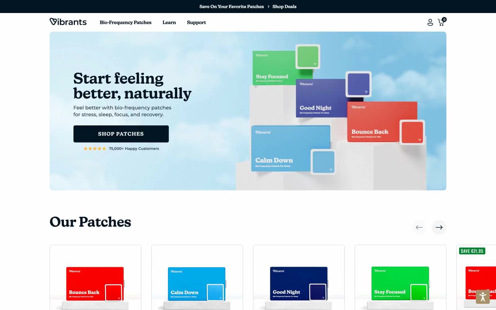
Vibrants design system

Brand2
Primary text, primary filled buttons, nav backgrounds, heading ink, footer surface — near-black that reads as ink rather than pure black, grounding the page while staying soft enough to pair with white
Sale badges, discount pills, success indicators, single-use accents — the only vivid hue that touches the chrome; every other chromatic surface belongs to a product
Accent3
Secondary text emphasis, card border accent on hero product, heading hierarchy step below Deep Navy — slightly bluer for tonal variation without leaving the family
Outlined button borders, icon accents, link highlights — light blue that whispers rather than shouts, used for ghost controls that still need chromatic definition
Decorative product-spectrum gradient flowing violet → indigo → cyan → green → yellow → orange → red — used only in hero wash and product card colorways, never on UI chrome
Neutrals9
Icon fills, micro-typography, fine SVG strokes — soft black that never hits pure #000
Heading sub-labels, nav secondary text, card meta text — middle gray for informational hierarchy
Muted body text, helper text, de-emphasized metadata — readable but clearly secondary to Deep Navy
Muted card borders, secondary borders, de-emphasized card outlines — cool gray with a blue undertone
Card borders, badge backgrounds, hairline dividers — the structural gray that separates white-on-white layers
Navigation dividers, secondary hairline borders — slightly lighter than Silver Mist for less prominent edges
Cool-tinted surface for elevated cards, subtle wash behind testimonials, very-light-blue backdrop panels — the cool side of the surface stack
Warm-tinted surface for promotional or seasonal highlight cards, sale callout backgrounds — the warm counterpoint to Cloud
Page canvas, card surface, button text on dark fills, badge text — the dominant background
Try a pairing
Pick any two colors from the palette to check whether text stays readable on top.
Aa
Snow on Deep Navy
18.65 : 1 contrast
- Body textPasses AA 4.5
- Large textPasses AA 3
- StrictPasses AAA 7
More DESIGN.md files. Same web, different personalities.

High Protein
Commerce
Hopper
Commerce
2.AG
Commerce
A-WARE
Commerce
AATHER
Commerce
Abel
Commerce
Acme Cups New Zealand
Commerce
Acne Studios
Commerce
Adam Lippes
Commerce
Adanola
Commerce
Advene
Commerce
Aevi Wellness
Commerce


