
Unicorn Studio. A black velvet void pierced by prismatic violet light, with type that breathes quietly beside it.
- Design tools
- Dark theme
- 12 colors
- 3 typefaces
Unicorn Studio lives in a near-black void where light itself becomes the product: the canvas is a matte charcoal, typography whispers in cool pearl grays, and the only chromatic voice is a violet WebGL aurora that bleeds through gradients, link borders, and hero atmospheres. Surfaces stack in barely-perceptible steps of darkness — #08080a → #0d0d12 → #17171c — so depth is communicated through value shifts rather than shadows, with a thin dark key-line (`#31313a`, -1px offset) doing the work of elevation on interactive elements. The display face is Overused Grotesk with aggressive negative tracking (up to -0.063em), pulling letters so close they almost touch, while body text stays in the system stack at a comfortable 16px with subtle -0.01em tightening. Interaction is restrained: light-filled cream buttons against the void, hairline violet underlines on links, and 3px micro-radii that keep the language architectural rather than friendly.
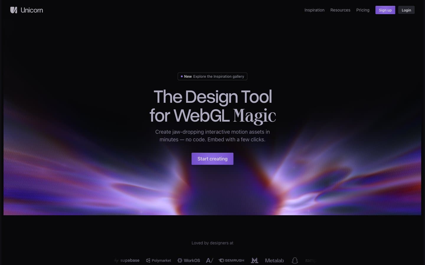
Unicorn Studio design system

Brand3
Link borders, accent strokes, chromatic highlight — the violet signal that breaks the monochrome
Deeper violet for link hover, gradient endpoint, chromatic emphasis on interactive accents
Hero radial gradient — the signature prismatic light burst that defines the brand atmosphere
Neutrals9
Page canvas, deepest surface, card backgrounds — the base layer against which everything else floats
Section backgrounds, elevated panels, modal surfaces — first step off the canvas
Card surfaces, nested containers, secondary panels
Elevated surface fill, subtle button hover states, dark interactive variant
Supporting neutral for secondary UI, dividers, and muted labels. Do not promote it to the primary CTA color
Muted helper text, inactive icons, low-emphasis body
Secondary text, placeholder copy, subheadings, icon strokes
Primary body text, card borders, heading borders — the dominant foreground voice
Hairline borders, dividers, input outlines, and card edges on light surfaces. Do not promote it to the primary CTA color
Try a pairing
Pick any two colors from the palette to check whether text stays readable on top.
Aa
Void on Lavender Beam
7.56 : 1 contrast
- Body textPasses AA 4.5
- Large textPasses AA 3
- StrictPasses AAA 7
More DESIGN.md files. Same web, different personalities.
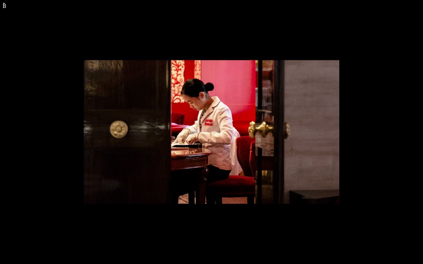
Bibliothèque
Design tools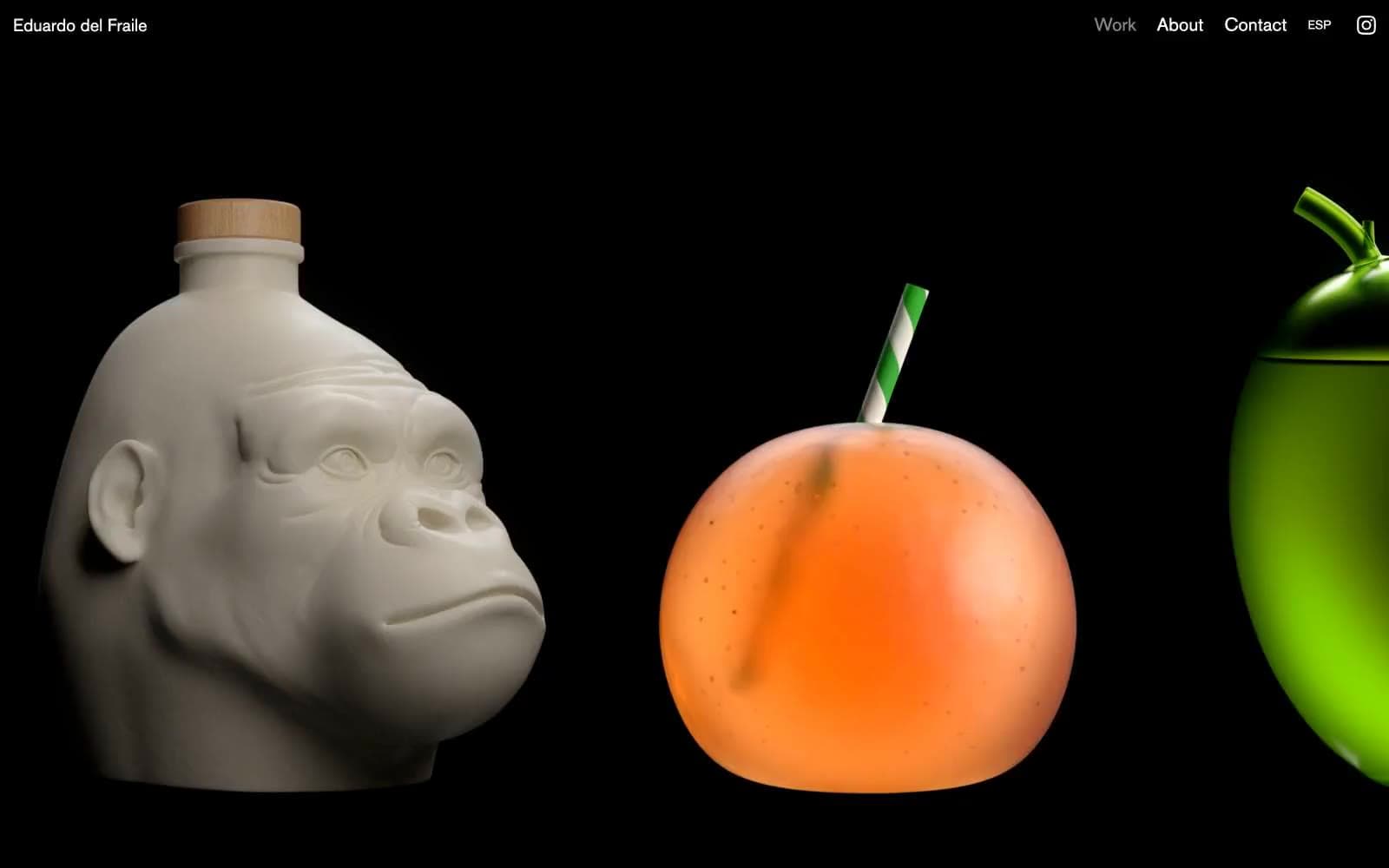
Eduardo del Fraile
Design tools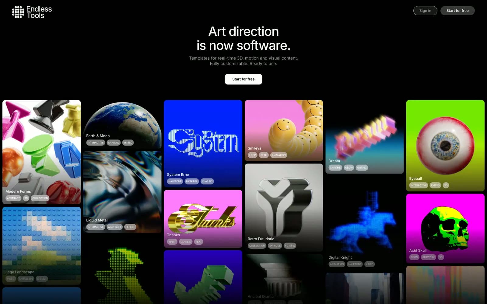
Endlesstools
Design tools
Figma Config
Design tools
Foundry
Design tools
Frame.io
Design tools
Framer
Design tools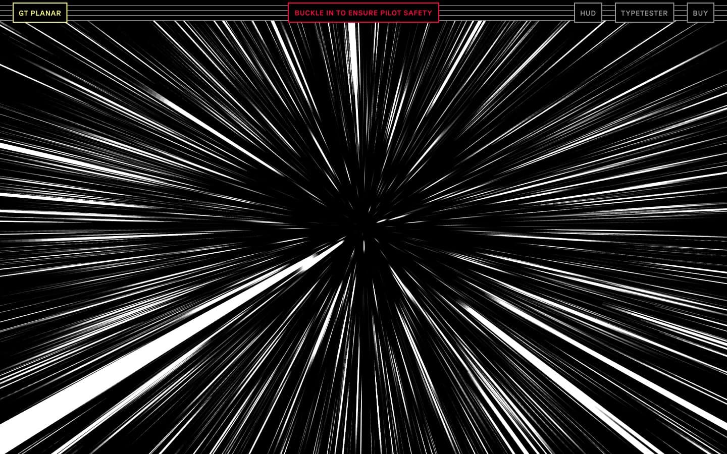
Gt-planar
Design tools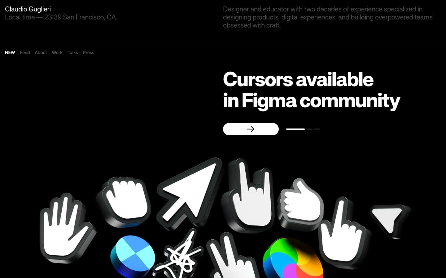
Guglieri
Design tools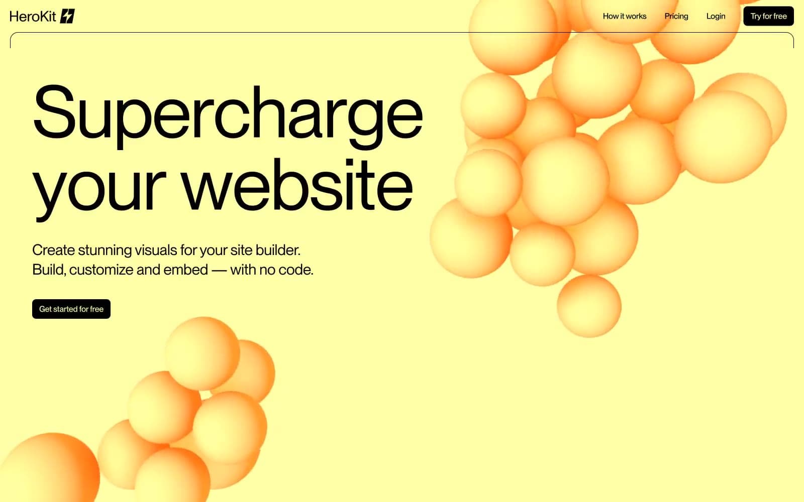
HeroKit
Design tools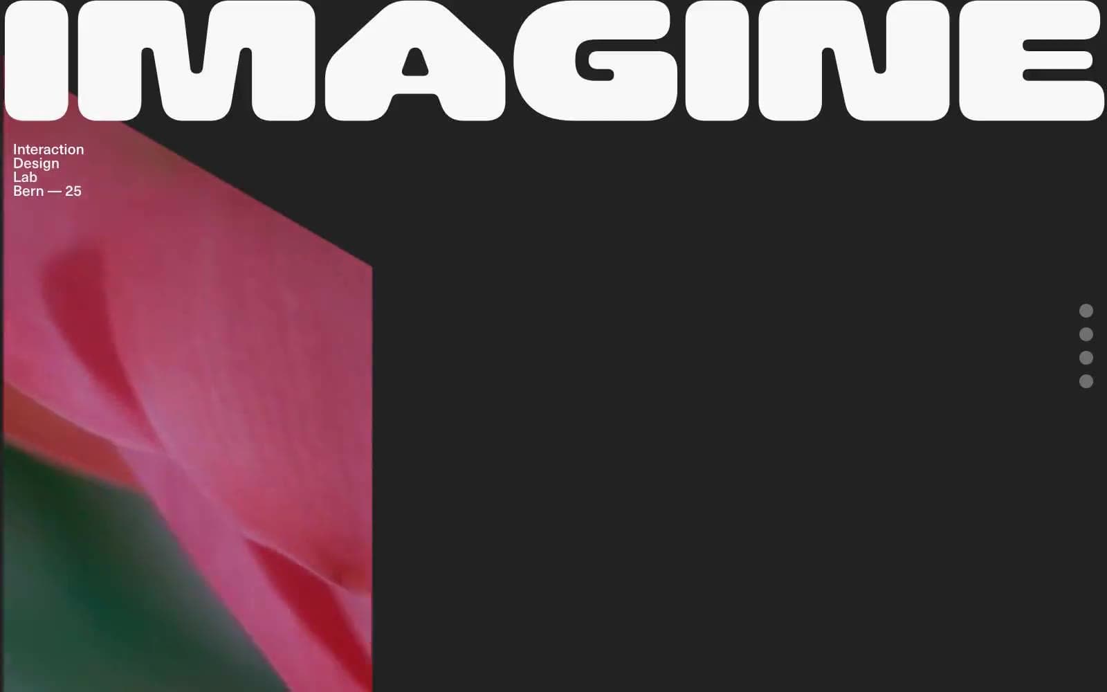
Iad-lab
Design tools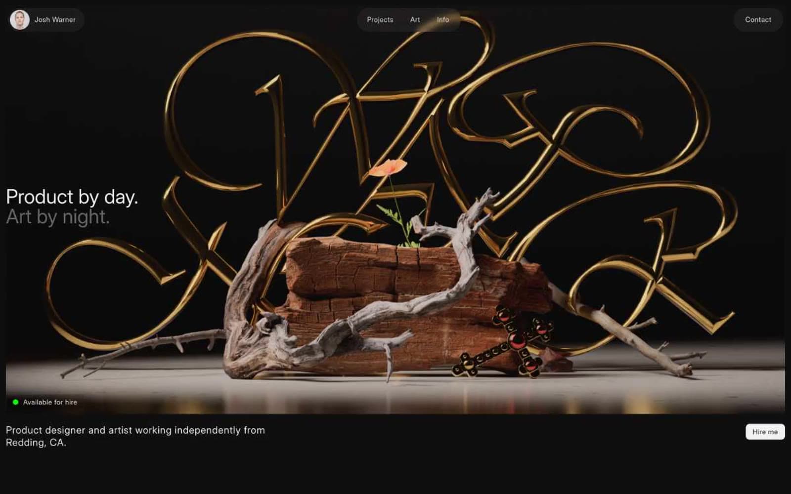
Josh Warner
Design tools


