
HeroKit. An editorial poster that happens to be a product page.
- Design tools
- Dark theme
- 7 colors
- 4 typefaces
HeroKit uses an obsidian-canvas, neon-punctuation language: pure black surfaces swallow the page, and a single pale lemon yellow #ffffa7 is the entire chromatic vocabulary for action and brand identity. Display type is huge, tight-tracked PP Neue Montreal at 100–120px with negative tracking around -4.8px, giving headlines a compressed, editorial-poster feel that dominates the hero and section openers. The product speaks through 3D bubbly, organic renders rather than photography or flat illustration, floating against the void like jellyfish under spotlight. Components stay light: thin borders, 8px radii, no drop shadows, no gradients — structure is implied through contrast and whitespace rather than elevation. Density is generous; the site breathes because the product visuals do the heavy work.
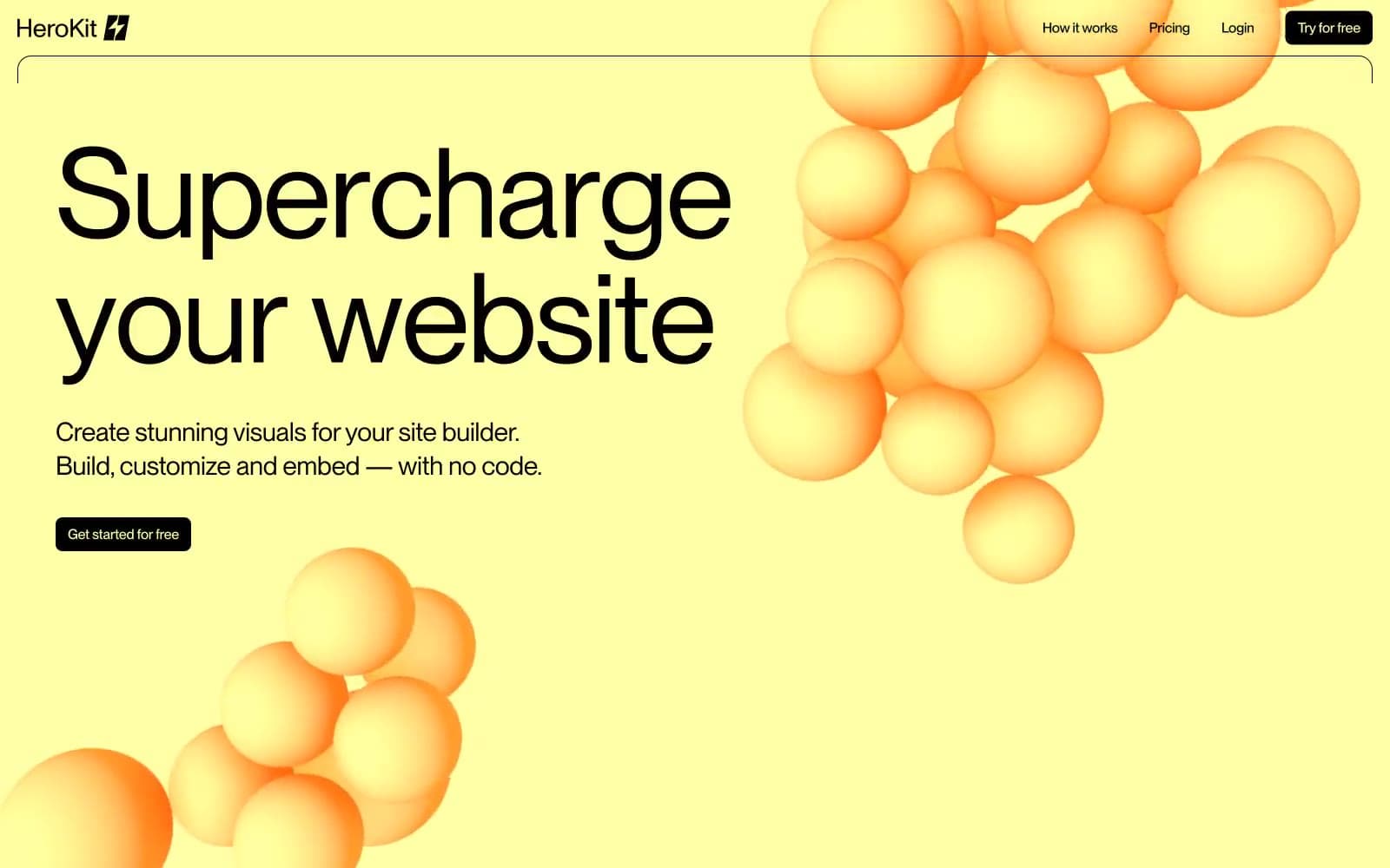
HeroKit design system

Brand2
Primary action fill, brand accent, hero section wash, badge labels — the single chromatic voice of the entire system
Yellow outline accent for tags, dividers, and focused UI edges. Do not promote it to the primary CTA color
Neutrals5
Page canvas, card surfaces, text on light fills, hairline dividers, image borders — the base everything floats on
Muted heading strokes, de-emphasized outline text, secondary borders on dark
Captions, helper text, dense metadata rows, low-emphasis body
Body subtext, link idle state, tertiary metadata — the only neutral that softens body copy without going silver
Primary text on dark, card surface alt, heading strokes, inverted button text
Try a pairing
Pick any two colors from the palette to check whether text stays readable on top.
Aa
Obsidian on Pale Lemon
20.11 : 1 contrast
- Body textPasses AA 4.5
- Large textPasses AA 3
- StrictPasses AAA 7
More DESIGN.md files. Same web, different personalities.
Bibliothèque
Design tools
Eduardo del Fraile
Design tools
Endlesstools
Design tools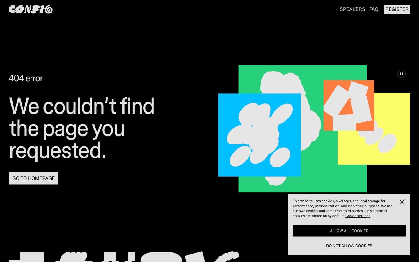
Figma Config
Design tools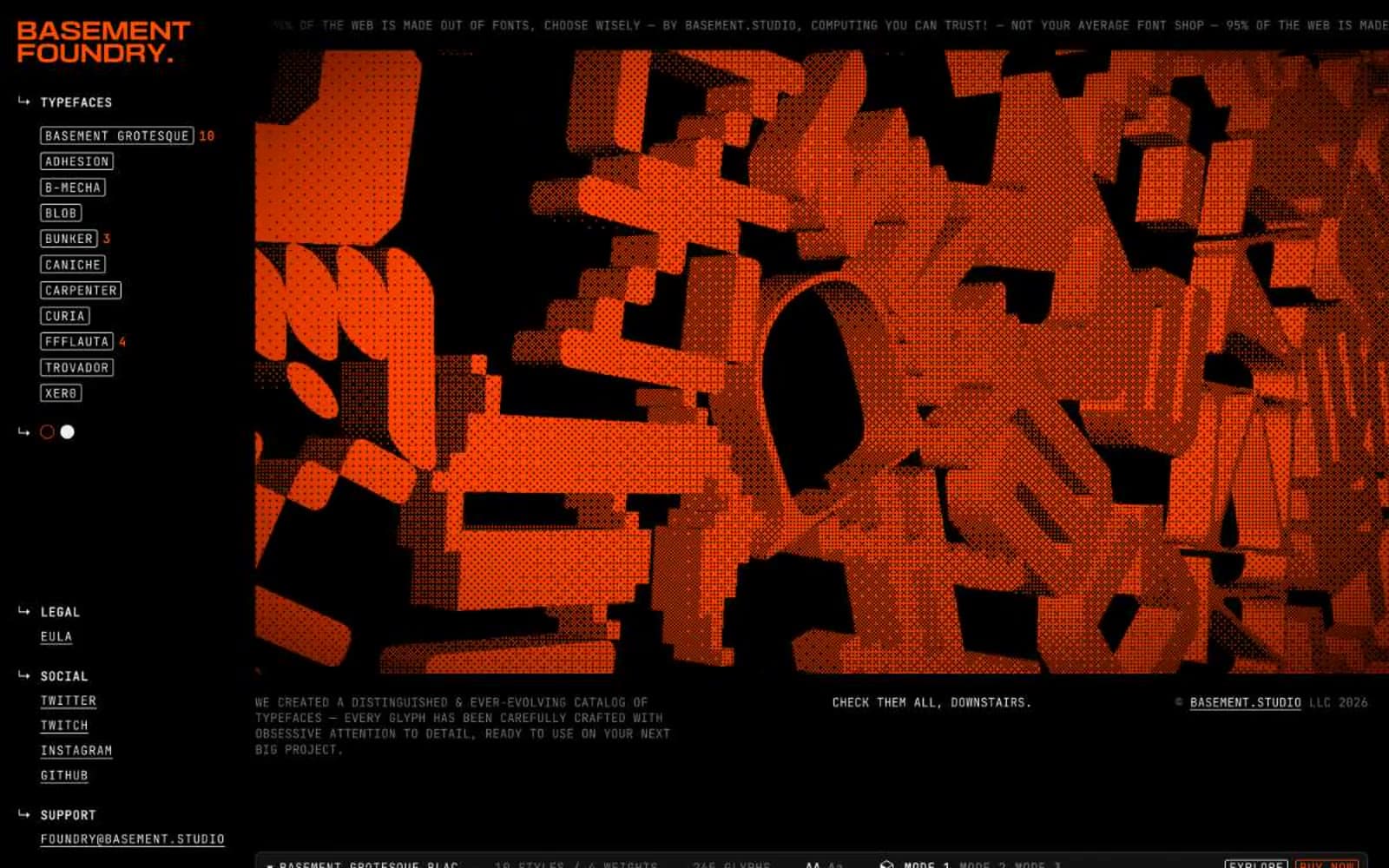
Foundry
Design tools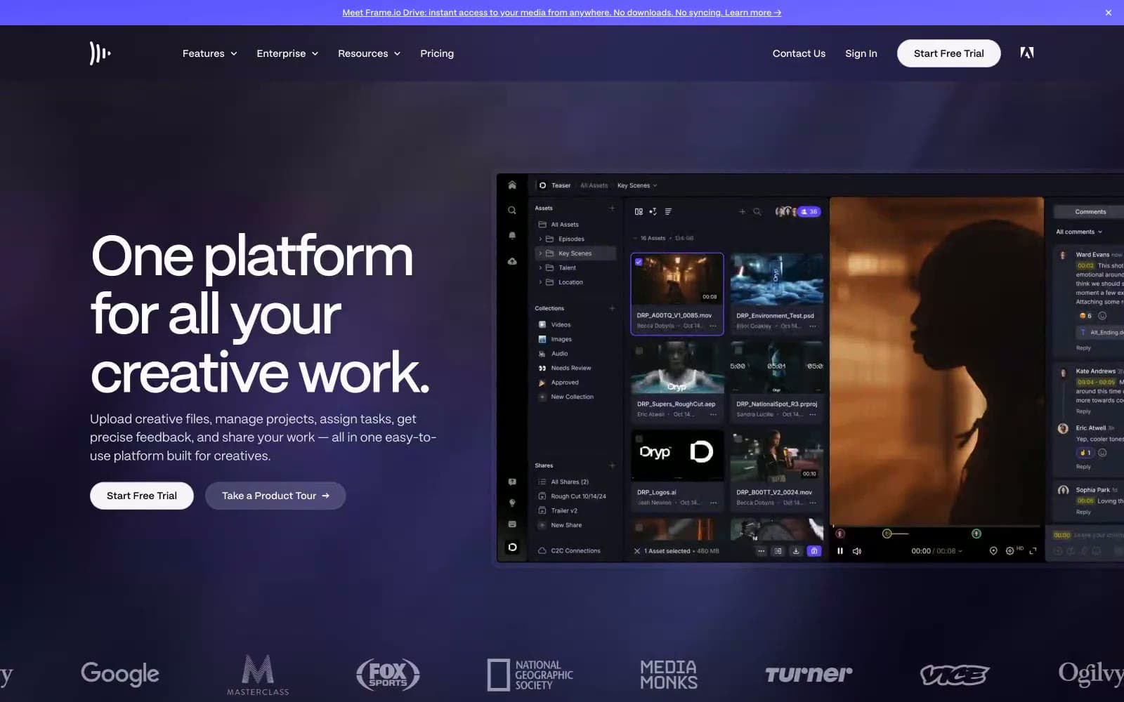
Frame.io
Design tools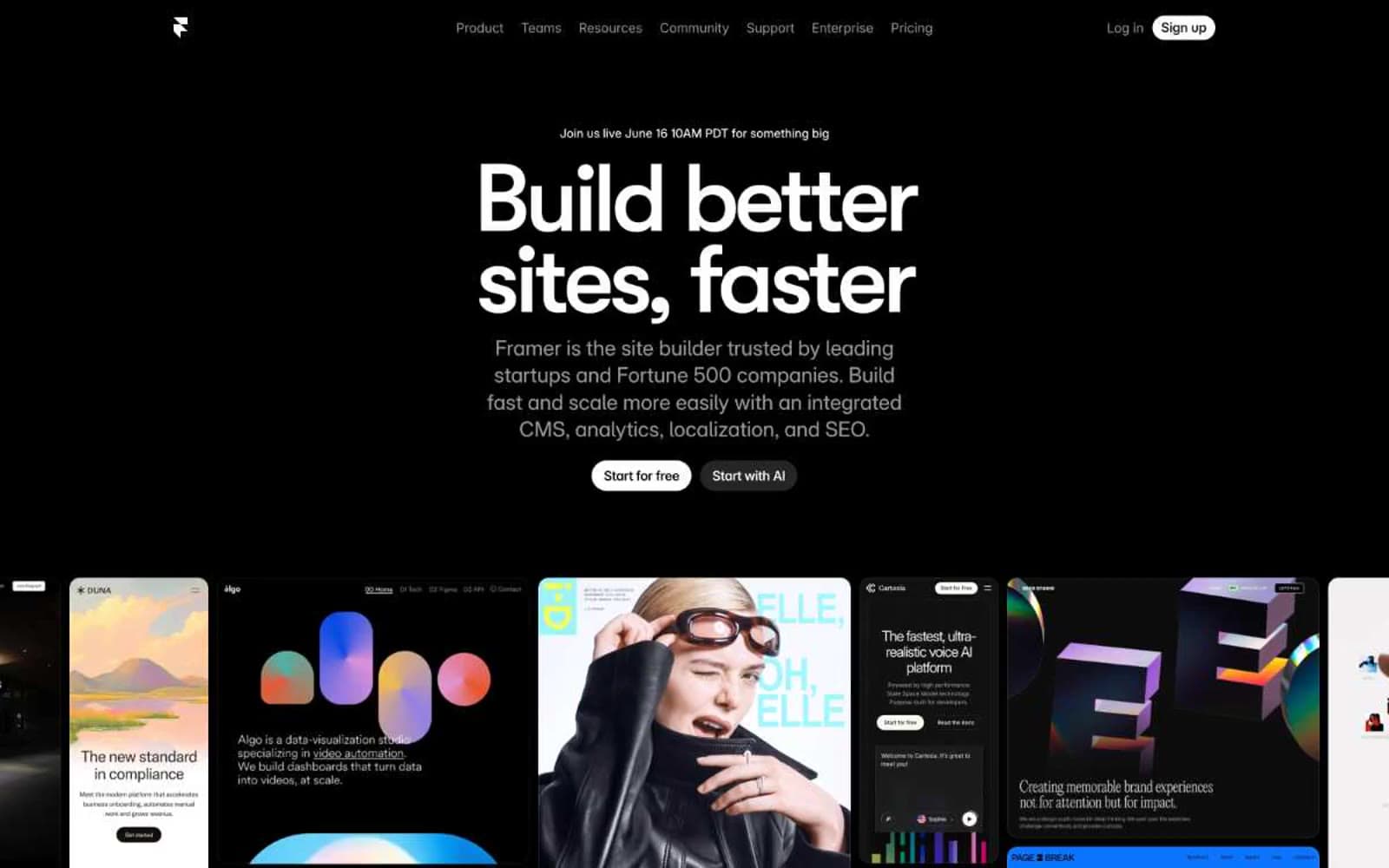
Framer
Design tools
Gt-planar
Design tools
Guglieri
Design tools
Iad-lab
Design tools
Josh Warner
Design tools
Linearity
Design tools


