Bibliothèque. A single illuminated plate in a vast dark room.
- Design tools
- Dark theme
- 2 colors
- 1 typeface
Bibliothèque operates as a black-cube gallery aesthetic: the entire interface is a dark void (#000000) where only white hairline type and centered photographic plates exist. The only brand mark is a small white serif 'B.' tucked in the top-left corner. Components feel like museum vitrines — thin white rules, generous negative space, no fills, no shadows, no gradients, and no chromatic accent of any kind. Typography is a single weight (400) of a custom neo-grotesque at an extreme binary scale: 12–18px functional text against an isolated 80px display. The visual system is fundamentally about restraint and curation — every UI element should feel like it could be removed and the page would not lose meaning.
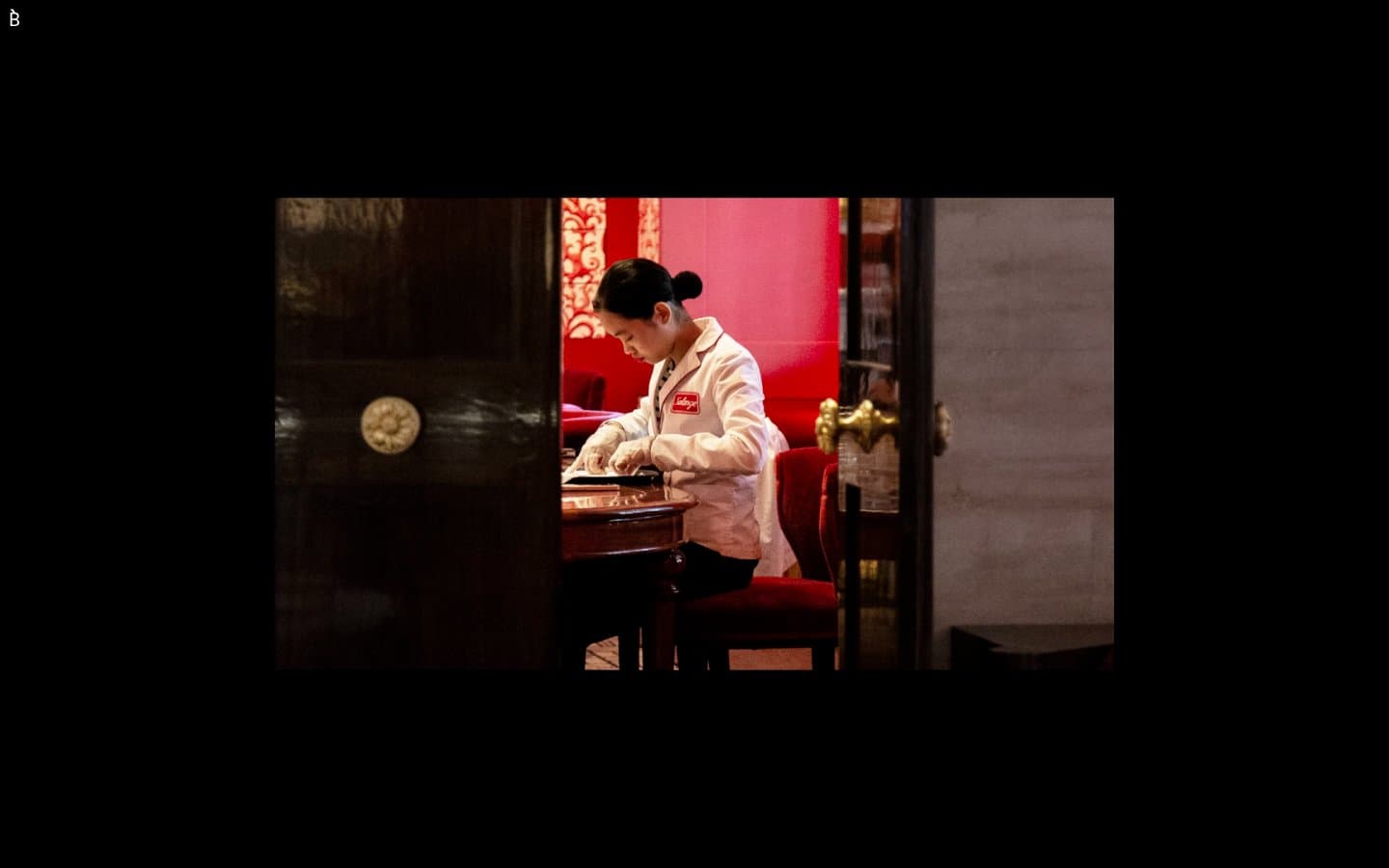
Bibliothèque design system
Neutrals2
Page canvas, card surfaces, footer — the universal background. Cards do not lift from the canvas; they are demarcated only by hairline white borders
Body text, headings, nav marks, hairline borders, link underlines, list dividers — the sole foreground. Used as 1px structural lines rather than fills
Try a pairing
Pick any two colors from the palette to check whether text stays readable on top.
Aa
Gallery White on Ink Black
21.00 : 1 contrast
- Body textPasses AA 4.5
- Large textPasses AA 3
- StrictPasses AAA 7
More DESIGN.md files. Same web, different personalities.
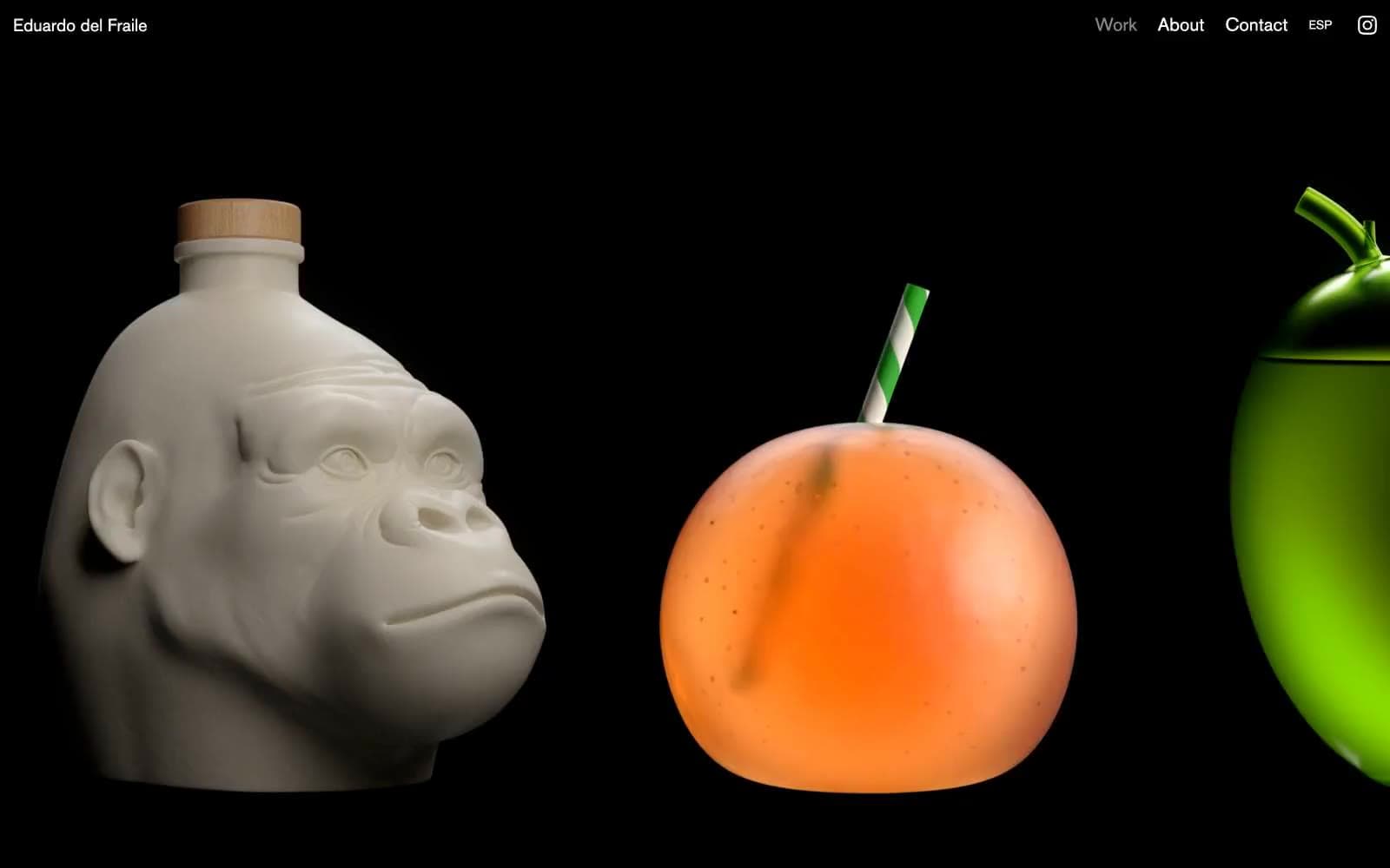
Eduardo del Fraile
Design tools
Endlesstools
Design tools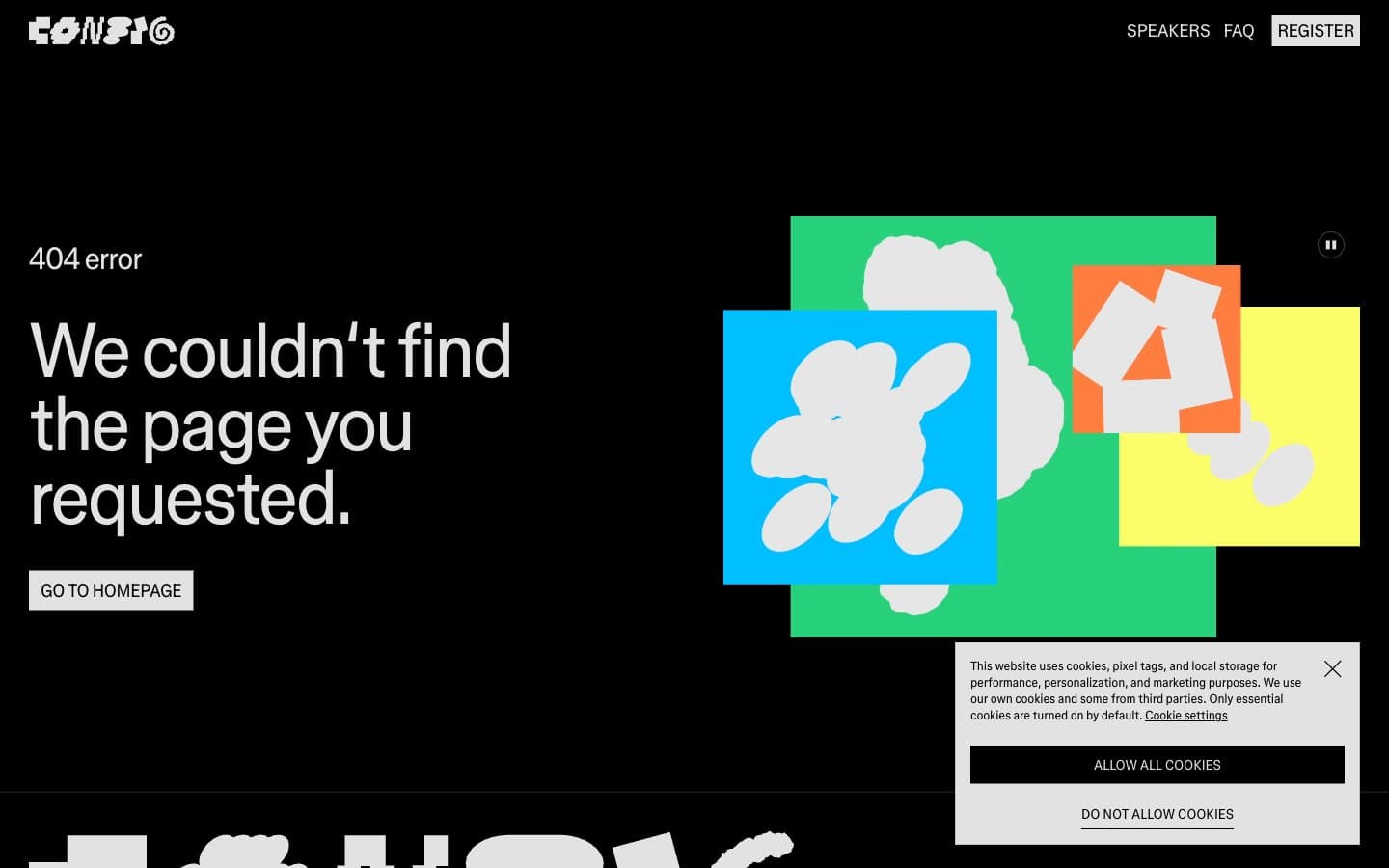
Figma Config
Design tools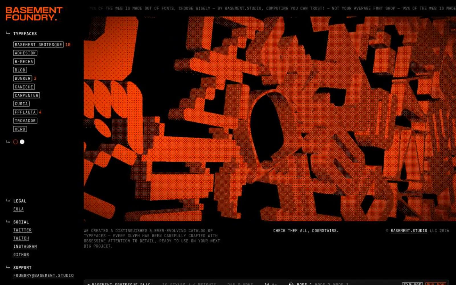
Foundry
Design tools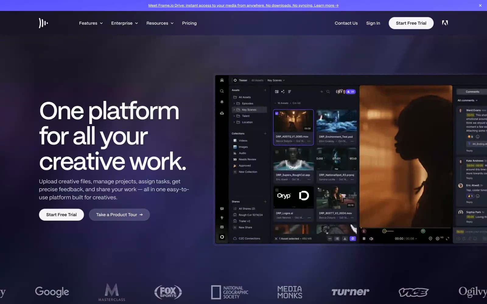
Frame.io
Design tools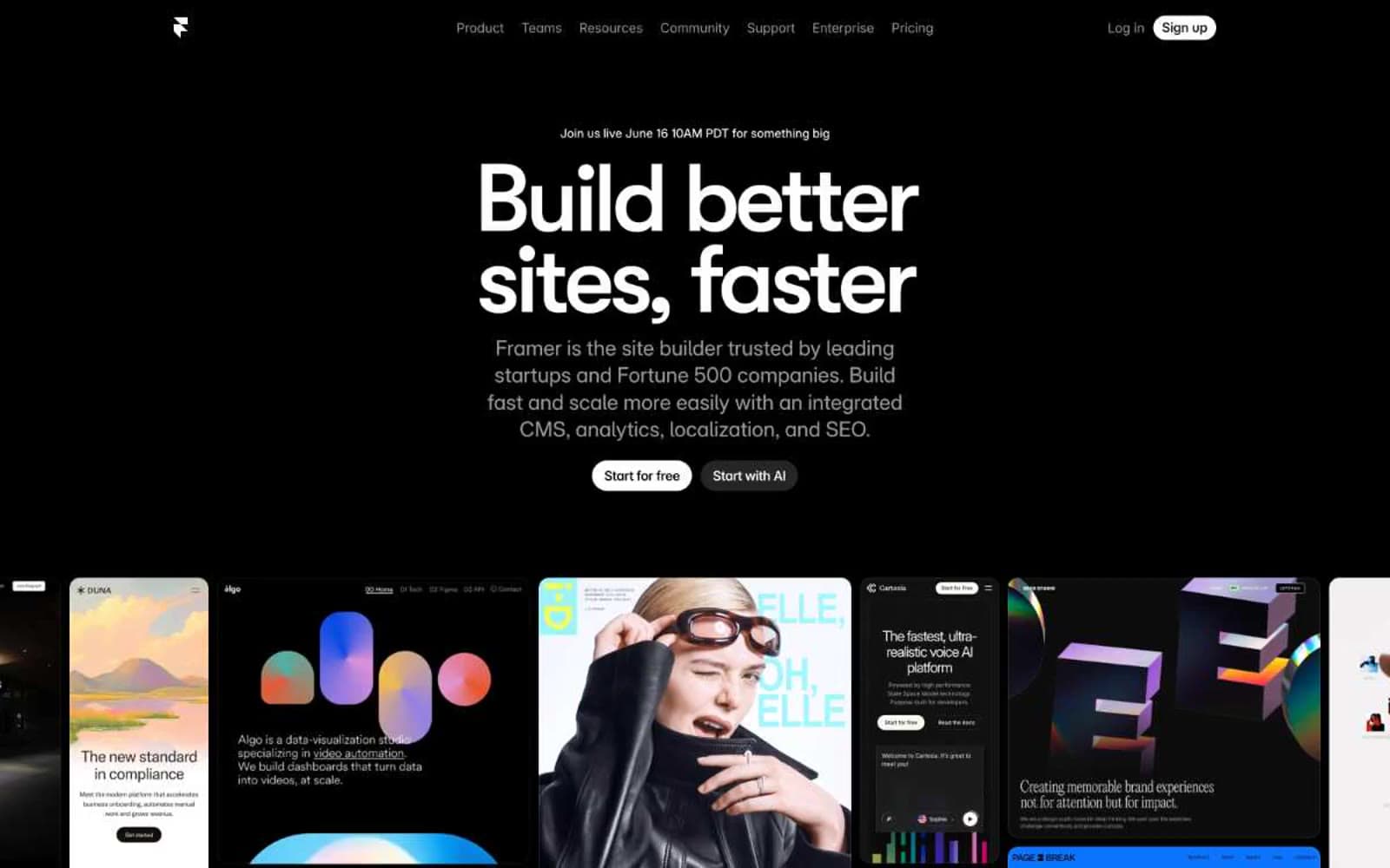
Framer
Design tools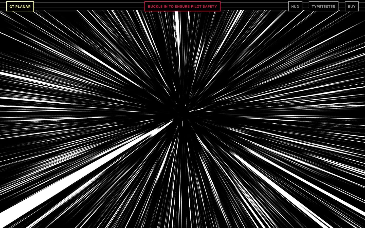
Gt-planar
Design tools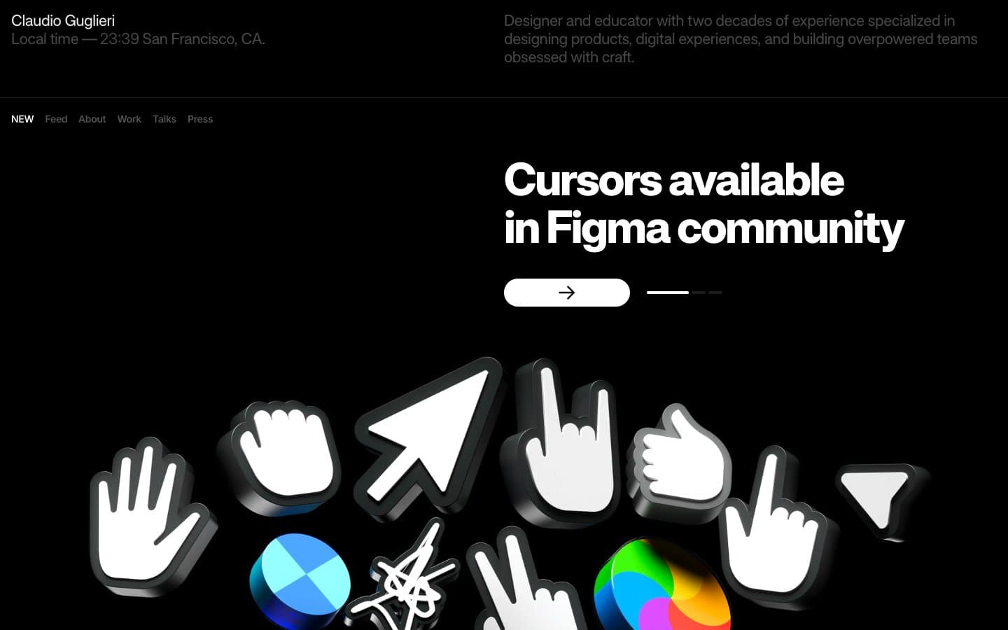
Guglieri
Design tools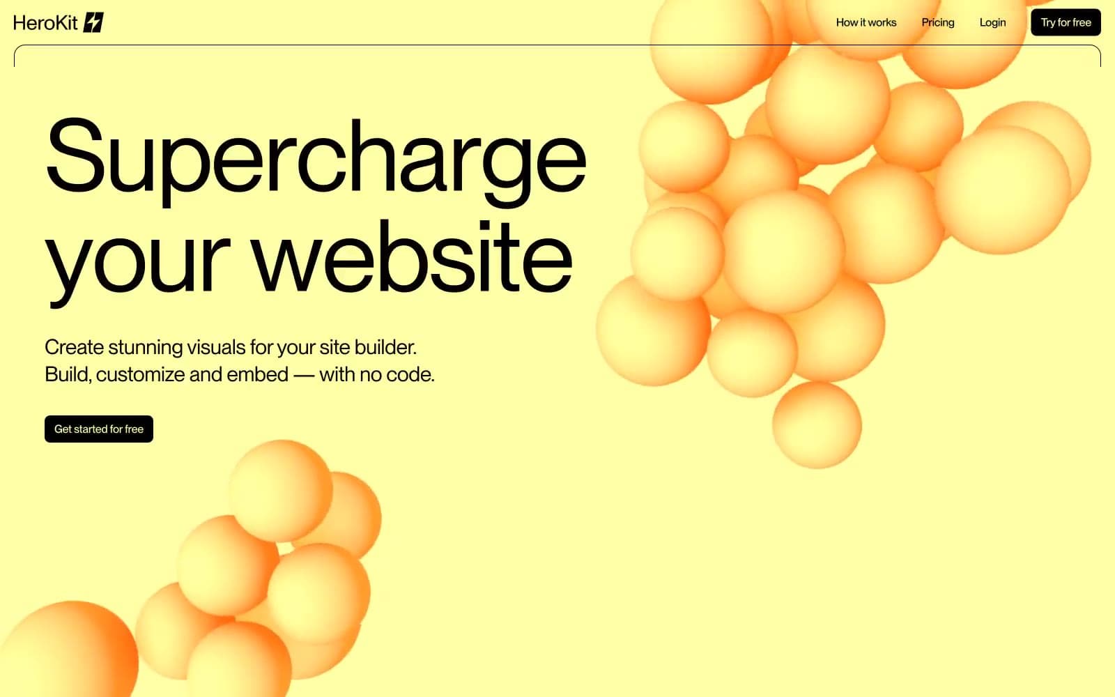
HeroKit
Design tools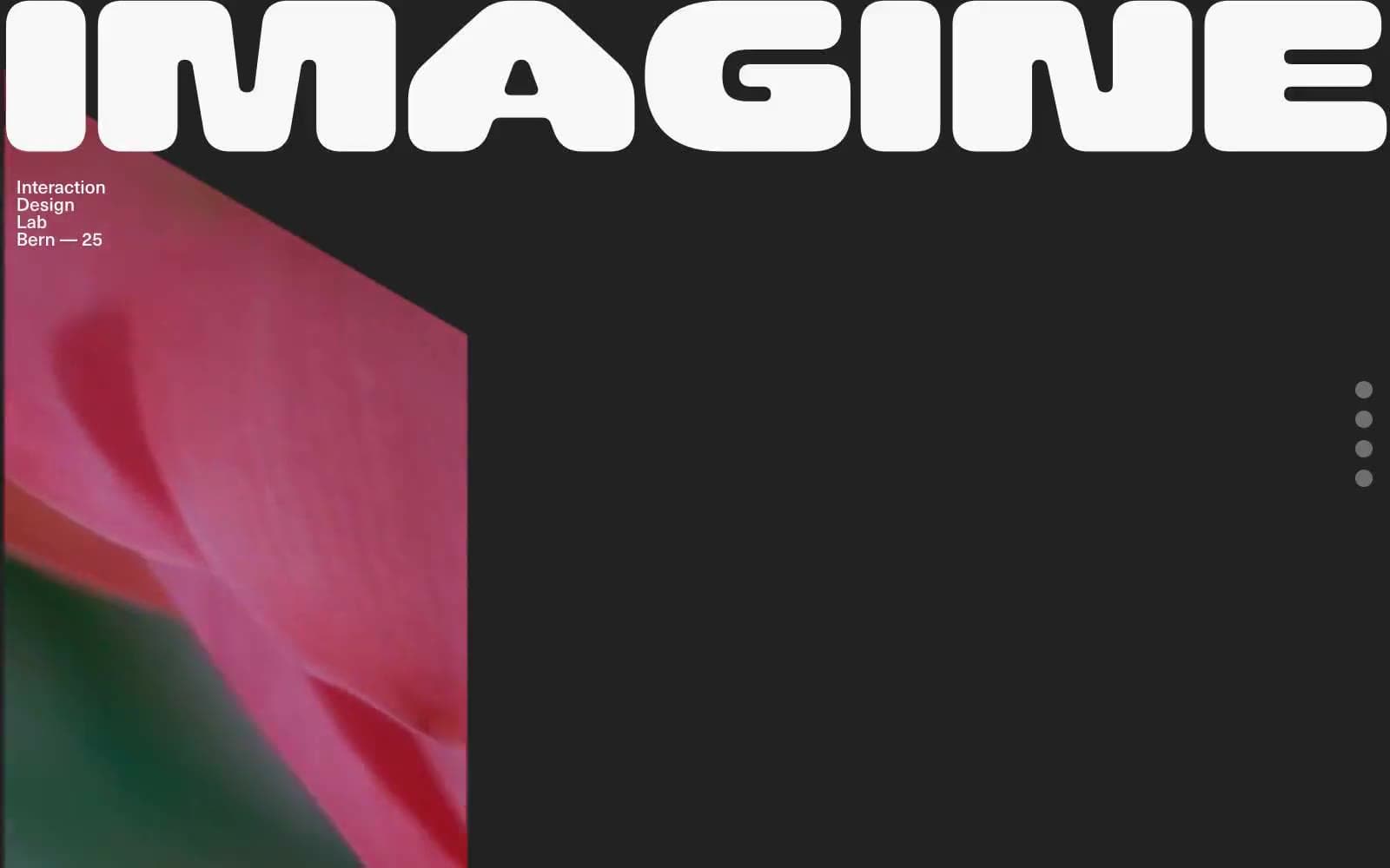
Iad-lab
Design tools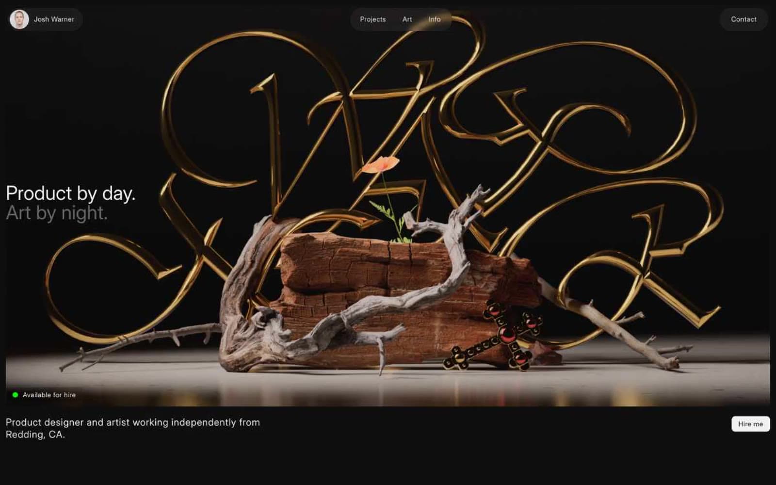
Josh Warner
Design tools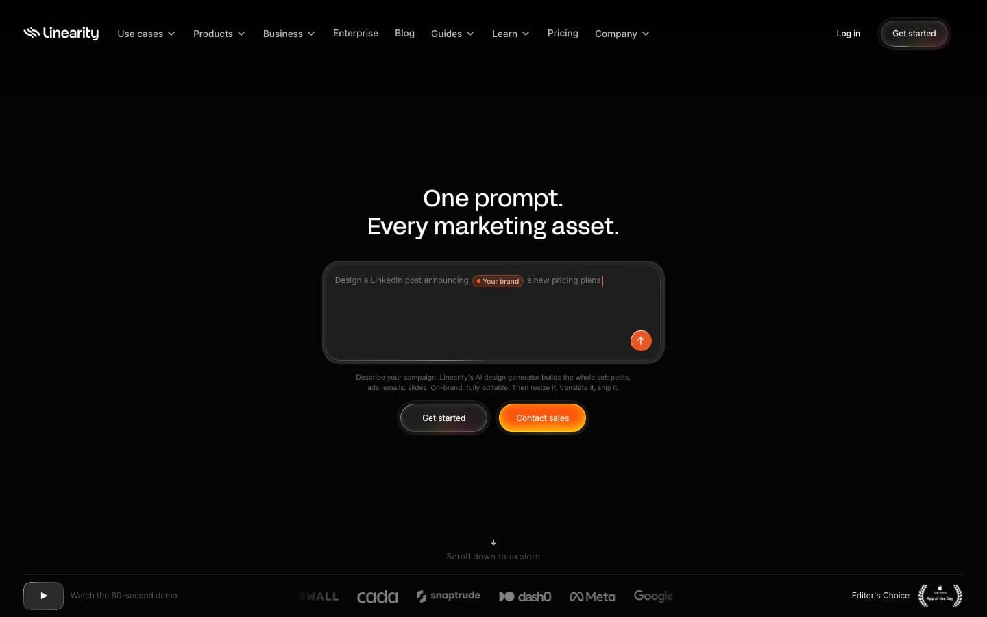
Linearity
Design tools


