
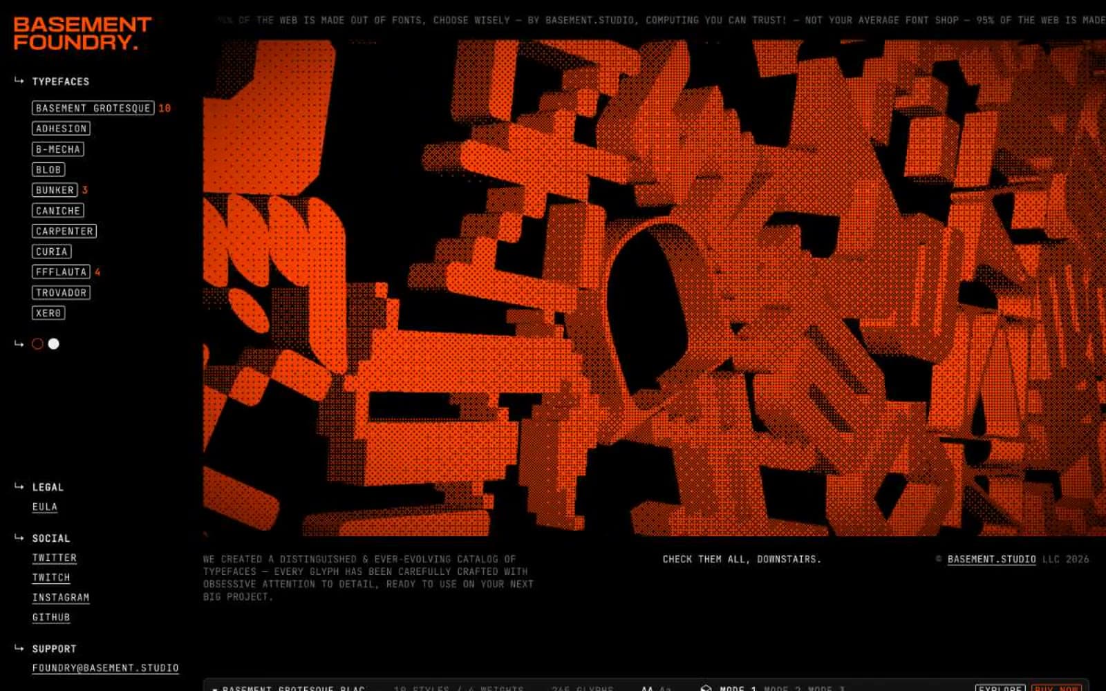
Foundry. A black room where enormous illuminated letterforms hang as exhibits and the only guide rails are pale wireframe borders and one neon marker color.
- Design tools
- Dark theme
- 6 colors
- 14 typefaces
Foundry is a type foundry presented as a dark workbench where the products are also the interface. A near-black canvas (#121212) hosts sharp-cornered UI chrome built almost entirely from monospaced text and hairline borders, giving the whole site the feel of a developer's terminal crossed with a gallery wall. The only chromatic voice is a vivid orange (#ff4d00) used as a structural accent on the logo, outlined action borders, and selective highlights — never as a filled button background, which keeps the accent feeling like a warning lamp or marker stroke rather than a brand paint job. Every screen is a specimen: massive custom display faces (90–234px) dominate the viewport, the UI recedes around them, and even sidebar items are styled as labeled tags. Compact spacing, near-zero radii (2.8px), and uppercase monospace metadata reinforce a precise, industrial, no-decoration sensibility — decoration lives entirely inside the typefaces themselves.
Foundry design system

Brand1
Orange accent for outlined action borders, linked labels, and lightweight interactive emphasis. Do not promote it to the primary CTA color
Neutrals5
Page background, section canvas, main surface — the dominant ground that lets white type and orange accents read as luminous
Low-contrast structural borders, subtle dividers between stacked sections — the quietest rule line, only visible against the bone-white inverted surfaces
Muted helper text, inactive labels, secondary metadata — recedes so the monospace chrome can carry hierarchy without competing with display type
Hairline borders, nav rules, link underlines, tag outlines — the wireframe color that constructs the entire UI scaffold
Primary body and UI text, icon strokes, button text, secondary surface fills — the readable text color and the inverse fill used for emphasized controls
Try a pairing
Pick any two colors from the palette to check whether text stays readable on top.
Aa
Foundry Black on Ember Orange
5.63 : 1 contrast
- Body textPasses AA 4.5
- Large textPasses AA 3
- StrictFails AAA 7
More DESIGN.md files. Same web, different personalities.
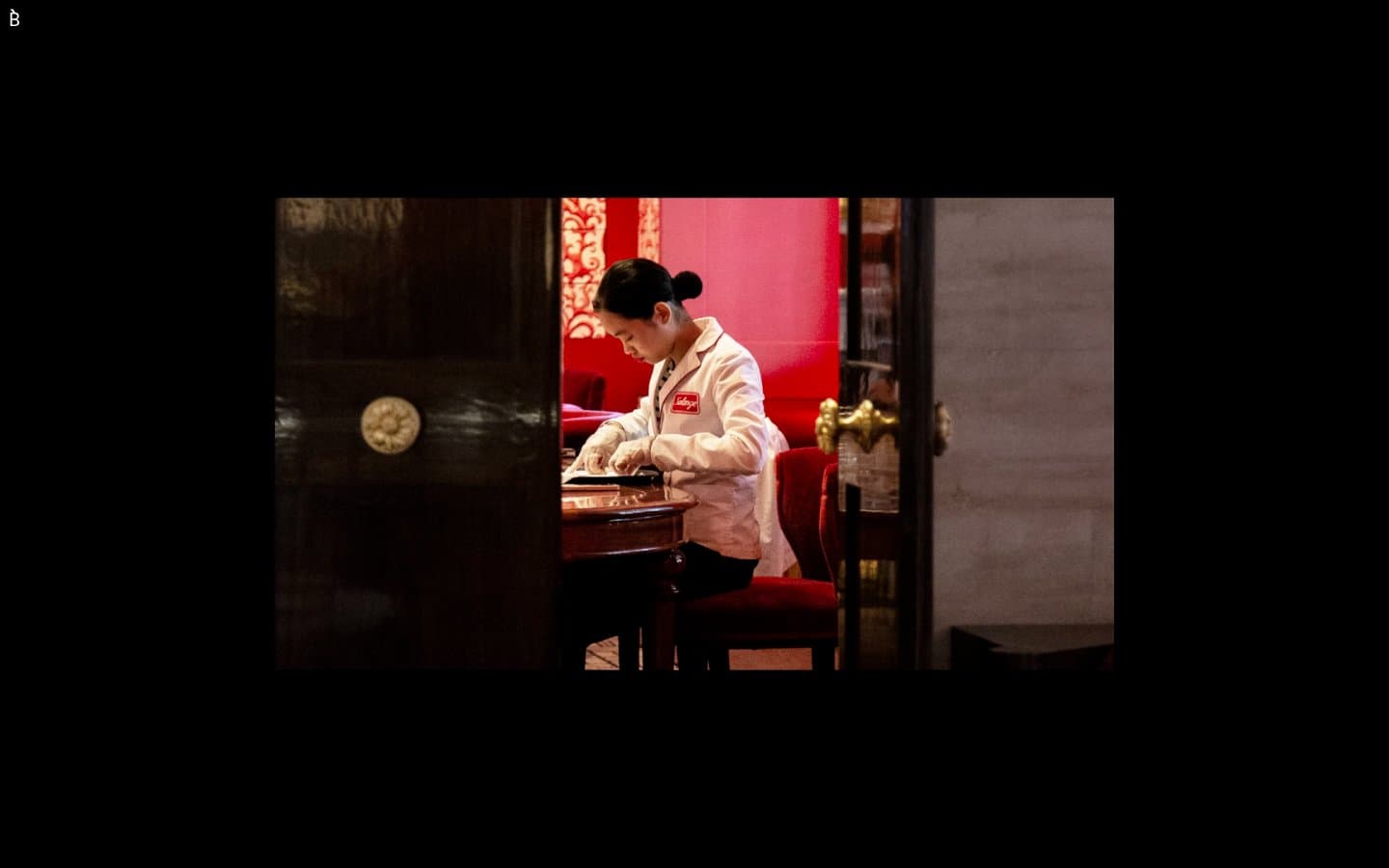
Bibliothèque
Design tools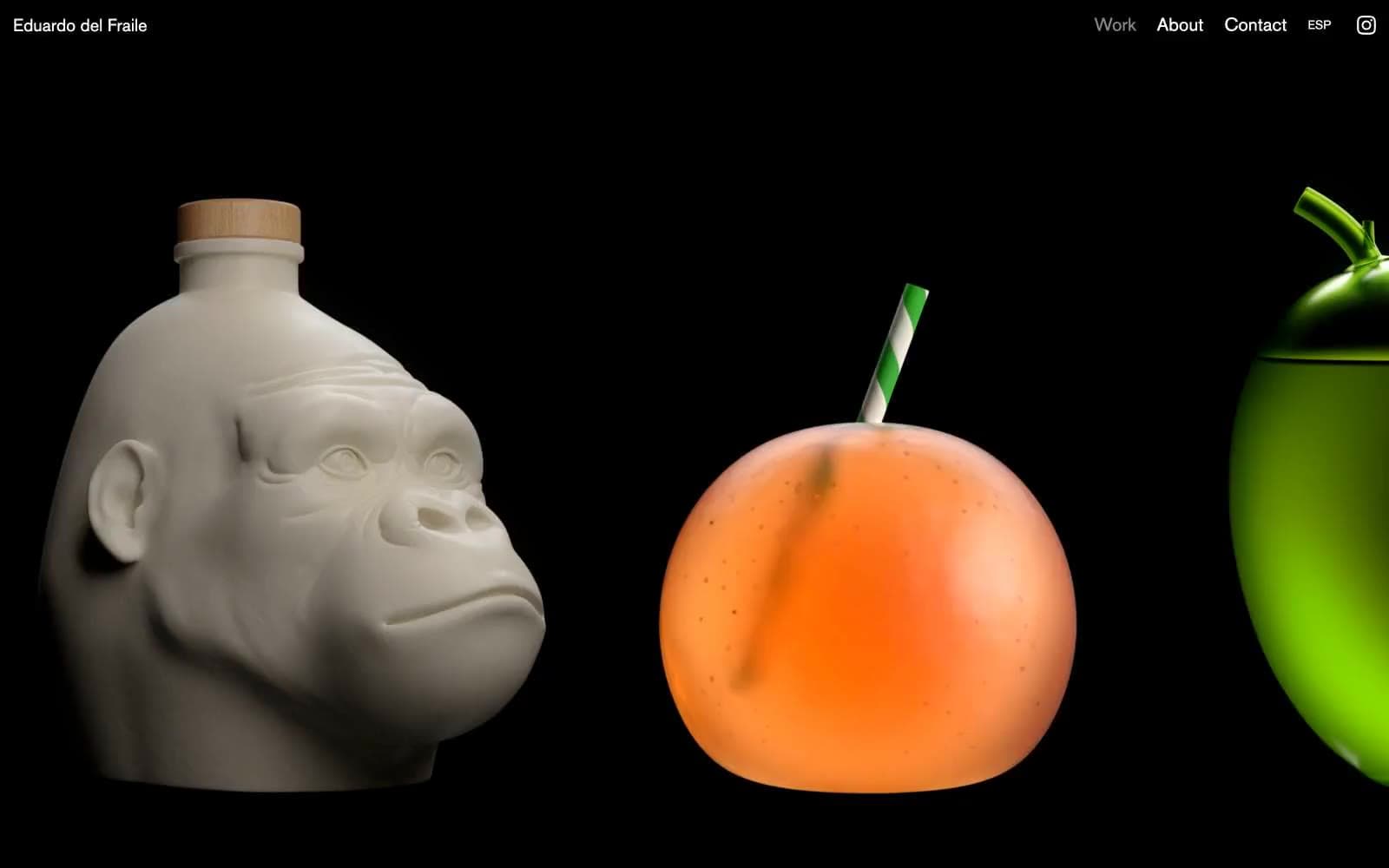
Eduardo del Fraile
Design tools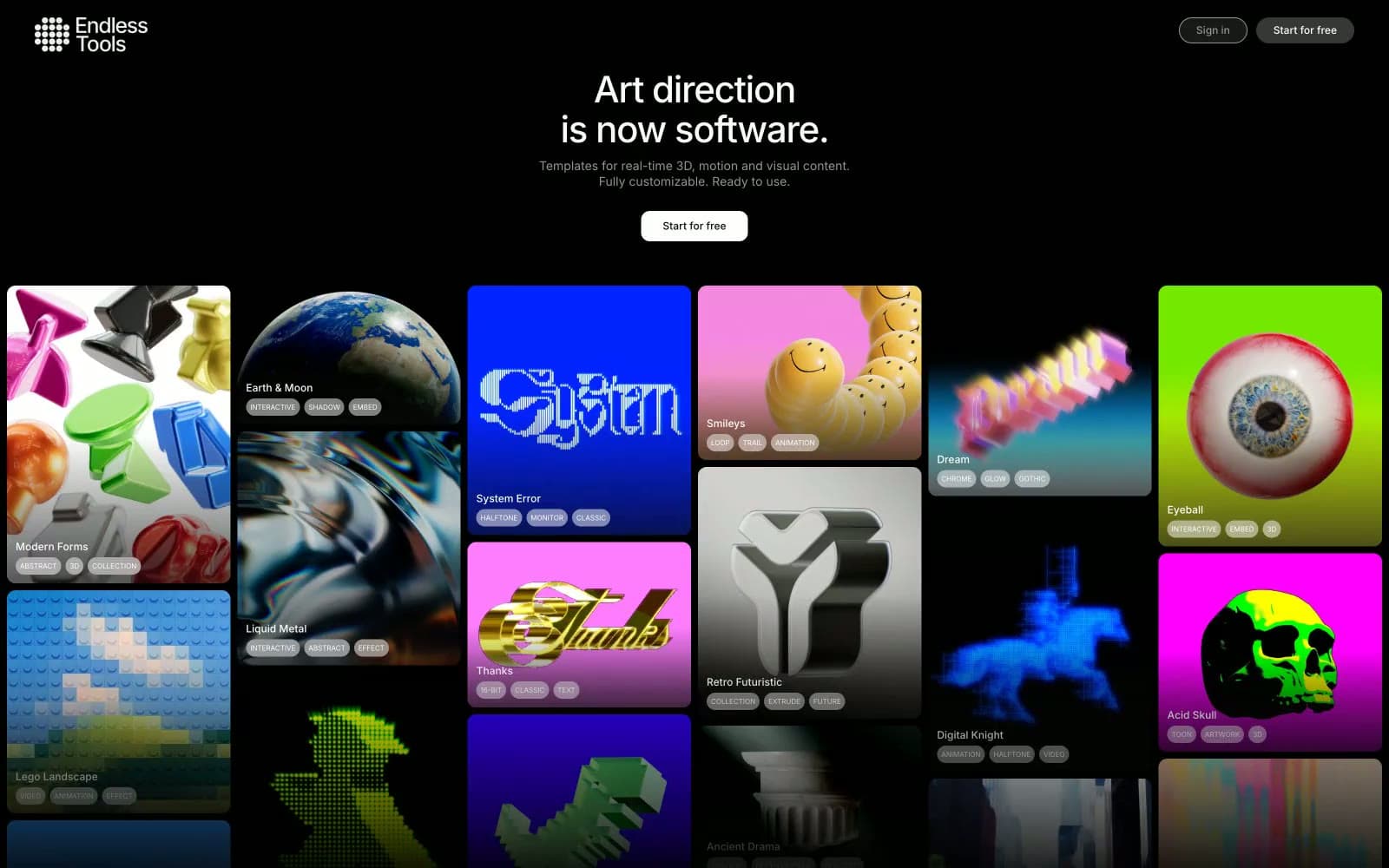
Endlesstools
Design tools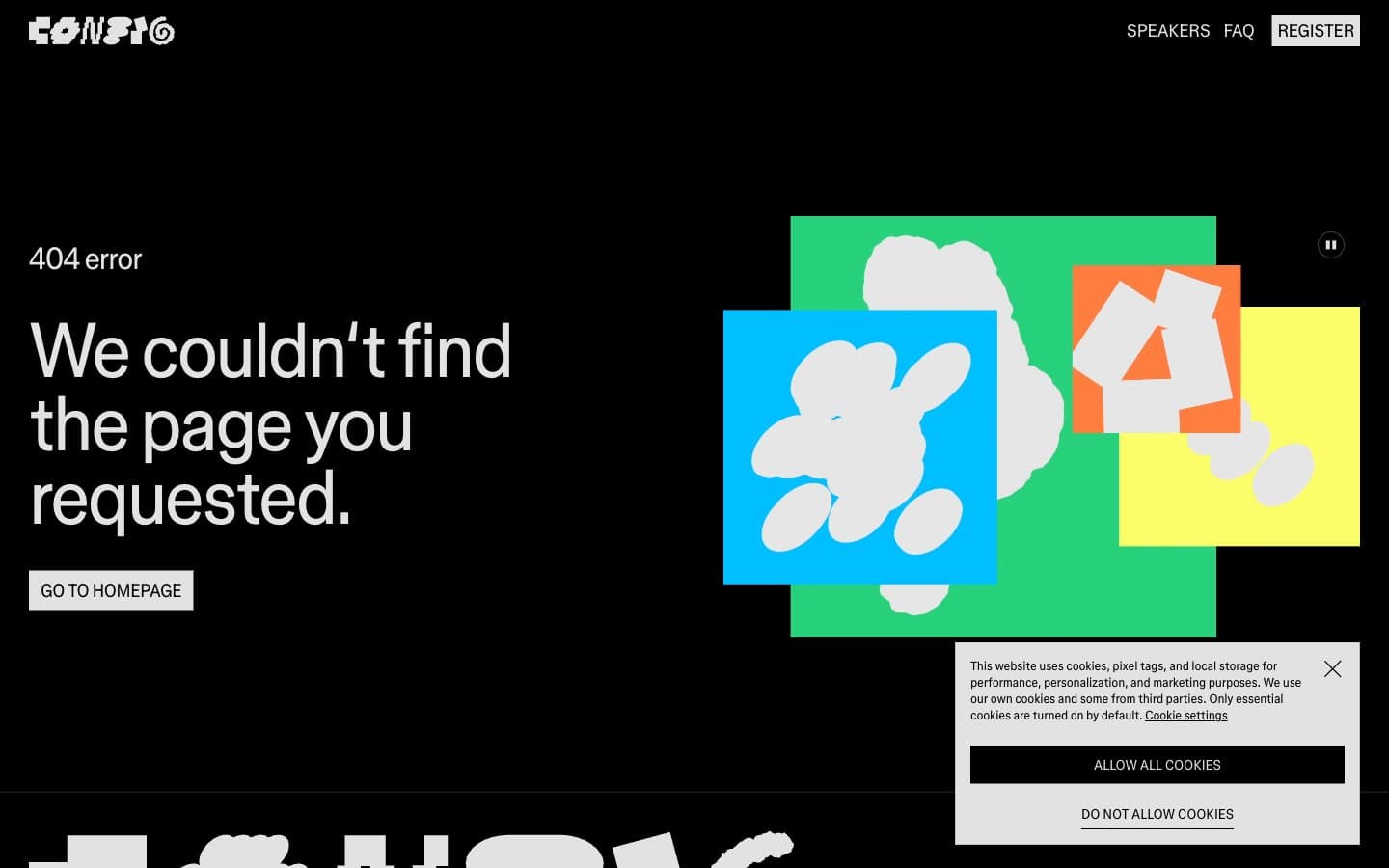
Figma Config
Design tools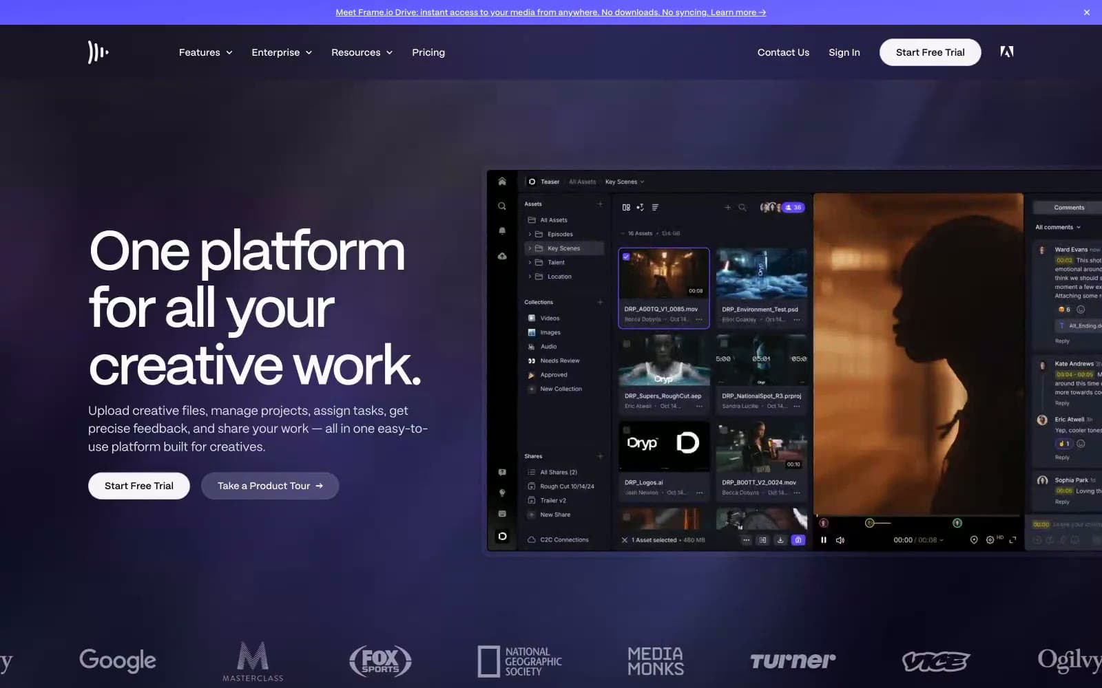
Frame.io
Design tools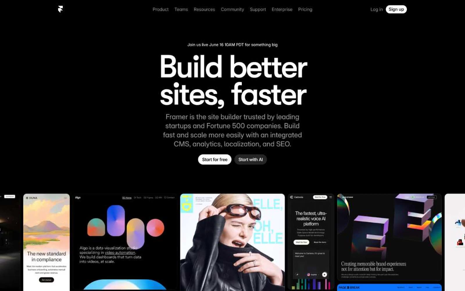
Framer
Design tools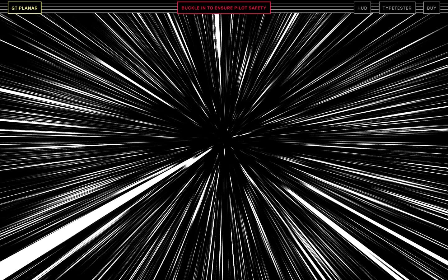
Gt-planar
Design tools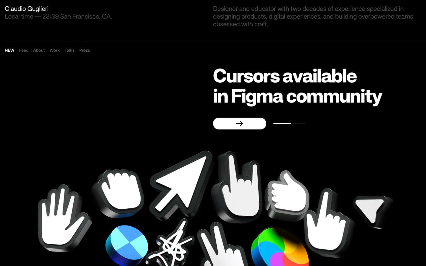
Guglieri
Design tools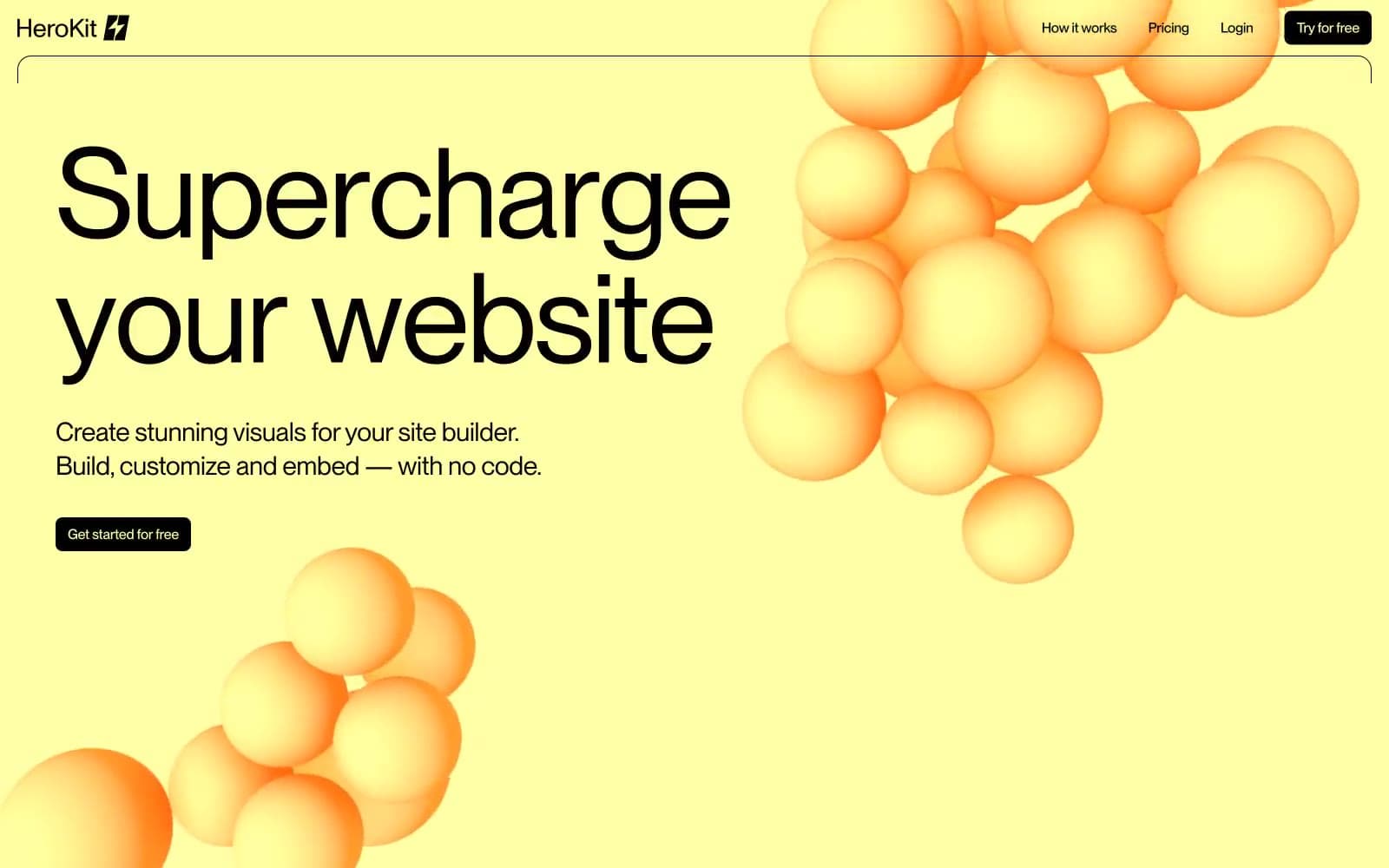
HeroKit
Design tools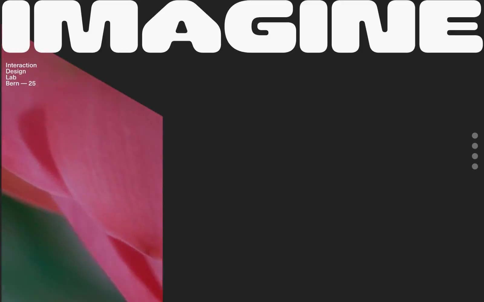
Iad-lab
Design tools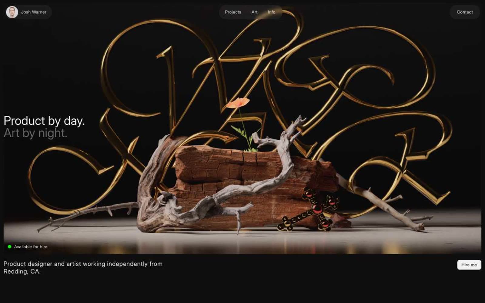
Josh Warner
Design tools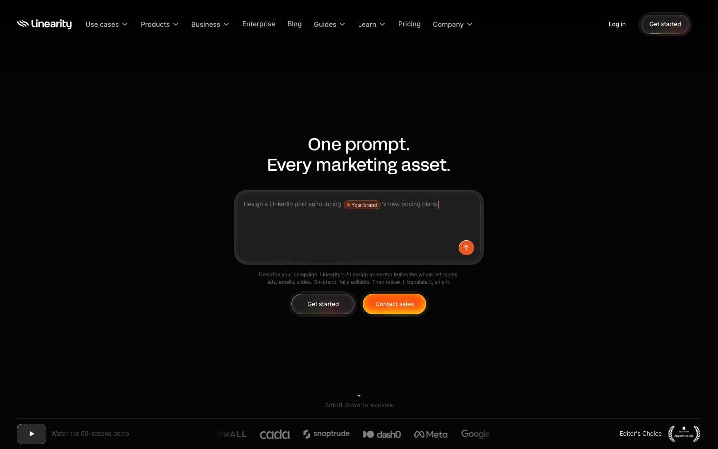
Linearity
Design tools


