
Josh Warner. Black void gallery wall.
- Design tools
- Dark theme
- 8 colors
- 2 typefaces
Josh Warner's portfolio operates as a near-pure black gallery wall: the interface recedes so that 3D renders, product mockups, and photographic compositions can dominate every viewport. Typography is whisper-thin and uniformly weighted at 400 across the scale, using a single sans-serif family that refuses to shout — hierarchy is built through size and generous letter-spacing (0.04em) rather than weight contrast. The entire palette is achromatic except for a single electric green status dot (#08ff00), which functions as the site's only living signal against the void. Surfaces are flat or near-flat; depth is borrowed entirely from the artwork, not from drop shadows or gradients. Components are sparse, pill-shaped, and almost weightless — ghost buttons, hairline borders on #000, circular avatars, and pill nav items. The system is a frame, not a subject.
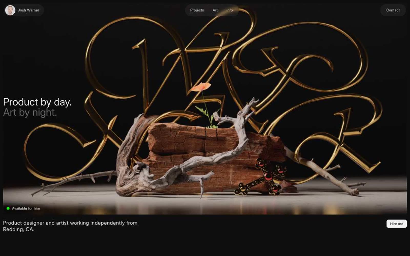
Josh Warner design system

Accent1
Green wash for highlight backgrounds, decorative bands, and soft emphasis behind content
Neutrals7
Hairline borders, image containers, icon strokes, footer dividers — pure black acts as the structural ink that defines edges in the absence of visible card surfaces
Shadow base for subtle elevation effects — nearly invisible against canvas, used in box-shadow compositions for soft ambient lift
Page canvas and primary surface — the base layer beneath all artwork, slightly lifted from pure black to prevent OLED banding in the dark void
Elevated footer surface and deeper UI panels — a single step up from canvas for zone separation without breaking the dark void
Tertiary text and border accents on headings — used sparingly for fine print and inactive labels that should recede
Secondary body text, subdued helper labels, muted metadata — sits one step below Bone for non-emphasized copy without losing legibility on dark surfaces
Primary text color, nav item fills, filled button background — warm off-white replaces pure white to soften contrast against the black void and reduce eye strain
Try a pairing
Pick any two colors from the palette to check whether text stays readable on top.
Aa
Absolute on Live Wire
15.31 : 1 contrast
- Body textPasses AA 4.5
- Large textPasses AA 3
- StrictPasses AAA 7
More DESIGN.md files. Same web, different personalities.
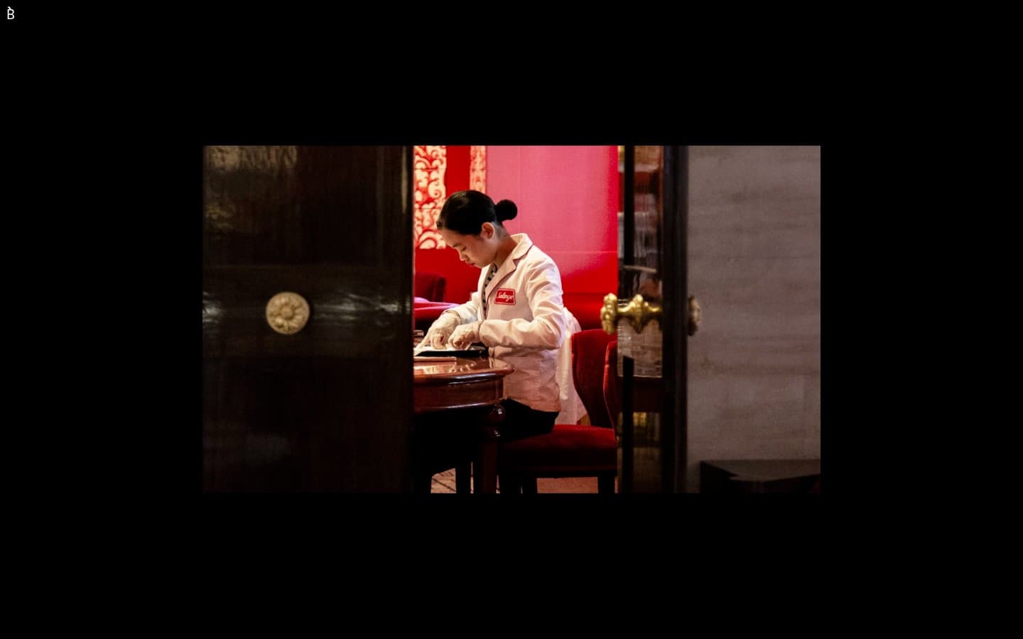
Bibliothèque
Design tools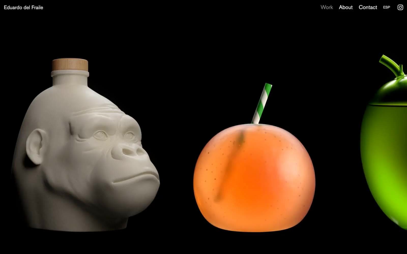
Eduardo del Fraile
Design tools
Endlesstools
Design tools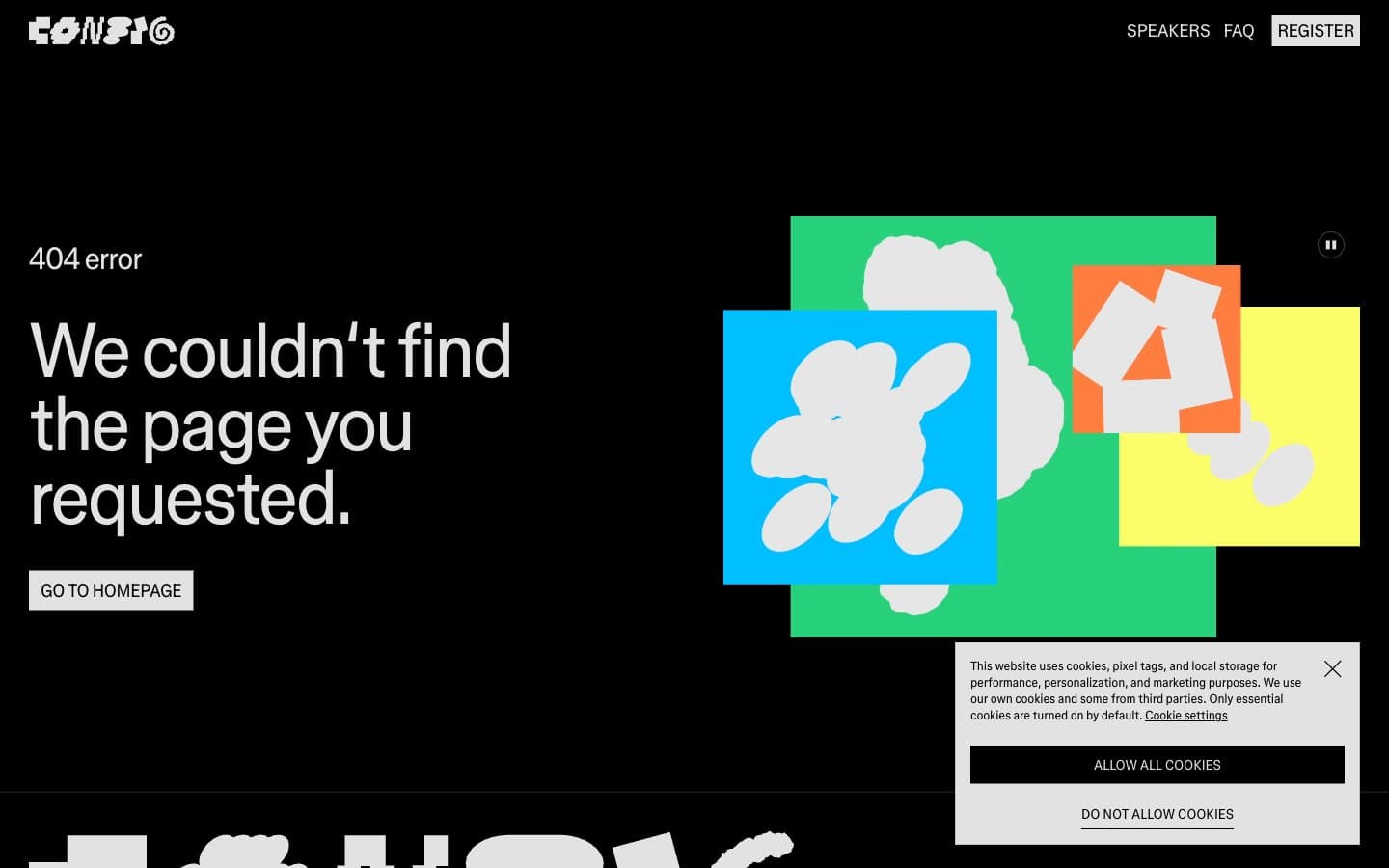
Figma Config
Design tools
Foundry
Design tools
Frame.io
Design tools
Framer
Design tools
Gt-planar
Design tools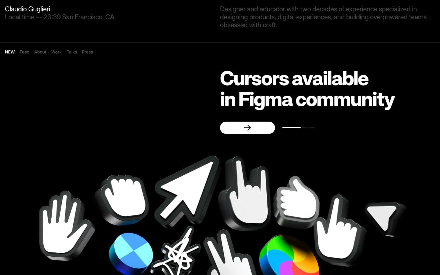
Guglieri
Design tools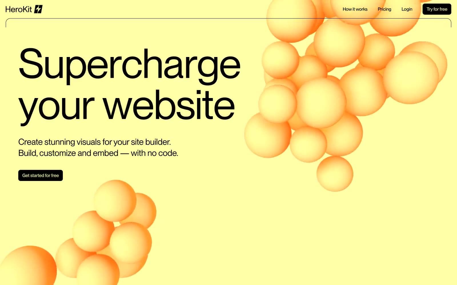
HeroKit
Design tools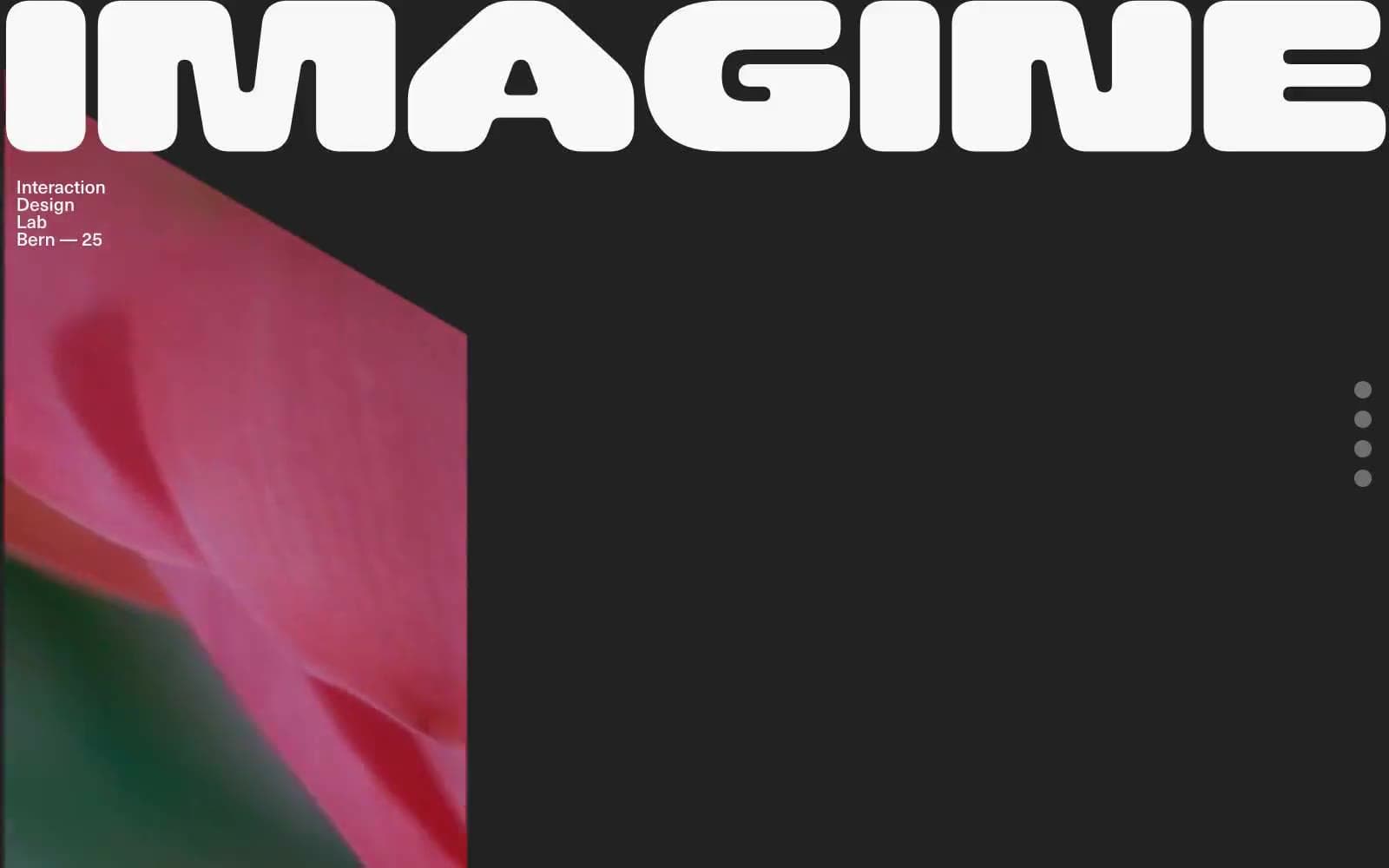
Iad-lab
Design tools
Linearity
Design tools


