
Framer. Cinematic black gallery.
- Design tools
- Dark theme
- 13 colors
- 6 typefaces
Framer operates in absolute darkness: a pure black canvas (#000000) where white typography and one electric blue (#0099ff) do all the talking. The design language is cinematic and confident — oversized condensed display type (GT Walsheim at 85–110px) anchors every section, while the rest of the interface dissolves into near-black surface layers. The signature rhythm is alternating maximalist hero typography against minimal, gridded screenshots of customer sites, all bordered by hairline dividers and powered by compact 10px spacing. The blue accent never fills buttons; it traces edges, outlines cards, and fires on micro-interactions like text selection and link hover — restrained, never decorative. Components are weightless: pill-shaped controls, thin borders, and barely-there elevation that lets the photography and editorial typography carry the weight.
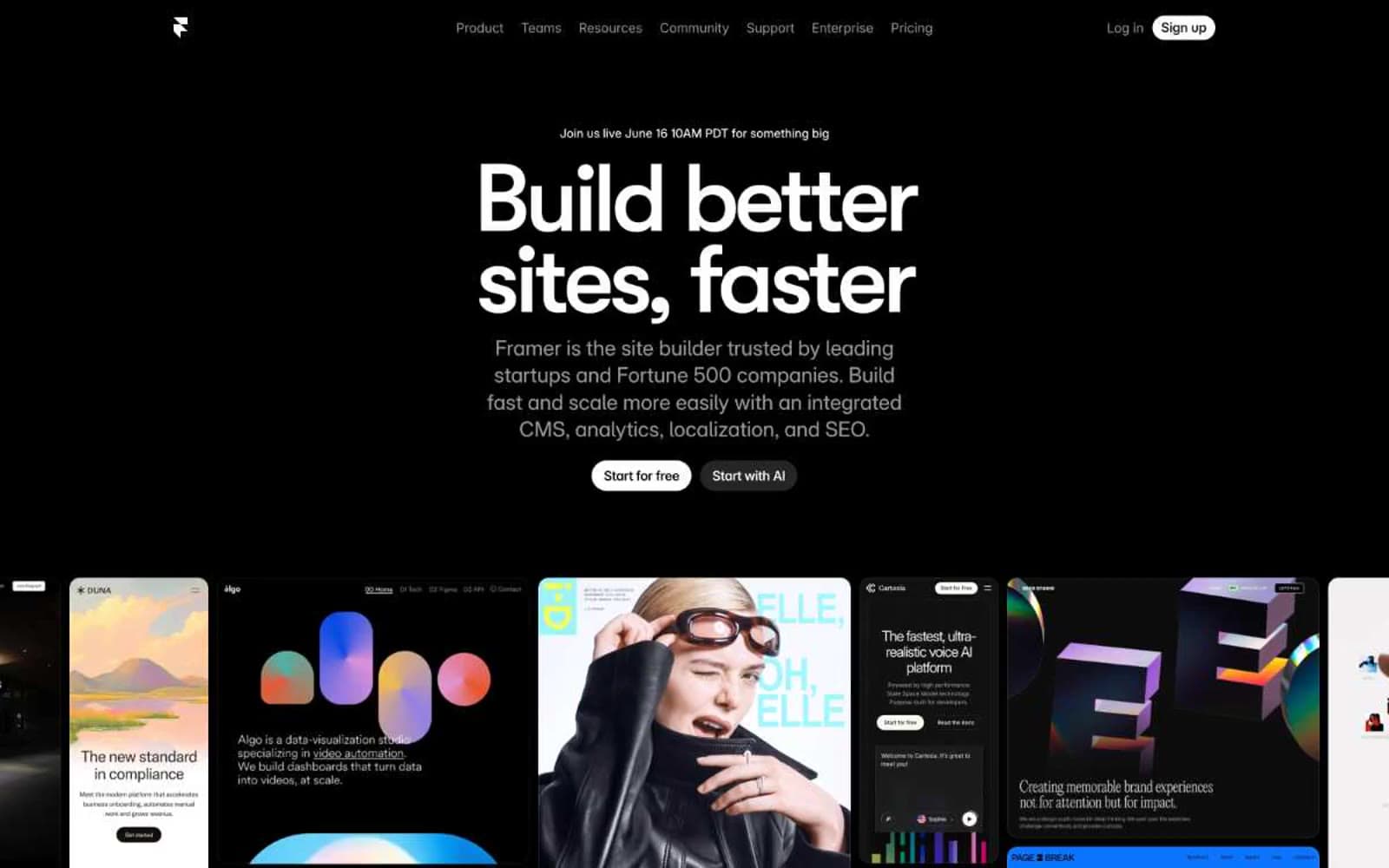
Framer design system

Brand1
Deep blue-black for box-shadows and subtle tinted surface washes — carries the brand's cool undertone into elevation
Accent1
Brand accent: link underlines, active nav state, focus rings, outlined button borders, decorative card borders, and text selection — appears only on edges and micro-states, never as a fill
Neutrals11
Page background, primary canvas — the void that everything else sits on. Also used for filled primary buttons, nav background, card borders, and the vast majority of interface borders
Card surface layer, elevated panels, secondary background — barely lifted from the void to suggest depth without leaving the dark family
Higher elevation cards and modal surfaces — the second step up from the page
Top-tier surface for popovers, tooltips, and deeply nested panels
Mid-tone fills, hover states, subtle panel backgrounds
Button hover, pressed states, and darker UI fills
Muted text, secondary labels, disabled states, subtle borders
Helper text, tertiary metadata, thin dividers
Secondary text, body copy at lower emphasis, border dividers
Light borders, subtle dividers on dark surfaces
Primary text, headings, filled button backgrounds, light-on-dark iconography — the dominant foreground against the void
Try a pairing
Pick any two colors from the palette to check whether text stays readable on top.
Aa
Paper on Deep Harbor
16.85 : 1 contrast
- Body textPasses AA 4.5
- Large textPasses AA 3
- StrictPasses AAA 7
More DESIGN.md files. Same web, different personalities.
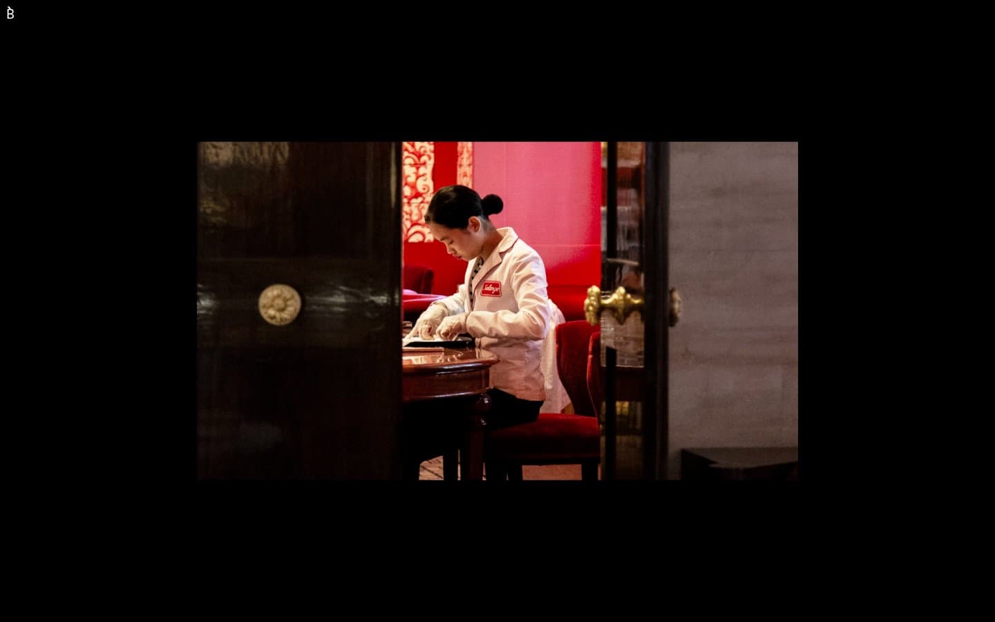
Bibliothèque
Design tools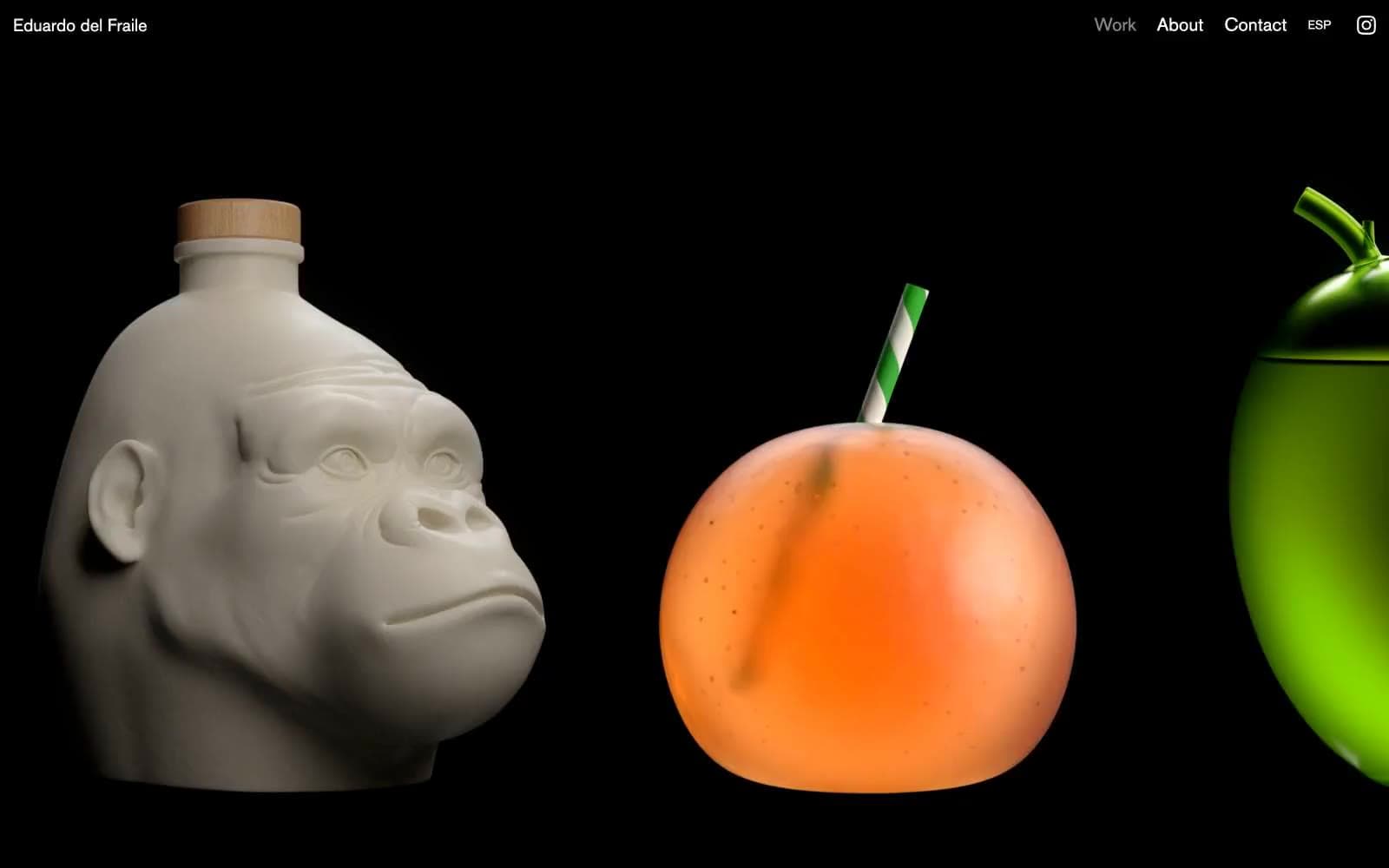
Eduardo del Fraile
Design tools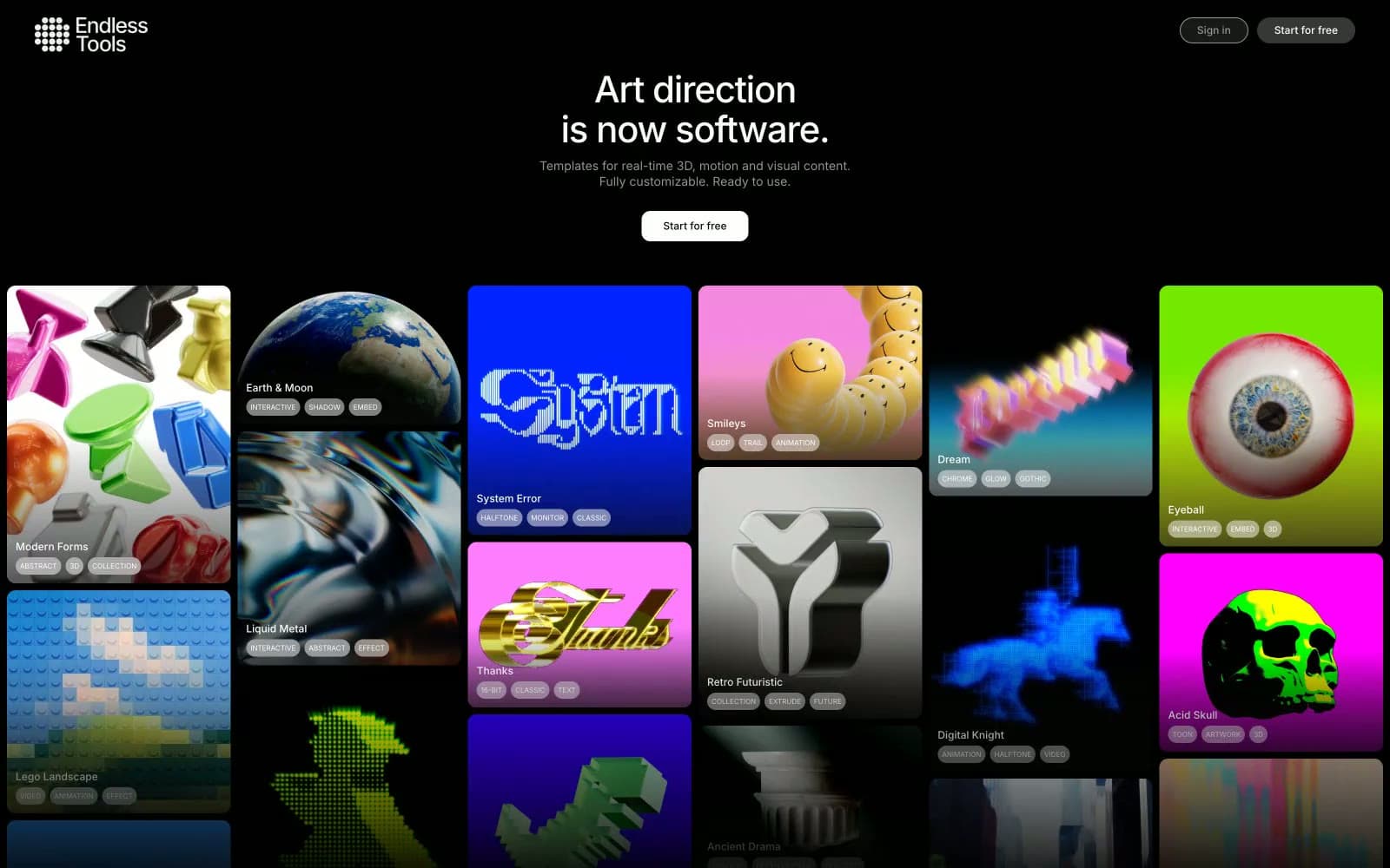
Endlesstools
Design tools
Figma Config
Design tools
Foundry
Design tools
Frame.io
Design tools
Gt-planar
Design tools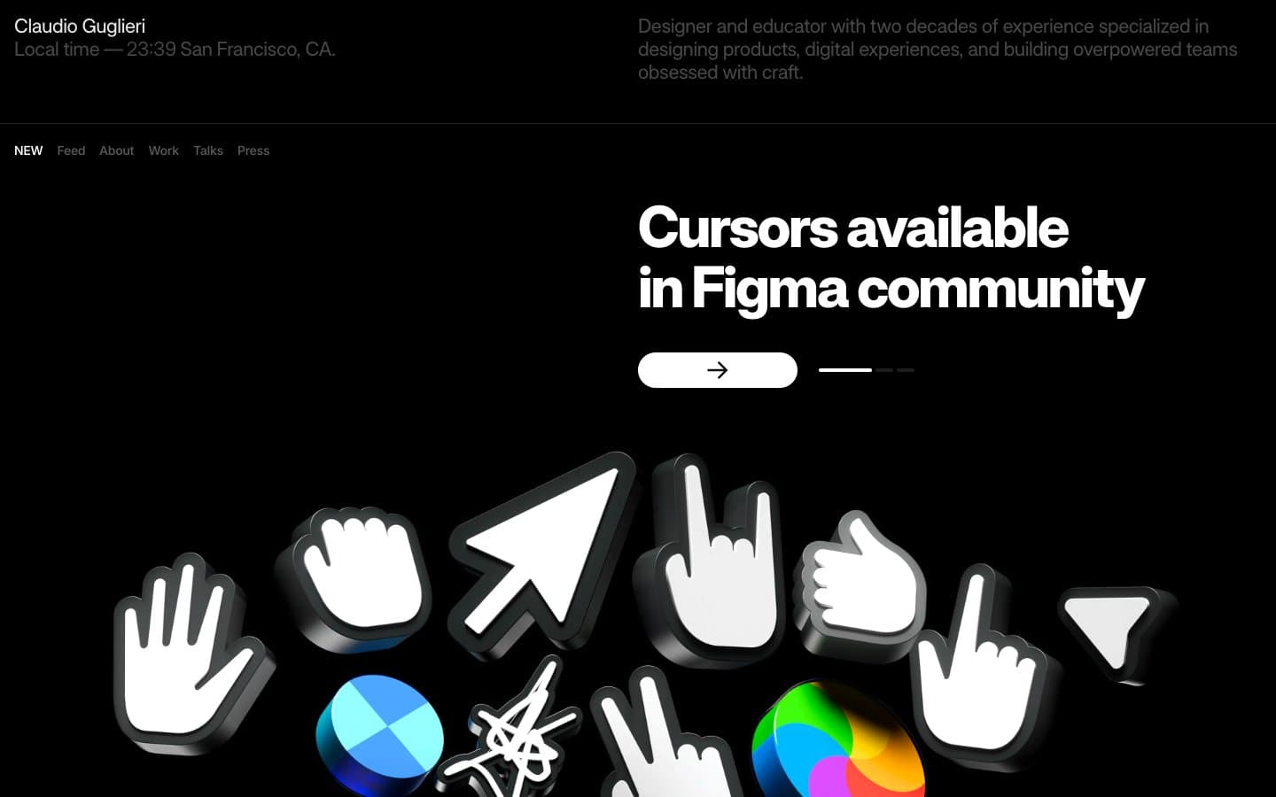
Guglieri
Design tools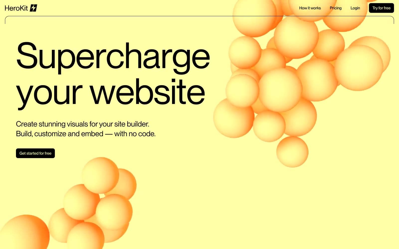
HeroKit
Design tools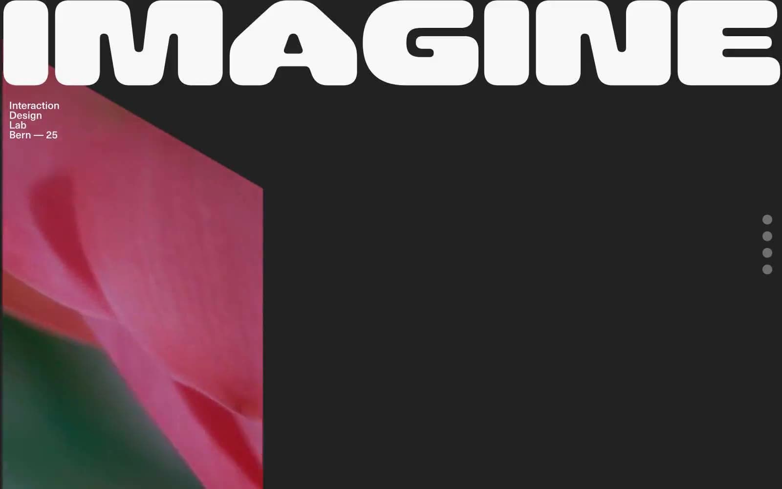
Iad-lab
Design tools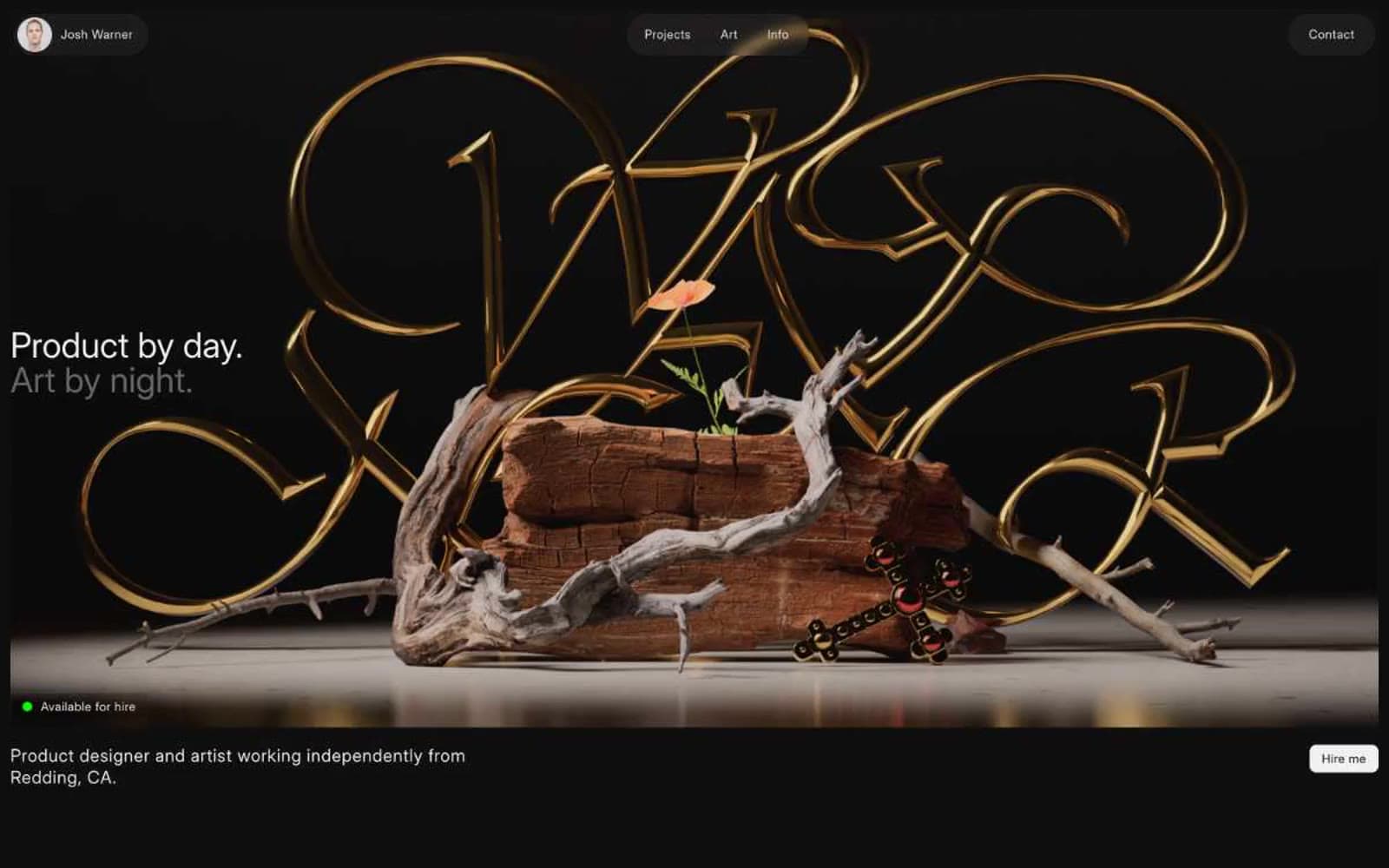
Josh Warner
Design tools
Linearity
Design tools


