
Frame.io. Midnight cinema projection room.
- Design tools
- Dark theme
- 11 colors
- 4 typefaces
Frame.io is a midnight projection room for creative teams: a near-black canvas layered with deep cosmic gradients, where large confident display type floats above product surfaces like film titles above a reel. The palette is almost entirely achromatic — only one vivid blue (#6199f6) and a muted violet border tone (#4f4f80) break the monochrome, used sparingly for icons, eyebrow labels, and card edges. Typography is the loudest voice: a single geometric sans (FrameGothic) carries everything from 80px display headlines to 14px body copy, with custom inktrap letterforms reserved for tiny all-caps section labels. Components stay thin and editorial: pill-shaped nav buttons, ghost CTAs, 10px-radius cards with violet-tinted borders, and zero decorative ornament — every element exists to frame the work, not compete with it.
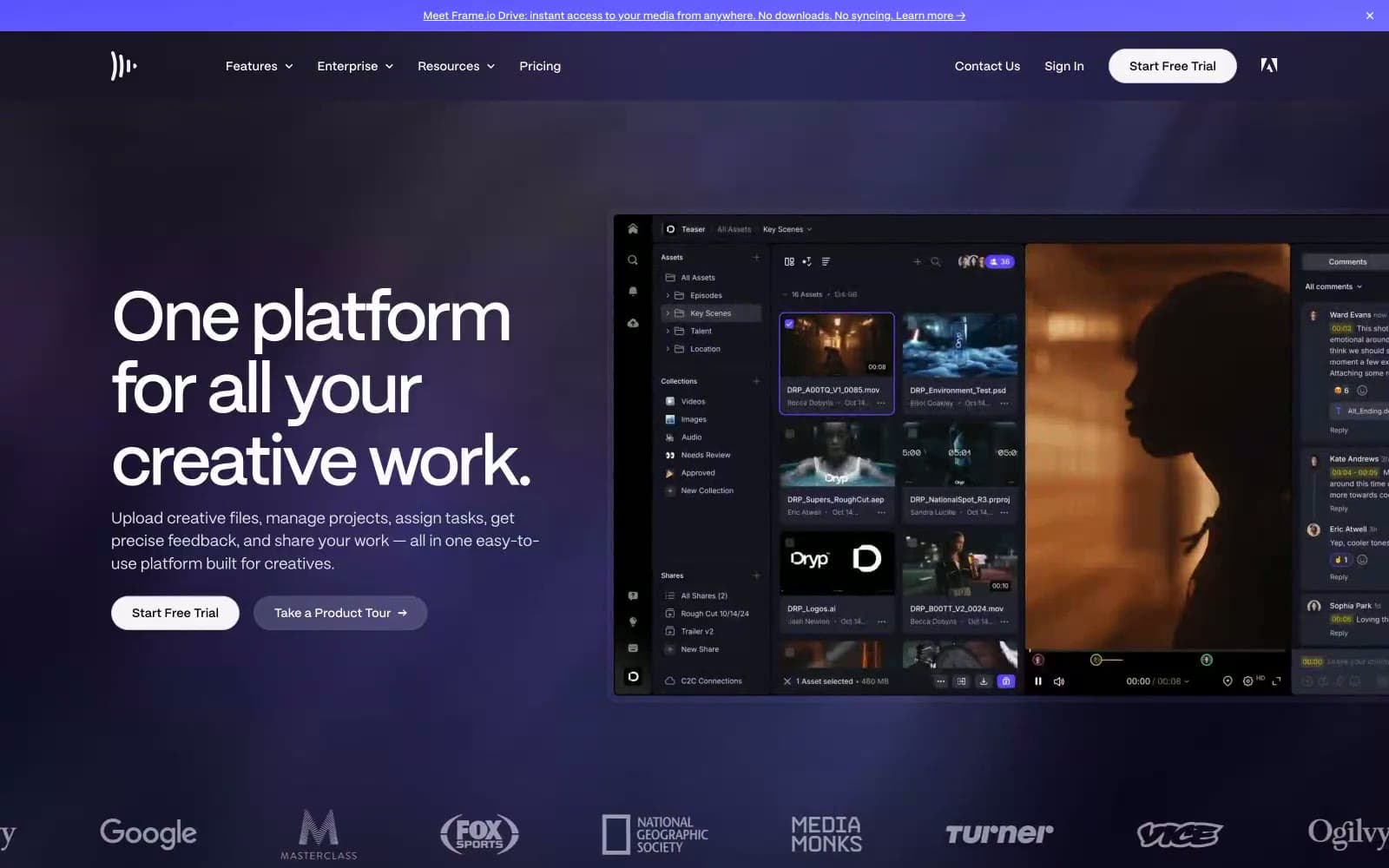
Frame.io design system

Brand1
Sole chromatic accent — icons, eyebrow labels, links, active states, feature marks. One blue, used surgically, carries the entire brand identity
Accent2
Muted violet used for card borders, glow halos, and atmospheric tints — the only color allowed to live near content surfaces
Soft highlight on violet accents and light-mode card edges; cool, desaturated lavender
Neutrals8
Dark supporting neutral for text, icons, and strong contrast. Do not promote it to the primary CTA color
Secondary canvas layer and topmost nav background, one shade lighter than Pitch
Card surface for elevated product mockups, sits one step above Obsidian
Primary page canvas and dominant background; the slight blue undertone keeps it from feeling flat black
Subtle card border on light-mode-adjacent surfaces; hairline divider
Secondary body text and metadata — cool gray, never warm, stays quiet under headlines
Tertiary text, card descriptions, inactive nav, most frequently used muted foreground
Primary text, inverse button text, icon strokes — near-white reads as paper against the void
Try a pairing
Pick any two colors from the palette to check whether text stays readable on top.
Aa
Pitch on Iris Glow
7.40 : 1 contrast
- Body textPasses AA 4.5
- Large textPasses AA 3
- StrictPasses AAA 7
More DESIGN.md files. Same web, different personalities.
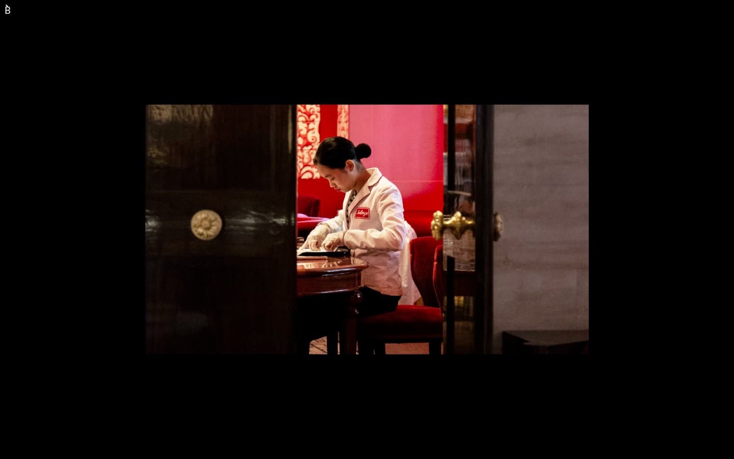
Bibliothèque
Design tools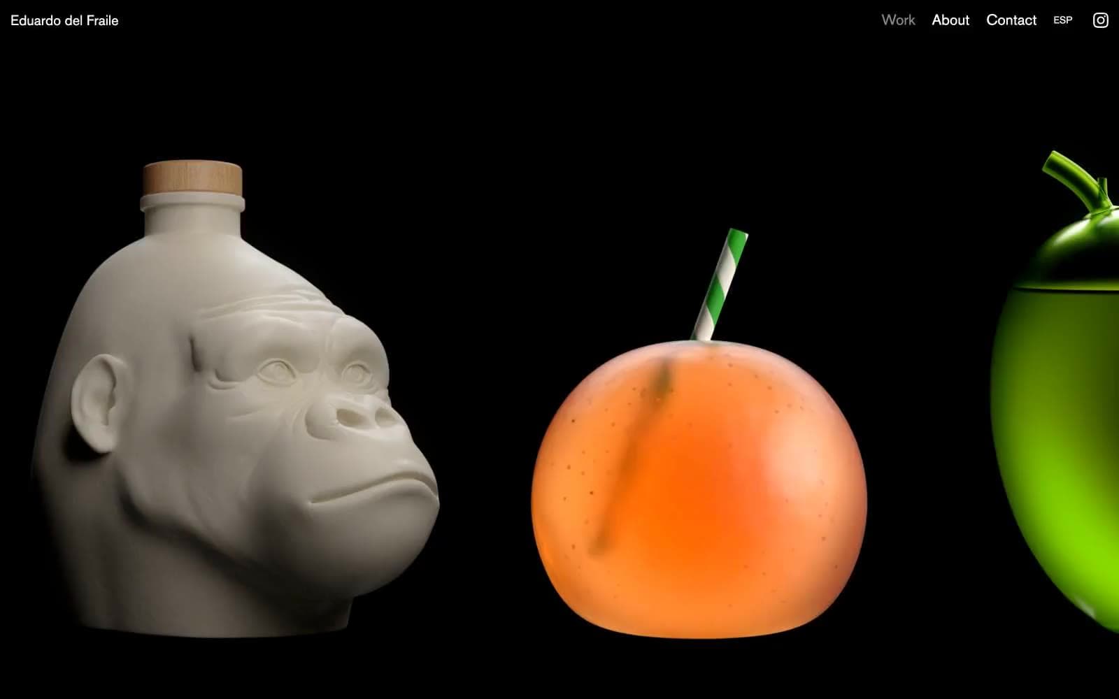
Eduardo del Fraile
Design tools
Endlesstools
Design tools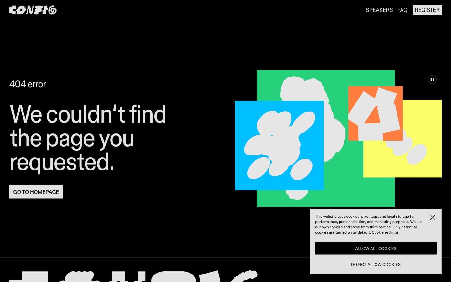
Figma Config
Design tools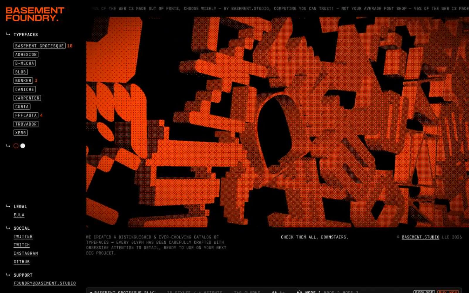
Foundry
Design tools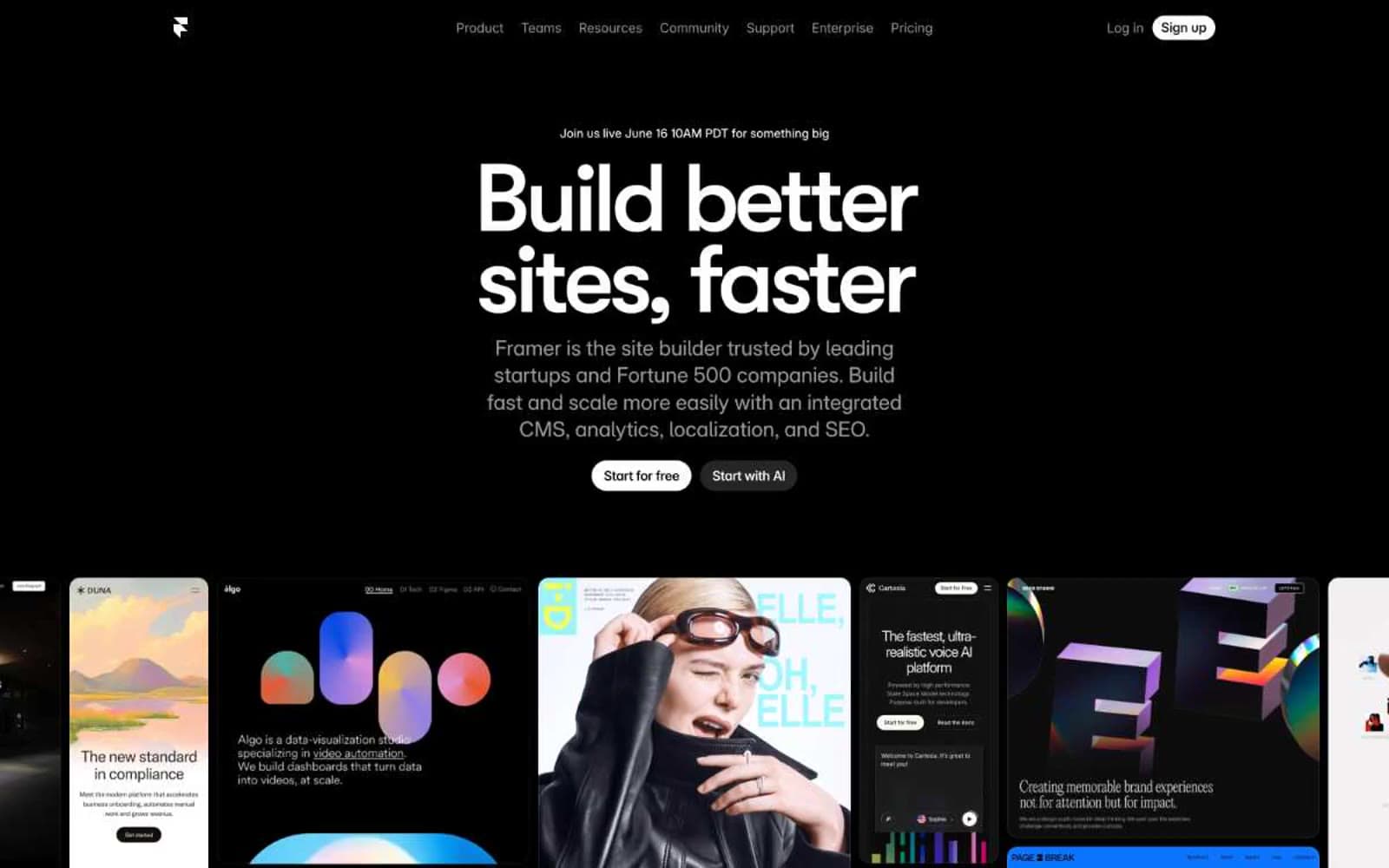
Framer
Design tools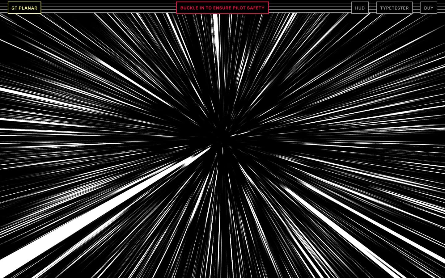
Gt-planar
Design tools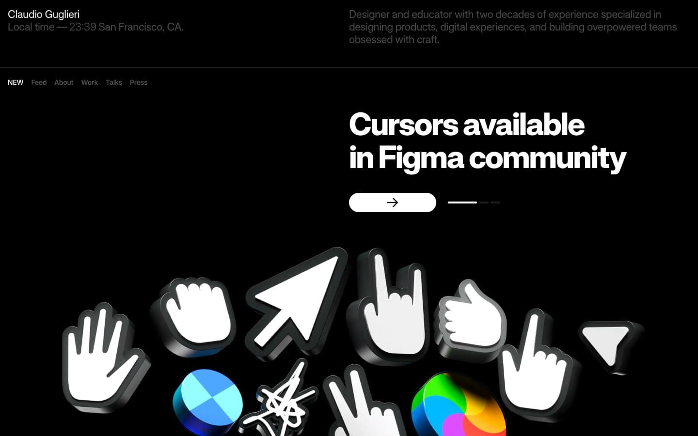
Guglieri
Design tools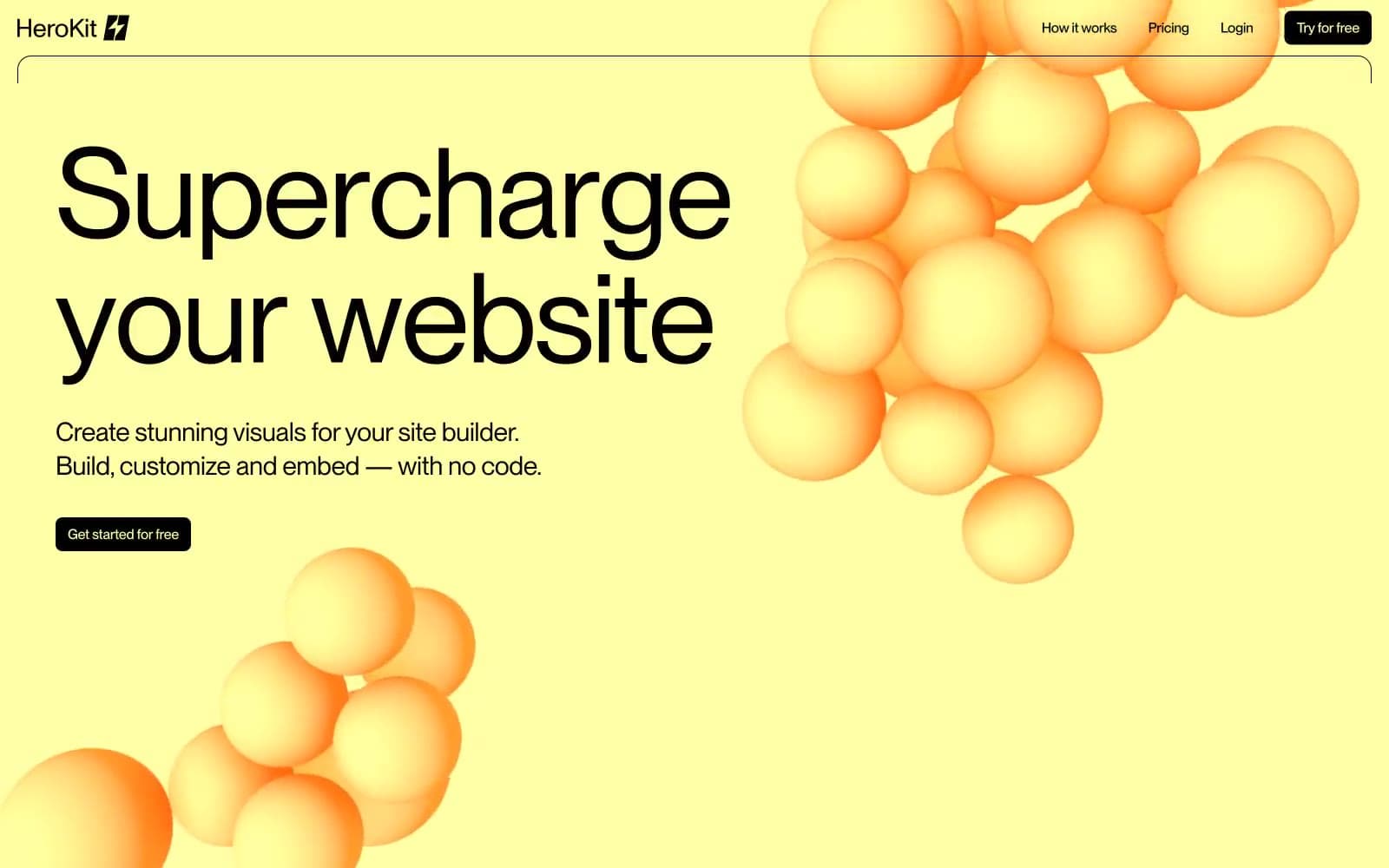
HeroKit
Design tools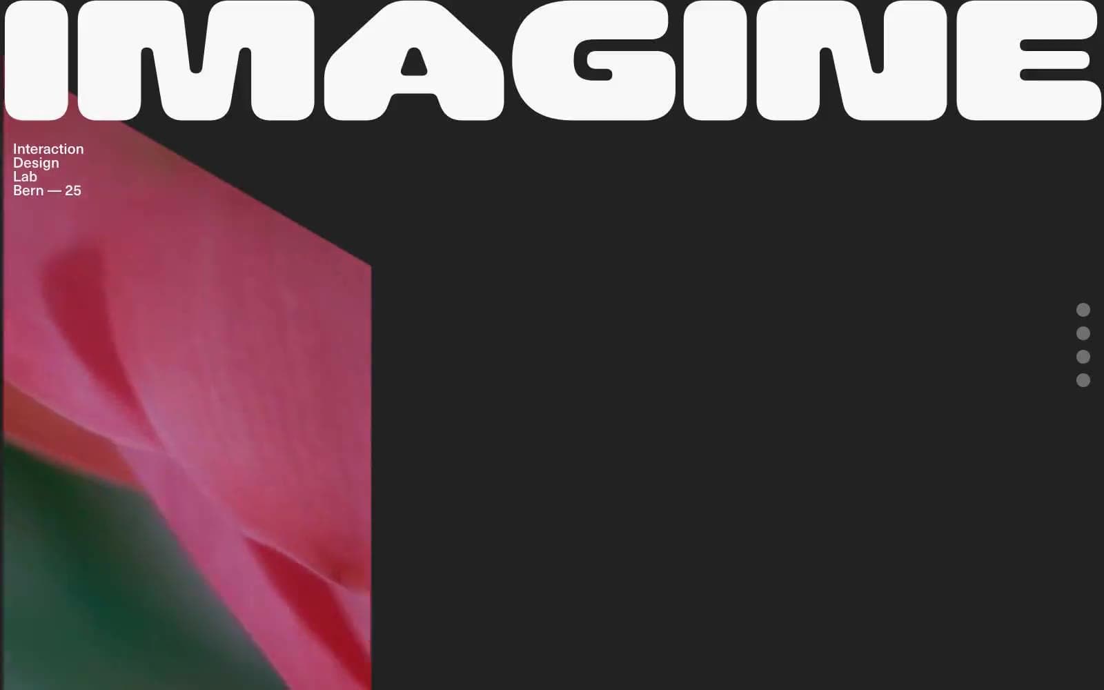
Iad-lab
Design tools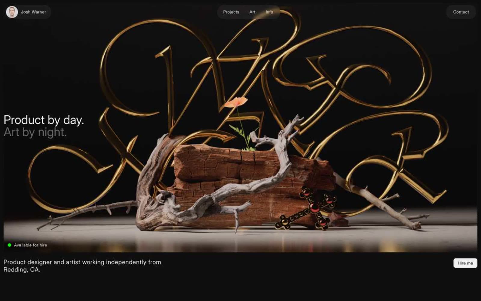
Josh Warner
Design tools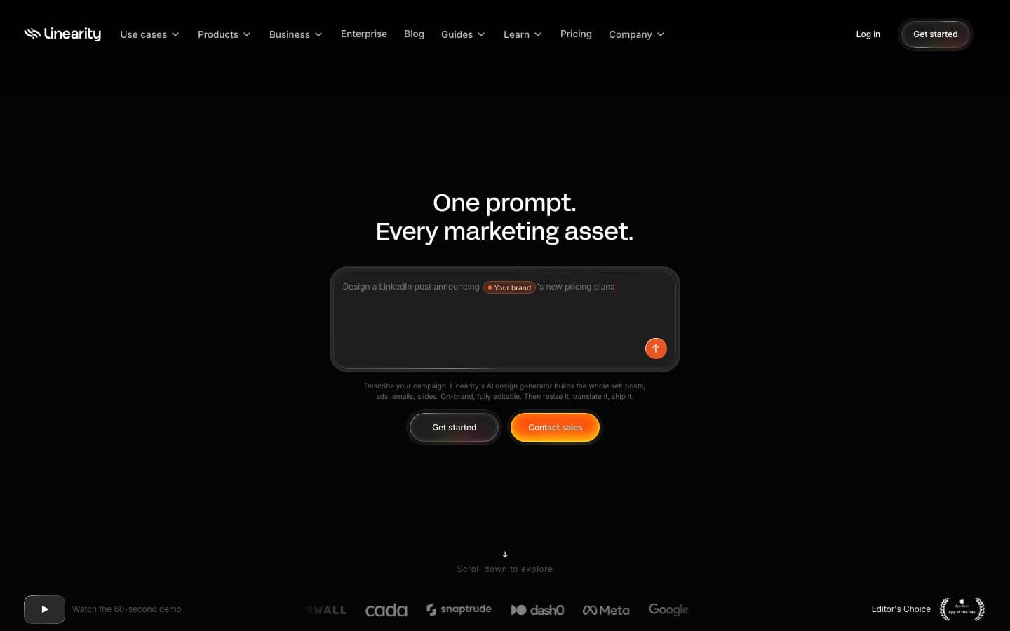
Linearity
Design tools


