
Gt-planar. Cockpit HUD at warp speed.
- Design tools
- Dark theme
- 12 colors
- 1 typeface
GT Planar is a cockpit-HUD aesthetic deployed as a typeface showcase: pitch-black canvas, violet primary action, and an electric yellow-green border palette that reads like instrument-panel backlighting. Typography is the protagonist — the custom GT Planar face is the interface, not decoration on top of it. The visual system avoids depth entirely: no drop shadows, no gradients, no elevation. Instead, structure comes from 1px white hairline borders and chromatic outlines that act as glowing wireframes against the dark void. Density is high, padding is tight (1-5px range), and color appears as small, intentional function-driven punctuation rather than background wash. The result feels like looking through a pilot's heads-up display at lightspeed — every element is engineered, every line carries data, and the page itself is a working instrument rather than a marketing surface.
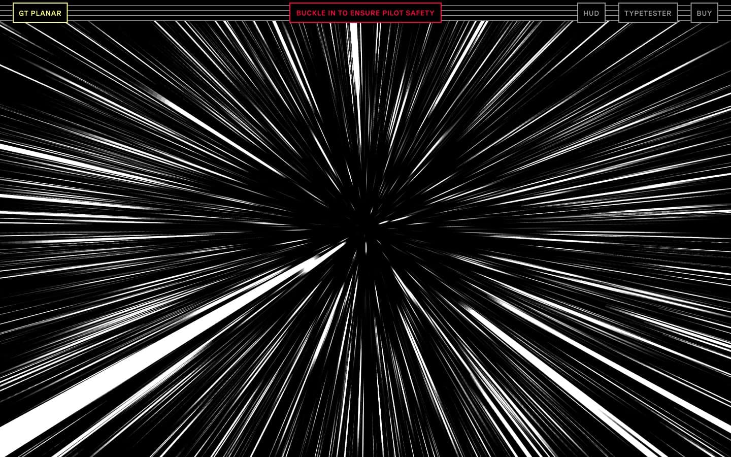
Gt-planar design system

Brand3
Primary CTA fill, filled action backgrounds, and dominant accent border — a saturated electric violet that reads as powered-on against pure black
Green outline accent for tags, dividers, and focused UI edges.
Secondary accent for headings, link text, and body emphasis — a neon mint that signals live/active states and reads as data flowing through the HUD
Accent4
Red outline accent for tags, dividers, and focused UI edges. Use as a supporting accent, not as a status color
Mid-tier surface fill for button backgrounds and elevated dark panels — sits between pure black and Hyperspace Violet
Decorative surface wash and large-area violet background — lighter and more luminous than Hyperspace Violet, used where broad violet fields appear
Tertiary accent for table data, secondary highlights, and rare warm punctuation — used sparingly so it reads as a specific instrument indicator
Neutrals5
Page canvas and button borders — the flat dark void from which all colored elements emerge
Pink state accent for badges, validation surfaces, and short status labels. Do not promote it to the primary CTA color
Lowest-priority dividers and button outlines — the dimmest neutral, used where structure is needed but emphasis is not
Muted text, nav borders, and secondary structural lines — the de-energized neutral for inactive labels and supporting metadata
Primary text, hairline borders, and 1px box-shadow wireframes — functions as the structural linework of the entire interface, not just foreground text
Try a pairing
Pick any two colors from the palette to check whether text stays readable on top.
Aa
Photon White on Hyperspace Violet
7.11 : 1 contrast
- Body textPasses AA 4.5
- Large textPasses AA 3
- StrictPasses AAA 7
More DESIGN.md files. Same web, different personalities.
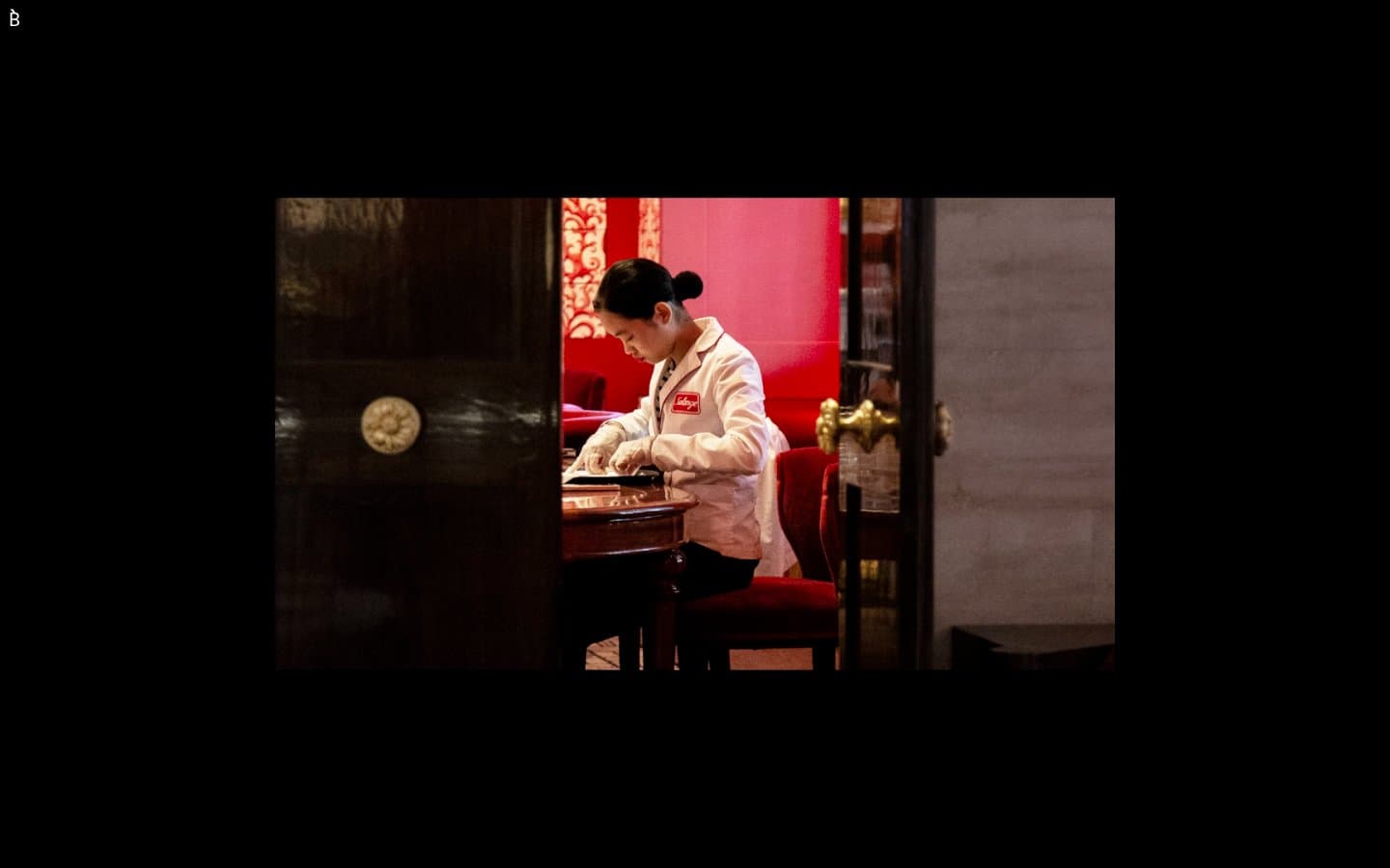
Bibliothèque
Design tools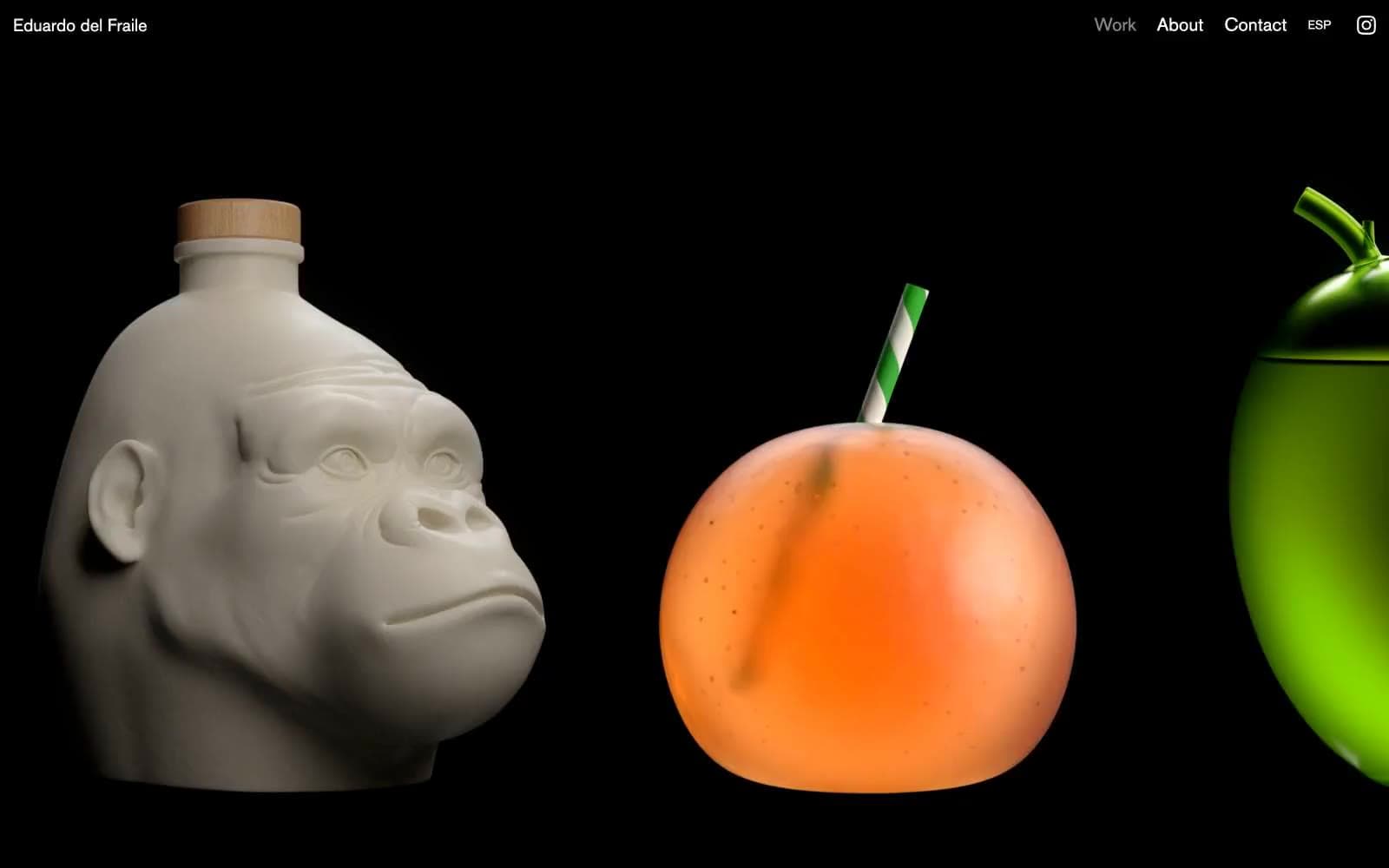
Eduardo del Fraile
Design tools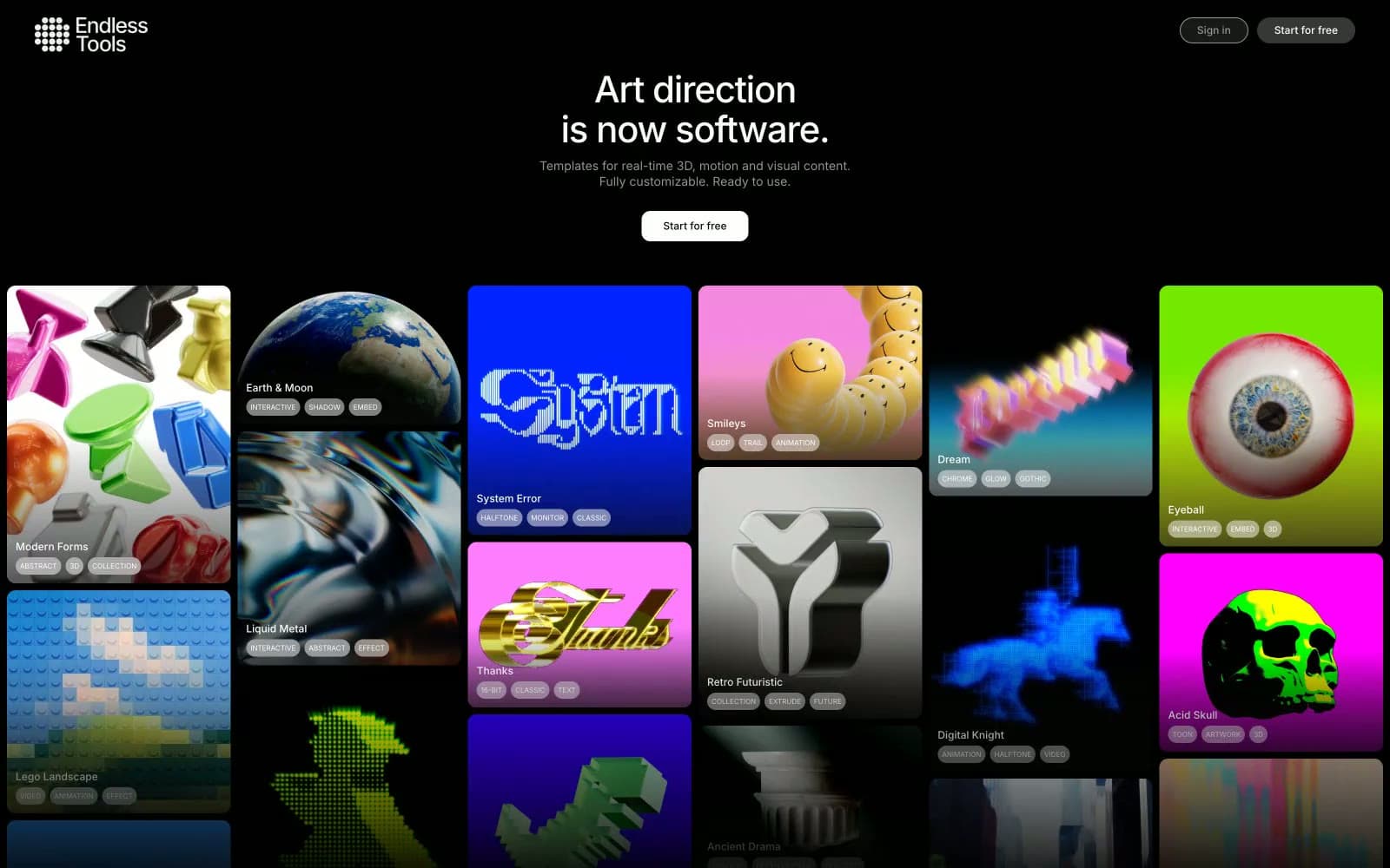
Endlesstools
Design tools
Figma Config
Design tools
Foundry
Design tools
Frame.io
Design tools
Framer
Design tools
Guglieri
Design tools
HeroKit
Design tools
Iad-lab
Design tools
Josh Warner
Design tools
Linearity
Design tools


