
Uizard. A single charged accent glowing against an ink-dark product canvas.
- Design tools
- Dark theme
- 12 colors
- 2 typefaces
Uizard operates as a midnight creative studio: near-black canvases absorb attention while a single violet glow (#a881fe) acts as the room's neon sign, drawing the eye to generation moments. The interface stays overwhelmingly achromatic — white type, graphite borders, ink-black surfaces — so that the purple accent reads as functional electricity, not decoration. Typography is confident and modern: Satoshi Variable carries the product voice at comfortable weights, while Clash Grotesk breaks through at display scale for hero headlines with tight tracking. Components feel contained and architectural — cards with hairline graphite borders, pills and inputs softened to 8-12px radii, and a signature purple outer-glow shadow on the primary action that makes it appear to emit light rather than sit on a surface.

Uizard design system

Brand4
Primary action fill, brand accent, hero glow origin, logo mark — the charged purple that signals generation and AI intent
Gradient deep stop, brand purple core — anchors hero radial bloom and logo gradient ramp
Gradient highlight stop — outer edge of brand gradient where violet dissolves into the dark canvas
Blue action color for filled buttons, selected navigation states, and focused conversion moments.
Neutrals8
Deepest surface tier, shadow base — used for shadow color and deepest elevation sink
Page canvas, card surface — the foundational darkness everything floats on
Secondary borders, subtle dividers on dark sections
Card and container borders — hairline outlines that separate dark surfaces without lifting them
Muted border accent for low-emphasis containers and section dividers
Muted body text, secondary copy, metadata — reads as quiet information
Primary text on dark surfaces, hairline borders — the default ink
Headline text, input field fill, high-emphasis foreground — maximum contrast moments
Try a pairing
Pick any two colors from the palette to check whether text stays readable on top.
Aa
Void Black on Violet Glow
7.24 : 1 contrast
- Body textPasses AA 4.5
- Large textPasses AA 3
- StrictPasses AAA 7
More DESIGN.md files. Same web, different personalities.

Bibliothèque
Design tools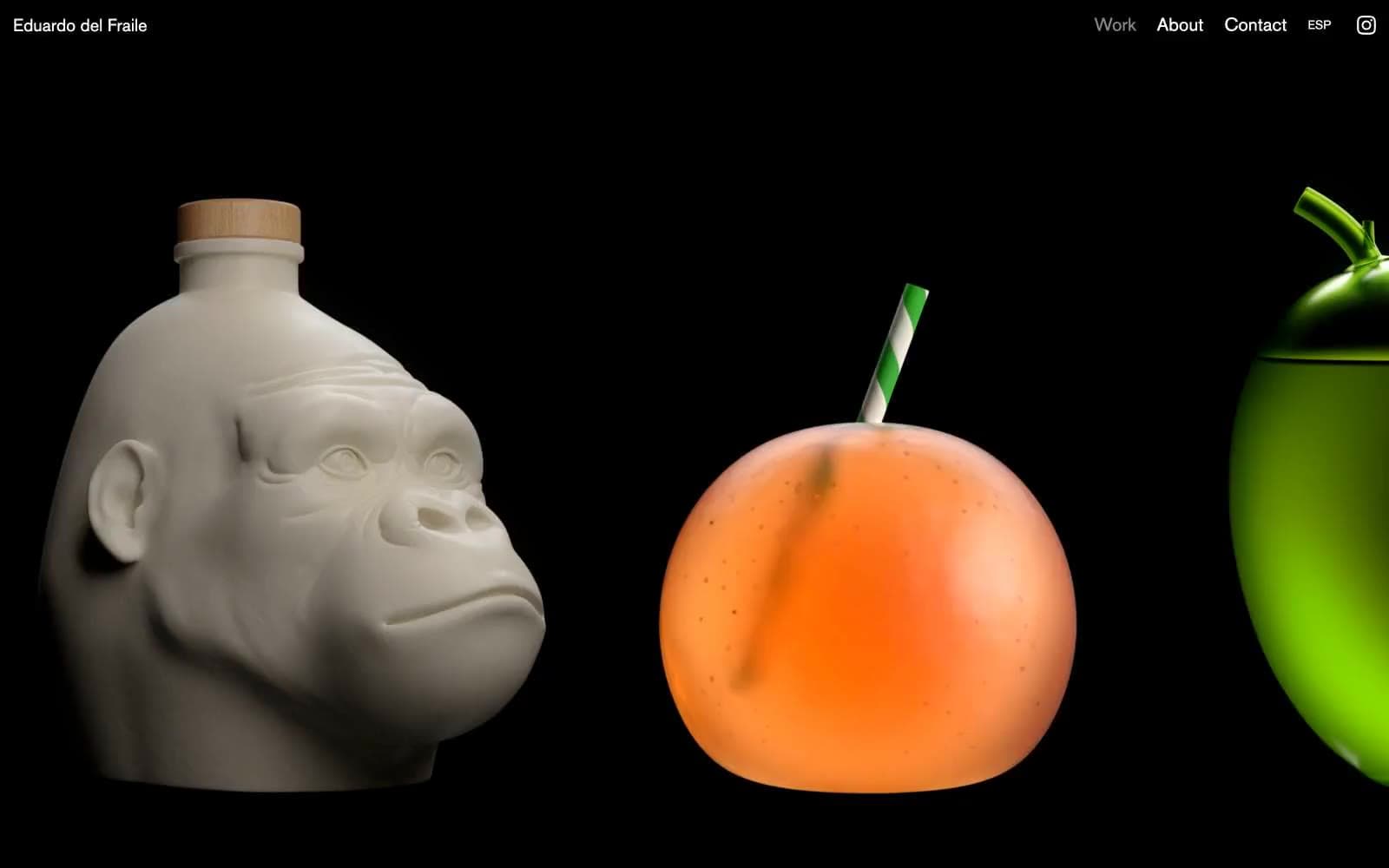
Eduardo del Fraile
Design tools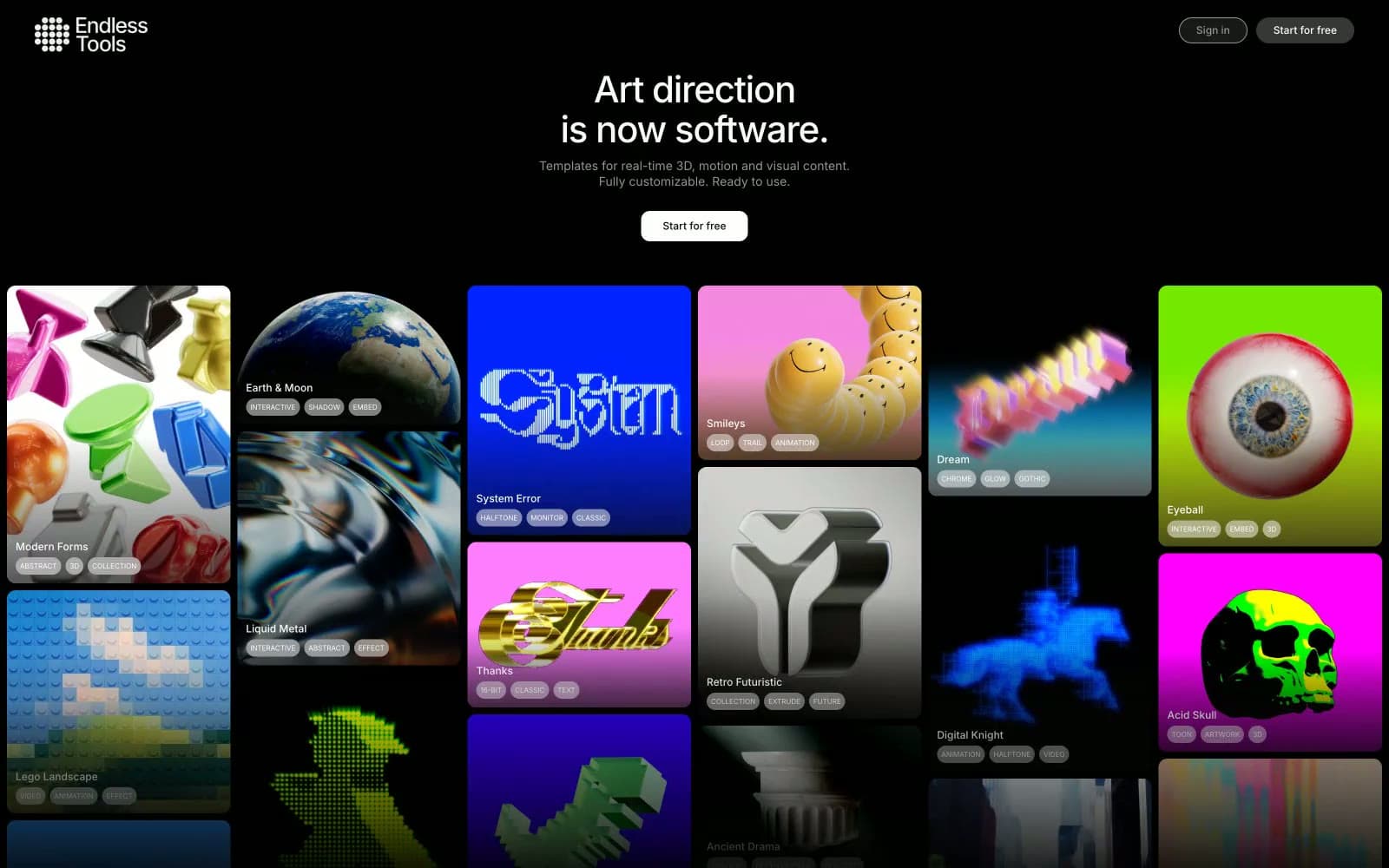
Endlesstools
Design tools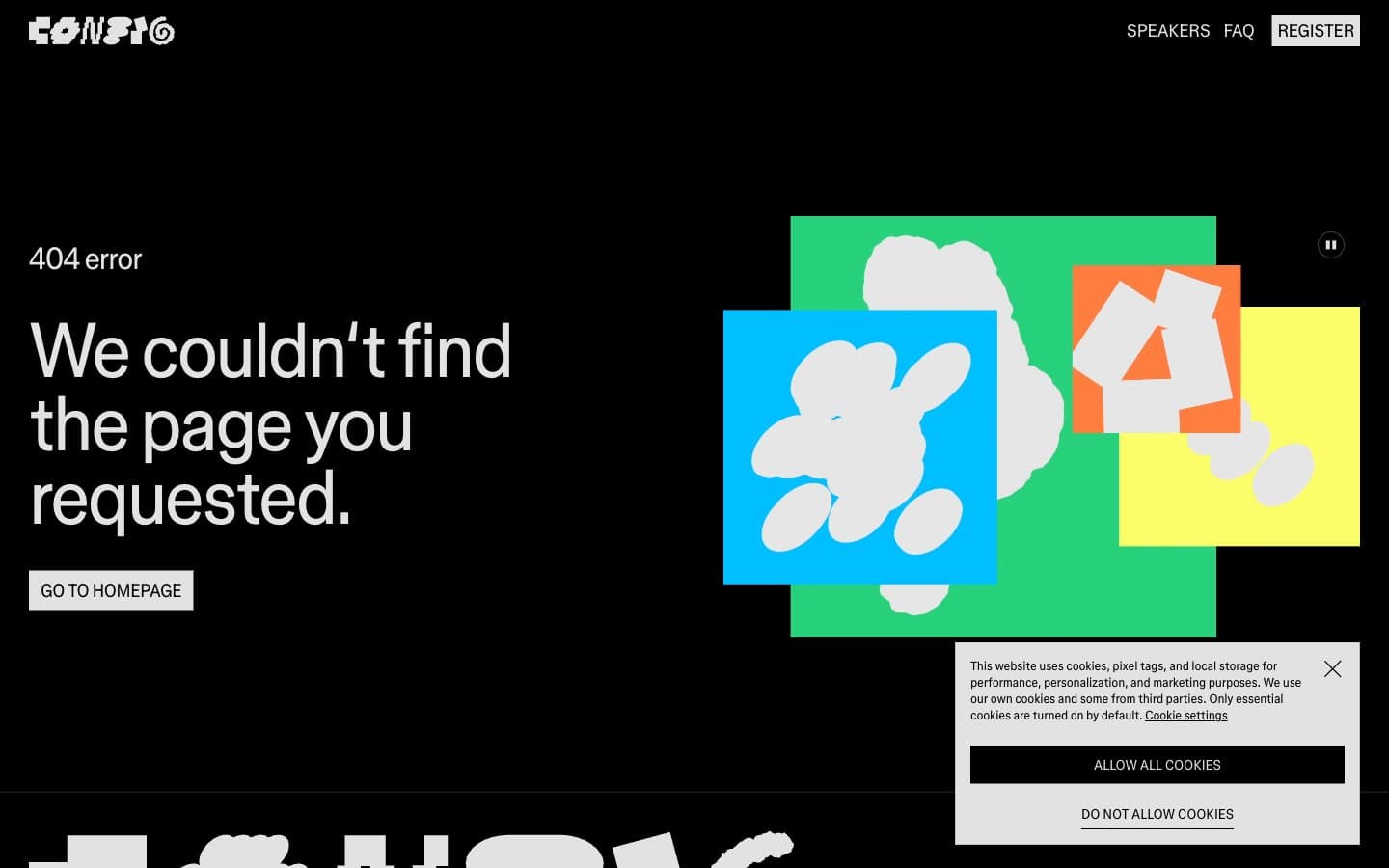
Figma Config
Design tools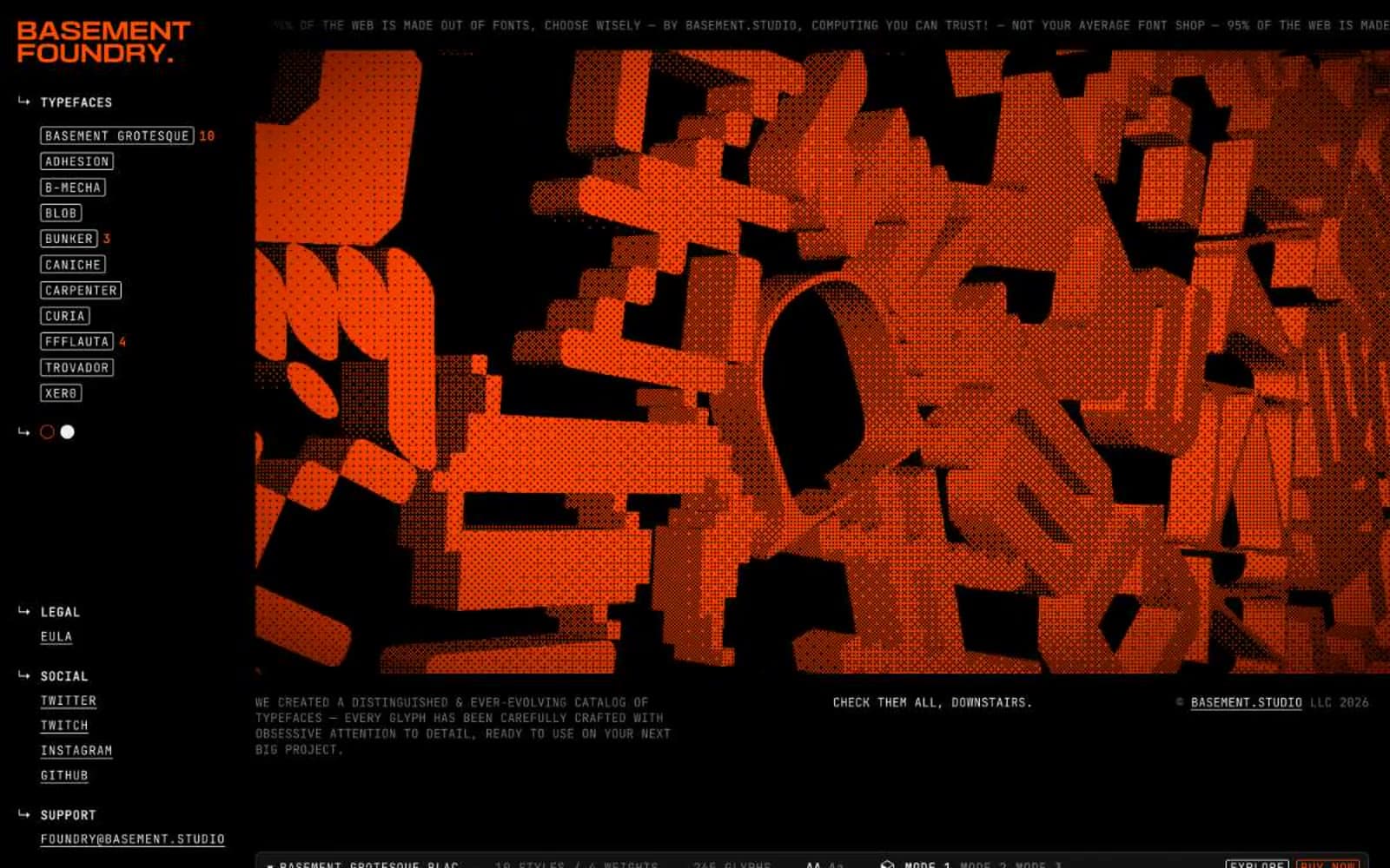
Foundry
Design tools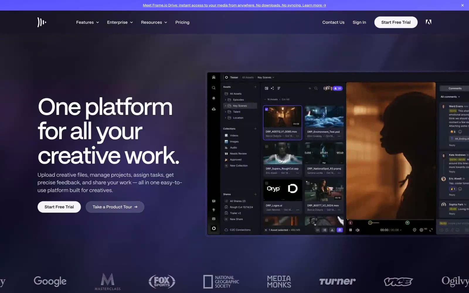
Frame.io
Design tools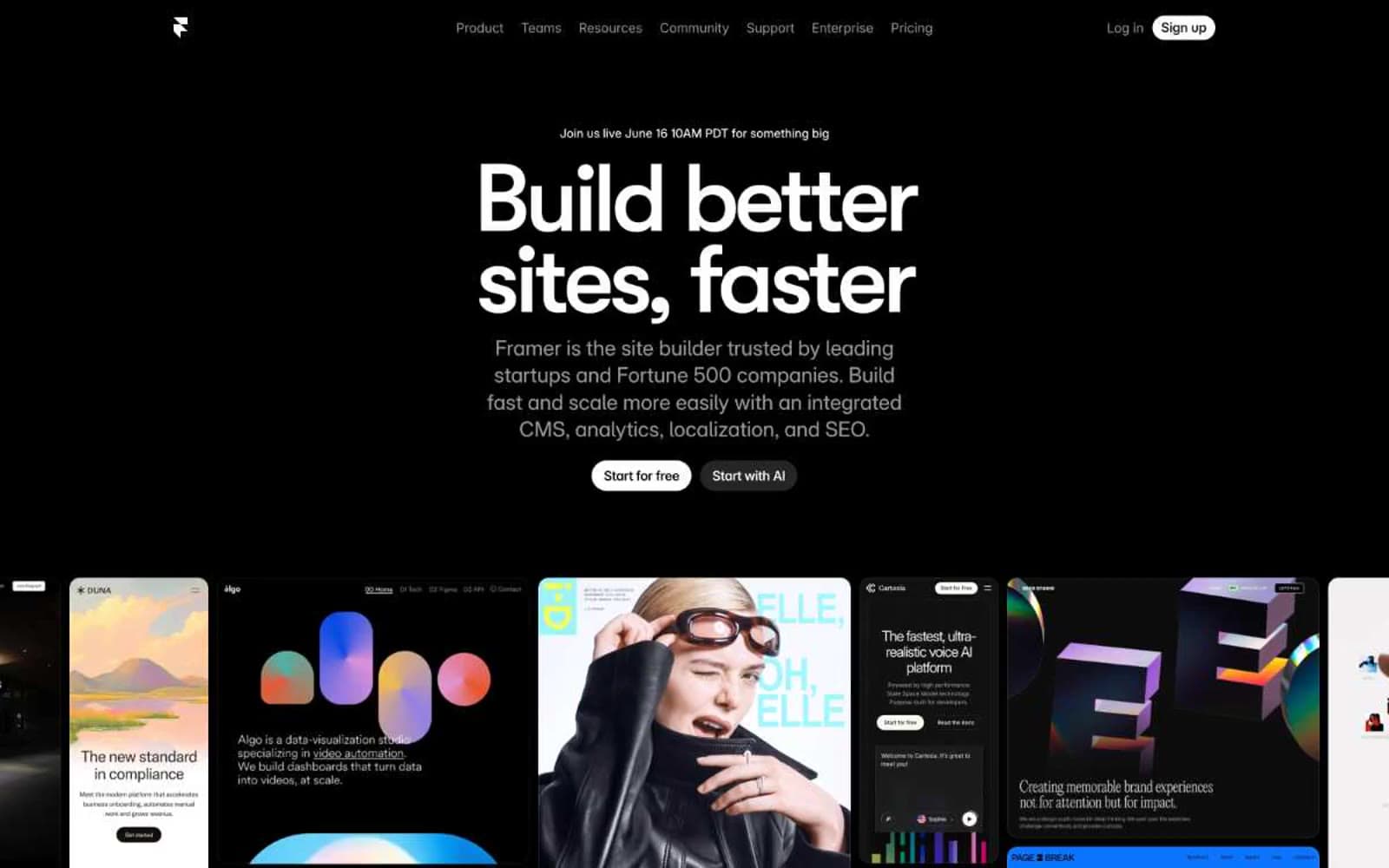
Framer
Design tools
Gt-planar
Design tools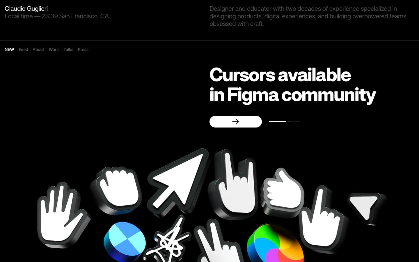
Guglieri
Design tools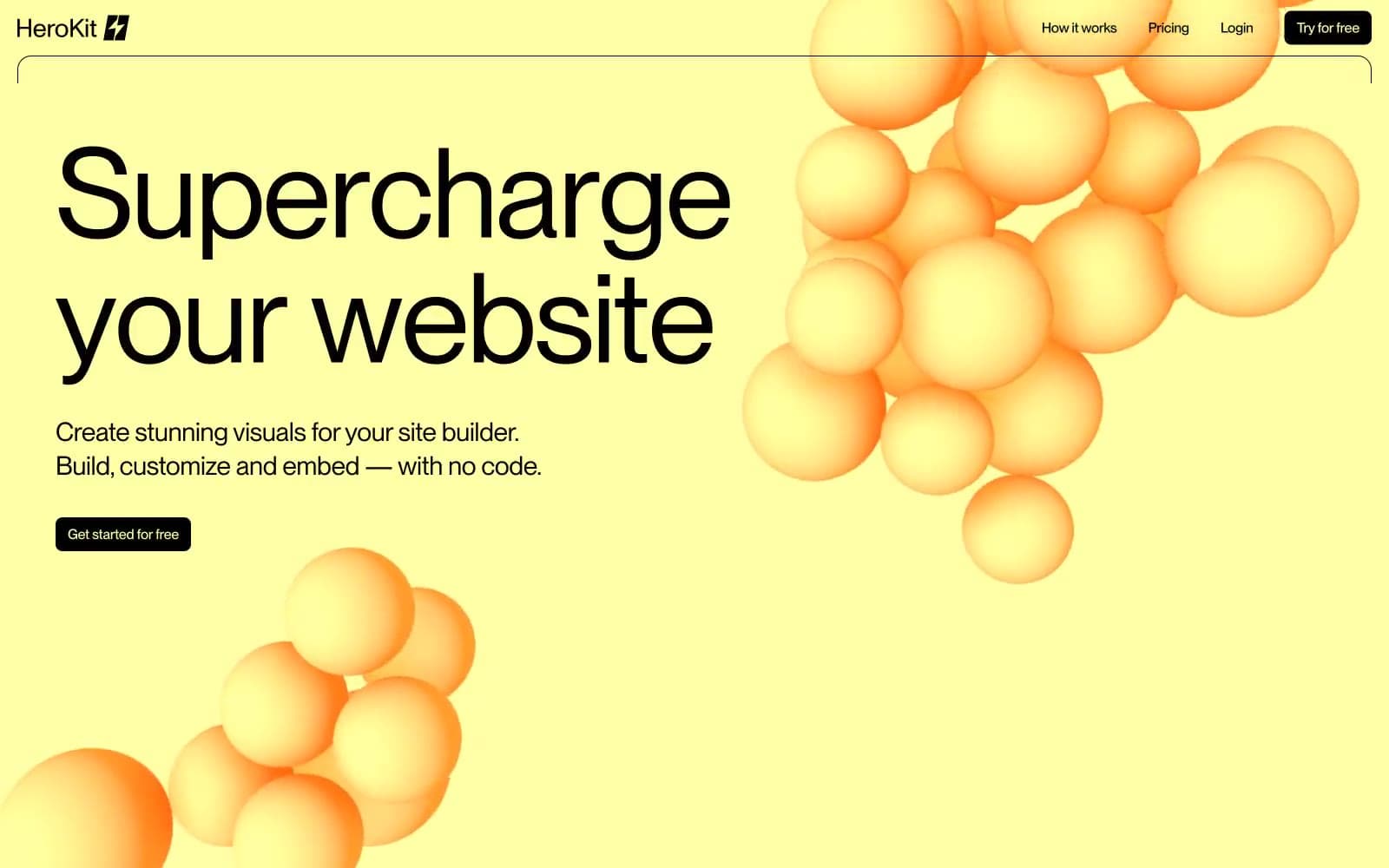
HeroKit
Design tools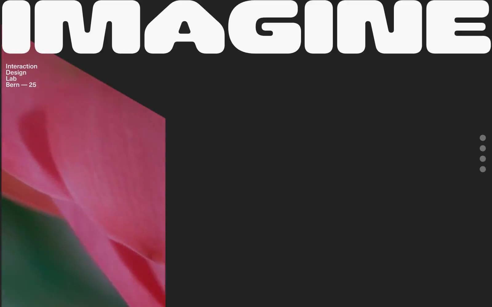
Iad-lab
Design tools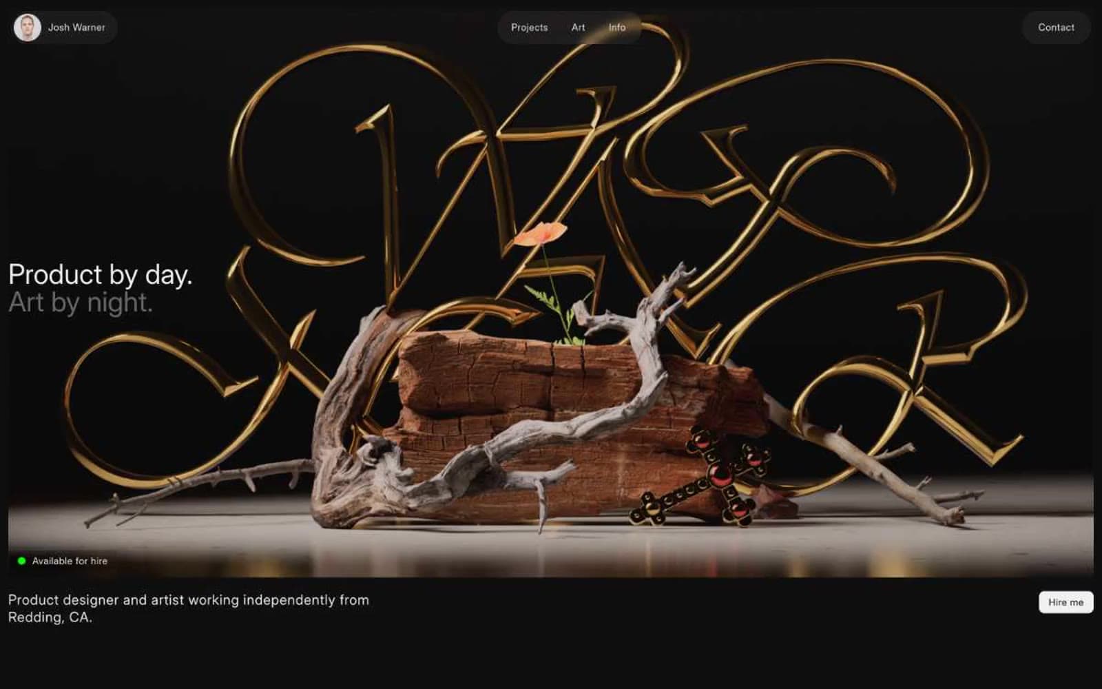
Josh Warner
Design tools


