
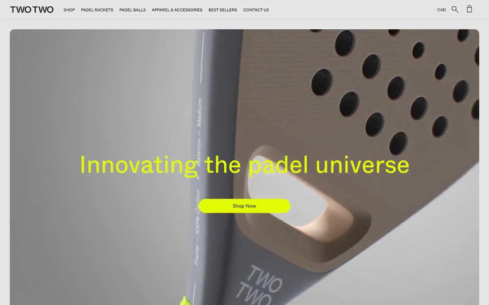
TWOTWO. A single neon punch inside a black-and-white editorial grid.
- Commerce
- Light theme
- 6 colors
- 4 typefaces
TWOTWO operates on ruthless visual discipline: a near-pure black-and-white system interrupted by a single piercing voltage-lime accent. The brand reads like a sports-tech catalog stripped to its bones — generous white space, a Swiss-grotesque typeface (Whyte) that does all the tonal work, and absolutely no decorative gradients, shadows, or secondary hues. Product photography is the only color the page permits on its own terms: the rackets themselves bring in coral, blue, sage, and orange, but every UI surface, border, and label stays monochrome. The lime accent functions as functional punctuation — a filled pill button, a hover state, a small swatch tag — never as decoration. Everything is geometric, compact, and confident: 16px image radii, 50px pill buttons, 72px display headlines, uppercase tracked navigation, and tight 1.1 line heights that let type do the heavy lifting. The mood is less 'padel store' and more 'industrial design catalog on a white marble bench.'
TWOTWO design system

Brand1
Primary CTA fill, active state, accent badges, and decorative highlights — the single chromatic moment in an otherwise monochrome system. Sits at 18.2:1 contrast against black, so it doubles as a high-visibility call-to-action and a hover indicator without needing a second hue
Neutrals5
Primary text, hairline borders, icon strokes, image borders, and footer background. Carries 2,045 border usages — this system uses black lines to structure space more than boxes or cards
Icon strokes, link underlines, and low-priority UI marks — the third step of the dark scale, reserved for fine detail that should recede from primary text
Secondary text and softer borders — slightly lifted from pure black to create a visible hierarchy without introducing color
Soft section background, alternate surface, and quiet card fill.
Primary page and card surface — the canvas everything else is drawn onto
Try a pairing
Pick any two colors from the palette to check whether text stays readable on top.
Aa
Obsidian on Voltage Lime
18.19 : 1 contrast
- Body textPasses AA 4.5
- Large textPasses AA 3
- StrictPasses AAA 7
More DESIGN.md files. Same web, different personalities.

High Protein
Commerce
Hopper
Commerce
2.AG
Commerce
A-WARE
Commerce
AATHER
Commerce
Abel
Commerce
Acme Cups New Zealand
Commerce
Acne Studios
Commerce
Adam Lippes
Commerce
Adanola
Commerce
Advene
Commerce
Aevi Wellness
Commerce


