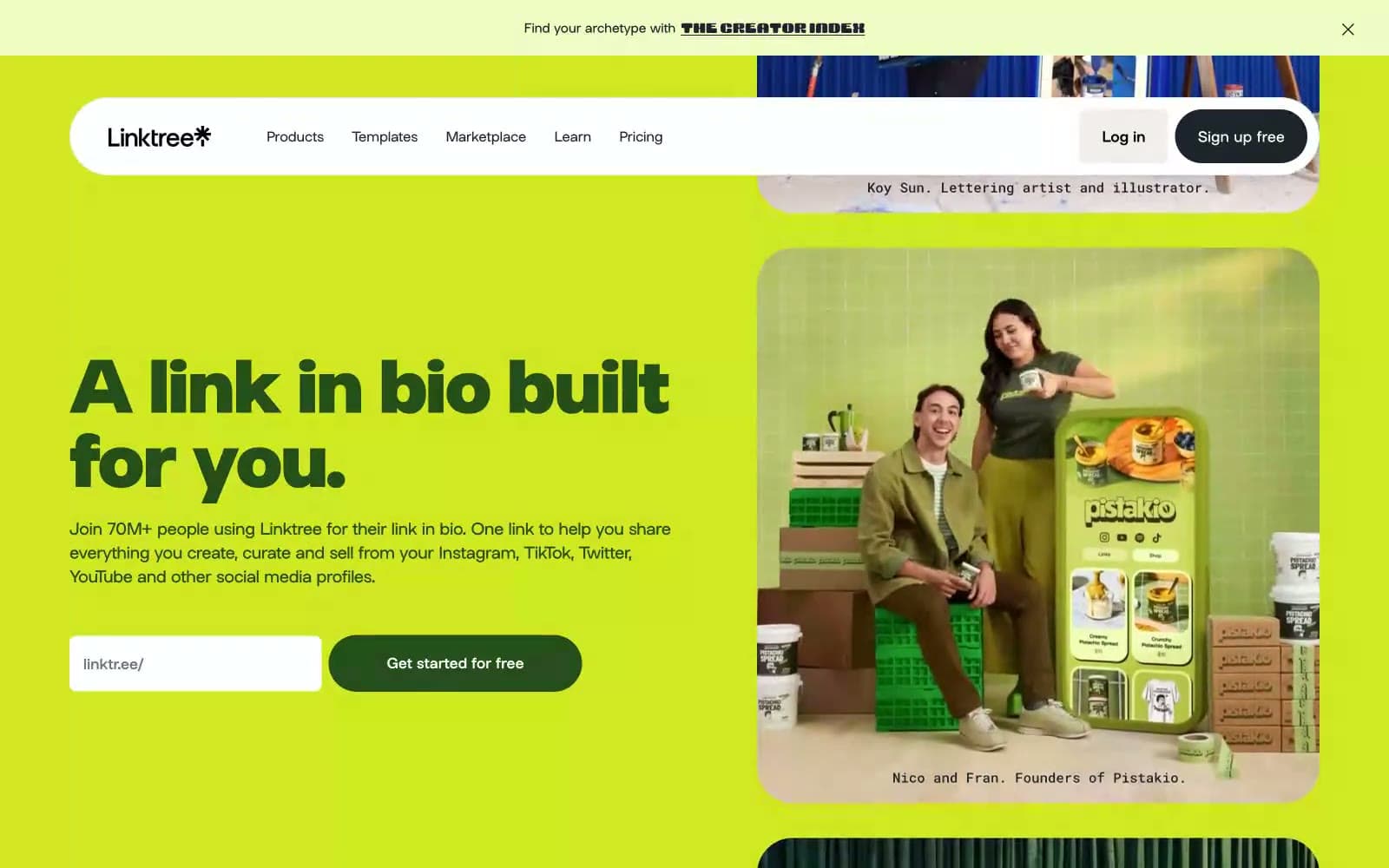
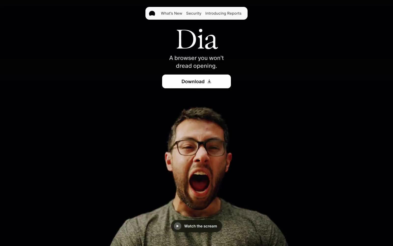
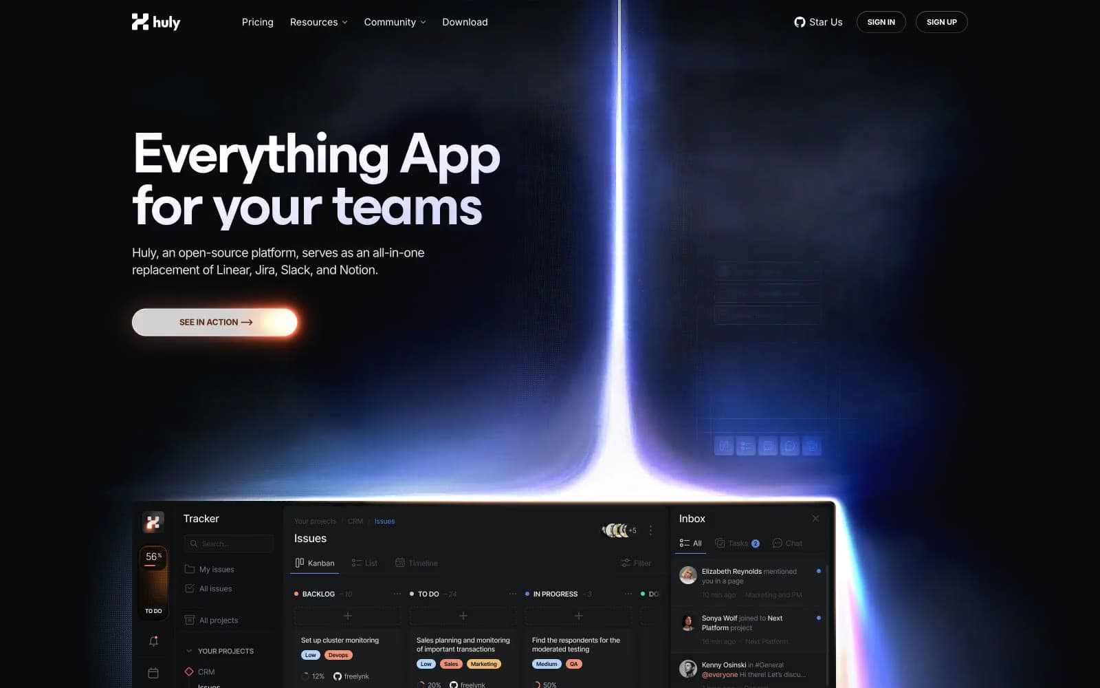
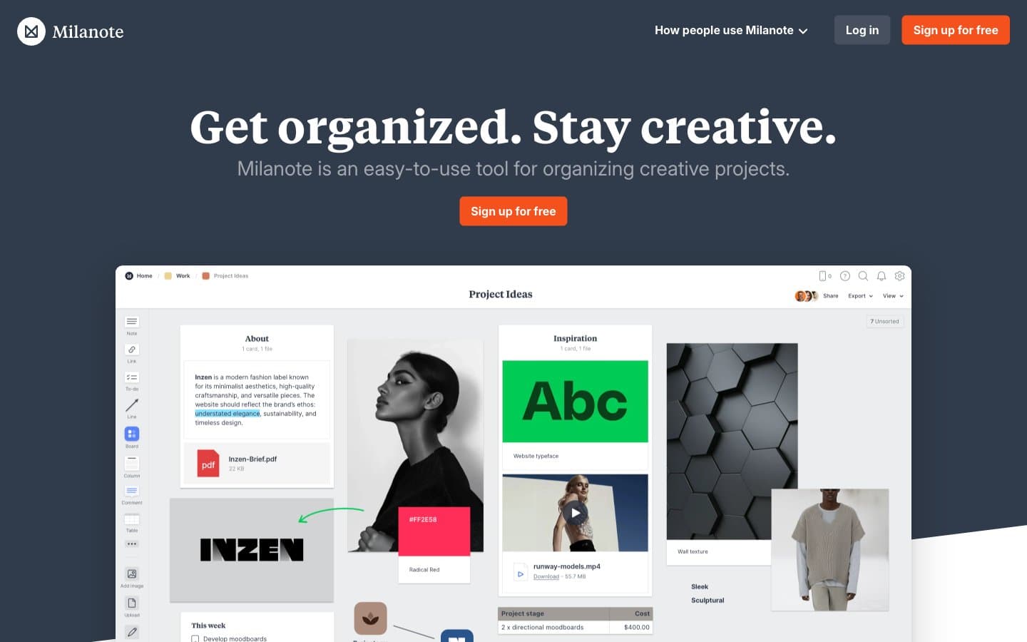
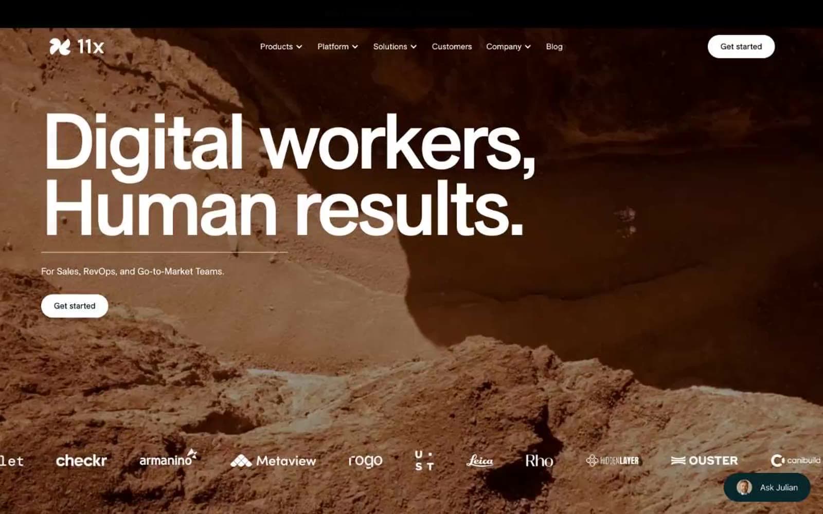
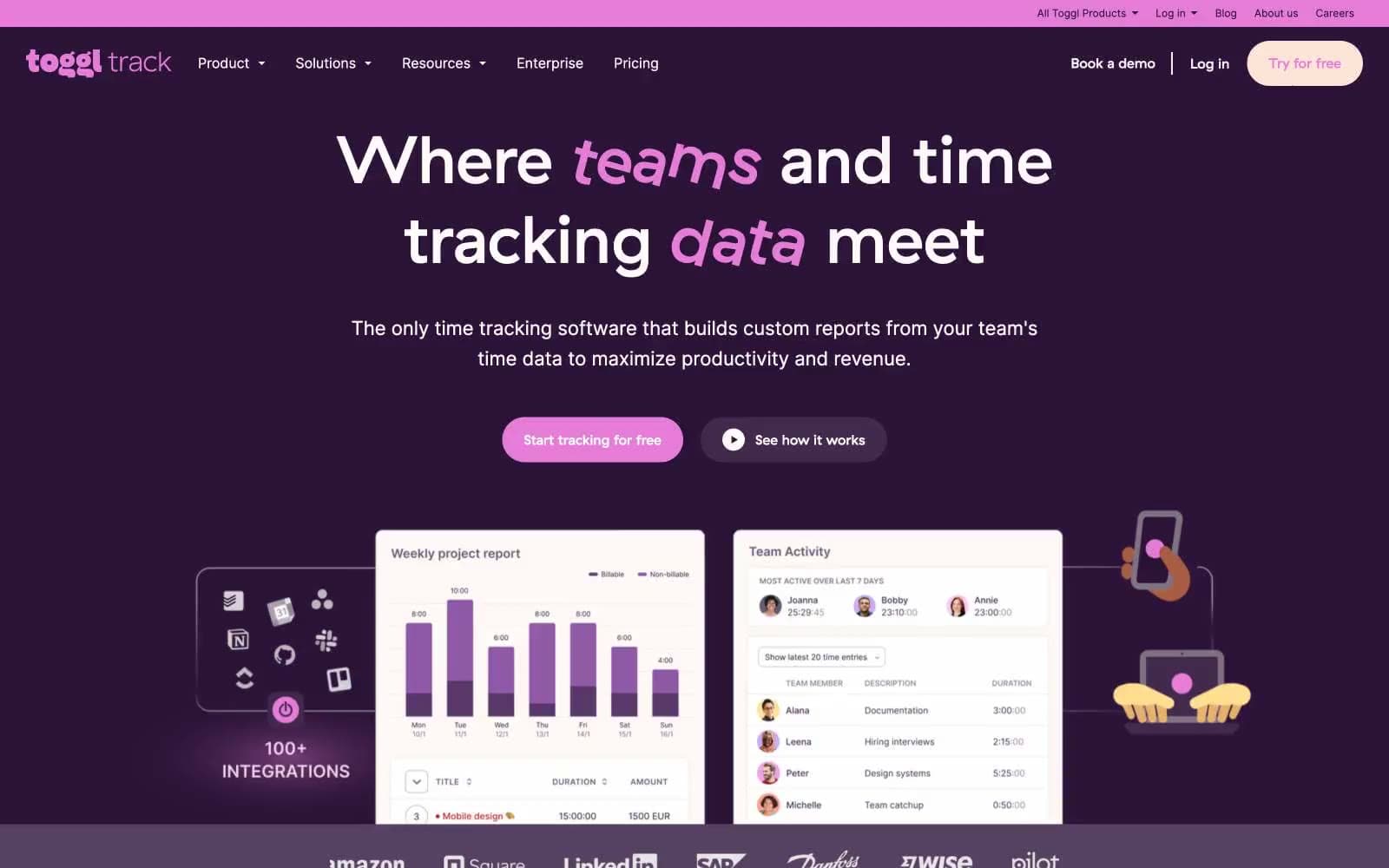
Toggl Track. A deep aubergine stage where a single magenta spotlight word illuminates each headline.
- Productivity
- Mixed theme
- 15 colors
- 4 typefaces
Toggl Track runs on a plum-and-cream duotone: a deep aubergine stage for hero and footer bands, warm off-white for product content, and one vivid magenta-pink that hijacks single words inside headlines — set in a rotalic italic — to make the copy feel theatrical. The pink is rationed; it appears as emphasis words, filled pill CTAs, and tiny icon dots, never as a wash. Surfaces stay flat; depth comes from the contrast between dark and light bands, not from shadows or gradients. Components are chunky and generously rounded: 26px for primary buttons, 200px for pill tags and nav chips, 10px for content cards. Typography pairs GT Haptik's geometric softness (display) with Inter's neutrality (body), both set tight at 1.1–1.25 line-height on the largest sizes so headlines feel dense and confident rather than airy.
Toggl Track design system

Brand4
Hero, header, and footer canvases; brand mark background. Near-black aubergine that reads as the brand's signature dark
Primary headings and UI text on light surfaces; secondary dark surface when Plum is too heavy. The workhorse purple
Body copy and link text on warm-white surfaces where Heather would feel too heavy. Carries the brand tint into running text
Secondary body text, descriptions, helper text, and muted icon strokes on light surfaces. Desaturated enough to recede behind headings
Accent2
Filled CTA buttons, emphasis words inside headlines, selected nav state, star ratings, and decorative dots. The only vivid hue — rationed to one word or one control per screen
Yellow action color for filled buttons, selected navigation states, and focused conversion moments.
Neutrals9
Primary text and high-contrast borders on light surfaces; footer text on dark Plum
Borders and dividers on light surfaces; button borders for outlined variants; disabled or placeholder text
Subtle borders and dividers where Silver reads too dark; secondary placeholder text on inputs
Hairline borders, list separators, and input outlines across cards and tables. The structural neutral grid
Pale pink surface for secondary buttons, tag backgrounds, and the softest brand-tinted fill
Highlighted card background for featured or selected content blocks
Soft warm wash for icon fills, decorative card backgrounds, and nav hover states. The warmest surface tint
Elevated card and modal surfaces above Bone. Carries a pink whisper without competing with Magenta
Page background for all content sections, card surfaces, and text color on dark Plum headers
Try a pairing
Pick any two colors from the palette to check whether text stays readable on top.
Aa
Bone on Plum
16.22 : 1 contrast
- Body textPasses AA 4.5
- Large textPasses AA 3
- StrictPasses AAA 7