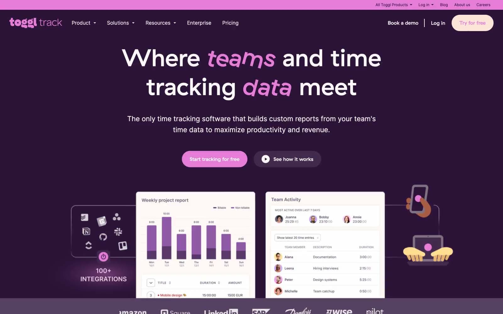
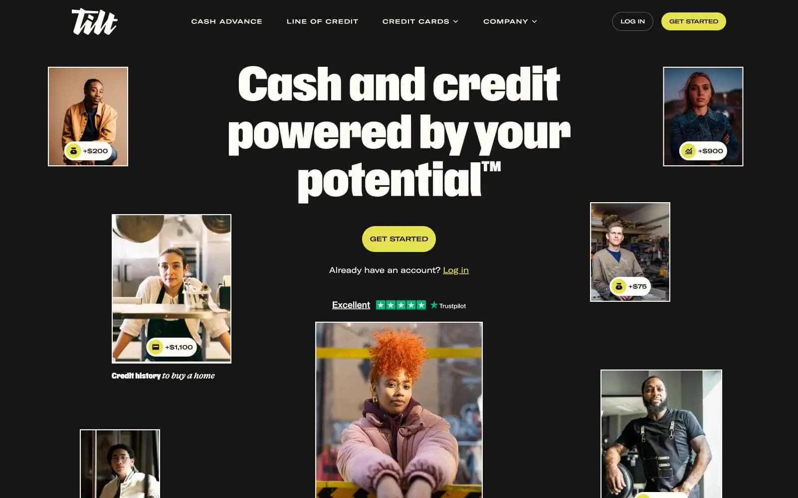
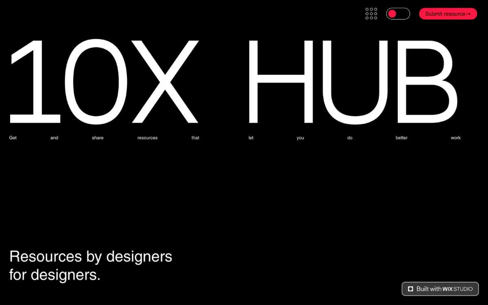
Notion. Midnight workspace, warm paper below.
- Productivity
- Mixed theme
- 15 colors
- 2 typefaces
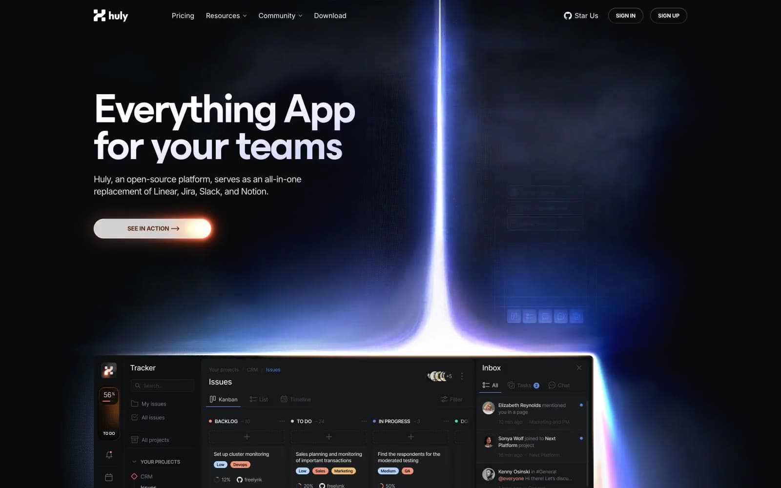
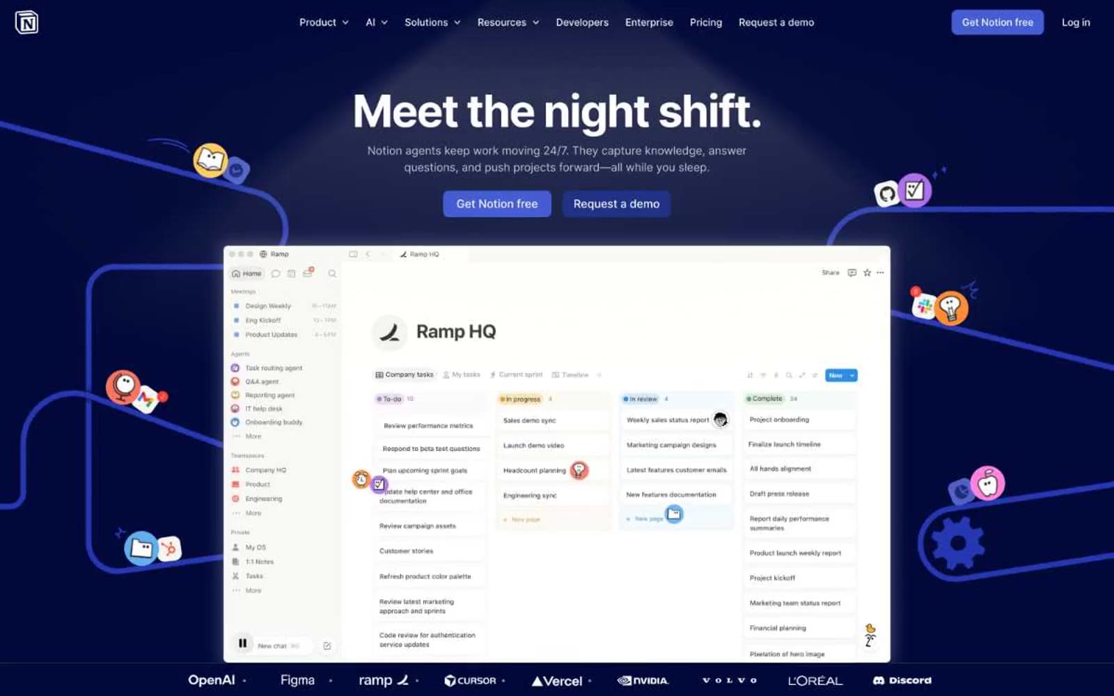
Notion operates as a midnight workspace that hands you the keys to a clean editorial room. The first screen is a deep navy stage (#02093a) where a single bold headline commands attention, surrounded by subtle violet glows and product screenshots that float like objects under glass. Below the fold, the page lightens into a warm white editorial canvas (#f6f5f4) where product cards, testimonials, and feature blocks read like a well-designed magazine spread. Typography carries the personality: NotionInter does the utilitarian work at compact confident sizes, while Lyon Text appears as occasional editorial accent — a serif whisper that signals 'this is thoughtful, not just functional.' The color system is mostly cool blue and violet for the dark surfaces, with the brand's identity expressed through the midnight canvas itself rather than a single bright accent — a deliberate inversion of the typical SaaS color hierarchy.
Notion design system

Brand5
Hero canvas, top-of-page surface, and the brand's defining dark stage — deep navy reads as serious, focused, almost like an editor's darkroom before the content lights up
Primary action buttons, filled CTA backgrounds, active link emphasis — the one bright blue that makes actions feel switched on against the midnight canvas
Decorative gradient stops, illustrated icon accents, soft highlight washes around headlines and product mockups — light blue provides the air around the heavy midnight
Decorative gradient accent, illustrated aura around product screenshots, secondary brand surface in dark mode navigation
Secondary action variant, outlined button fill, dark mode card surface elevation — sits between the midnight and signal blue as a bridge tone
Neutrals9
Primary text on light surfaces, hairline borders, icon strokes — the default ink for everything that needs to be read
Secondary text on light surfaces, high-contrast borders, card edges — slightly softer than pure black for visual comfort in long-form copy
Dark mode nav borders, text on dark surfaces, low-contrast dividers in the midnight stage
Muted helper text, secondary metadata, inactive icon strokes — warm undertone distinguishes it from cold grays in other SaaS systems
Muted icon strokes, separators, and secondary graphic details. Do not promote it to the primary CTA color
Divider lines, subtle separators between content blocks on light surfaces
Input field borders, form element outlines, the lightest structural divider
Light section canvas, card surface on light backgrounds, the warm off-white that gives below-the-fold sections a printed-page quality
Elevated card surface above Paper White, input field background, reversed text on dark buttons — only used where maximum contrast or stacking is needed
semantic1
Info badges, new-feature tags, inline highlight labels — cooler than Signal Blue, reserved for status and informational context
Try a pairing
Pick any two colors from the palette to check whether text stays readable on top.
Aa
Pure White on Midnight Ink
19.04 : 1 contrast
- Body textPasses AA 4.5
- Large textPasses AA 3
- StrictPasses AAA 7