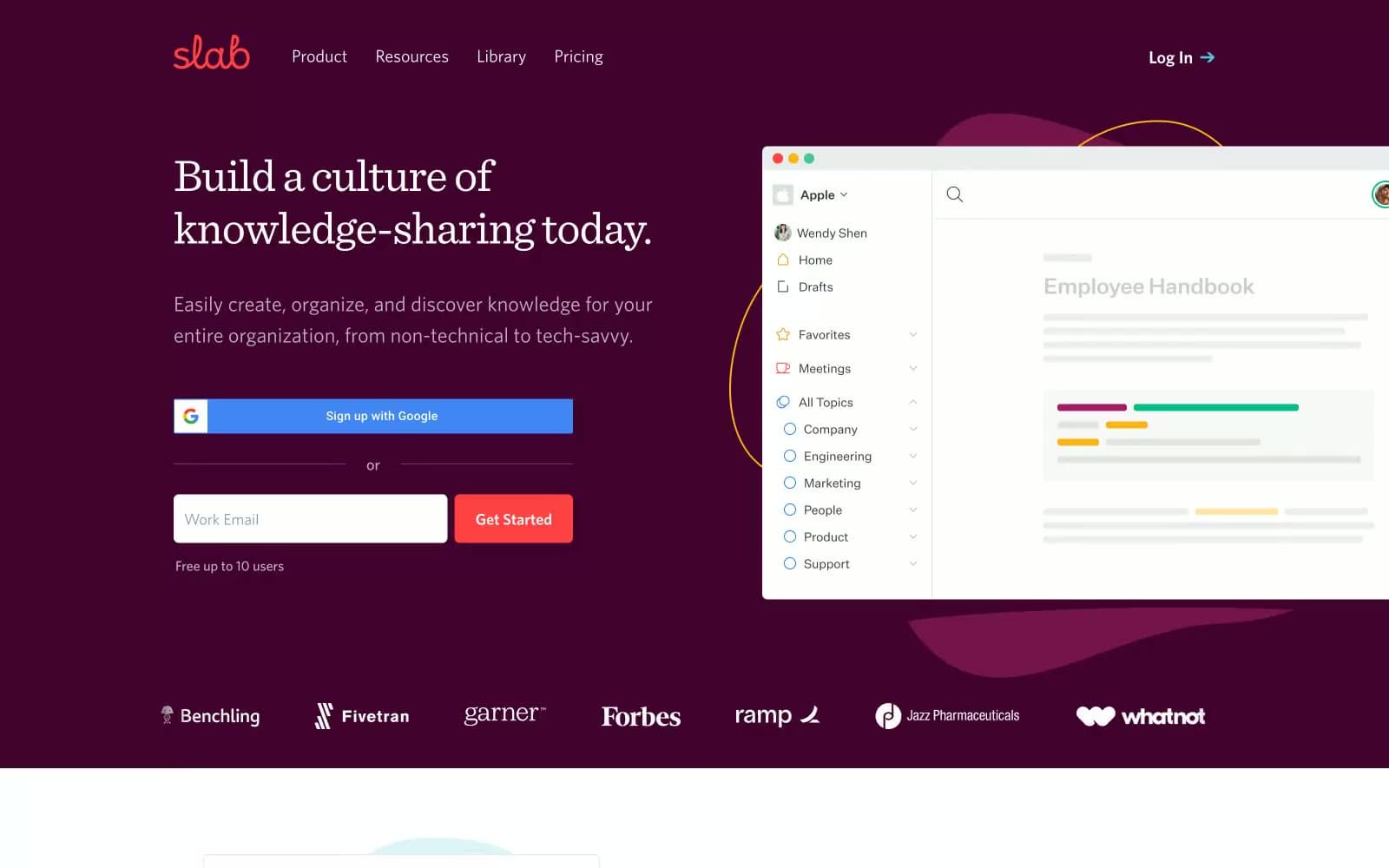
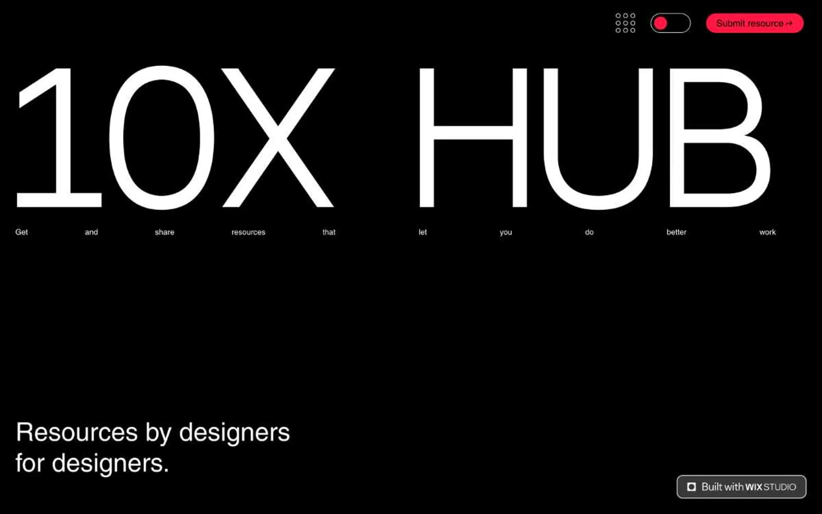
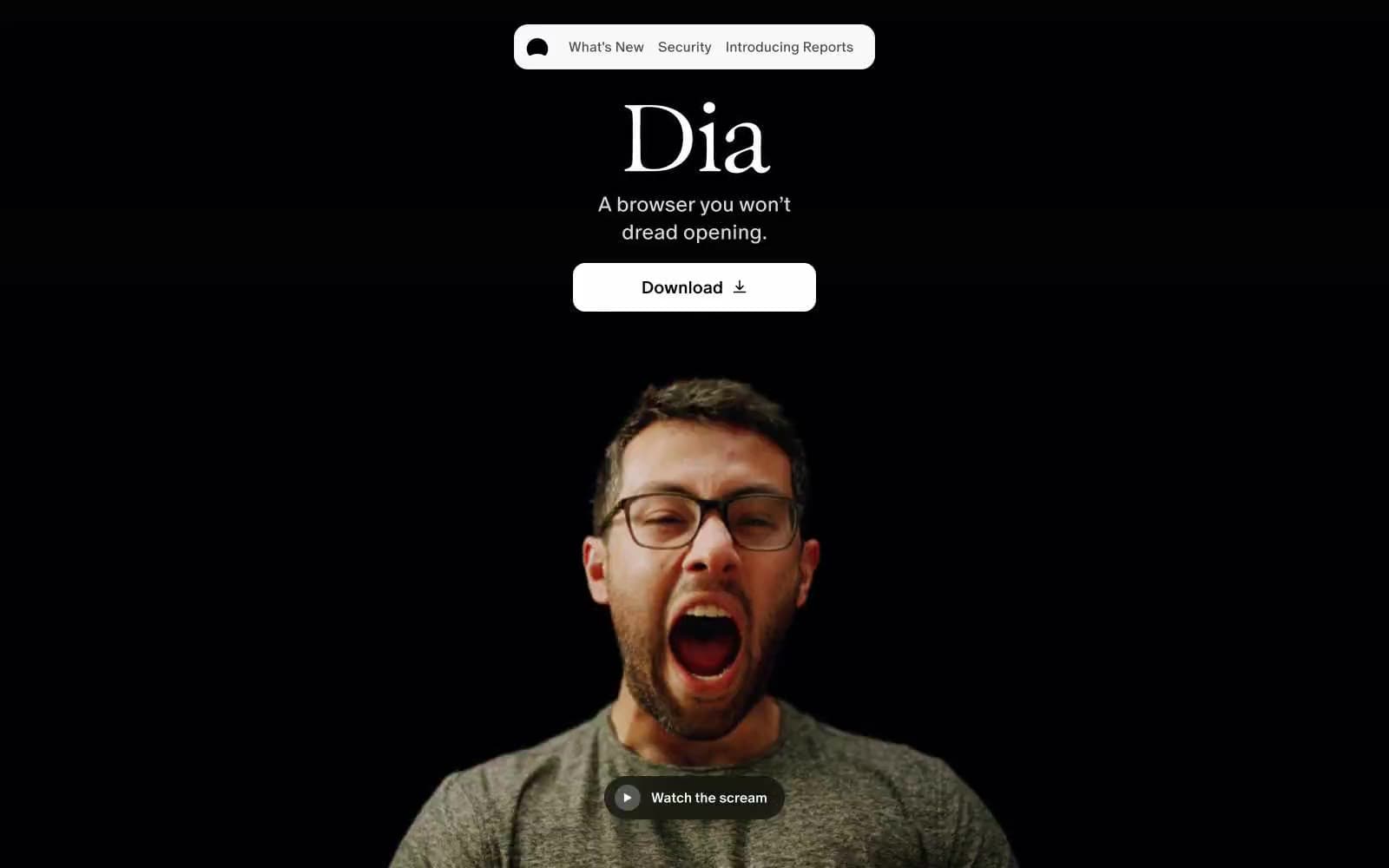
Dia Browser. Blackroom gallery meets editorial broadsheet.
- Productivity
- Mixed theme
- 12 colors
- 5 typefaces
Dia's visual language is editorial and cinematic: a pitch-black hero that erupts into a screaming human face gives way to a calm, magazine-like expanse of white space, serif display headlines, and whisper-thin type. The system lives almost entirely in black and white (4% colorfulness) with surgical chromatic accents — lime wash, golden yellow, and a sweeping spectrum gradient that reads like a rainbow scar through the page. Components are floating and weightless: glassmorphic nav pills, 9999px-radius buttons that hover above their content, 20px-radius cards with barely-there shadows. Typography does the heavy emotional work — the ultra-condensed Exposure Variable at 112px with 0.85 line-height creates headline impact through vertical compression rather than weight, while ABC Oracle at 300-400 carries body copy with editorial calm. The page breathes: 80px section gaps, generous line-heights (2.19 for body), and asymmetric layouts that refuse the standard SaaS card grid.
Dia Browser design system

Brand1
Sweeping rainbow gradient — the brand's signature motion element, traveling across hero and section dividers
Accent2
Accent background wash, highlight zones, editorial color punctuation
Secondary accent wash, warm highlight zones
Neutrals9
Primary text, button text, icon fills — the dominant ink across all surfaces
Hero background, dramatic dark sections — the opening stage of the experience
Dark button backgrounds on light surfaces — secondary action fill
Secondary text, muted nav, helper labels — softer than pure black for hierarchy
Tertiary text, inactive nav items, disabled states
Placeholder text, very subtle UI dividers
Button fills, pill backgrounds, header wash — slightly warmer than Bone, the dominant secondary surface
Page canvas, nav backgrounds, base surface beneath cards
Primary page canvas and white card surfaces. Do not promote it to the primary CTA color
Try a pairing
Pick any two colors from the palette to check whether text stays readable on top.
Aa
Pure Black on Lime Wash
19.35 : 1 contrast
- Body textPasses AA 4.5
- Large textPasses AA 3
- StrictPasses AAA 7