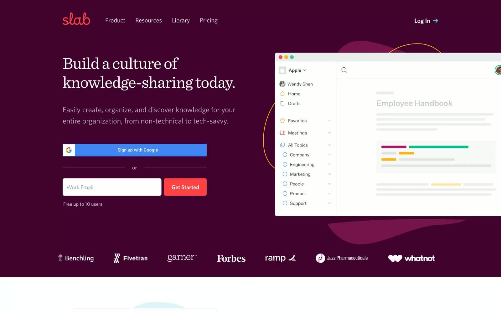
Slab. Midnight-wine reading room.
- Productivity
- Mixed theme
- 8 colors
- 2 typefaces
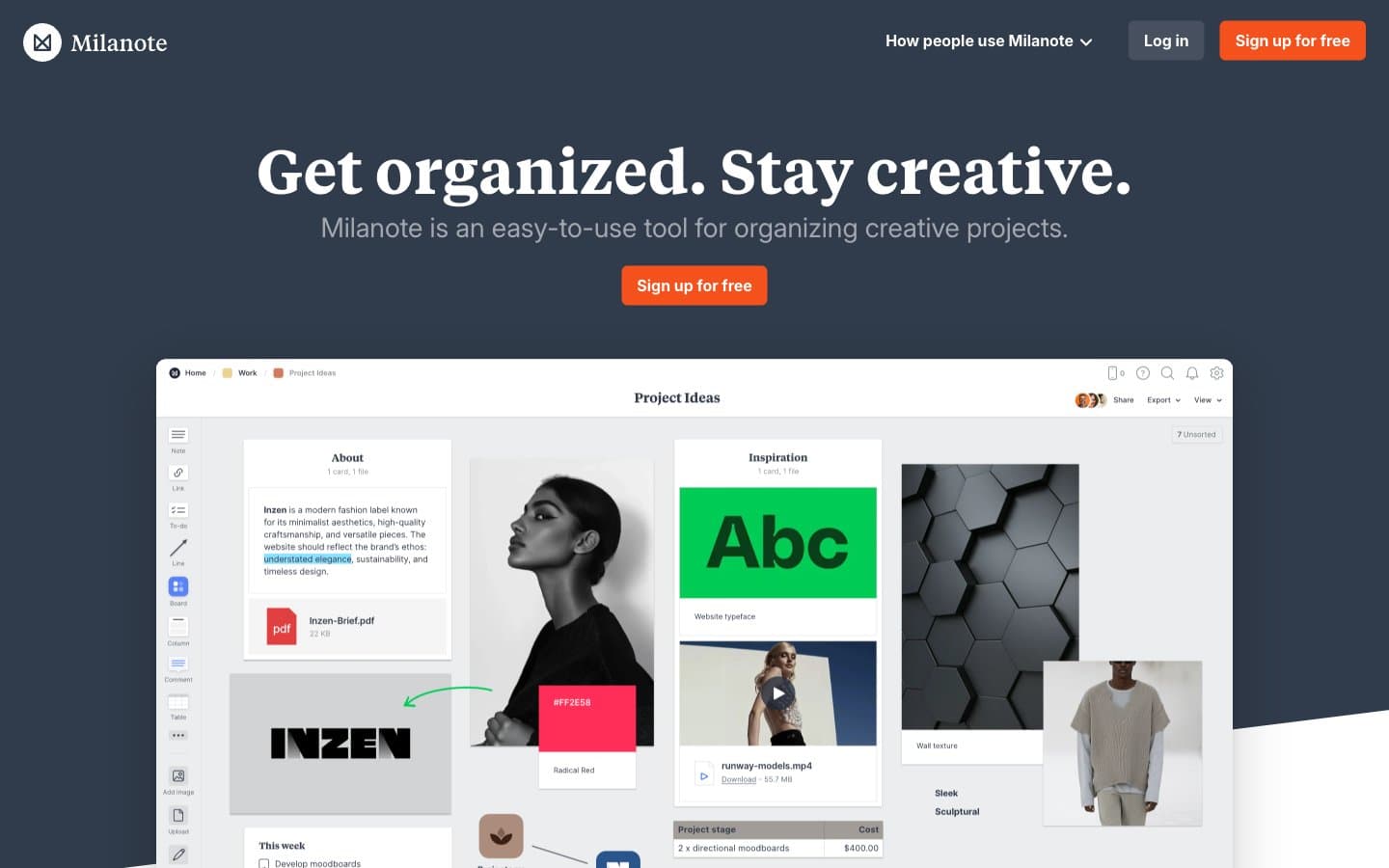
Slab reads like a curated library wrapped in a midnight-wine storefront: a deep plum hero cradles white serif headlines, then opens into bright, spacious editorial layouts where serif display type meets a quiet Whitney sans-serif system. Color is rationed — nearly all of the interface is grayscale — but the single coral-red action and the wine hero create a two-temperature palette: warm authority at the edges, cool utility in the middle. The aesthetic borrows from print publishing: Sentinel's 300-weight serif whispers rather than shouts, generous whitespace around each section feels like a magazine spread, and the 6px corner radius on inputs/buttons is restrained enough to feel editorial rather than soft. Decorative circles, organic blobs, and illustrated document cards float alongside flat UI — the visual language is human and craft-forward, not corporate.
Slab design system

Brand2
Hero band background, section dividers, deep surface moments — the deepest brand tone, used as atmosphere not as UI fill
Red supporting accent for decorative details and low-frequency emphasis. Do not promote it to the primary CTA color
Accent1
Third-party sign-in button (Google OAuth) — utility color for federated auth, not a brand accent
Neutrals5
Highest-emphasis text on light surfaces, deep icon fills — slightly warmer than pure black, reads as ink rather than absence
Primary text, icons, heading strokes, input borders, default UI chrome — the dominant near-gray that gives the system its printed-paper authority
Secondary text, helper copy, muted badges, logo tints — recedes behind Slate Ink to build typographic depth
Hairline dividers, decorative stroke accents, soft borders — the quietest neutral, separates without competing
Canvas background, card surfaces, text on dark bands — the bright neutral that holds the content sections open
Try a pairing
Pick any two colors from the palette to check whether text stays readable on top.
Aa
Graphite on Coral Ember
5.48 : 1 contrast
- Body textPasses AA 4.5
- Large textPasses AA 3
- StrictFails AAA 7