Bento. Bento lunchbox on sunlit linoleum.
- Productivity
- Mixed theme
- 17 colors
- 4 typefaces
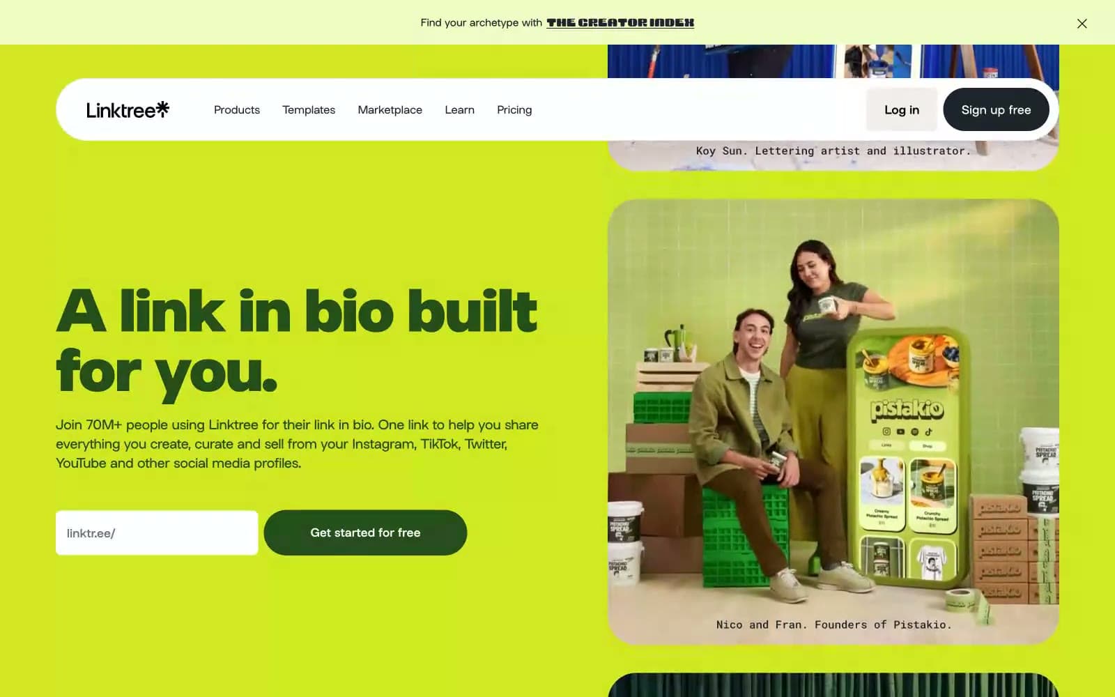
Bento speaks in a sunlit, pop-art bento-box language: full-bleed banded sections in lime, royal blue, and maroon stack vertically like a Japanese lunch tray, separated by generous white space on a warm linen canvas (#f3f3f1). The system is high-contrast and confident — thick black outlines wrap nearly every shape (1284+ black border occurrences), giving cards, buttons, and illustrations a hand-drawn, sticker-like quality that rejects soft shadows. Typography is tight and assertive: a custom geometric sans at up to 800 weight, with negative tracking that pulls display headlines into a single dense mass at 80px. The color palette is deliberately loud but disciplined — lime green is the single loud action accent, while maroon, royal blue, lavender, forest, cobalt, and gold serve as decorative section/card fills. Components lean pill-shaped (99px) and heavily rounded (64px, 32px), with small-radius (8px) exceptions for nav and inputs. The overall mood is playful, maximalist, and unapologetically graphic — a creator-tool brand that celebrates personality over neutrality.
Bento design system

Brand5
Primary action buttons, active nav fills, highlight card surfaces — the single loud CTA accent that punches through every colored band
Violet outline accent for tags, dividers, and focused UI edges. Do not promote it to the primary CTA color
Deep section backgrounds, card fills — anchors the lower page with a wine-colored tray that makes white type glow
Card surface fills for product mockups and feature blocks — a denser, more intense blue than Cobalt Band
Card surface fills, body accent text — the dark green that grounds warm-toned card compositions
Accent2
Decorative borders, icon outlines, soft card edges, and subtle highlight washes — a pastel companion that desaturates without disappearing
Card surface fills, decorative tile colors — a warm gold that adds variety to bento grid compositions
Neutrals10
Primary text, dominant borders (all cards/buttons/icons carry a black stroke), and illustration outlines — the structural ink that defines every shape
Dark mode button borders, hover state outlines on inverted components
Secondary dark text and borders, heading strokes on light surfaces, icon outlines — a near-black with a cool cast that softens the harshness of pure black
Muted helper text, secondary link borders, low-emphasis captions — a desaturated olive-gray that recedes without disappearing
Placeholder card backgrounds, skeleton states, and muted tile fills
Subtle button borders, disabled states, low-emphasis dividers
Alternate pale surface for section banding — a desaturated green-gray that adds another neutral layer
Soft section backgrounds and highlight washes — a very pale lime that echoes Lime Spark without competing
Page background, neutral button fills, soft section breaks — the warm off-white base that lets colored bands float
Card surfaces, form inputs, icon fills, and inverted text on dark/colored backgrounds
Try a pairing
Pick any two colors from the palette to check whether text stays readable on top.
Aa
Ink Black on Lime Spark
15.31 : 1 contrast
- Body textPasses AA 4.5
- Large textPasses AA 3
- StrictPasses AAA 7