Milanote. Pinned creative studio.
- Productivity
- Mixed theme
- 11 colors
- 4 typefaces
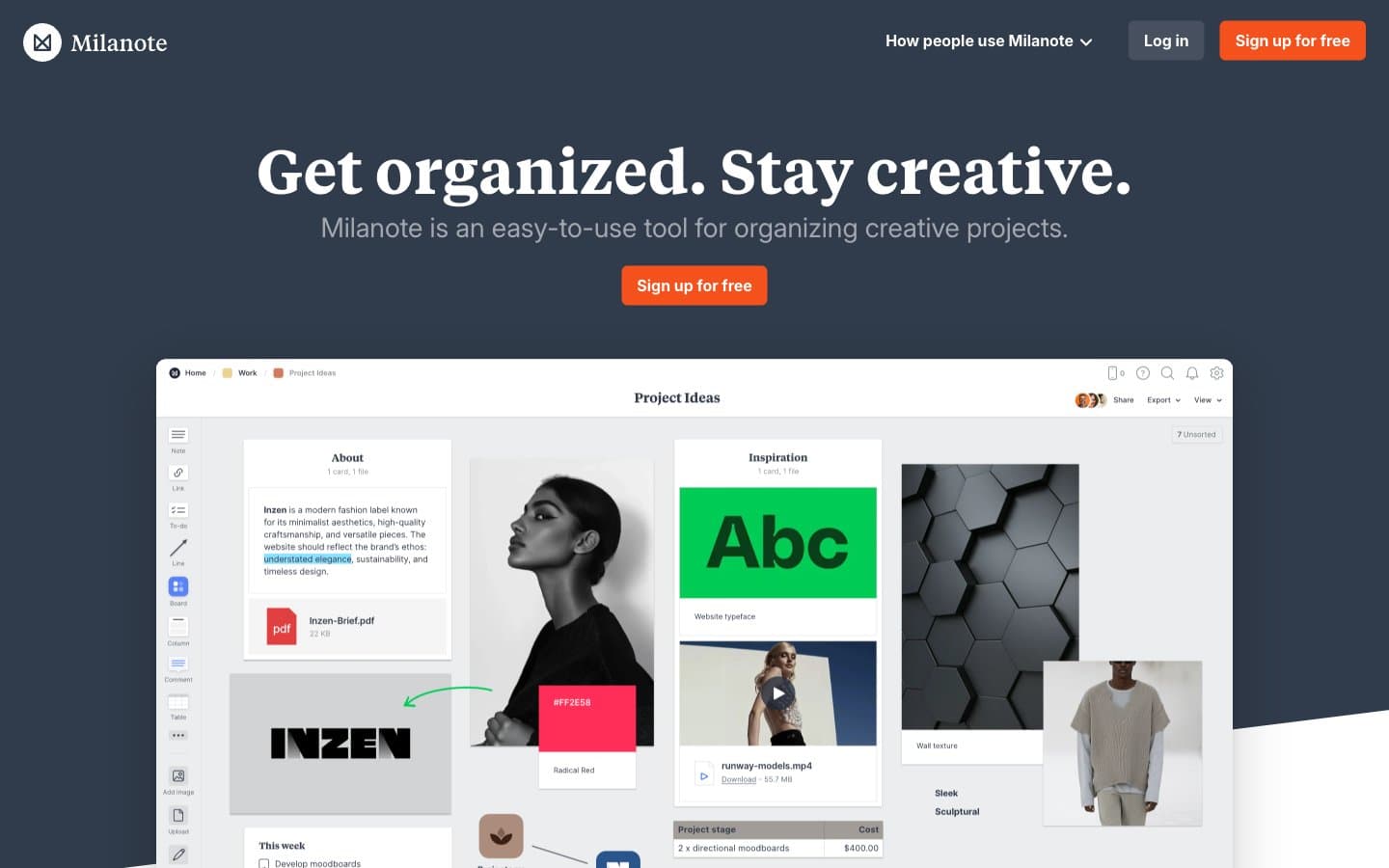
Milanote alternates a deep slate workspace backdrop with broad white editorial sections, treating product boards as tangible pinned canvases rather than abstract software diagrams. Large, high-contrast Tiempos headlines anchor each scene, while Inter keeps navigation, actions, and explanatory copy compact and direct. The orange #f4511c action color appears sparingly against slate and white; its restraint lets photographic moodboards and layered board screenshots carry the visual energy.
Milanote design system

Brand1
Filled sign-up buttons and conversion moments — a concentrated warm mark against the blue-gray workspace
Neutrals10
Deep text, dark input text, and the cool-black foundation of surface shadows
Dark hero, navigation, dark showcase bands, footer, and dark heading text
Dark filled account controls within the slate navigation system
Long-form body copy, secondary links, and text on white controls
Quiet icon strokes, auxiliary labels, and subtle input definition
Small legal copy and deeply secondary links
Muted text on dark surfaces, supporting labels, and fine icon strokes
Inset control outlines and low-contrast field boundaries
Muted board canvas, pale control surfaces, dividers, and light-gray section treatment
Light page canvas, card surfaces, board frames, and inverse text
Try a pairing
Pick any two colors from the palette to check whether text stays readable on top.
Aa
#111111 on Studio Orange
5.43 : 1 contrast
- Body textPasses AA 4.5
- Large textPasses AA 3
- StrictFails AAA 7