
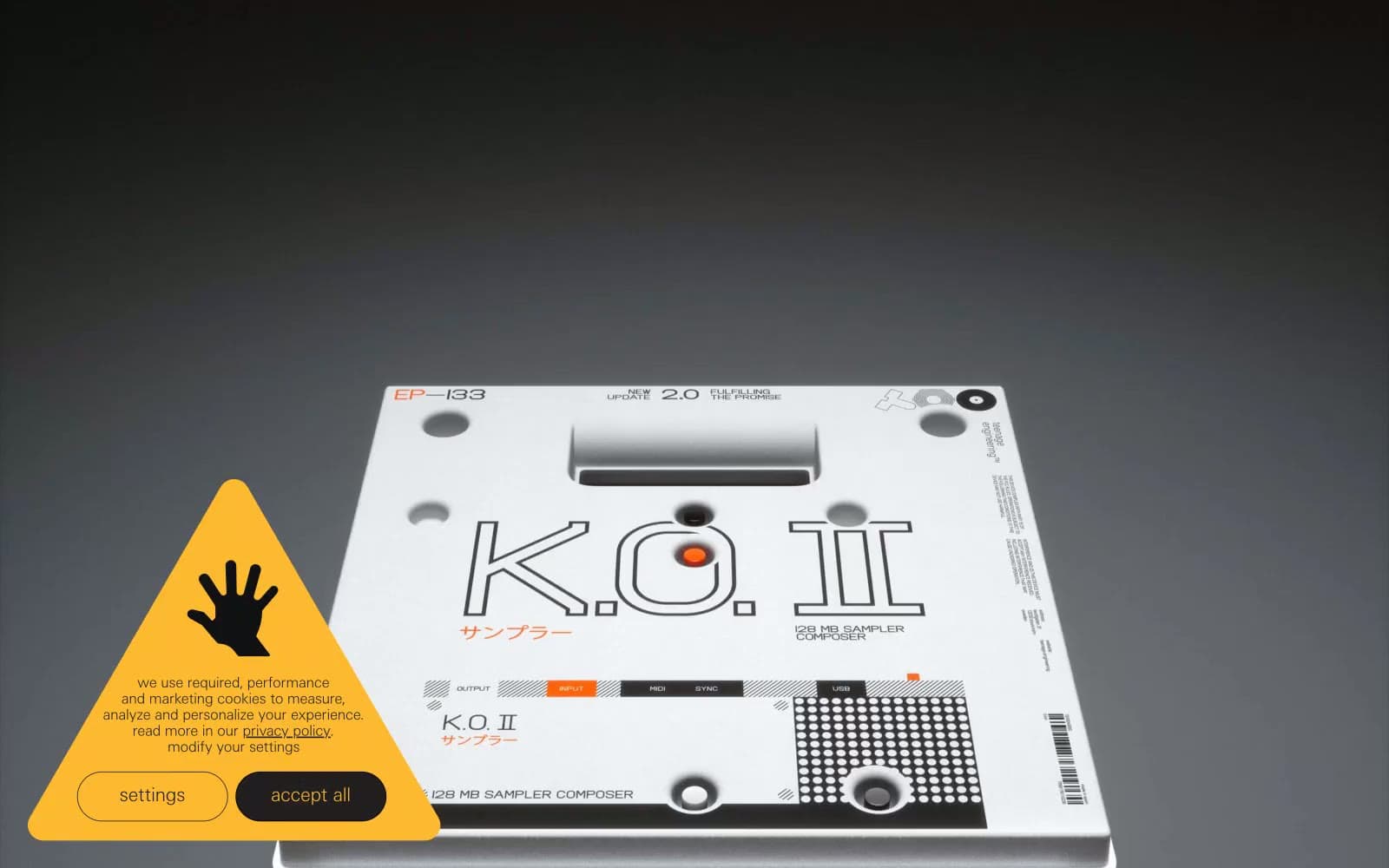
teenage engineering. The product is the only rich object on the page and everything else is whispered around it.
- Commerce
- Light theme
- 5 colors
- 2 typefaces
teenage engineering reads as an industrial product catalogue rendered in typographic whispers: a near-white canvas of #f6f8f7 hosts photographed products on seamless studio backdrops, while everything else — nav items, body copy, borders, labels — sits in ultra-thin weight 100 type that almost disappears into the page. The contrast comes not from ornament but from material: products are the only dense visual objects; the UI around them is mostly negative space, hairline rules, and one occasional dark band of #0f0e12 that acts like a display case wall. Zero rounded corners, zero drop shadows, zero gradients — every edge is a straight cut, every surface is flat. Color is deliberately rationed: pure black text, gray hairlines, a slightly purplish near-black for inverted sections, and a single chromatic note (the amber warning triangle) that earns its presence by being the only non-neutral element on the page.
teenage engineering design system

Neutrals5
Primary body text, dominant hairline borders, footer rules — the most-used color in the system at ~1017 occurrences, functioning as the typographic anchor
Near-black with a barely-perceptible violet cast — used for dark hero bands, inverted text, and footer/divider blocks where pure black would feel too clinical
Muted secondary borders and subdued helper text — the quietest neutral, used only when a rule needs to be present but not assertive
Light border hairlines, nav icon fills, list dividers — the structural gray that organizes the page into ruled sections without ever calling attention to itself
Page background, product photography backdrop, the dominant surface — everything else sits on this almost-white field
Try a pairing
Pick any two colors from the palette to check whether text stays readable on top.
Aa
Canvas Mist on Ink Black
19.69 : 1 contrast
- Body textPasses AA 4.5
- Large textPasses AA 3
- StrictPasses AAA 7
More DESIGN.md files. Same web, different personalities.

High Protein
Commerce
Hopper
Commerce
2.AG
Commerce
A-WARE
Commerce
AATHER
Commerce
Abel
Commerce
Acme Cups New Zealand
Commerce
Acne Studios
Commerce
Adam Lippes
Commerce
Adanola
Commerce
Advene
Commerce
Aevi Wellness
Commerce


