
Tana. A dark editorial spread where one pale-green button is the only color on the entire page.
- Productivity
- Dark theme
- 7 colors
- 3 typefaces
Tana is a midnight editorial: pure black canvas, one pale-lime signal, nothing else. The entire interface is monochrome — warm off-white type, a quiet scale of grays for hairlines and secondary text — with a single chromatic accent (#e1f0bd) reserved exclusively for the primary action. Headlines come from a custom high-contrast serif (tanaClassic) set tight at negative tracking, which creates a magazine-spread authority against the void. Category labels are pentagon-shaped tags (pointed left edge, flat right) that orbit around imagery like marginalia, turning product features into a printed index. Layout is centered and generous, with editorial photography used sparingly as a single warm focal point in an otherwise typographic page. Everything else is restraint.
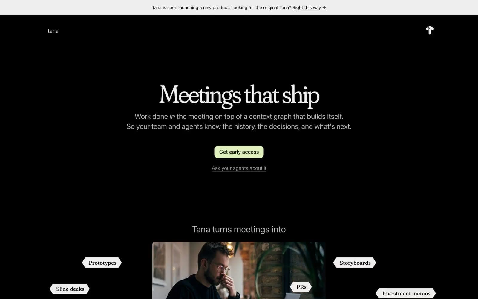
Tana design system

Brand1
Primary CTA fill only — a muted pale lime used exclusively for the early-access button, never for links, icons, or decoration. The one chromatic moment on the entire page
Neutrals6
Page canvas, section backgrounds, card surfaces — pure black, not near-black, makes the off-white type and the lime accent feel luminous
Elevated surface layer, subtle borders, secondary backgrounds — one step off the void for depth without breaking the dark mode
Faintest visible borders, disabled text — the lower edge of the readable gray scale
Tertiary text, subtle metadata, low-priority borders
Secondary body text, muted helper copy, list dividers — the dominant mid-gray for all non-primary prose
Primary text, pentagon tag fills, announcement bar background — slightly warm off-white, softer than pure white against deep black
Try a pairing
Pick any two colors from the palette to check whether text stays readable on top.
Aa
Void on Lime Signal
17.40 : 1 contrast
- Body textPasses AA 4.5
- Large textPasses AA 3
- StrictPasses AAA 7
More DESIGN.md files. Same web, different personalities.
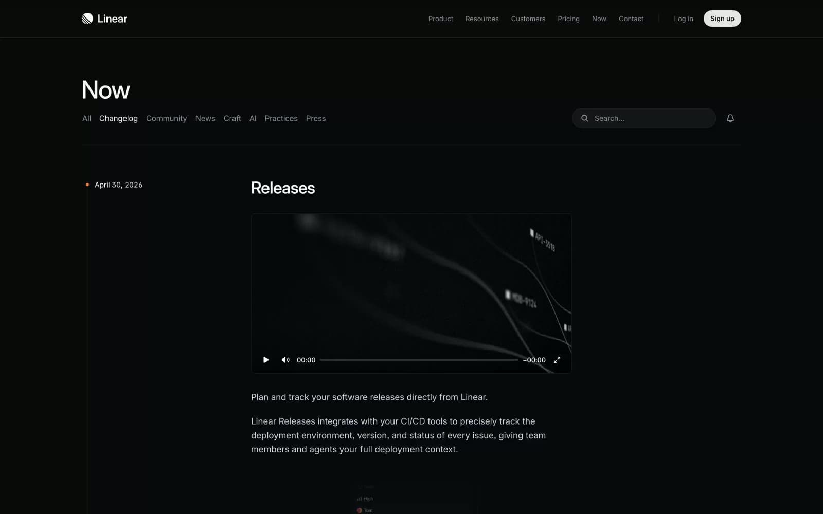
Changelog
Productivity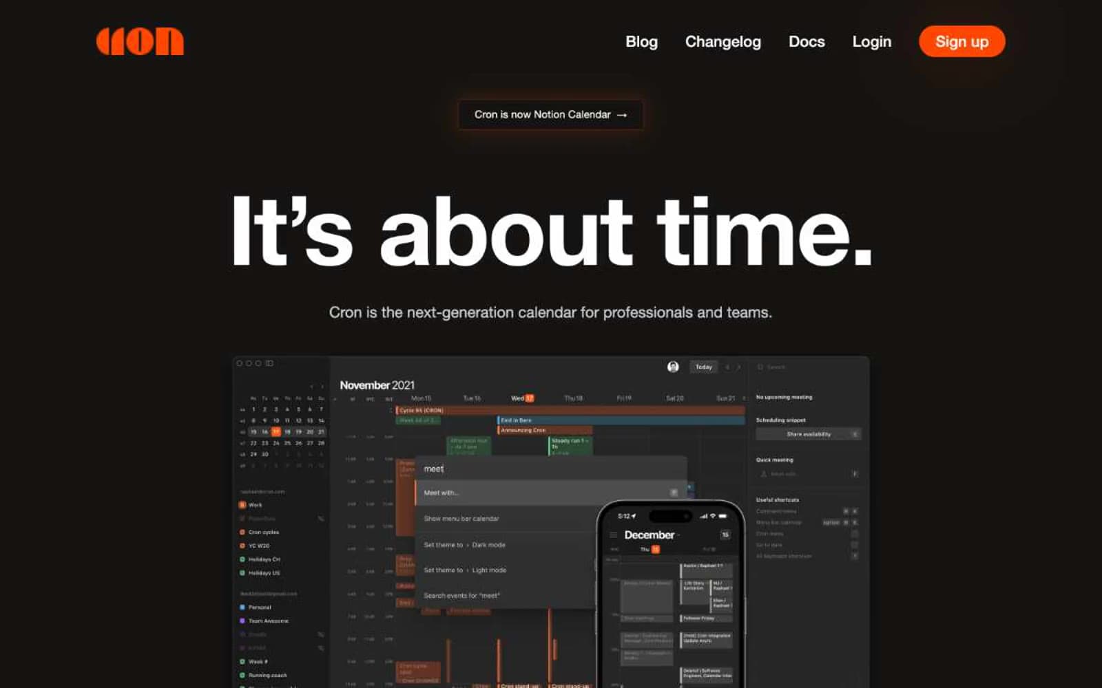
Cron Calendar
Productivity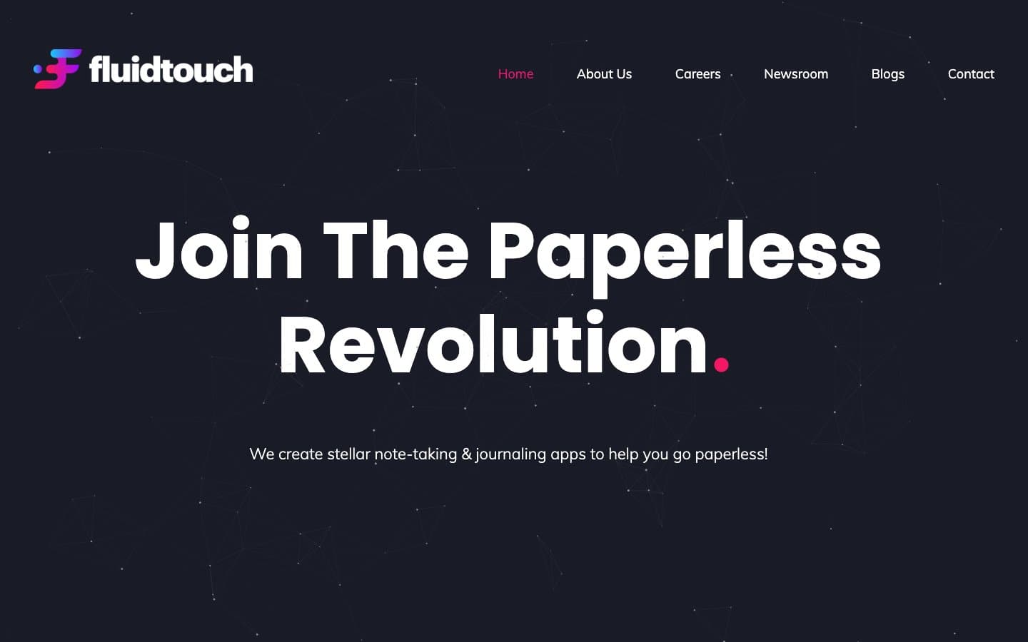
Fluidtouch
Productivity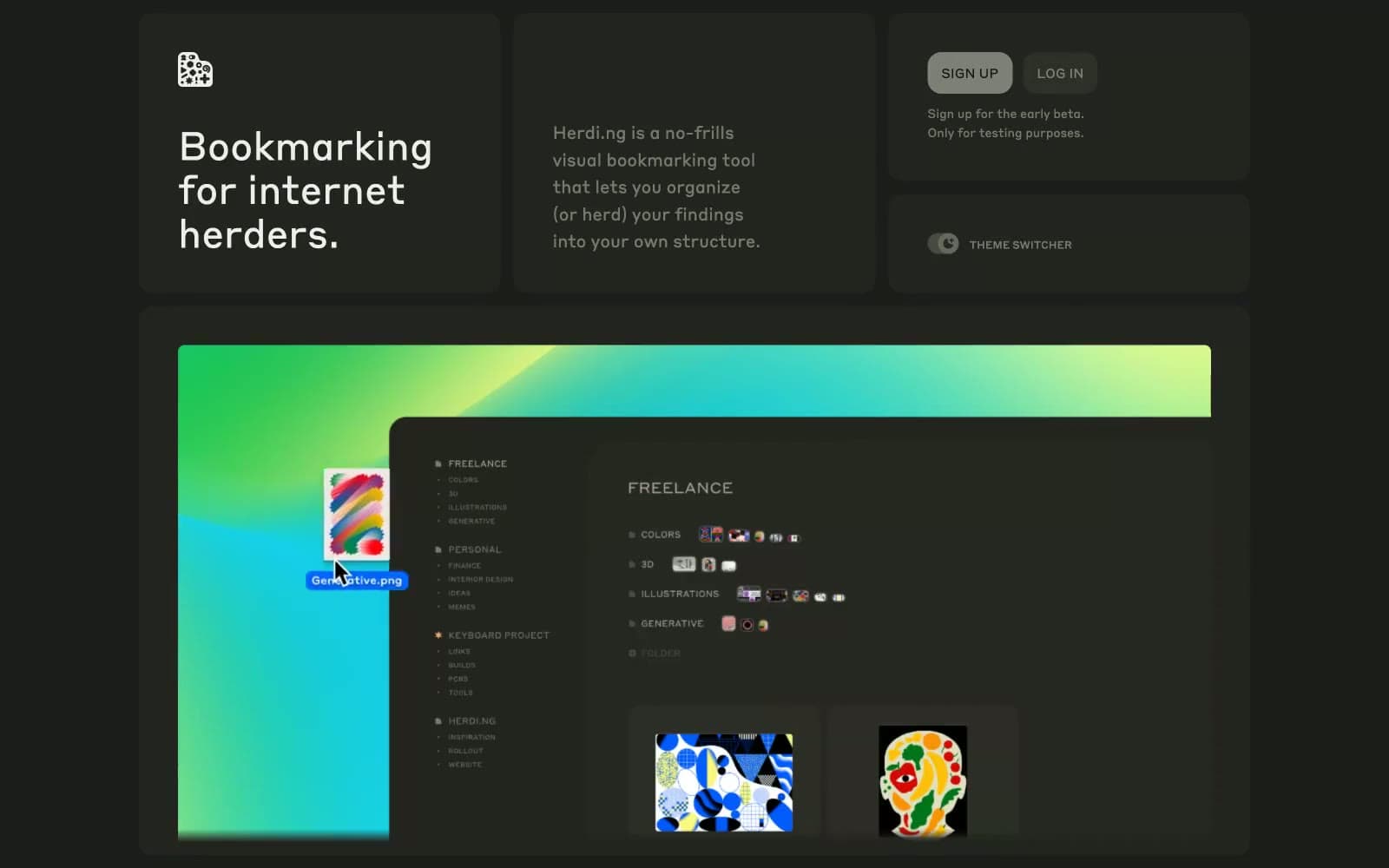
herding.app
Productivity
Index
Productivity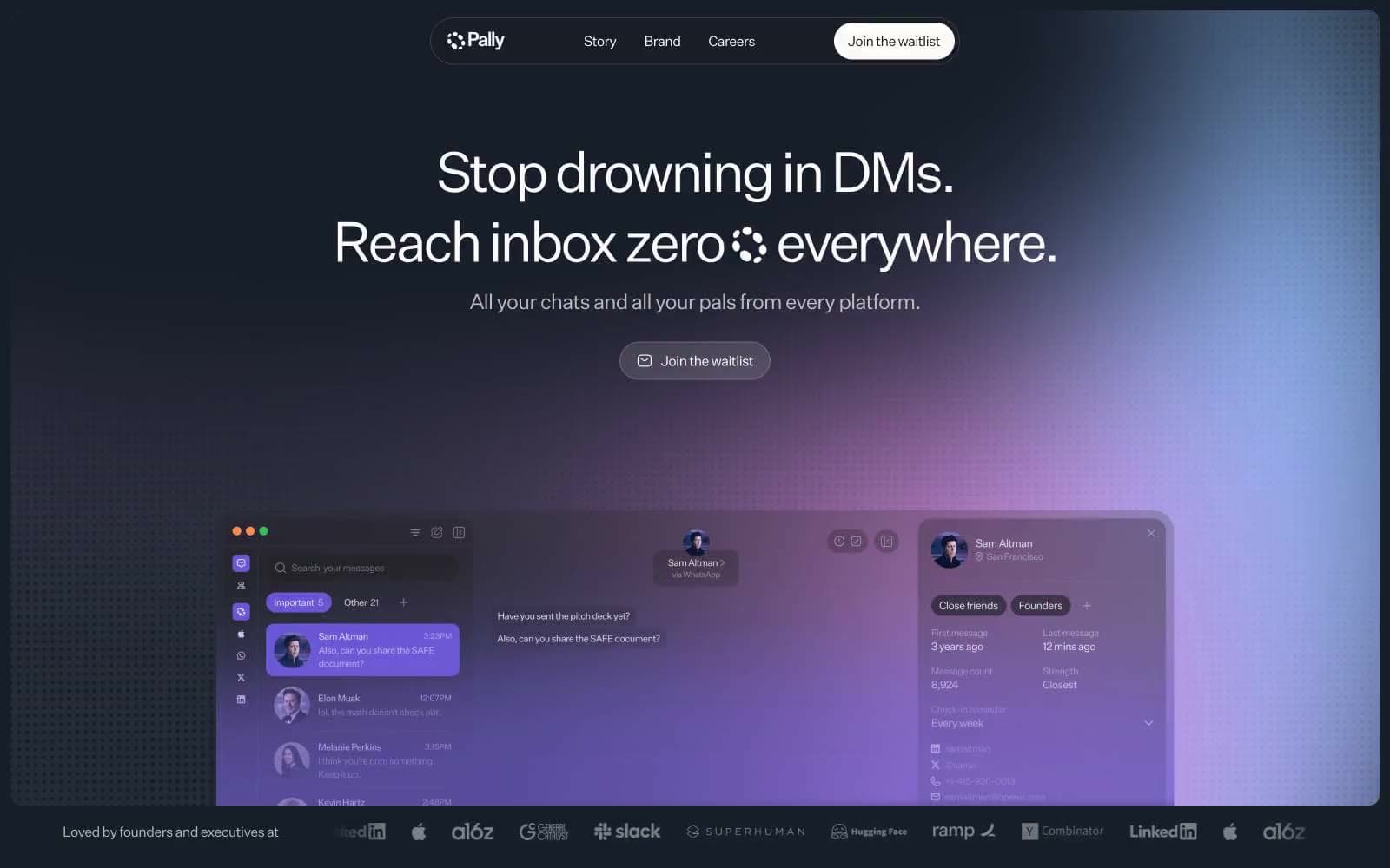
Pally
Productivity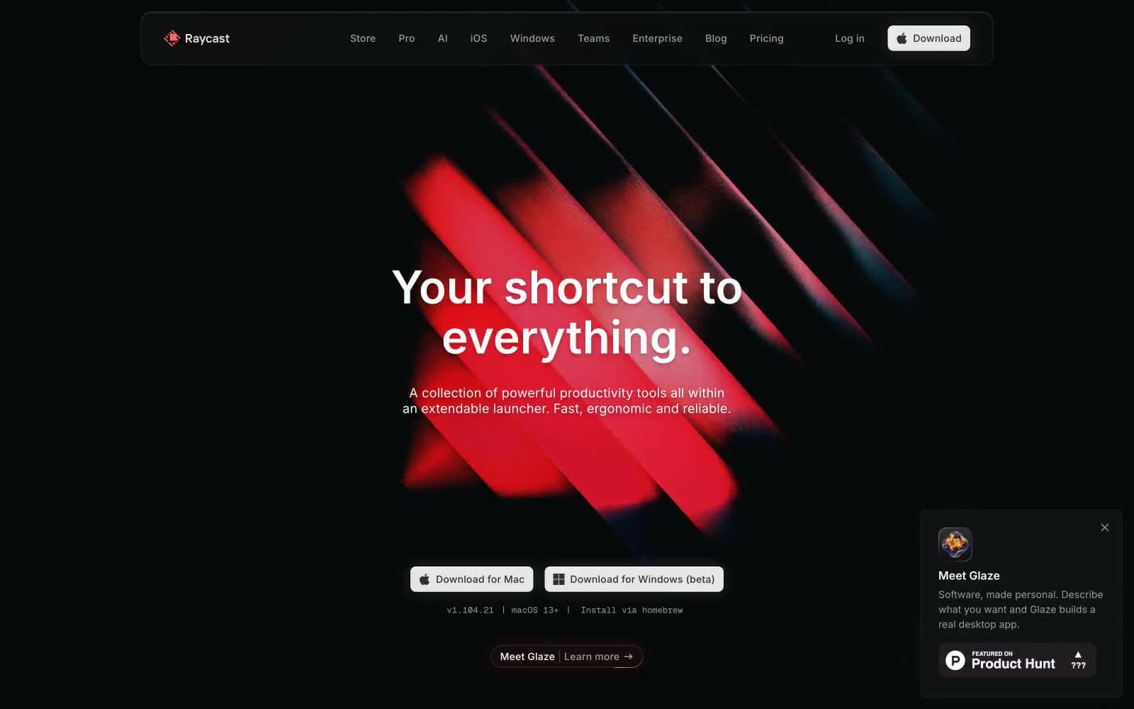
Raycast
Productivity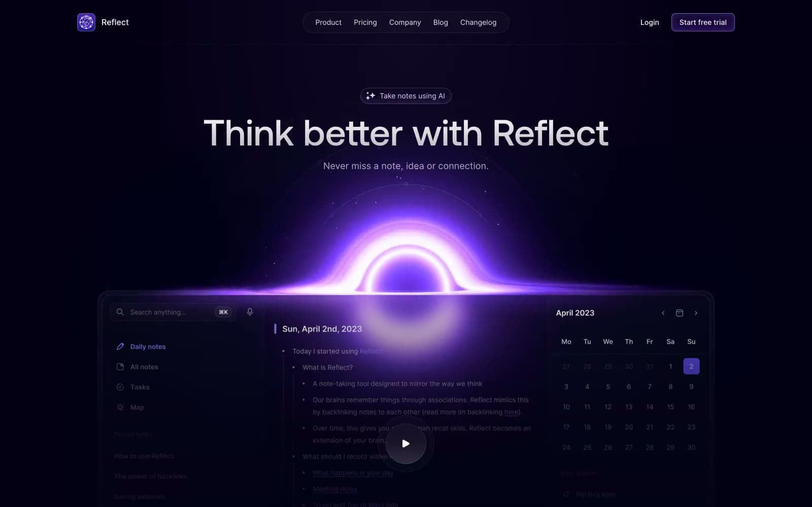
Reflect Notes
Productivity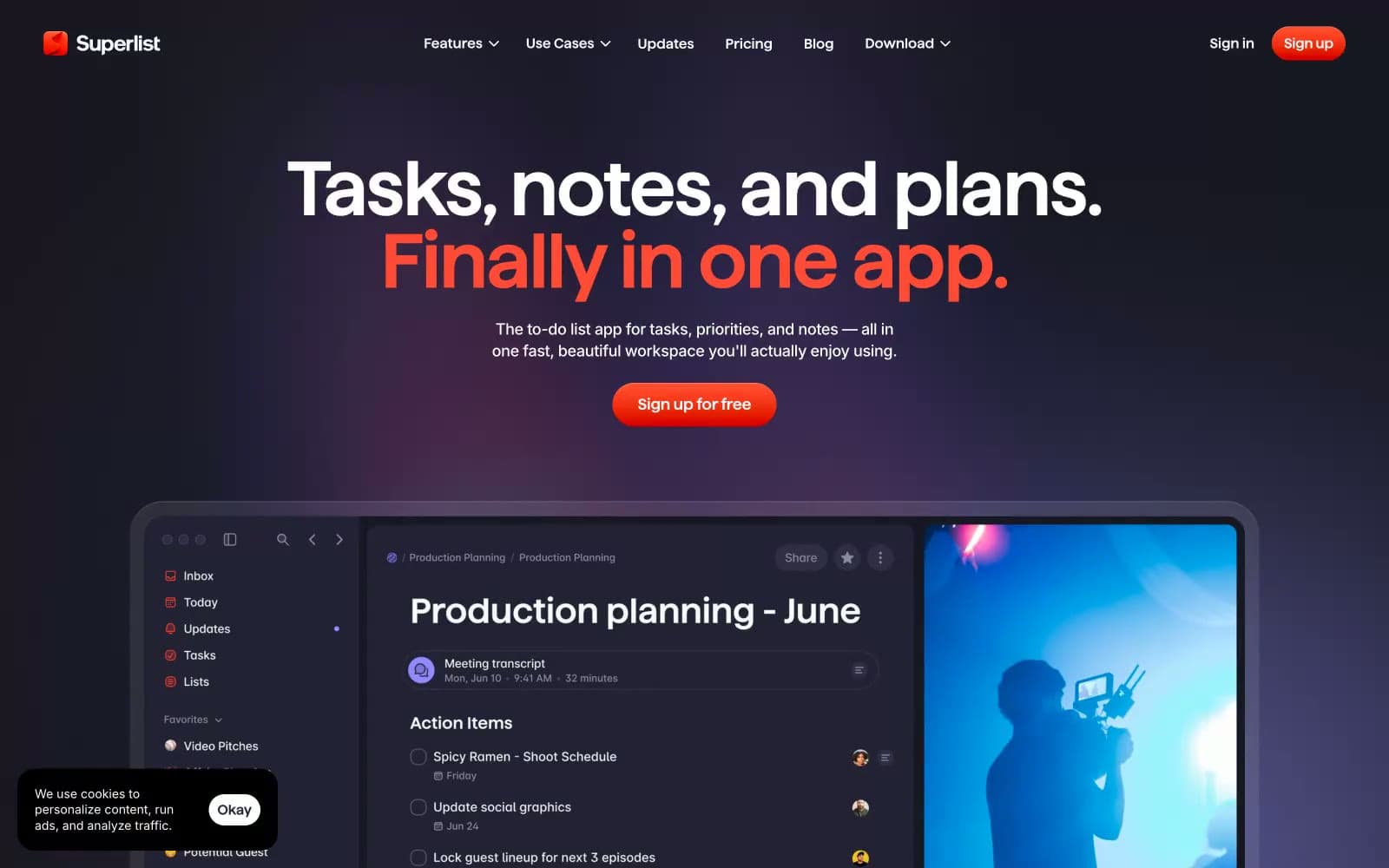
Superlist
Productivity
Railway
Developer tools
Basement Studio
Studio
Stripe Press
Media


