
Reflect Notes. A dark observatory where notes float like constellations against a near-black indigo void.
- Productivity
- Dark theme
- 14 colors
- 2 typefaces
Reflect Notes is a starlit thinking environment: near-black canvas tinted with violet (#030014), illuminated text in a soft lavender-white, and a single vivid lavender accent (#9382ff) that functions as a point of focus against the dark. The interface stays monochromatic and quiet — surfaces are separated by inset rim-light glows rather than borders or elevation shadows, giving components the feel of dark glass panels catching ambient light. Display headlines use AeonikPro at weight 500 (deliberately medium, not bold), creating a calm editorial voice rather than marketing bombast. A pastel pink-to-violet-to-blue gradient is reserved exclusively for accent text and decorative strokes — never for large fills. Components are compact and tight: 5px button radii, 16px card radii, 4px base spacing. The whole system reads as a constellation map, not a dashboard.
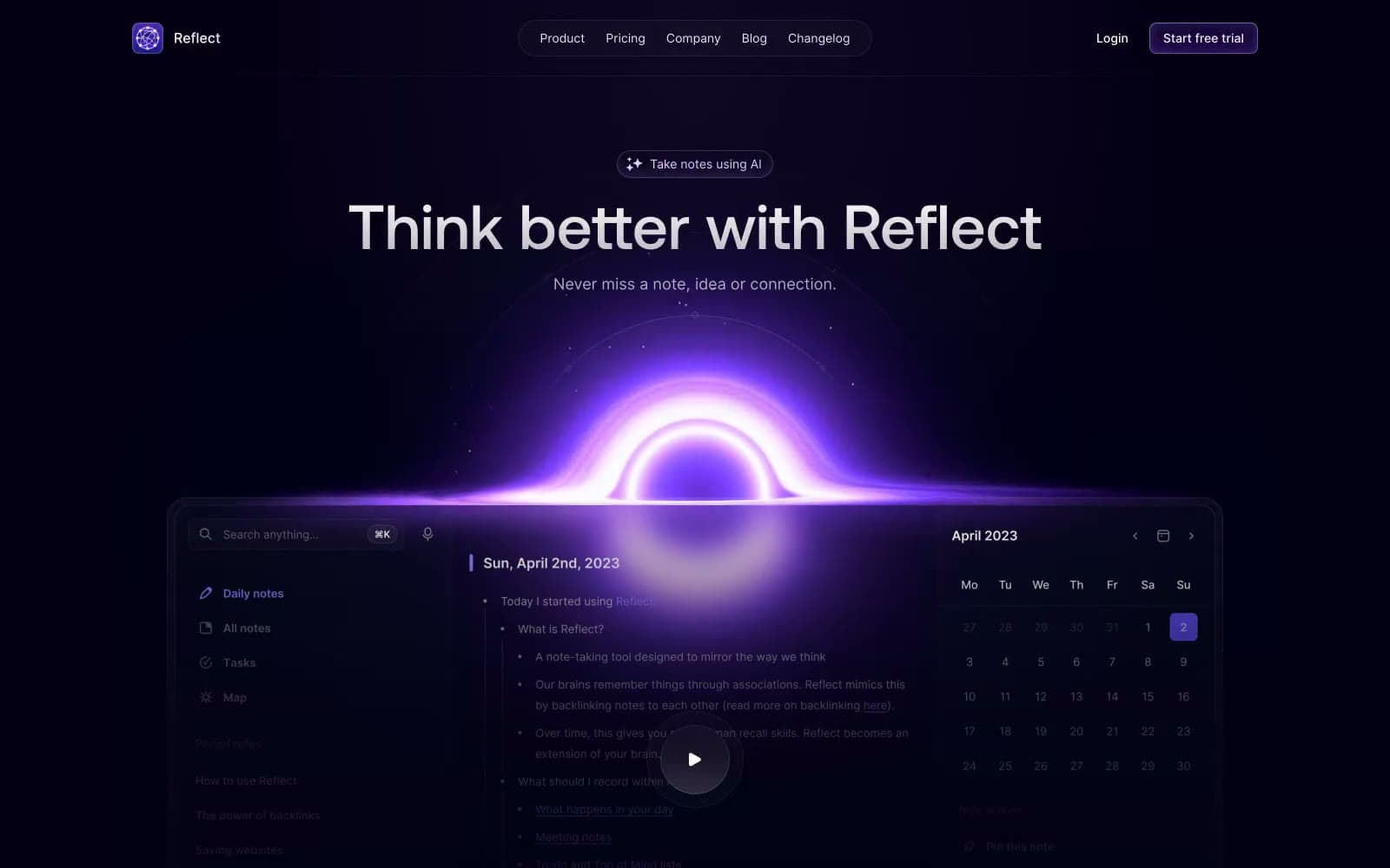
Reflect Notes design system

Brand2
Brand accent — links, active icons, focus rings, gradient endpoints, highlight punctuation. The single chromatic signal in a monochrome system
Violet supporting accent for decorative details and low-frequency emphasis. Do not promote it to the primary CTA color
Accent2
Decorative gradient running from pink #e59cff through #ba9cff to blue #9cb2ff — used only on accent text and thin highlight strokes, never as a fill
Vertical violet glow gradient used for divider lines and edge highlights — transparent at both ends, peaks at violet center
Neutrals10
Page background, hero canvas, deepest surface layer — the near-black with violet undertone that defines the entire system's mood
Elevated surface, card backgrounds, slightly raised panels above the void canvas
Most elevated surface, hover states, prominent UI panels — a step brighter than midnight surface; Filled button surface, deep brand surface for primary controls sitting on the void canvas
Deepest muted text, disabled labels, dark-mode border contrast — the lowest readable neutral
Mid-neutral for secondary borders, inactive icon strokes, and subtle background tints
Tertiary text, metadata, helper text, inactive controls, border lines at full opacity
Secondary body text, card labels — cool neutral with violet undertone
Bright neutral used in dividers, subtle borders, and light-on-dark surface tints
Primary text, headings, icons, high-contrast UI elements — white with a lavender cast that harmonizes with the violet canvas
Pure white used sparingly for text on violet-filled elements and maximum-contrast headlines
Try a pairing
Pick any two colors from the palette to check whether text stays readable on top.
Aa
Void Canvas on Lavender Accent
6.78 : 1 contrast
- Body textPasses AA 4.5
- Large textPasses AA 3
- StrictFails AAA 7
More DESIGN.md files. Same web, different personalities.
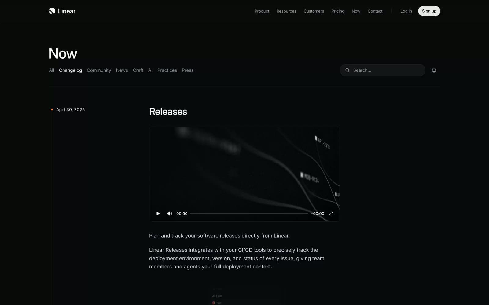
Changelog
Productivity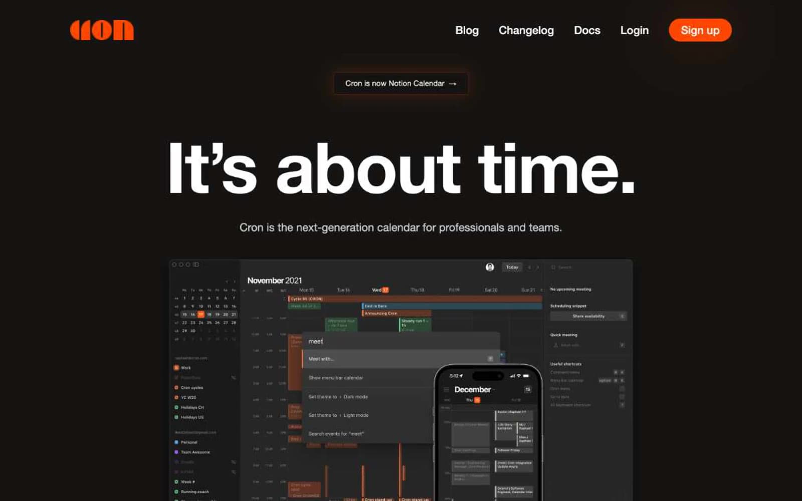
Cron Calendar
Productivity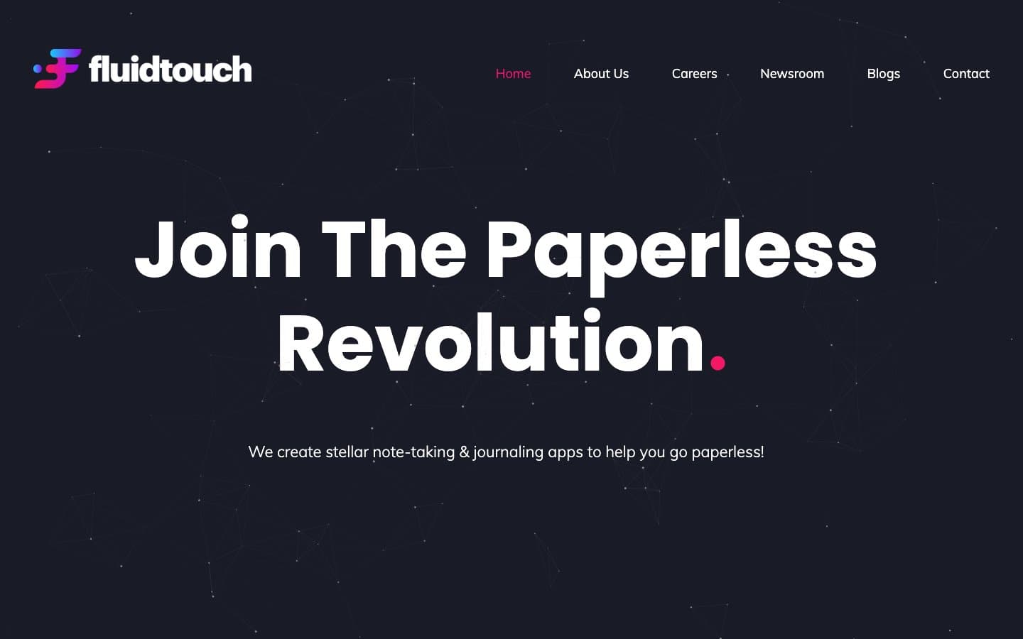
Fluidtouch
Productivity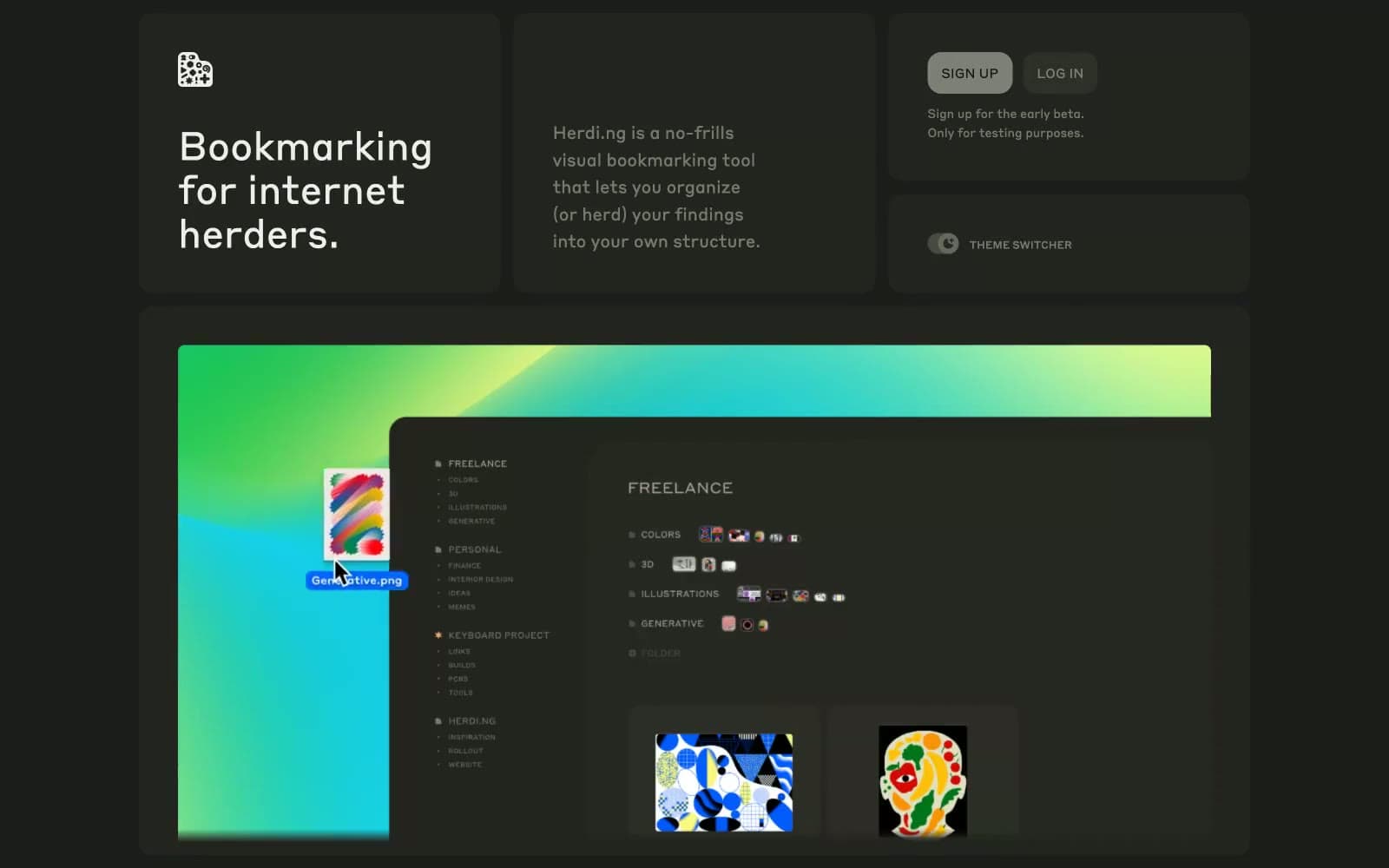
herding.app
Productivity
Index
Productivity
Pally
Productivity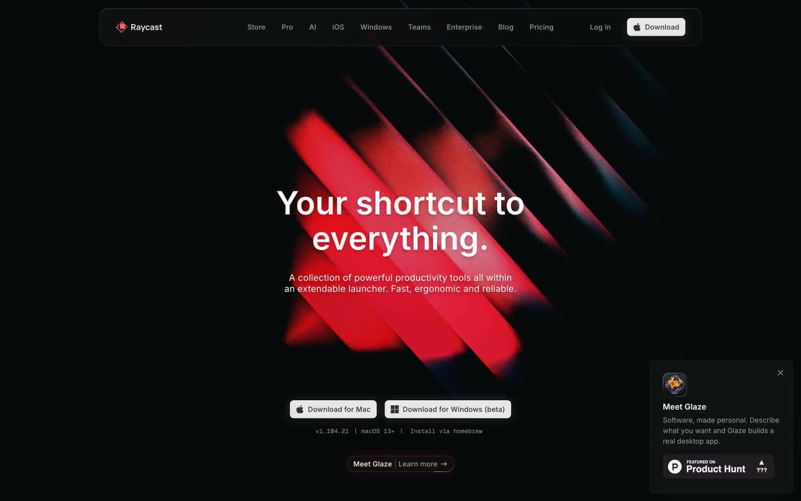
Raycast
Productivity
Superlist
Productivity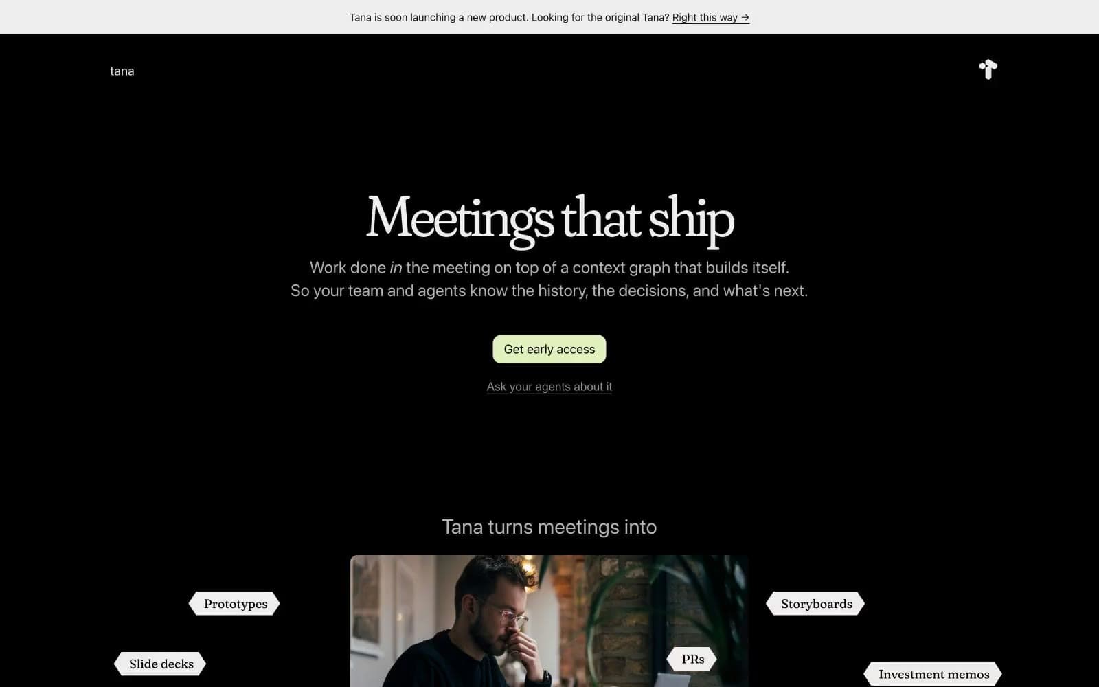
Tana
Productivity
Railway
Developer tools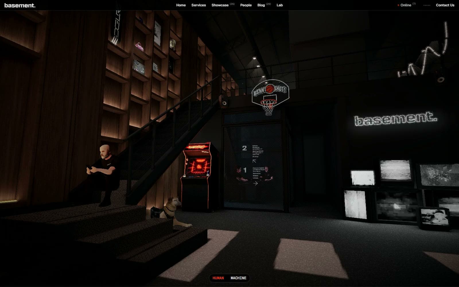
Basement Studio
Studio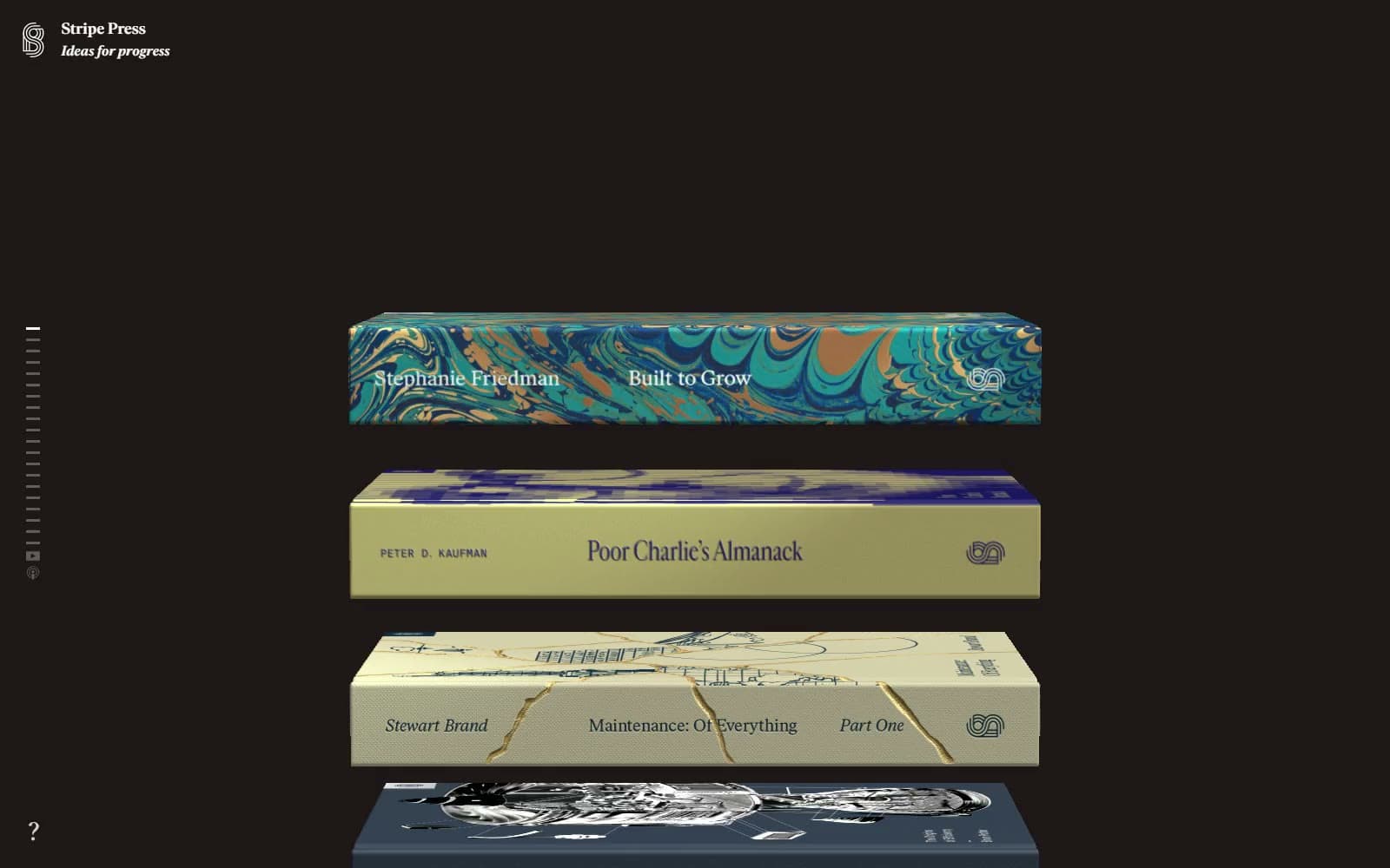
Stripe Press
Media


