
Raycast. Midnight command center, coral neon.
- Productivity
- Dark theme
- 17 colors
- 4 typefaces
Raycast reads as a dark power-tool cockpit: an almost-black canvas (#040506) with barely-visible elevation steps, a single warm coral accent (#ff6363) that carries brand identity, and quiet white/gray typography in Inter. Components are defined less by shadows and more by hairline borders, inset highlight strokes, and the distinctive 'keyboard key' inner-shadow treatment that makes cards feel pressed and tactile rather than floating. Color is rationed — the page is 98% achromatic, and the coral appears only in the logo, hero artwork, AI badge, and the occasional warm-tinted surface. Navigation floats with a glass-blur effect, and most interactive surfaces are neutral light-gray buttons on dark, not chromatic CTAs. The hero abandons the system entirely with large red/blue gradient geometry, then the rest of the page returns to the austere dark surface — contrast through atmosphere, not decoration.
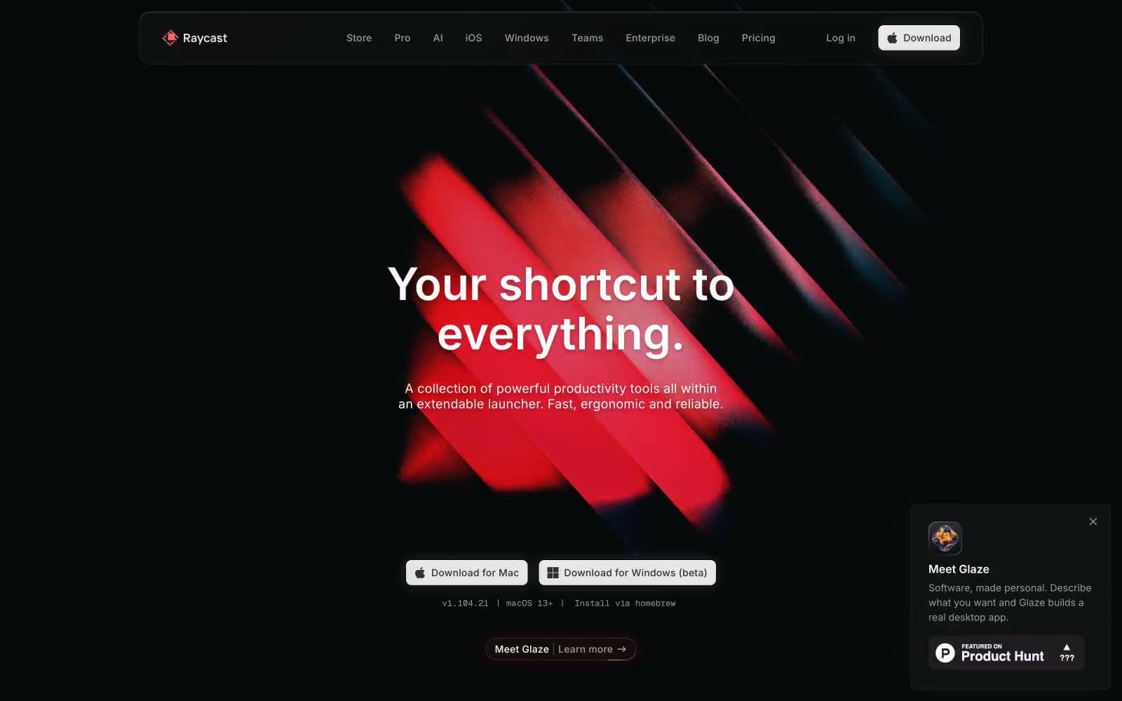
Raycast design system

Brand2
Brand accent — logo diamond, AI badge fill, hero artwork saturation, the single warm punctuation in an achromatic system
Warm-tinted card backgrounds, accent surface tints — desaturated coral used as a muted backdrop for coral-anchored content
Accent5
Hero illustration mid-tone, decorative gradient — appears only in the dramatic abstract hero artwork, not in interface controls
Hero illustration stroke, deep gradient anchor — paired with Electric Sky in the hero's blue geometry
Hero illustration fill, darkest blue in the artwork gradient — not a UI token
Blue wash for highlight backgrounds, decorative bands, and soft emphasis behind content. Use as a supporting accent, not as a status color
Green wash for highlight backgrounds, decorative bands, and soft emphasis behind content. Use as a supporting accent, not as a status color
Neutrals10
Page canvas, dominant background — the near-pure-black base that most of the interface sits on
Card surfaces, elevated panels, image backgrounds — one step up from the canvas for content blocks
Subtle surface tint, pressed states, input wells — used for slight depth on form fields and recessed containers
Neutral form states, badge text, and quiet UI feedback where color should stay understated.
Dark button borders and labels on ghost/dark buttons
Button text on light fills, mid-gray borders — paired with Mist for filled button labels
Secondary body text, muted labels — the everyday reading color on dark surfaces
Light text on dark surfaces, inverse labels, and high-contrast captions.
Light neutral action fill for buttons on dark surfaces.
Headings, high-emphasis text, reversed text on light buttons — the loudest text color in the system
Try a pairing
Pick any two colors from the palette to check whether text stays readable on top.
Aa
Void Black on Coral Pulse
7.01 : 1 contrast
- Body textPasses AA 4.5
- Large textPasses AA 3
- StrictPasses AAA 7
More DESIGN.md files. Same web, different personalities.
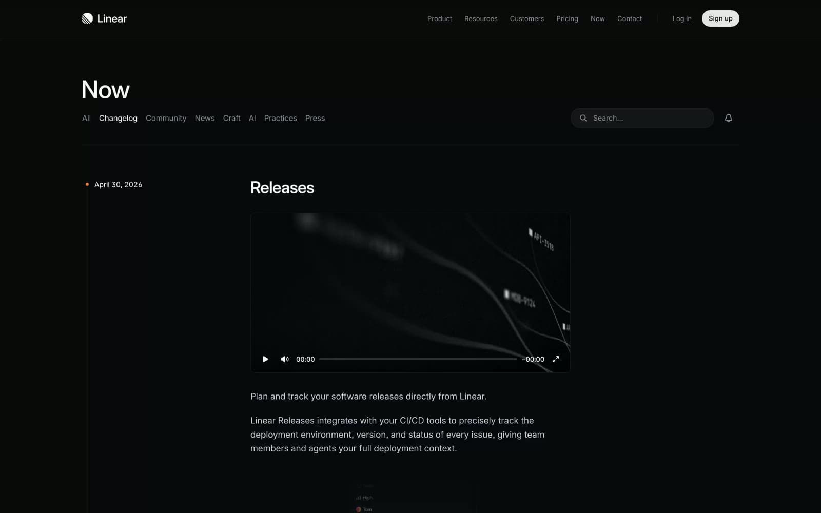
Changelog
Productivity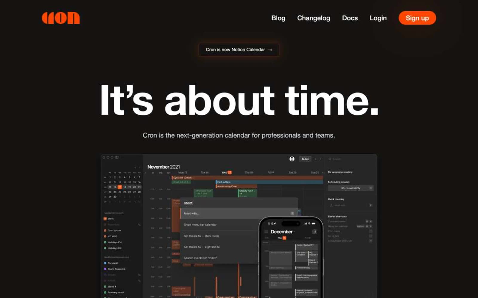
Cron Calendar
Productivity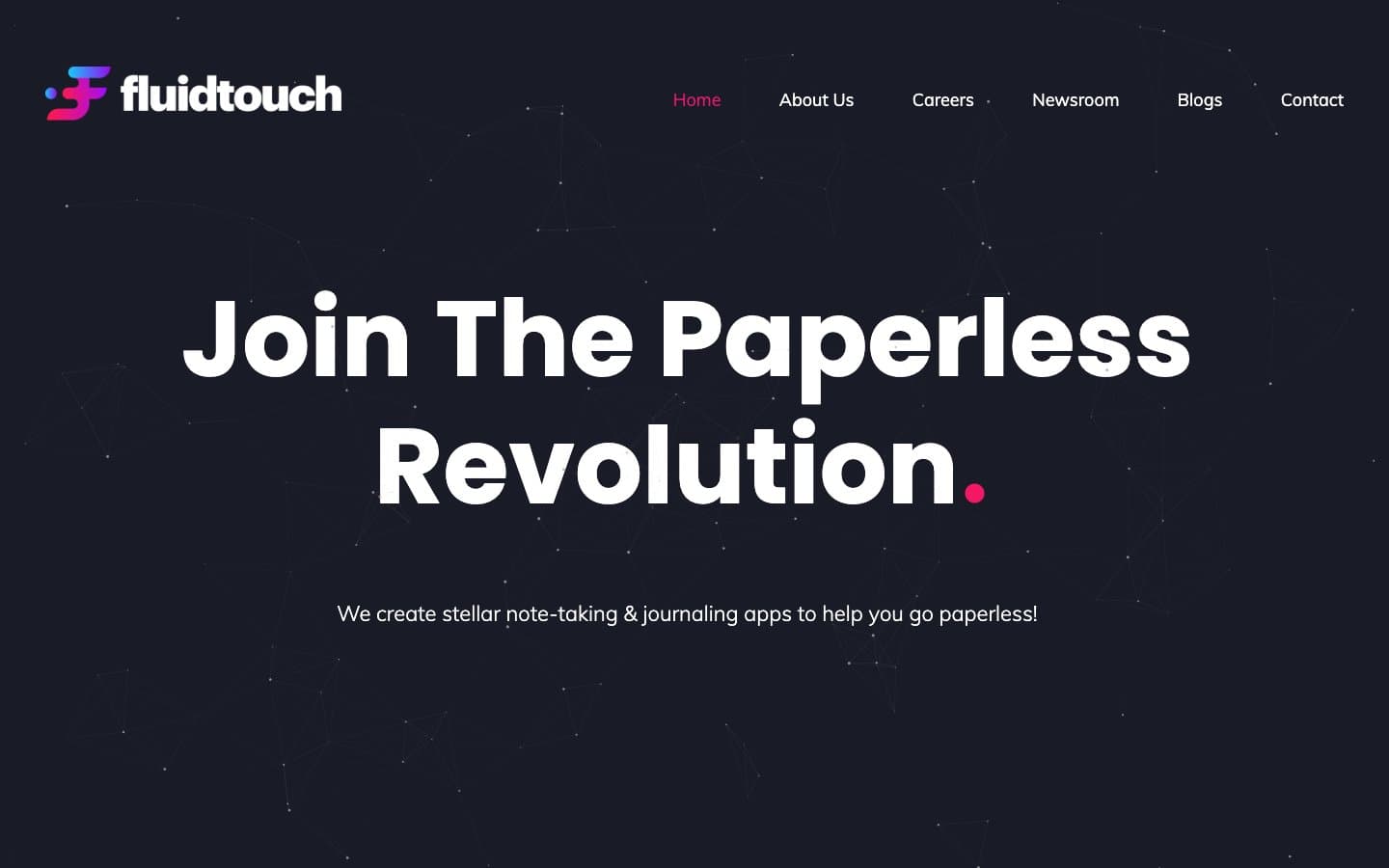
Fluidtouch
Productivity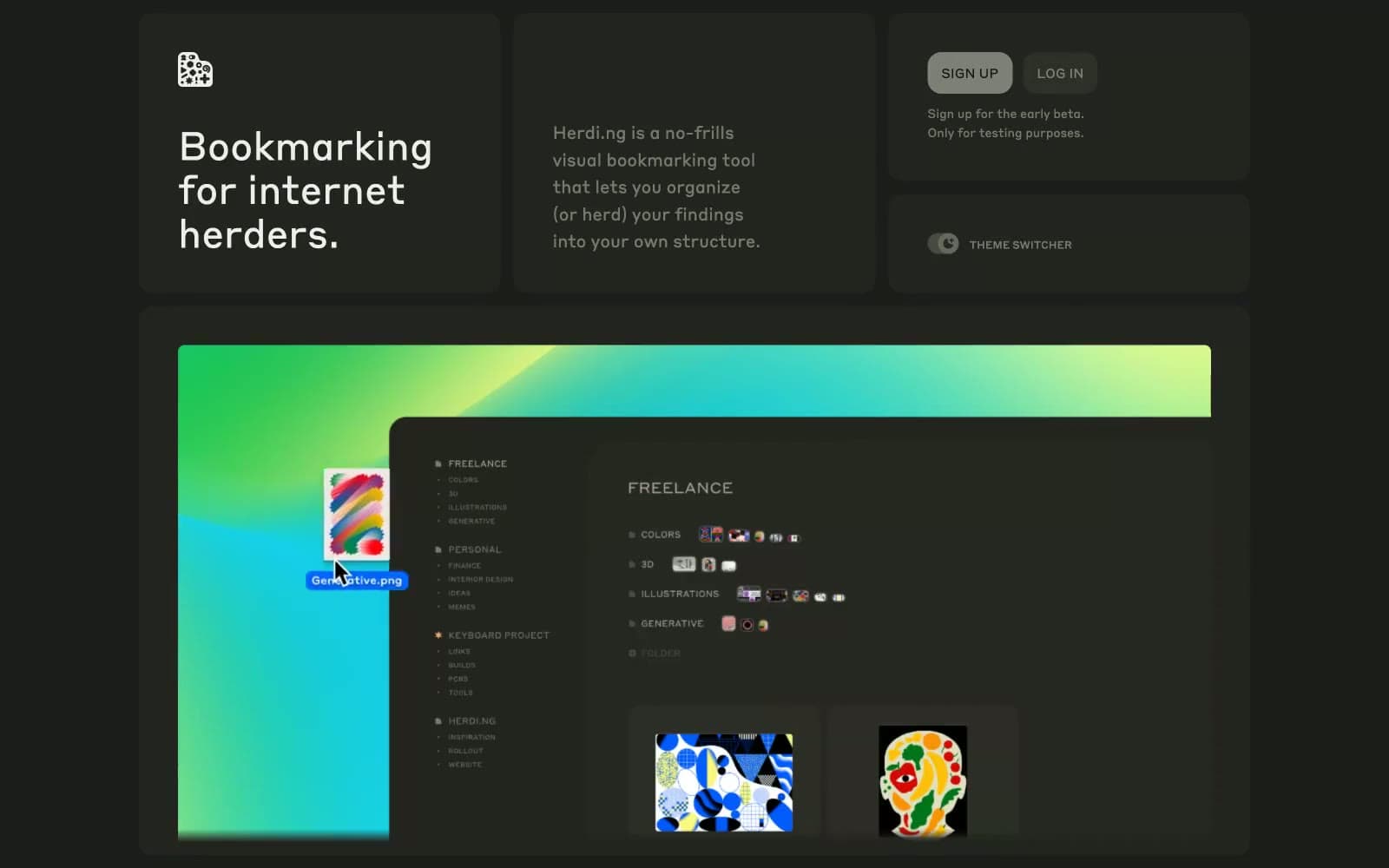
herding.app
Productivity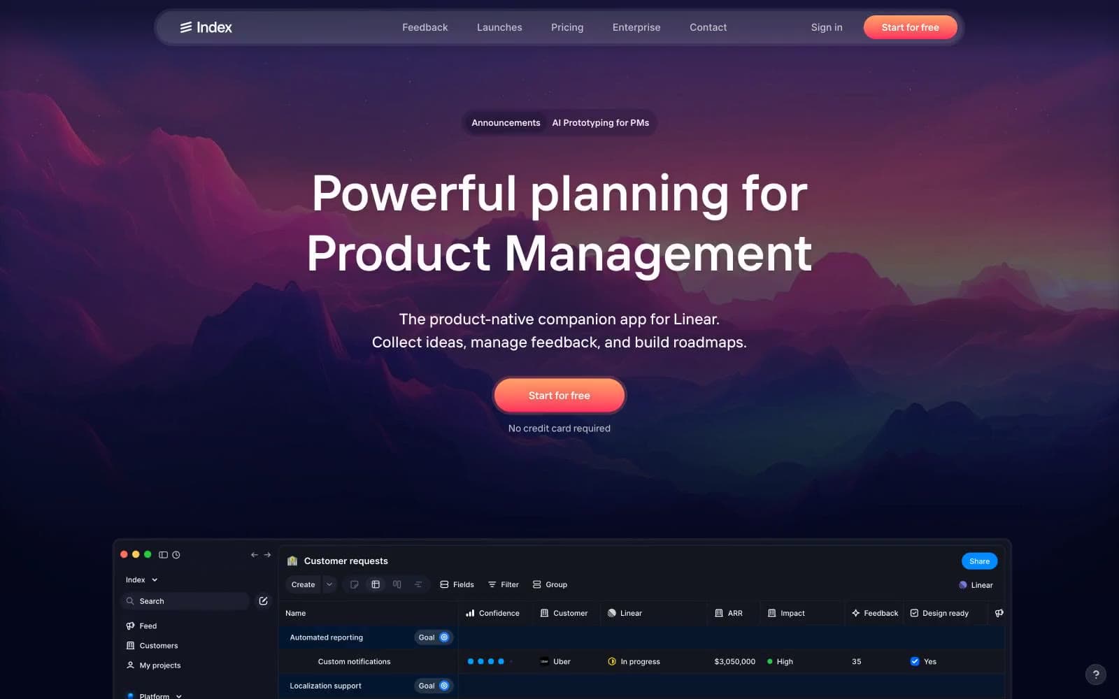
Index
Productivity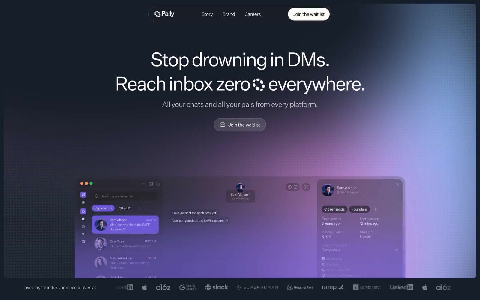
Pally
Productivity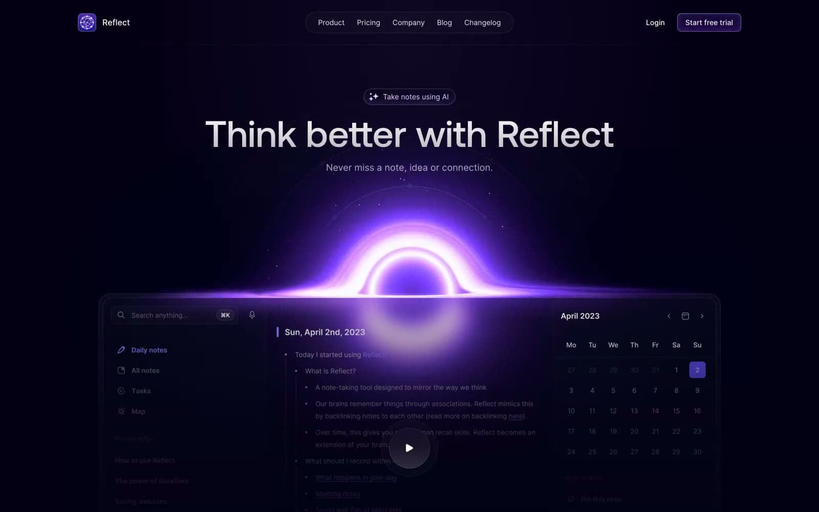
Reflect Notes
Productivity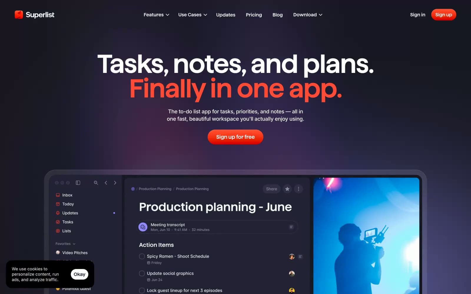
Superlist
Productivity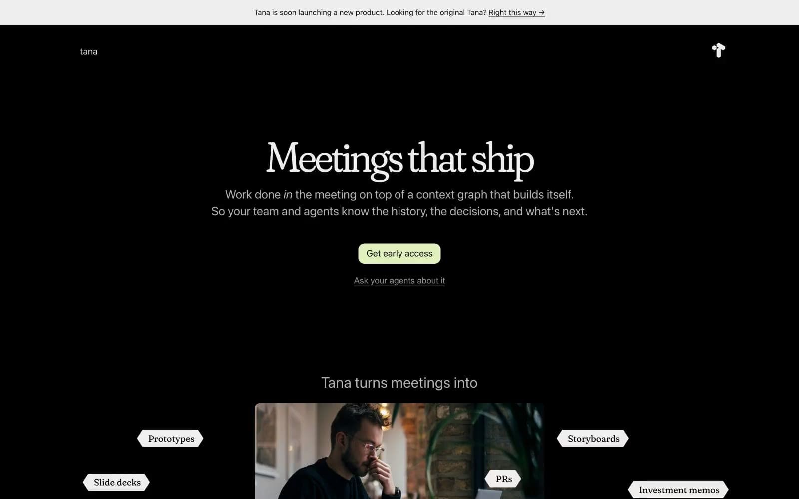
Tana
Productivity
Railway
Developer tools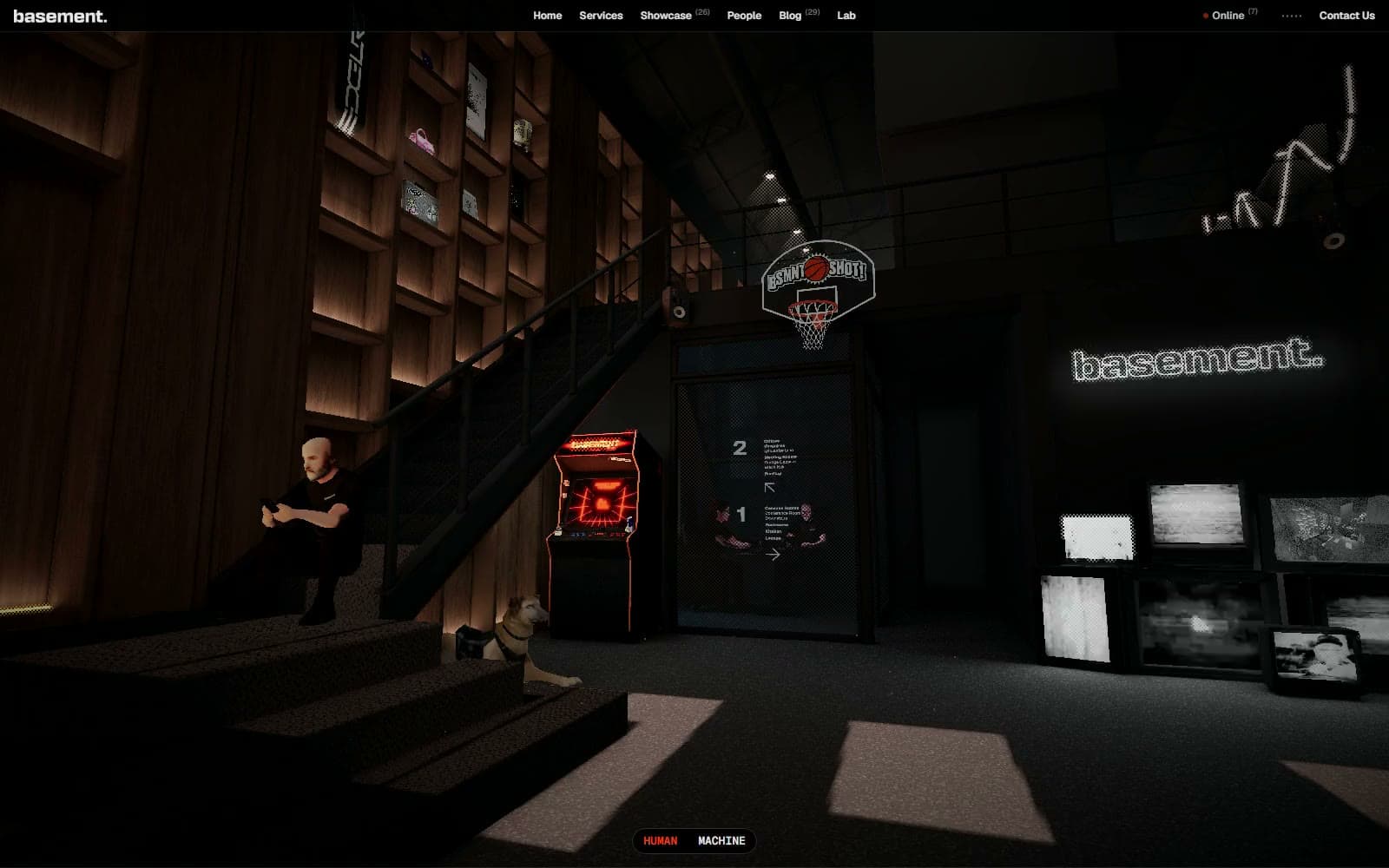
Basement Studio
Studio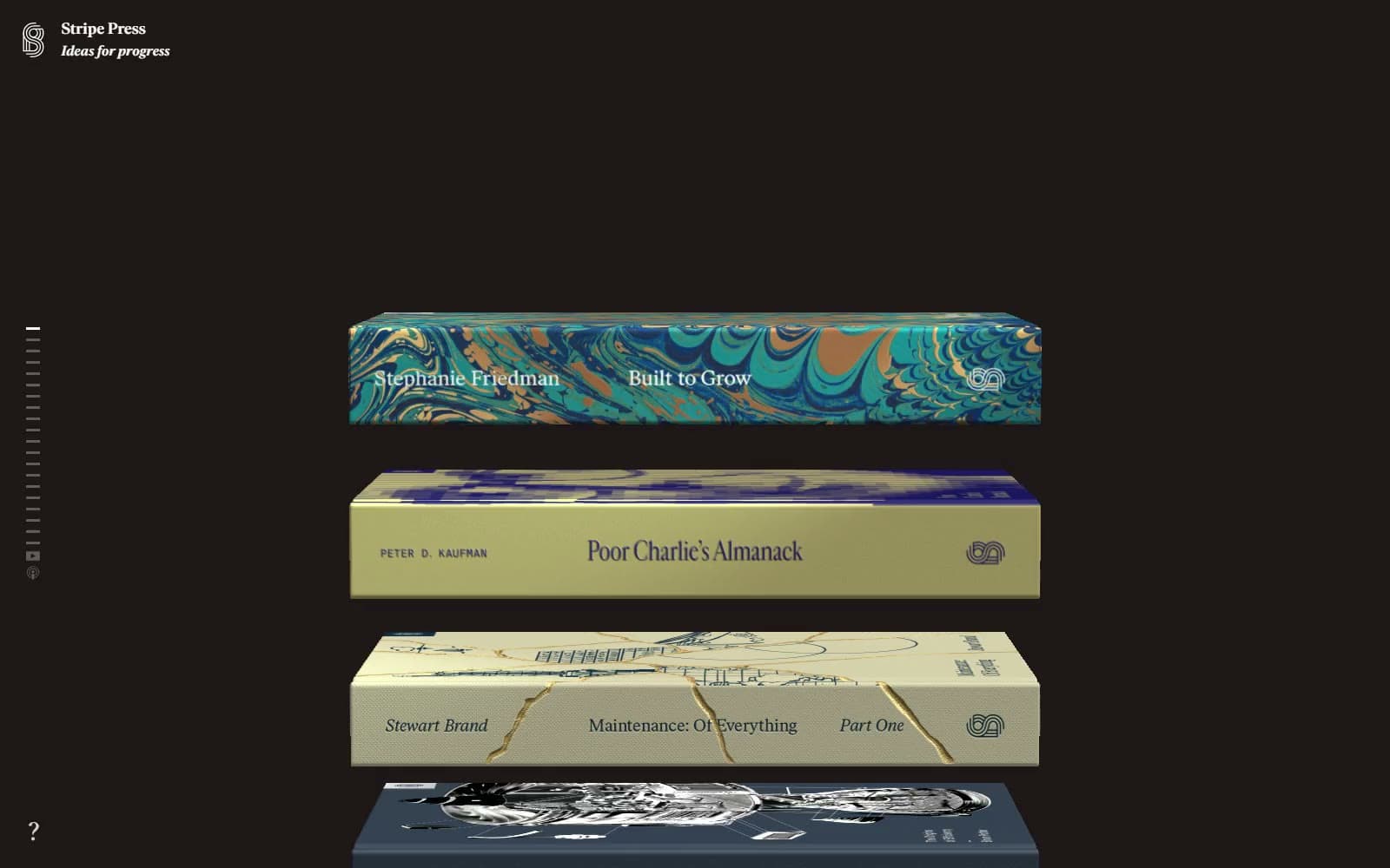
Stripe Press
Media


