
Pally. Violet signals in a dark void.
- Productivity
- Dark theme
- 11 colors
- 2 typefaces
Pally's marketing site is a near-monochrome dark canvas where the product is the only source of color. The page reads as a quiet, editorial space: a deep navy void, white display type set in a custom grotesque with aggressive negative tracking, and a single white pill CTA that functions as the lone bright object on screen. Color is entirely deferred to the in-app screenshot — violet glass panels, indigo chat bubbles, pink-to-purple gradient halos behind floating platform icons — which makes the product UI itself feel like the brand's chromatic moment. The layout favors centered compositions, generous negative space, and minimal section count: one hero, one animated platform constellation, one social proof strip. Every component is reduced to its essential silhouette — pill nav, pill button, flat cards, organic glowing blobs — and the absence of shadows, borders, or decorative chrome is the point.
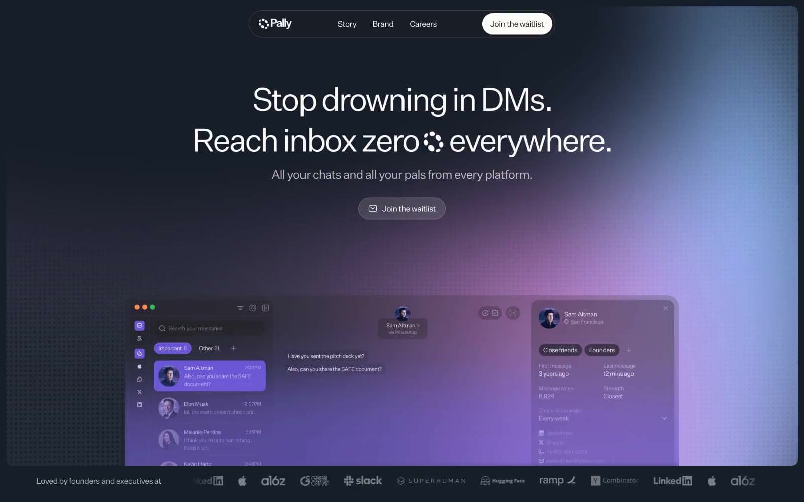
Pally design system

Brand2
Deepest stop in the brand gradient — appears as the terminal indigo in the product UI mockup and the base of floating icon halos
Top stop of the brand gradient — the soft pink-violet that opens the glow behind floating platform icons and tints the product's glass panels
Neutrals9
Hairline borders, image edges, structural dividers — pure black defines outlines where the navy canvas needs edge
Page canvas, hero background, full-bleed sections — the near-black stage on which every other element sits
Deep text and border color for headings and body copy, warm-tinted alternative to pure black
Tertiary metadata, timestamps, dimmed annotations
Sub-label, footer micro-text, disabled-state typography
Muted body text and subdued borders for secondary information
Lighter body text and hairline borders for de-emphasized copy and inactive states
Isolated card or panel surface when a warm off-white is needed against the dark void
Primary text, pill CTA fill, highlight strokes — the only fully bright object against the dark canvas
Try a pairing
Pick any two colors from the palette to check whether text stays readable on top.
Aa
Carbon Border on Lilac Wash
12.19 : 1 contrast
- Body textPasses AA 4.5
- Large textPasses AA 3
- StrictPasses AAA 7
More DESIGN.md files. Same web, different personalities.
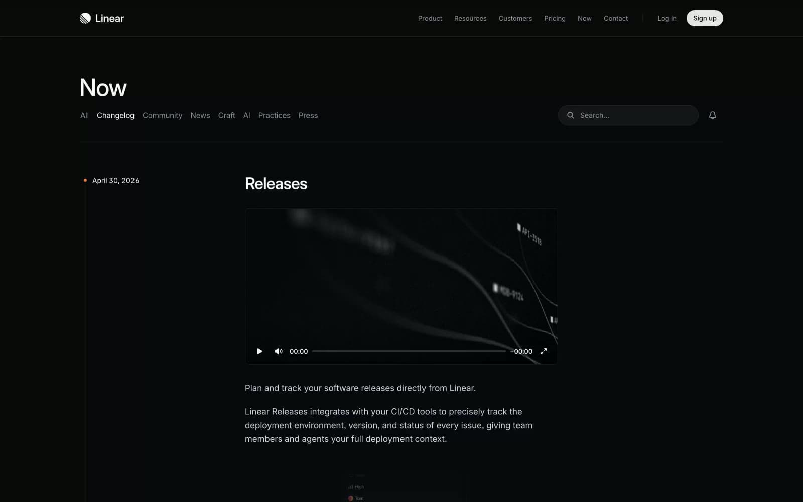
Changelog
Productivity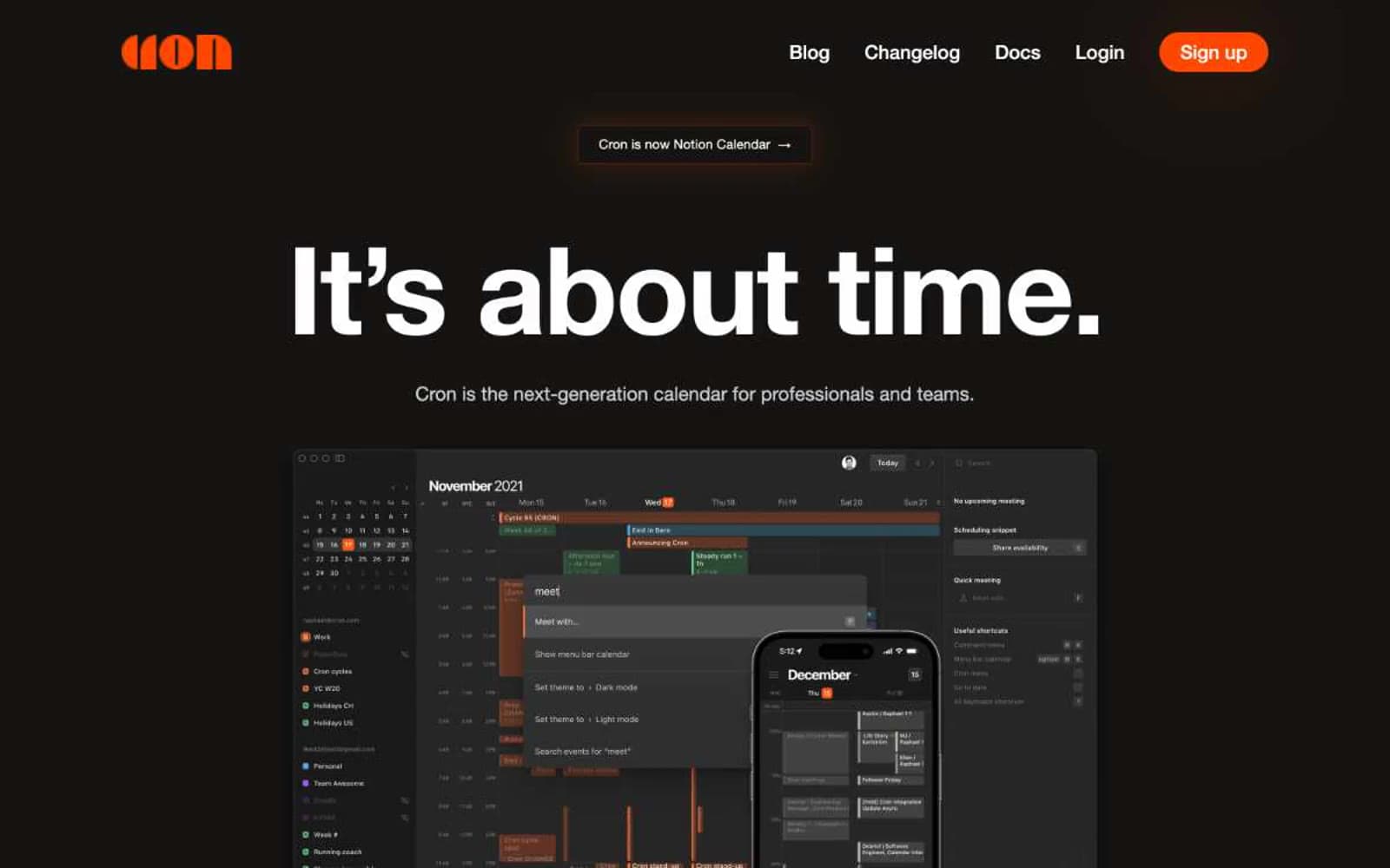
Cron Calendar
Productivity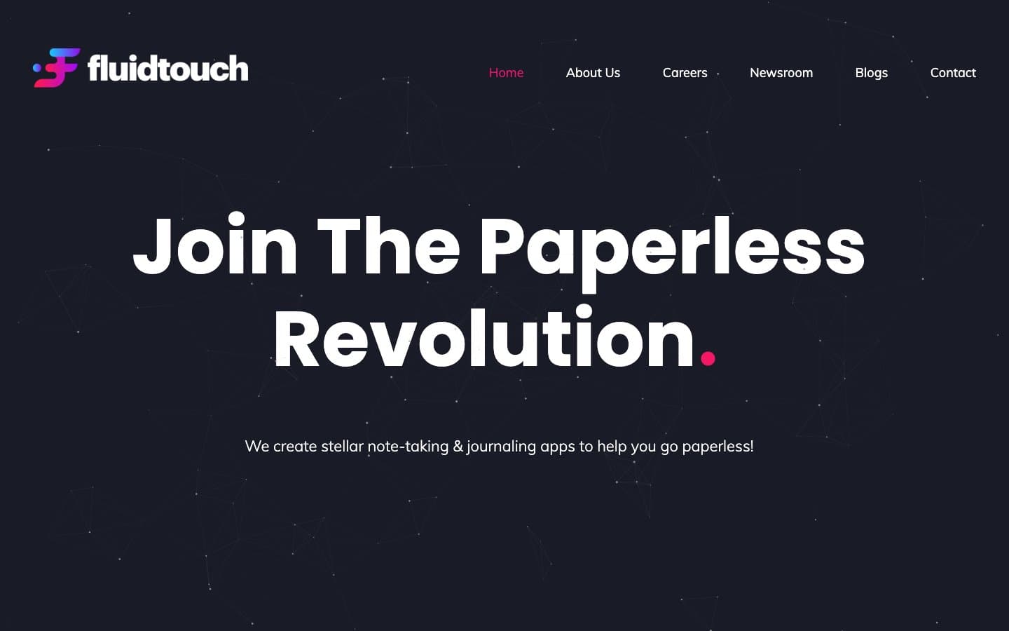
Fluidtouch
Productivity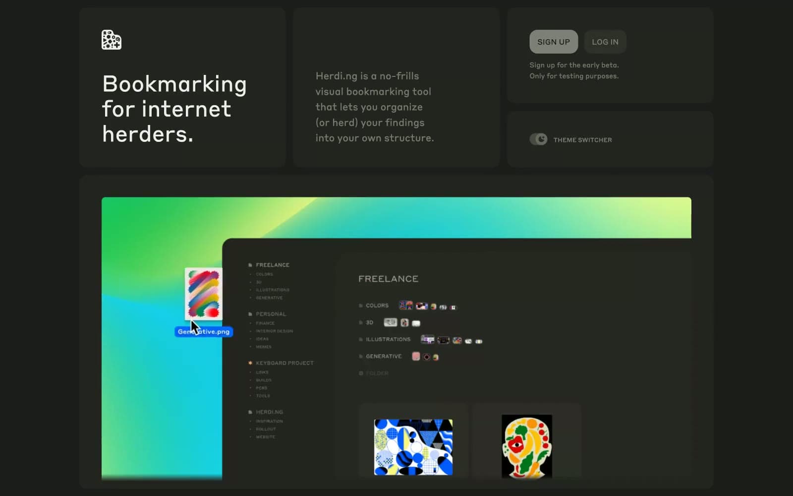
herding.app
Productivity
Index
Productivity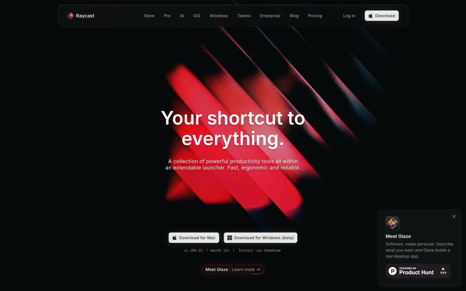
Raycast
Productivity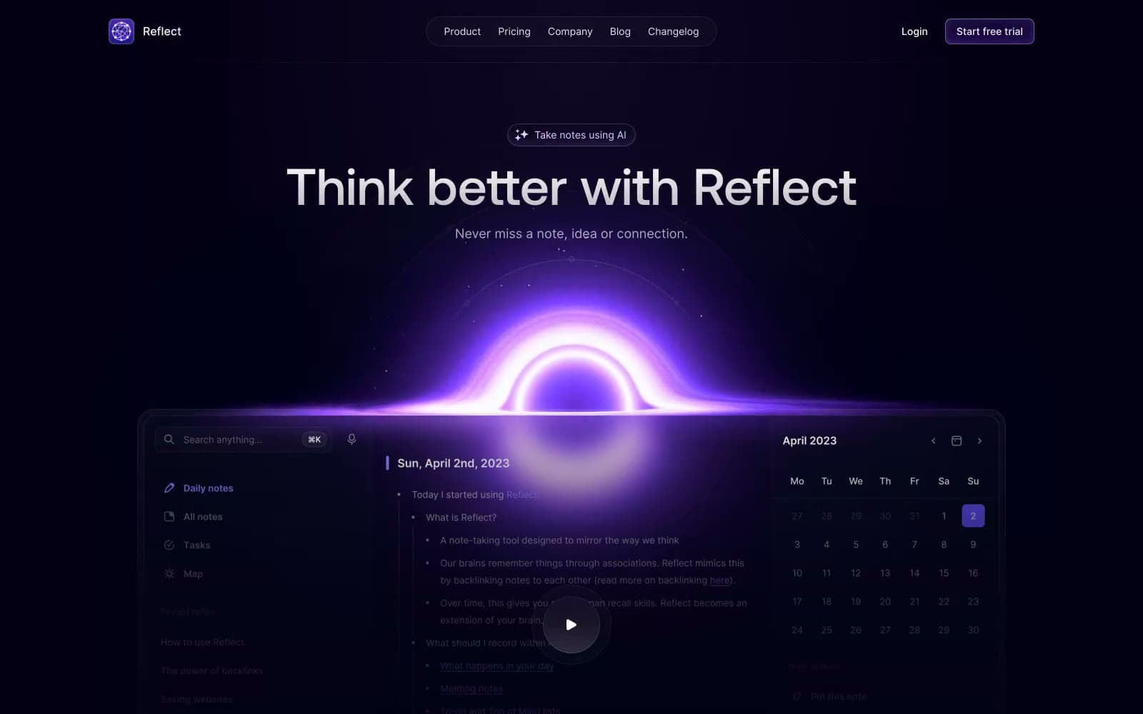
Reflect Notes
Productivity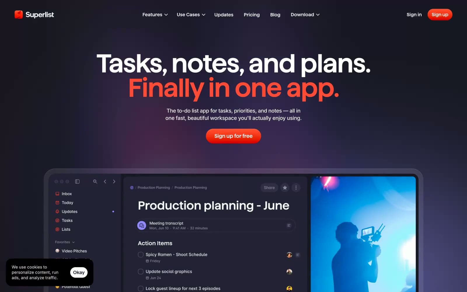
Superlist
Productivity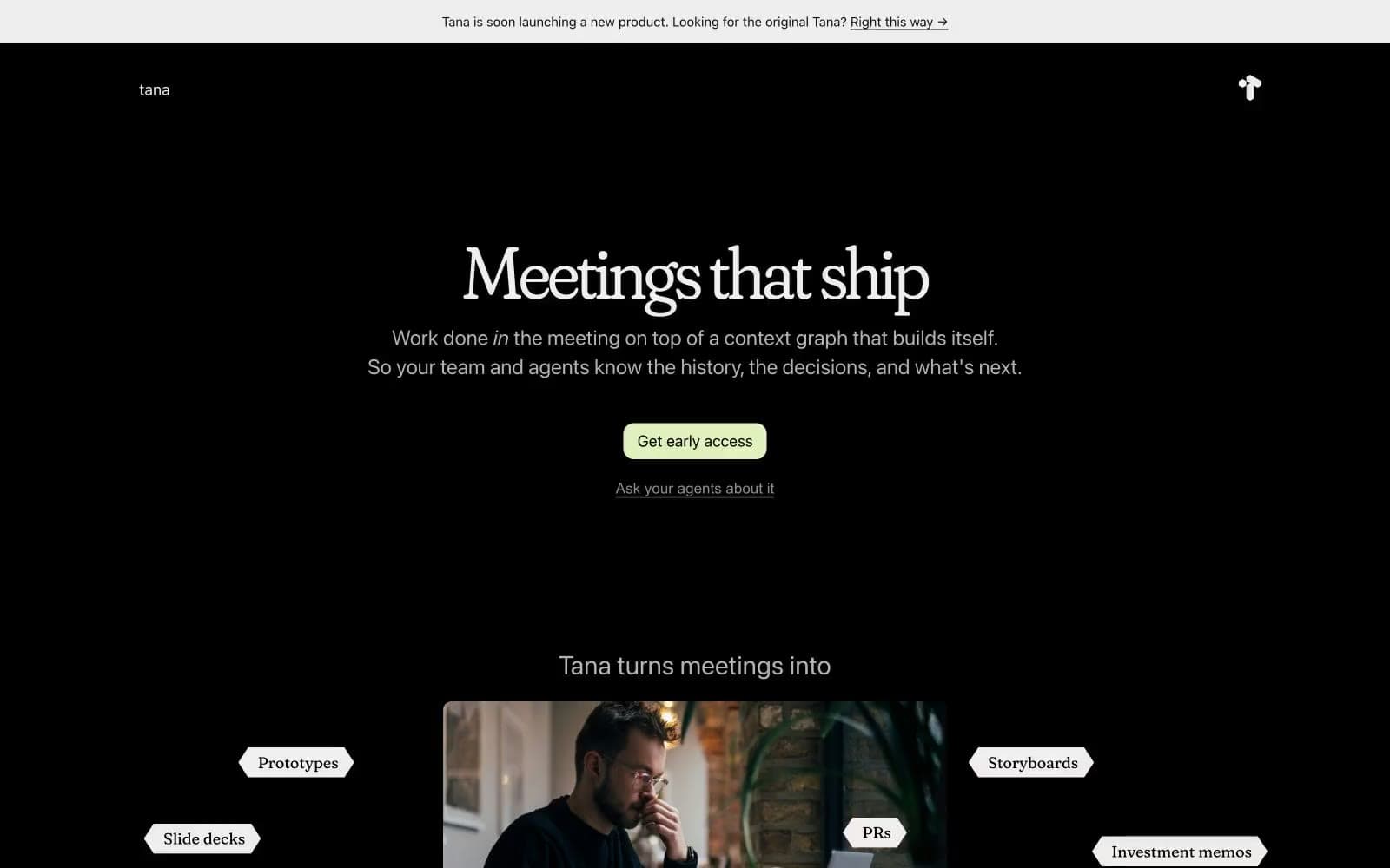
Tana
Productivity
Railway
Developer tools
Basement Studio
Studio
Stripe Press
Media


