
herding.app. Monochrome editorial dark UI broken by one vivid teal-lime wash.
- Productivity
- Dark theme
- 11 colors
- 1 typeface
Herding operates as a dim, warm-toned control room: a near-black canvas of olive-charcoal surfaces, one tight utilitarian typeface at every size, and almost no chromatic noise. The interface stays monochrome and editorial — close-set type, generous gutters, soft 16px corners, and a persistent ink-into-paper inset shadow that makes cards feel pressed into the page rather than floating. The single color event is a saturated teal-to-lime gradient used sparingly as a feature banner or highlight wash; everywhere else, hierarchy comes from value contrast between warm grays and a slightly cream off-white. Components are flat, rounded, and weightless — buttons are thin-stroked outlines, tags sit as small monospaced chips, and the only 'accent' punctuation is the gradient itself.
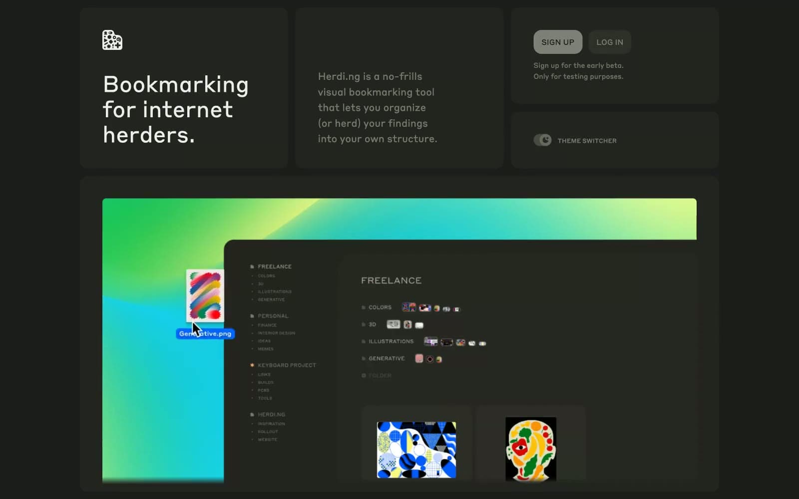
herding.app design system

Brand1
Decorative highlight — the only chromatic accent in the system, used exclusively inside the teal-to-lime gradient banner
Neutrals10
Dark border stroke, hairline separators, outline button border on hover
Deepest page background, behind everything; the recessed layer
Primary card and surface — most panels, modals, and elevated containers
Canvas-level surface, outer page background, content area baseline
Subtle surface lift, nested card backgrounds, hover wash
Higher elevation tier, active rows, secondary surface
Button and chip backgrounds, pressed states
Secondary muted text, captions, inactive controls; Reserved for button/dark accents
Mid-level text, metadata, helper copy, list labels — warm gray that holds presence without competing with primary text
Primary text, icon strokes, heading color — slightly cream warm-white reads softer than pure #fff against olive-charcoal surfaces
Try a pairing
Pick any two colors from the palette to check whether text stays readable on top.
Aa
Off-White Ink on Bistre Border
18.10 : 1 contrast
- Body textPasses AA 4.5
- Large textPasses AA 3
- StrictPasses AAA 7
More DESIGN.md files. Same web, different personalities.
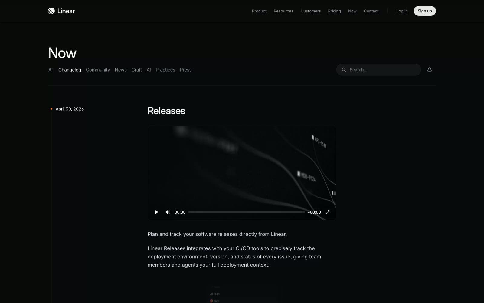
Changelog
Productivity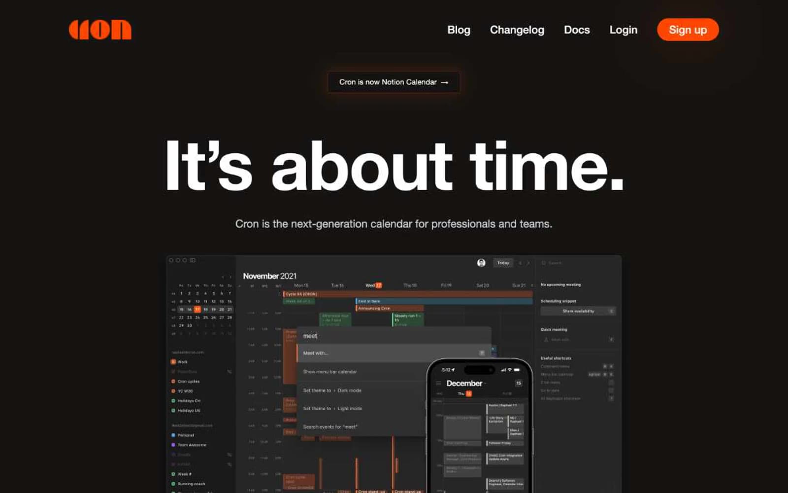
Cron Calendar
Productivity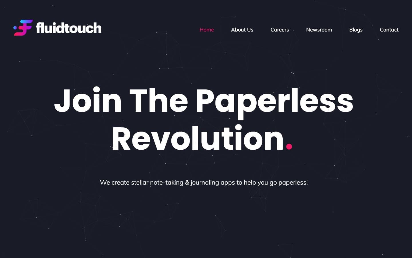
Fluidtouch
Productivity
Index
Productivity
Pally
Productivity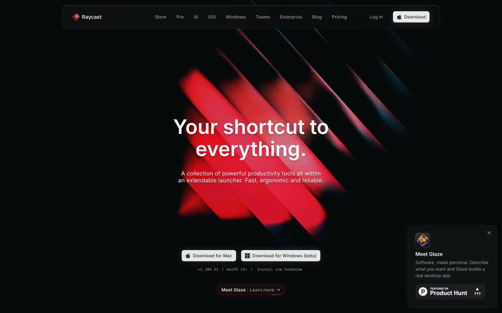
Raycast
Productivity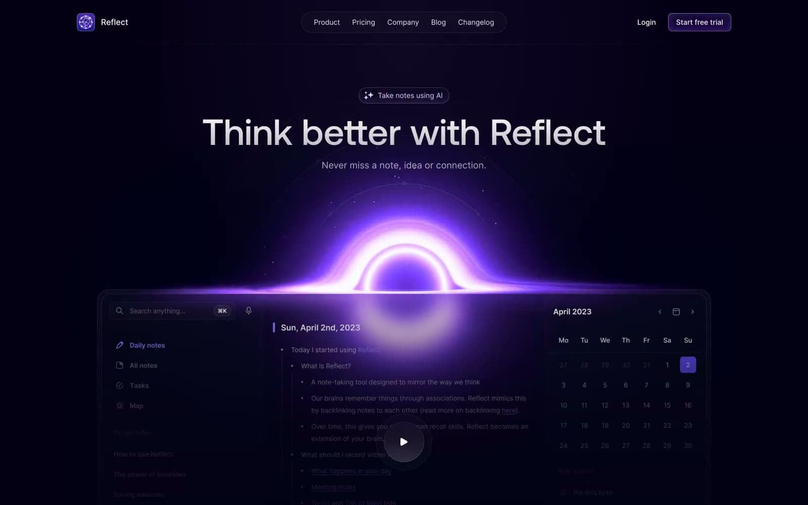
Reflect Notes
Productivity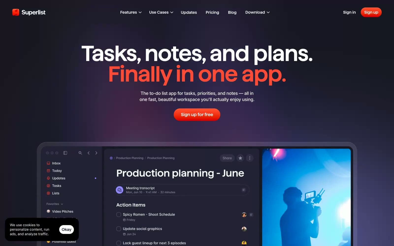
Superlist
Productivity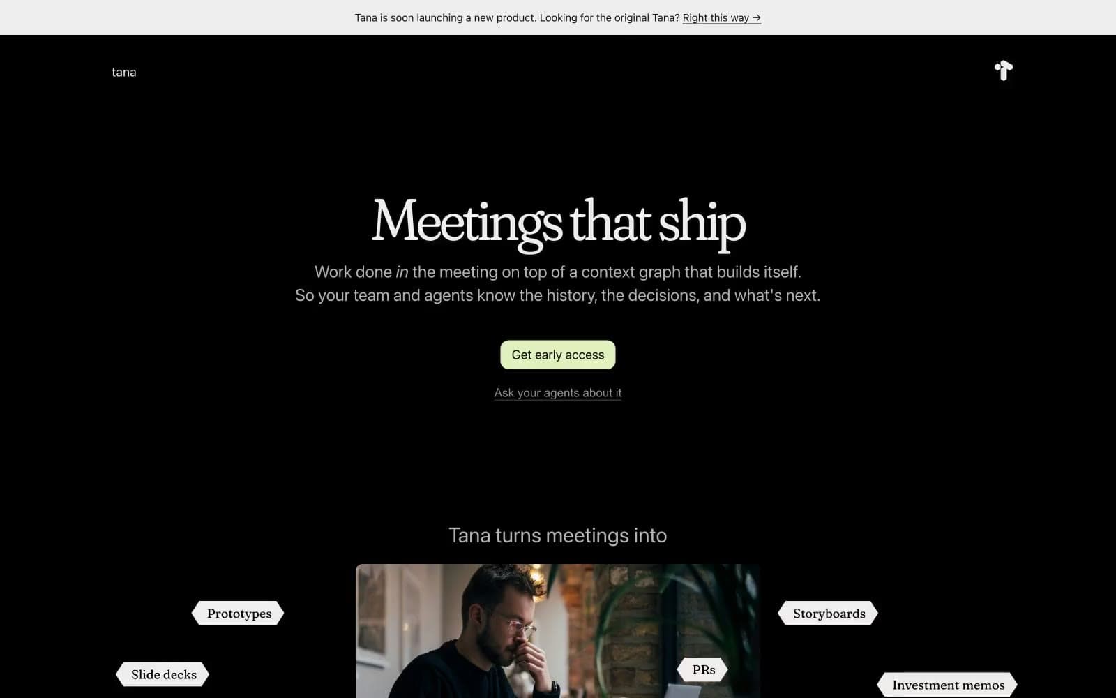
Tana
Productivity
Railway
Developer tools
Basement Studio
Studio
Stripe Press
Media


