
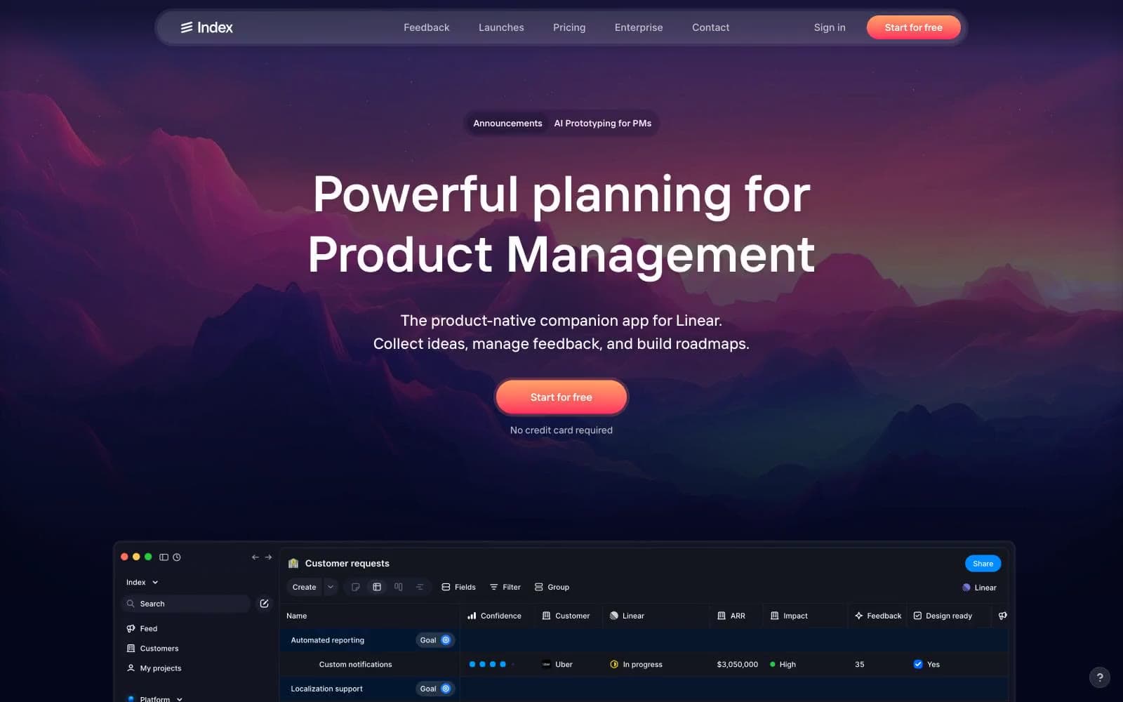
Index. A violet-tinted dark dashboard crowned by a single mountain horizon at dusk, where the only warm light is the coral CTA.
- Productivity
- Dark theme
- 16 colors
- 3 typefaces
Index operates as a twilight alpine command center: a near-black canvas tinted with deep indigo and violet, overlaid with high-density product UI and crowned by a single dramatic peak-against-dusk landscape. The system stays nocturnal — backgrounds are violet-shifted blacks (#0c0a2b, #13151f), borders are muted violet hairlines (#292a4d), and text is bone-white (#ffffff) with a graphite secondary (#9b9ba4). The lone warm signal is a coral-to-red gradient (#ff8a76 → #ff3a63) reserved exclusively for the primary CTA — it reads as sunrise breaking the ridge, demanding attention against the cold palette. Inside product surfaces, color is functional punctuation: small saturated dots (electric blue #0067ff, violet #665eff, vivid red #ff3a63, chartreuse #ffff00) mark status, priority, and category. Cards float on the dark canvas with 1px violet borders, no shadows — the surface system relies on luminance steps and border weight, not elevation. Typography is compact, geometric, and slightly tracked-out at small sizes, with a custom 'Index' display face (sizes up to 72px) and Inter for the dense table/UI layer.
Index design system

Brand2
Red wash for highlight backgrounds, decorative bands, and soft emphasis behind content
Hero landscape — dramatic cyan-to-indigo-to-violet mountain horizon behind the headline; never used on UI components
Accent3
Blue wash for highlight backgrounds, decorative bands, and soft emphasis behind content
Violet wash for highlight backgrounds, decorative bands, and soft emphasis behind content
Rare decorative accent — zero-friction indicators, callout highlights on screenshots only
Neutrals11
Deepest canvas — modal overlays, deepest surface beneath elevated cards
Primary page canvas — hero sits on this, full-bleed sections
Elevated surface — card backgrounds, panel containers, dropdowns
Secondary surface — table rows, list items, inset wells
Secondary border — subtle separators, nav container edge
Primary border — card outlines, dividers, table cell borders
Hover surface and subtle fills — input backgrounds, selected row highlights
Tertiary border — checkbox frames, input outlines, ghost button border
Secondary text — captions, helper text, metadata, muted labels
Tertiary text — placeholders, disabled labels, nav secondary
Primary text, icon stroke, and surface highlights — the dominant high-contrast value across all text and icon contexts
Try a pairing
Pick any two colors from the palette to check whether text stays readable on top.
Aa
Bone on Electric Blue
4.79 : 1 contrast
- Body textPasses AA 4.5
- Large textPasses AA 3
- StrictFails AAA 7
More DESIGN.md files. Same web, different personalities.
Changelog
Productivity
Cron Calendar
Productivity
Fluidtouch
Productivity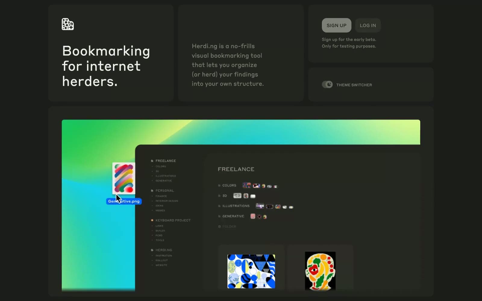
herding.app
Productivity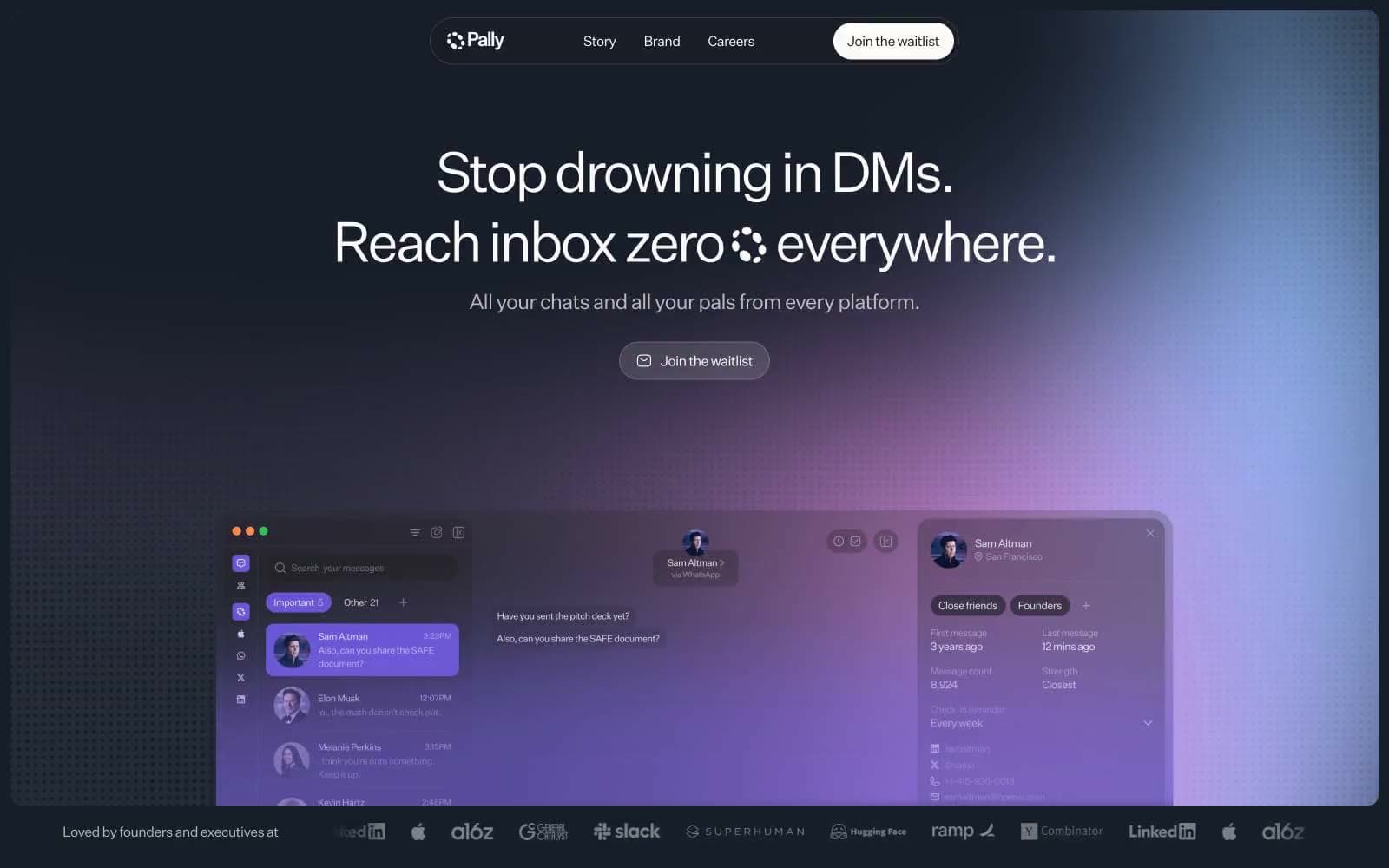
Pally
Productivity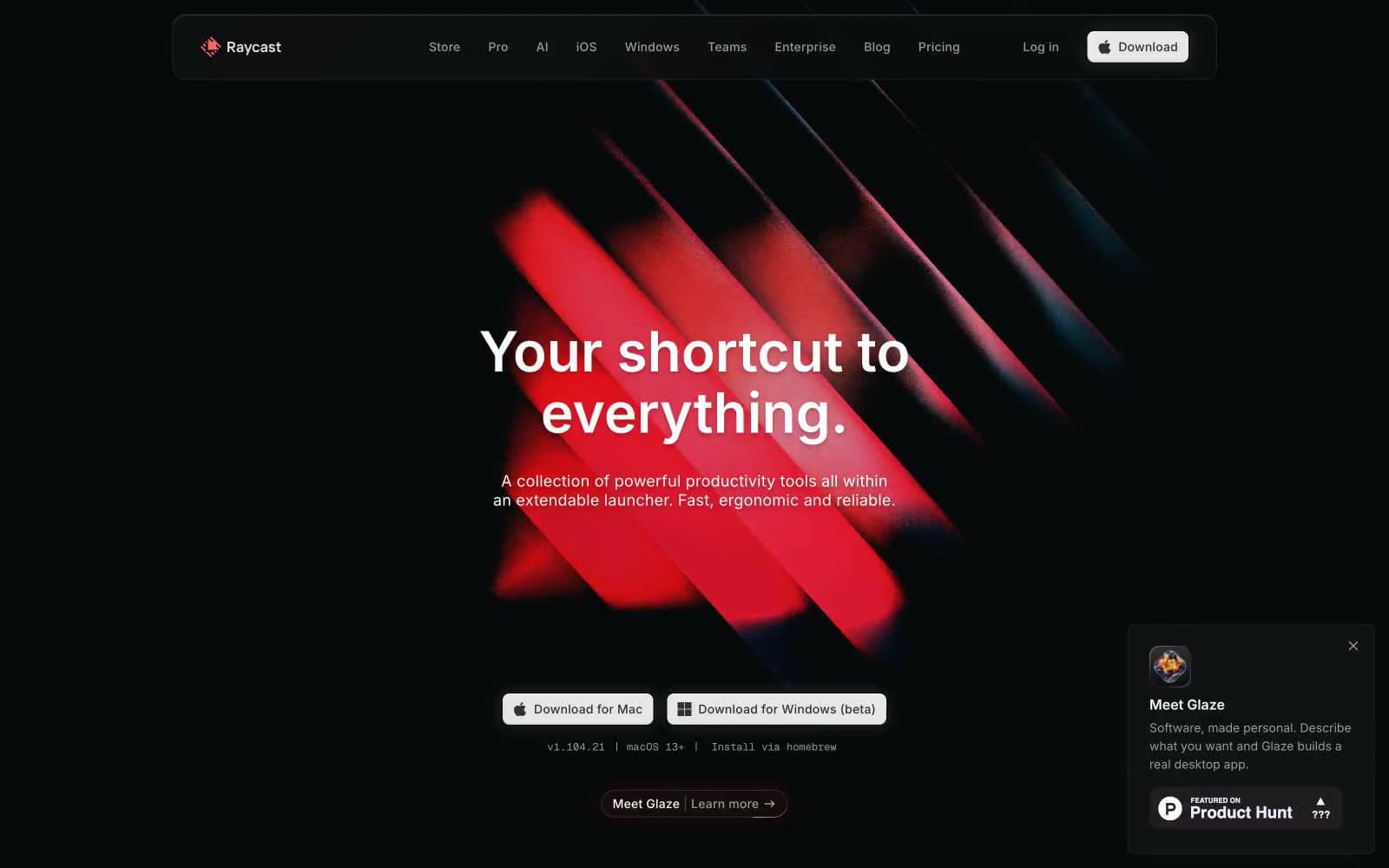
Raycast
Productivity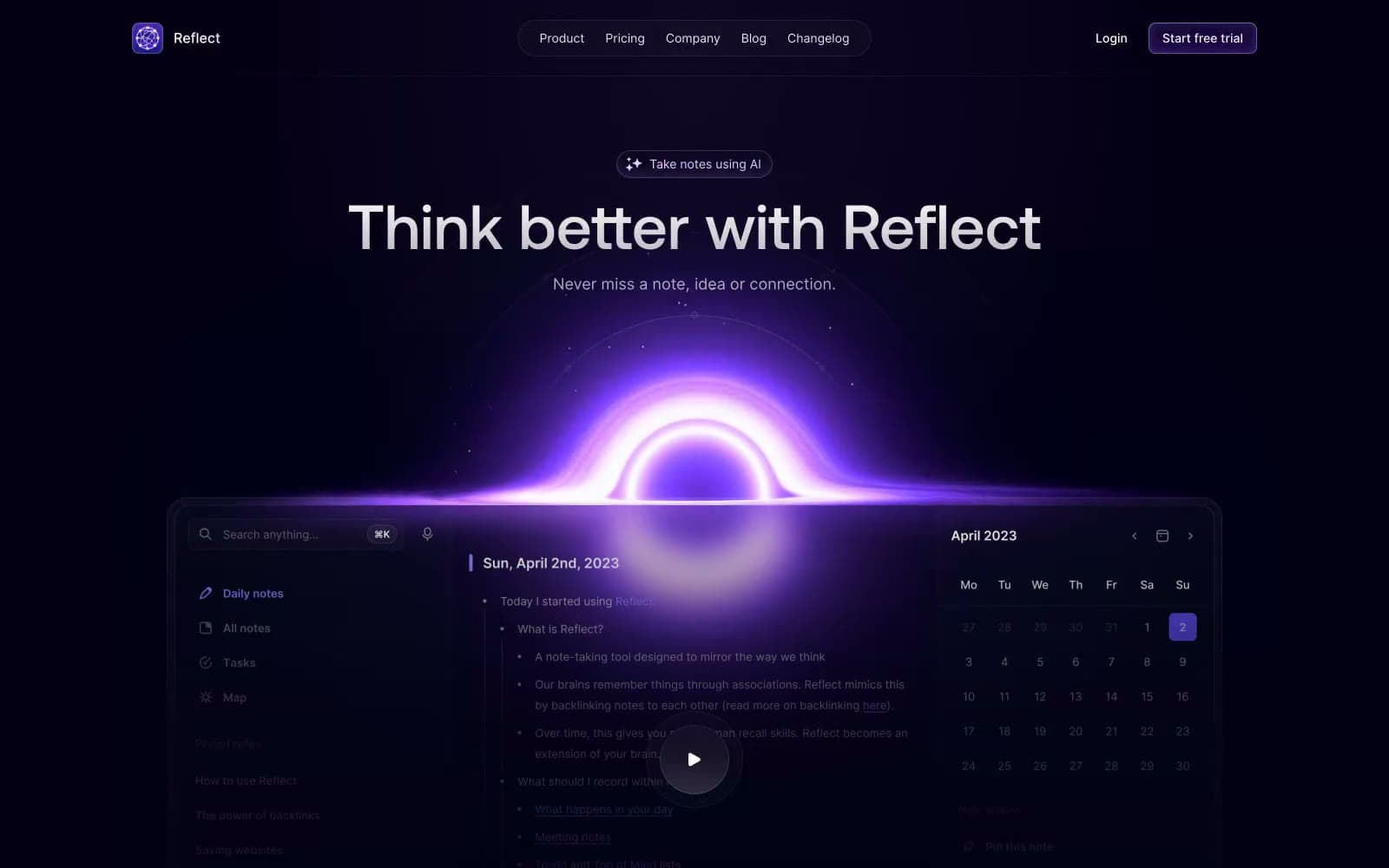
Reflect Notes
Productivity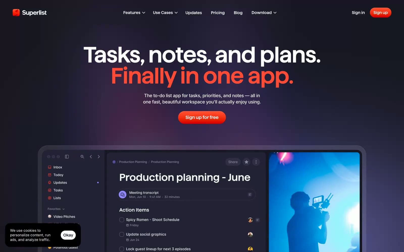
Superlist
Productivity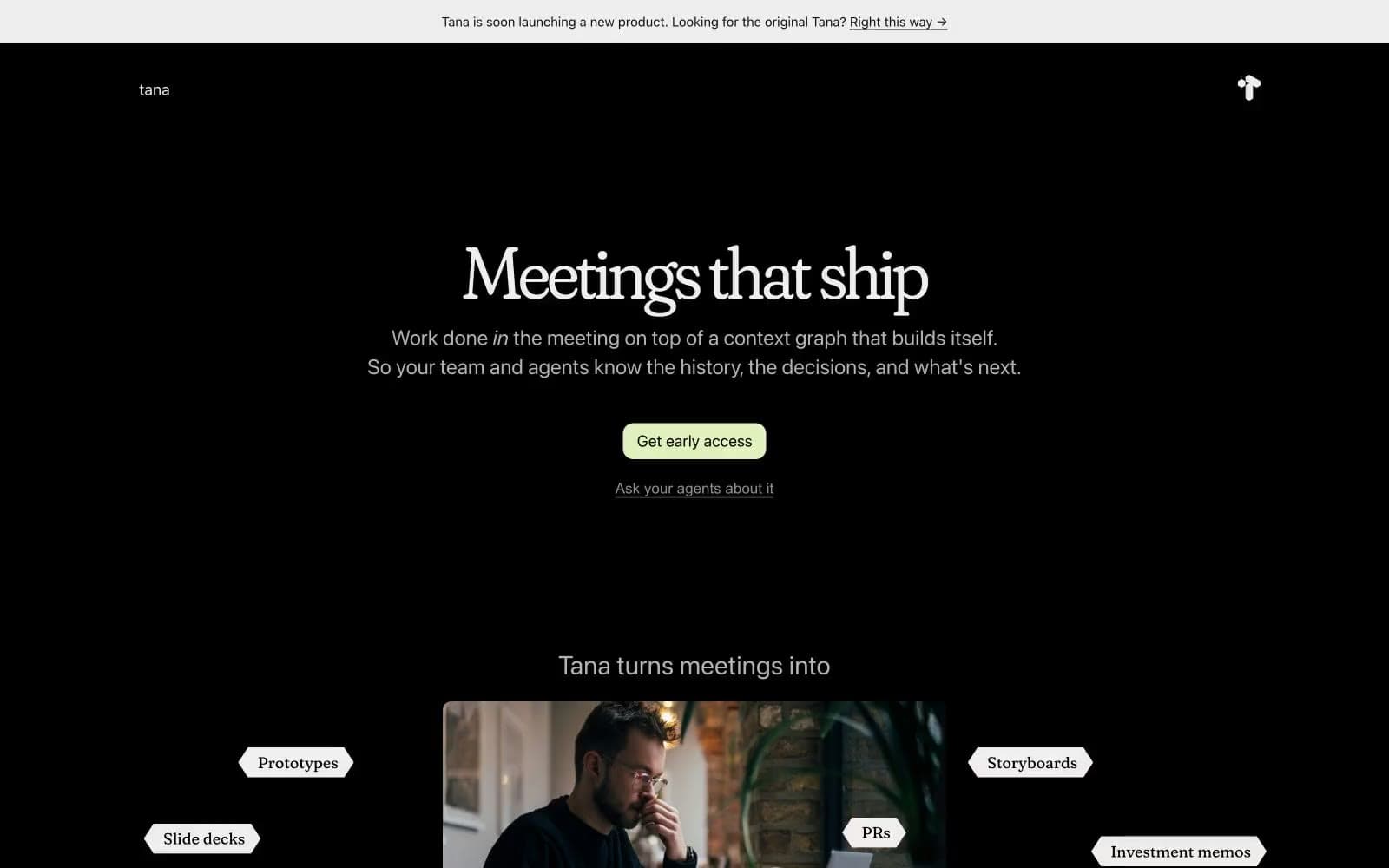
Tana
Productivity
Railway
Developer tools
Basement Studio
Studio
Stripe Press
Media


