Cron Calendar. One warm orange spark burning against a near-black canvas.
- Productivity
- Dark theme
- 7 colors
- 1 typeface
Cron uses a near-monochrome dark canvas with a single ember-orange accent — the visual logic of a luminous clock face in an unlit room. Almost every surface, border, and text element lives in a narrow band of near-black, warm-gray, and white, reserving #ff4700 exclusively for primary actions and brand moments. Type does the heavy lifting: a single 140px display headline at weight 700 with aggressive negative tracking commands the hero, while the rest of the system stays at 13–22px Helvetica Neue. Components are stripped to essentials — a pill-shaped nav chip, a glowing filled CTA, hairline borders, and product screenshots that float on the dark canvas. There are no gradients, no decorative illustrations, and no secondary hues: the design earns its identity through contrast, scale, and restraint.
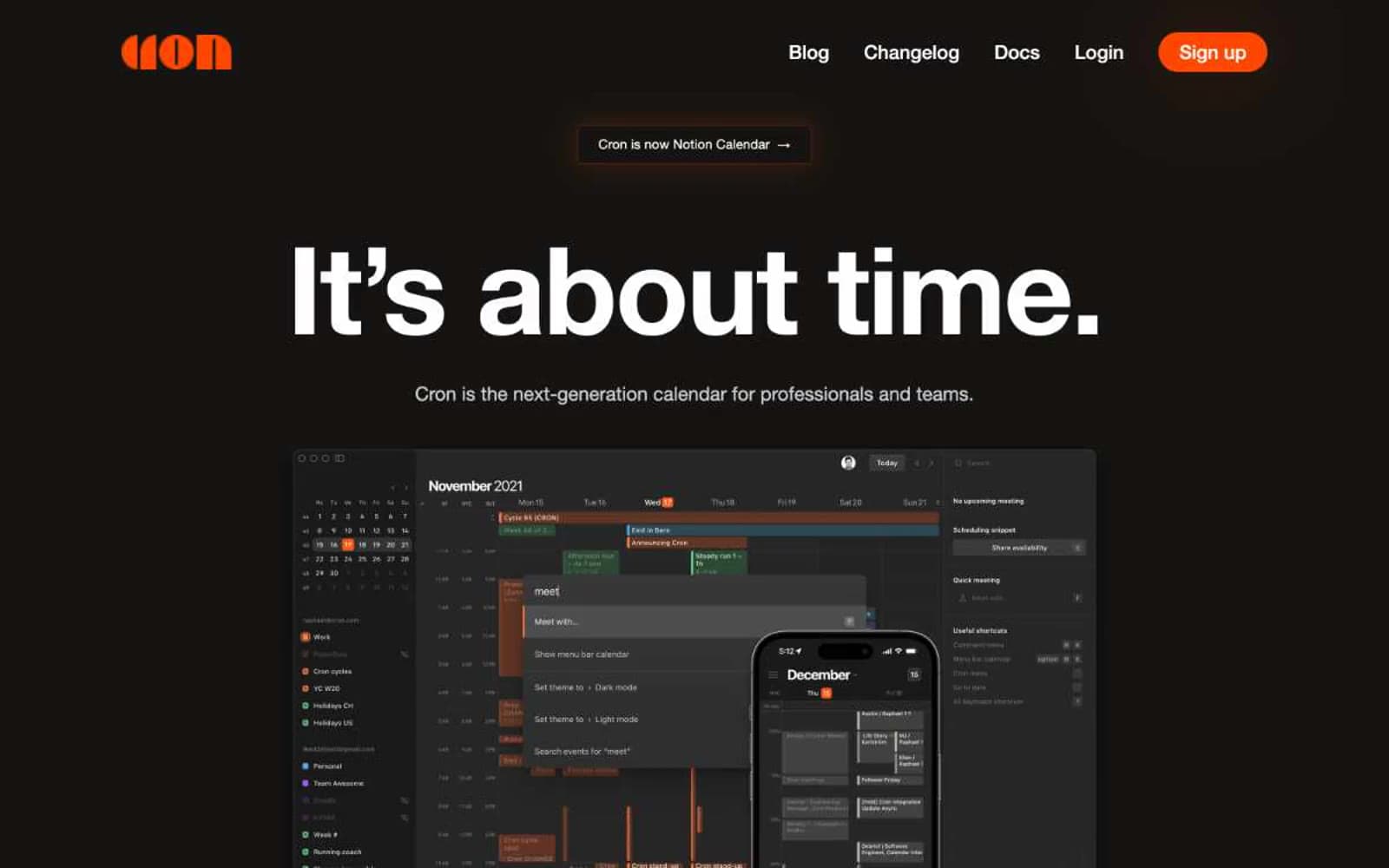
Cron Calendar design system
Brand3
Orange supporting accent for decorative details and low-frequency emphasis. Do not promote it to the primary CTA color
Orange supporting accent for decorative details and low-frequency emphasis. Do not promote it to the primary CTA color
Orange supporting accent for decorative details and low-frequency emphasis. Do not promote it to the primary CTA color
Neutrals4
Page canvas and footer background — the base near-black with a faint warm bias that keeps the UI from feeling clinical
Dark supporting neutral for text, icons, and strong contrast. Do not promote it to the primary CTA color
Body copy, secondary text, hairline borders, icon strokes, footer dividers — the warm neutral that carries the majority of UI content at 95 occurrences
Display headlines, primary headings, nav text, button text on dark fills, and image elements — the highest-contrast white reserved for moments that must shout
Try a pairing
Pick any two colors from the palette to check whether text stays readable on top.
Aa
Obsidian on Ember
5.69 : 1 contrast
- Body textPasses AA 4.5
- Large textPasses AA 3
- StrictFails AAA 7
More DESIGN.md files. Same web, different personalities.
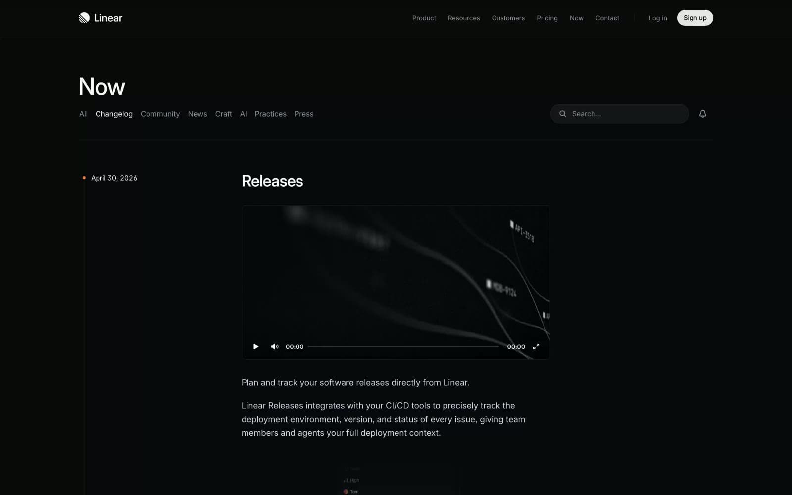
Changelog
Productivity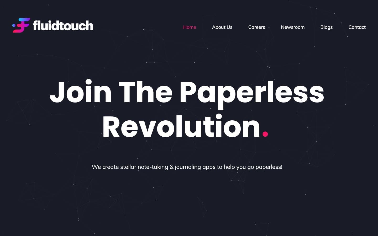
Fluidtouch
Productivity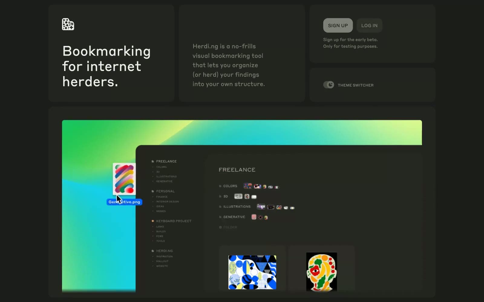
herding.app
Productivity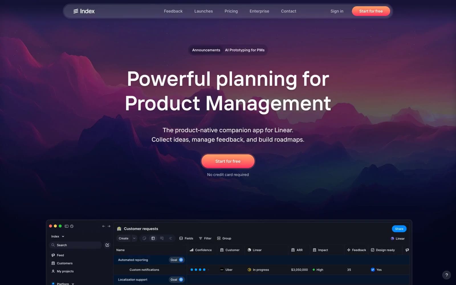
Index
Productivity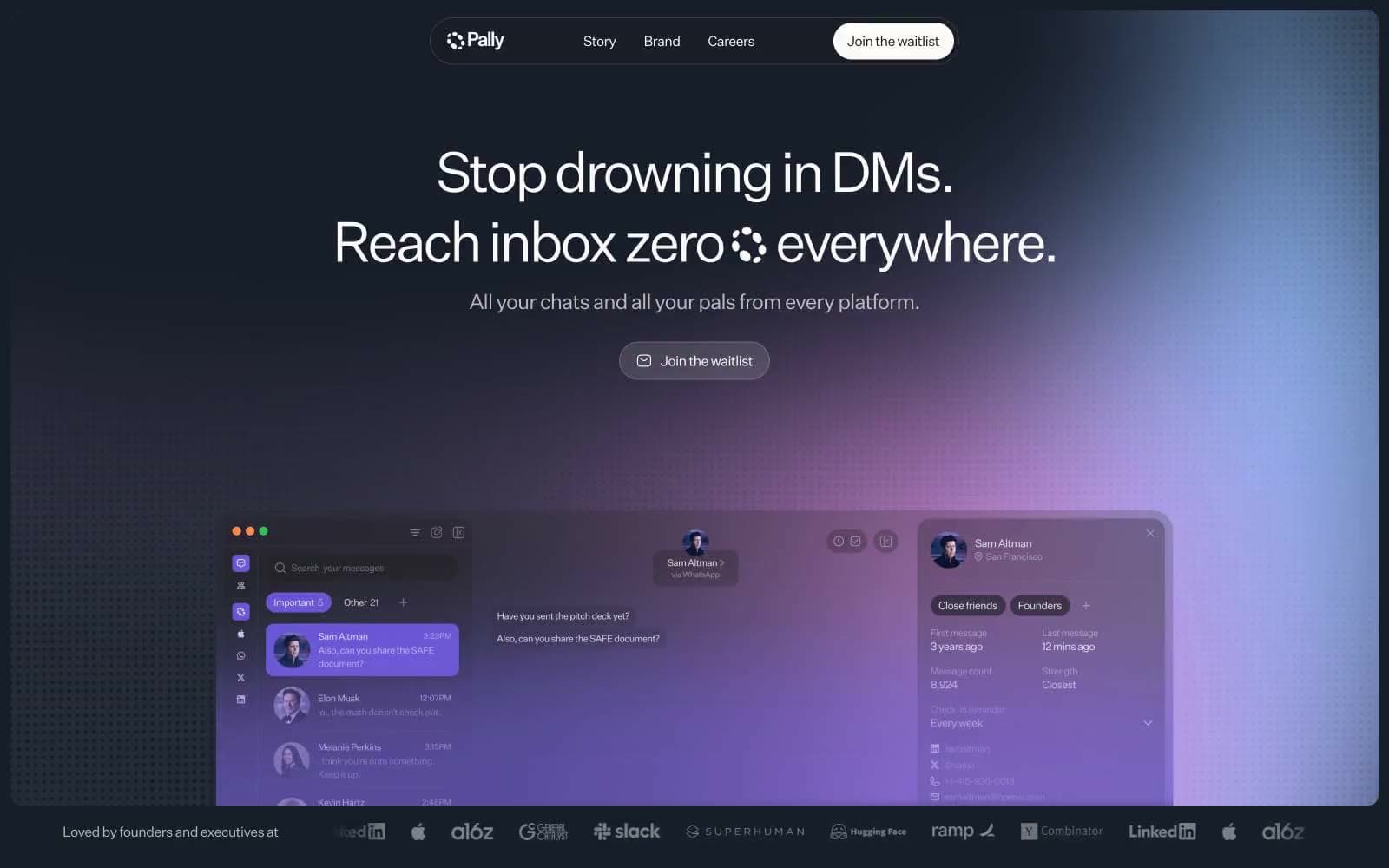
Pally
Productivity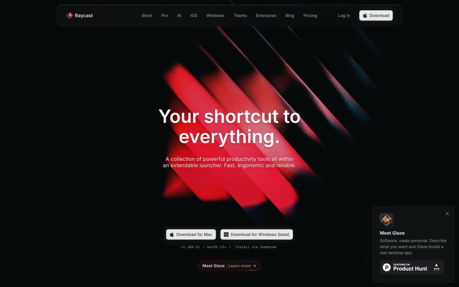
Raycast
Productivity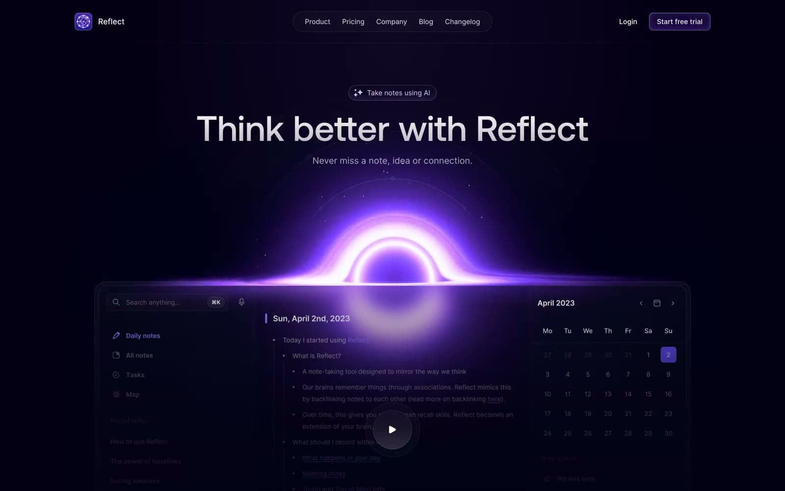
Reflect Notes
Productivity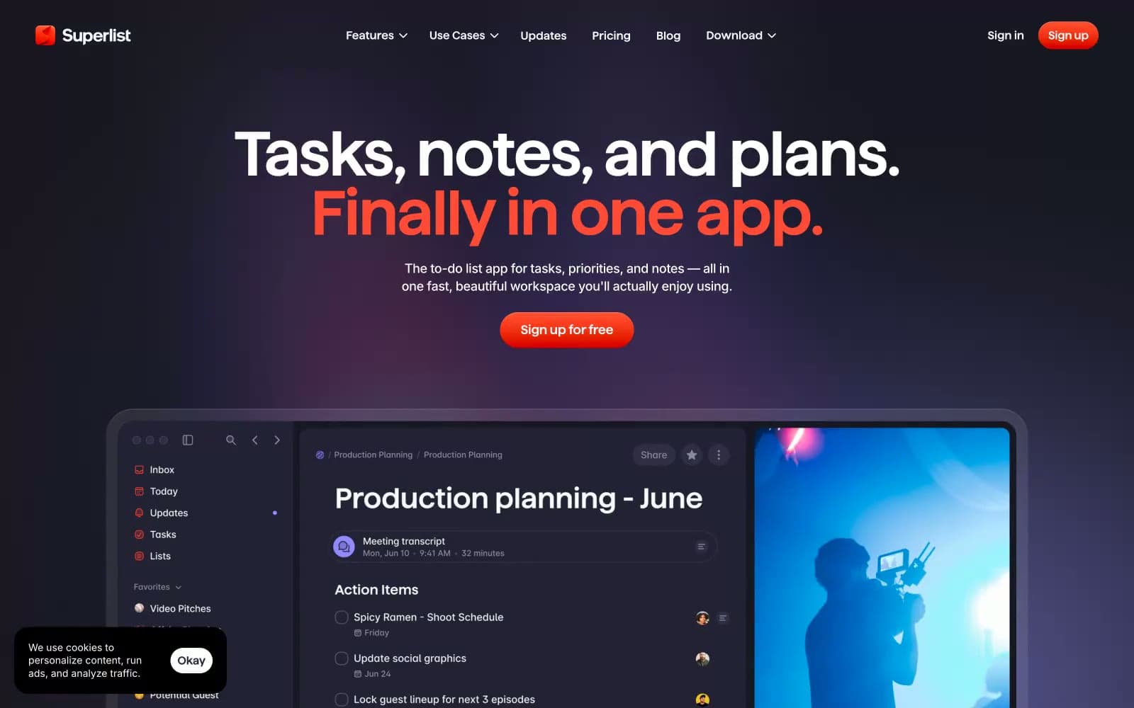
Superlist
Productivity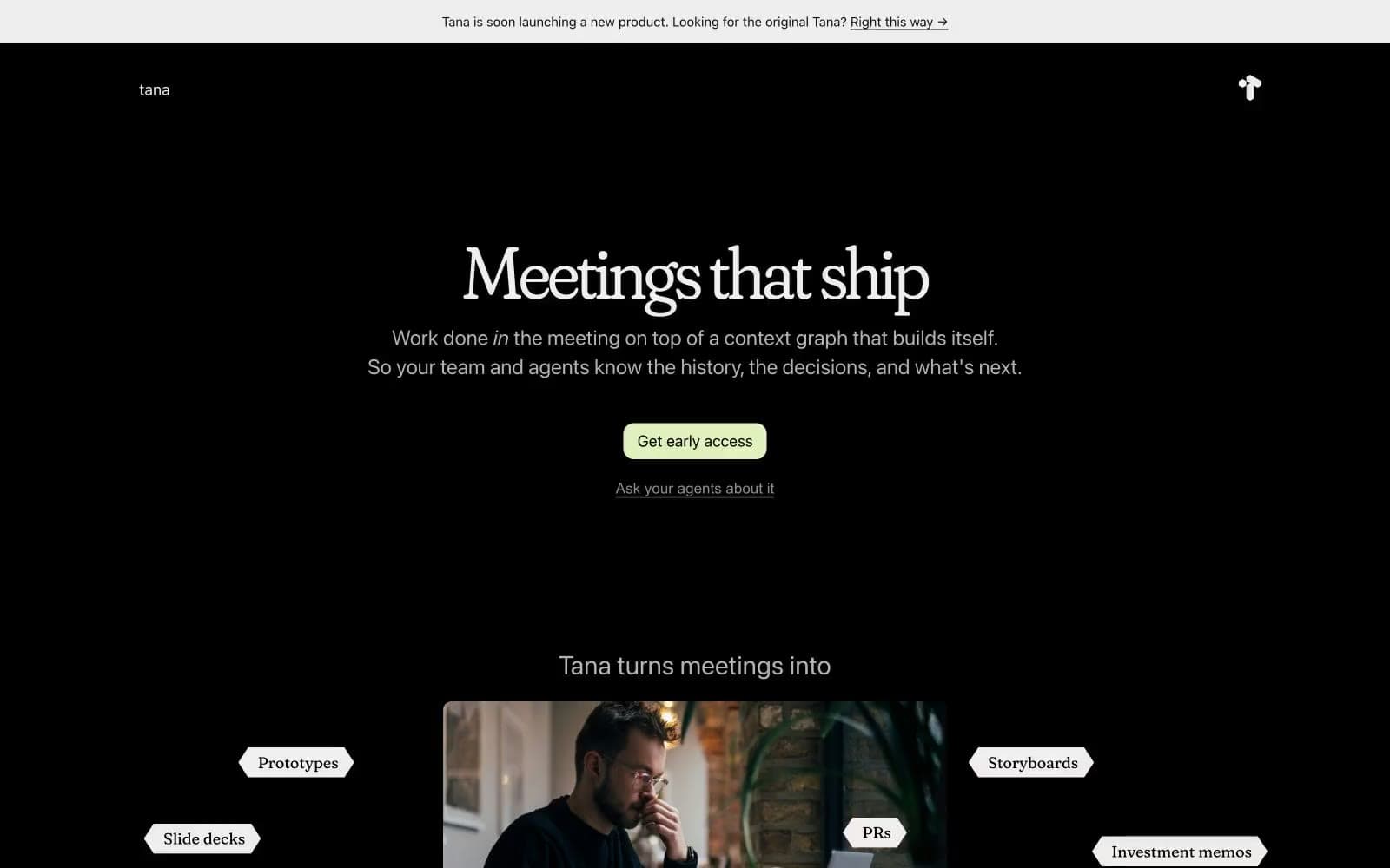
Tana
Productivity
Railway
Developer tools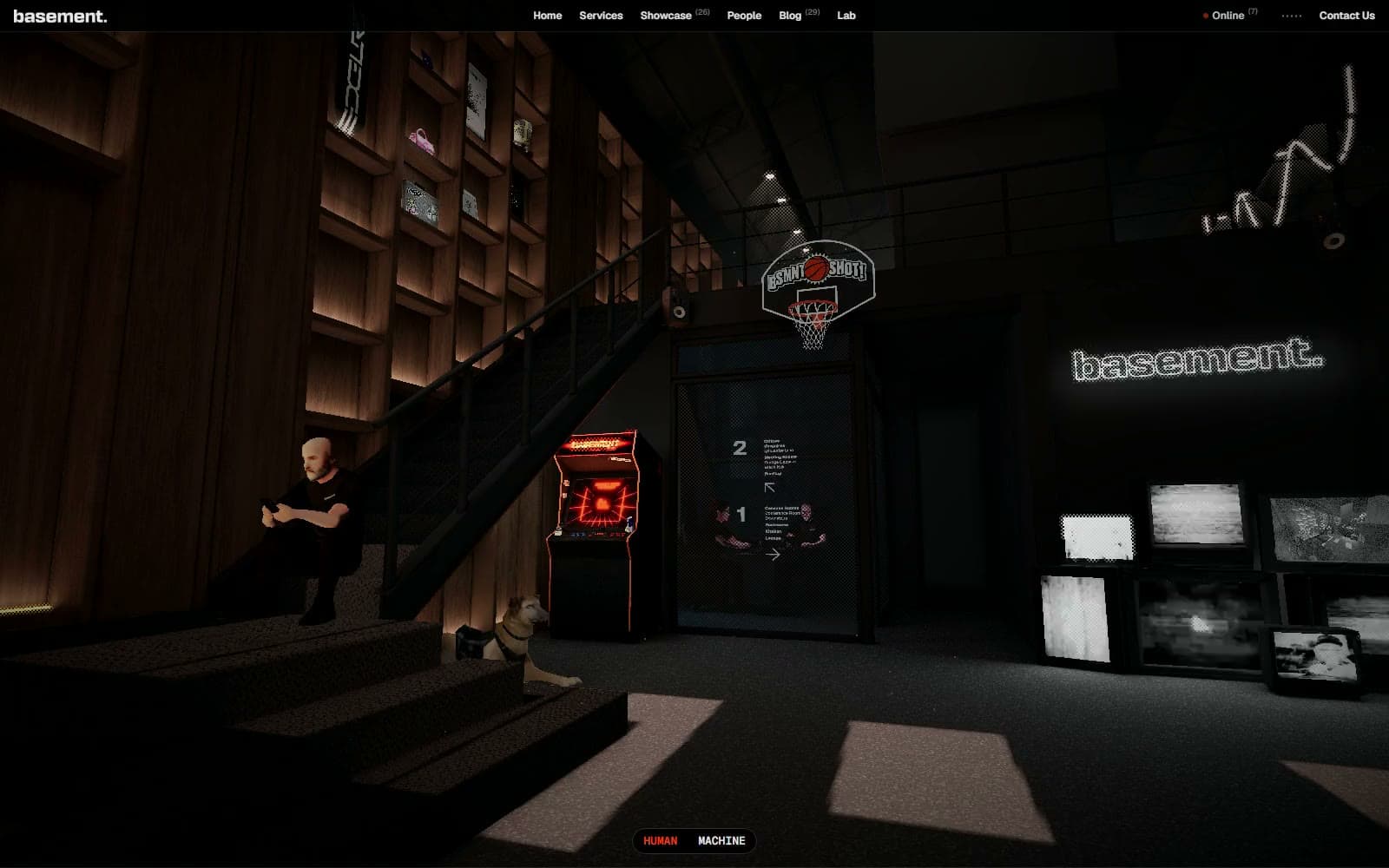
Basement Studio
Studio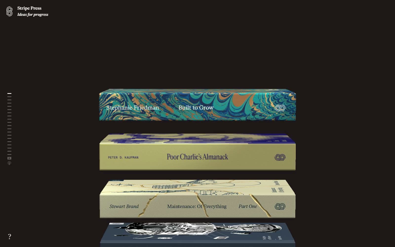
Stripe Press
Media


