
Superlist. A quiet aubergine app surface where one warm orange spark signals every action.
- Productivity
- Dark theme
- 9 colors
- 6 typefaces
Superlist uses a midnight-violet productivity language: deep aubergine canvas, warm coral as the single ignition color, and oversized sans-serif headlines that carry the entire mood. The interface feels like a focused late-night workspace — quiet, layered, and confident, with color appearing only as functional punctuation on CTAs, active states, and key highlights. Surfaces stack in subtle purple-tinted darks (#181824 → #26253b), avoiding pure black to keep depth feeling warm rather than clinical. Components are generously rounded (20px cards, pill buttons), softly shadowed, and breathe through comfortable 10–16px gaps rather than tight grids. The headline voice is everything: weight 600 at 70–88px with tight -0.02em tracking treats copy as typography, not interface text — it's closer to editorial than SaaS.
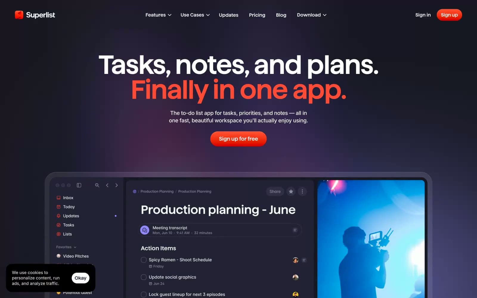
Superlist design system

Brand1
Orange supporting accent for decorative details and low-frequency emphasis. Do not promote it to the primary CTA color
Accent1
Secondary headings, decorative violet text — a muted blue-violet that harmonizes with the aubergine canvas without competing with coral
Neutrals7
Page background, primary canvas — warm-tinted dark replaces pure black so the UI feels layered rather than flat
Card surfaces, input fields, nav containers — one step lighter than canvas to create depth without a visible border
Body text, secondary headings, muted borders — sits at 7:1 contrast for comfortable reading on the aubergine canvas
Supporting neutral for secondary UI, dividers, and muted labels. Do not promote it to the primary CTA color
Subtle borders, dividers, inactive nav items — the faintest neutral that still reads against canvas
Hairline highlights on dark surfaces, inset strokes — a near-white that reads as a light edge in dark mode
Primary headings, button text, icon strokes — maximum contrast on the dark canvas
Try a pairing
Pick any two colors from the palette to check whether text stays readable on top.
Aa
Aubergine Canvas on Coral Ember
5.26 : 1 contrast
- Body textPasses AA 4.5
- Large textPasses AA 3
- StrictFails AAA 7
More DESIGN.md files. Same web, different personalities.
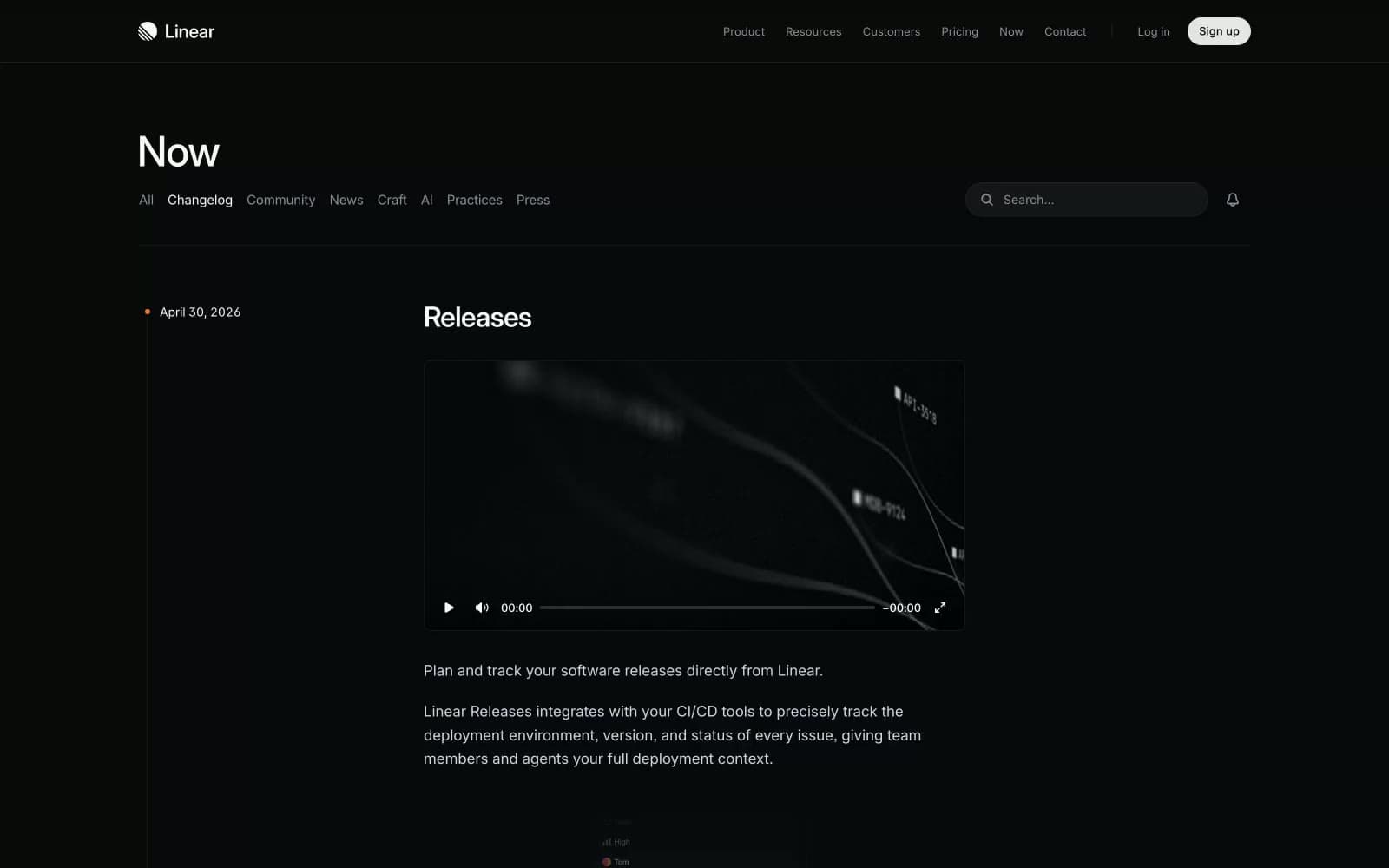
Changelog
Productivity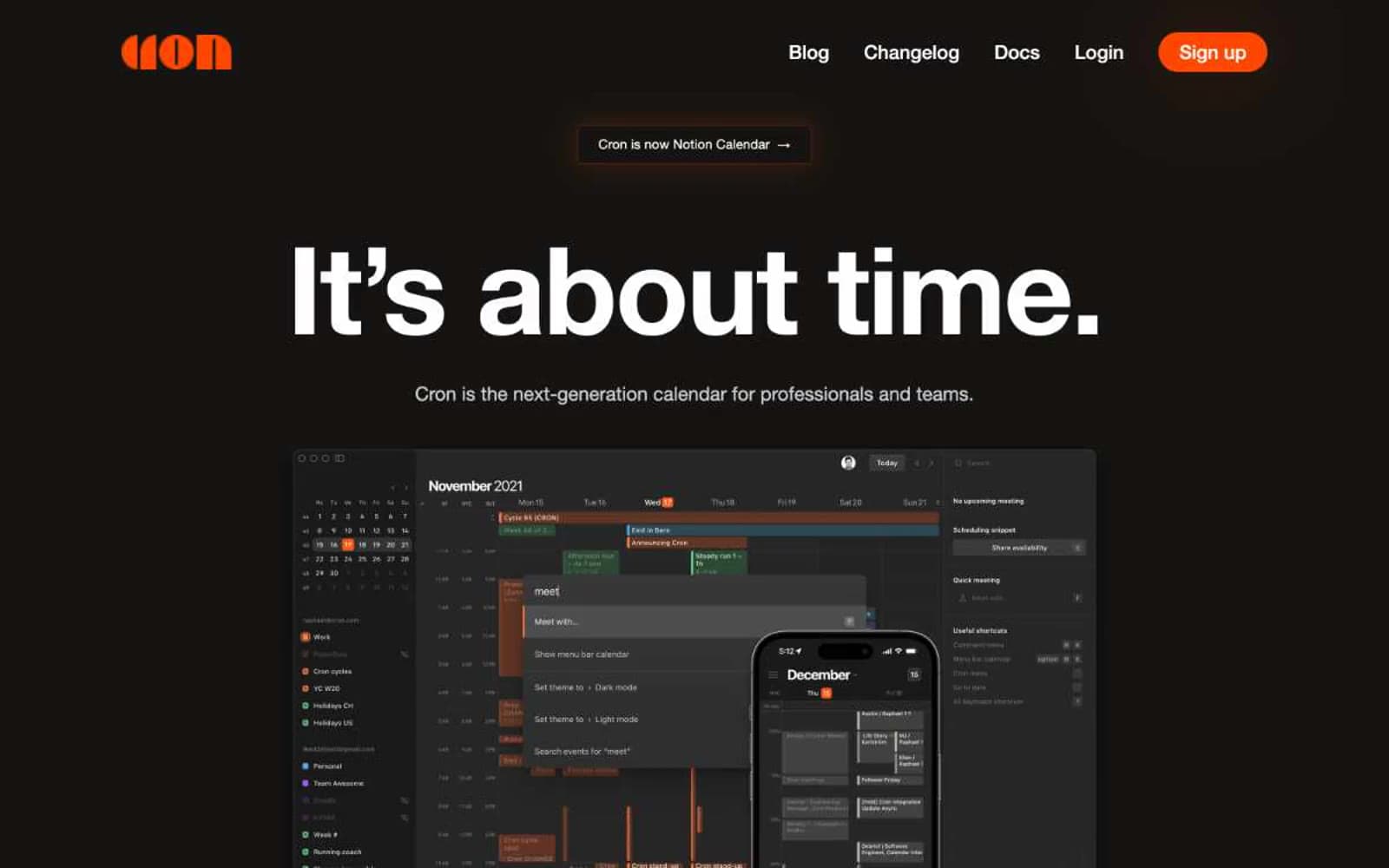
Cron Calendar
Productivity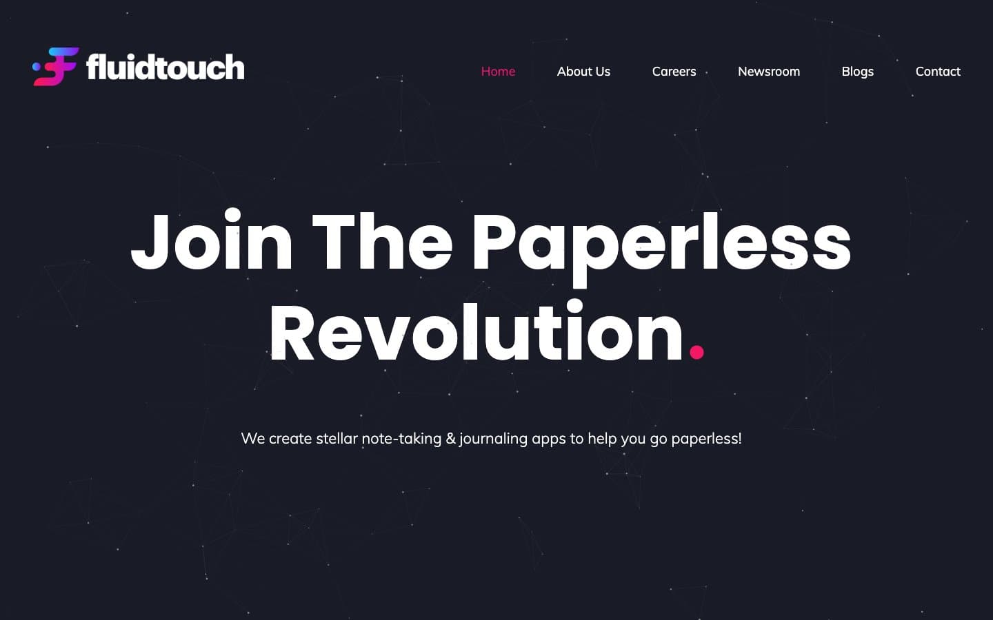
Fluidtouch
Productivity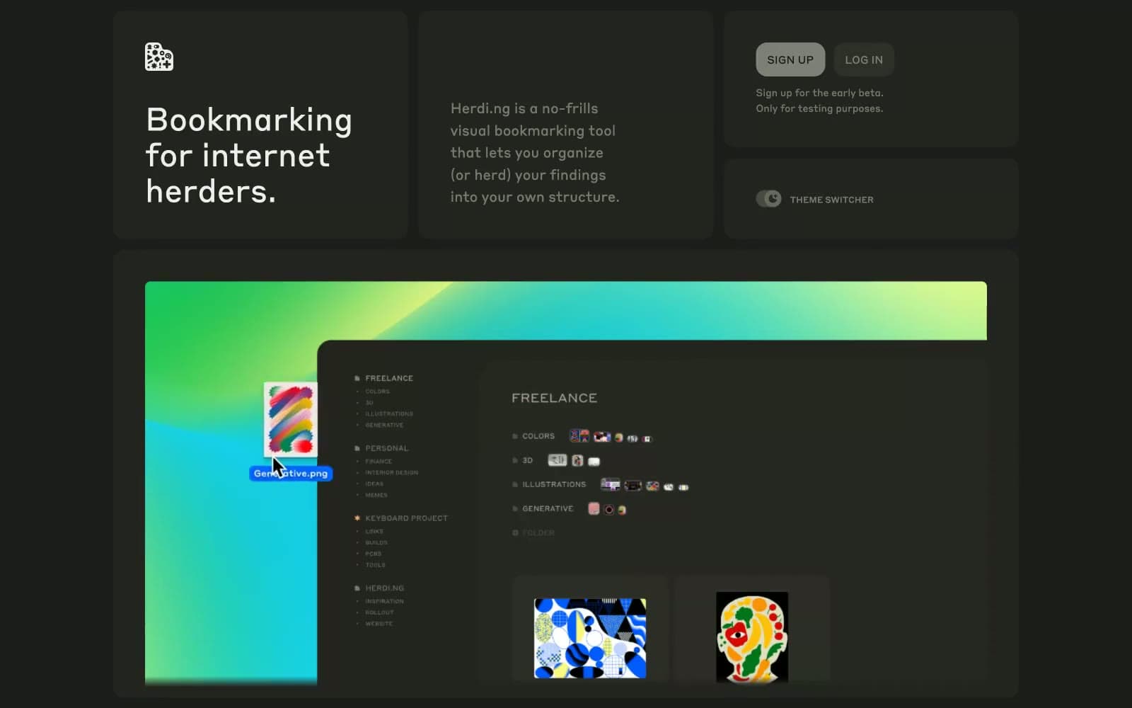
herding.app
Productivity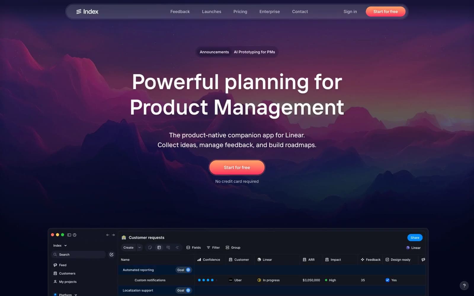
Index
Productivity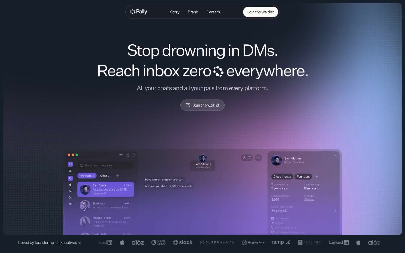
Pally
Productivity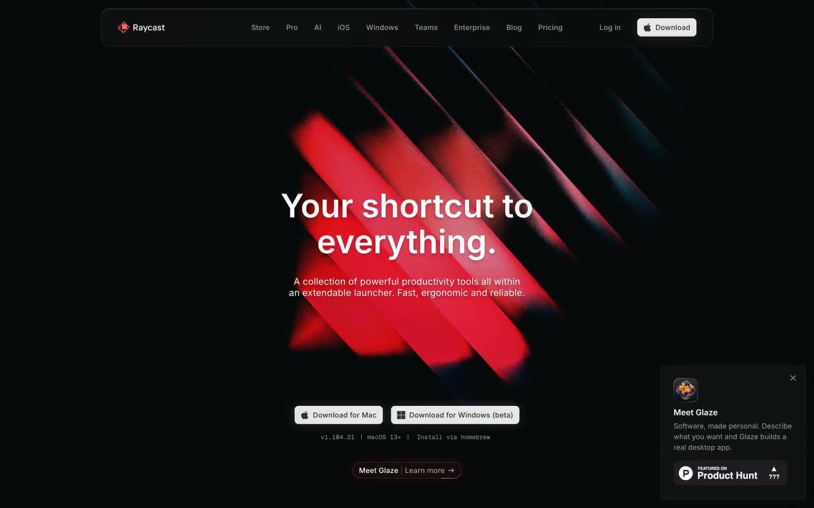
Raycast
Productivity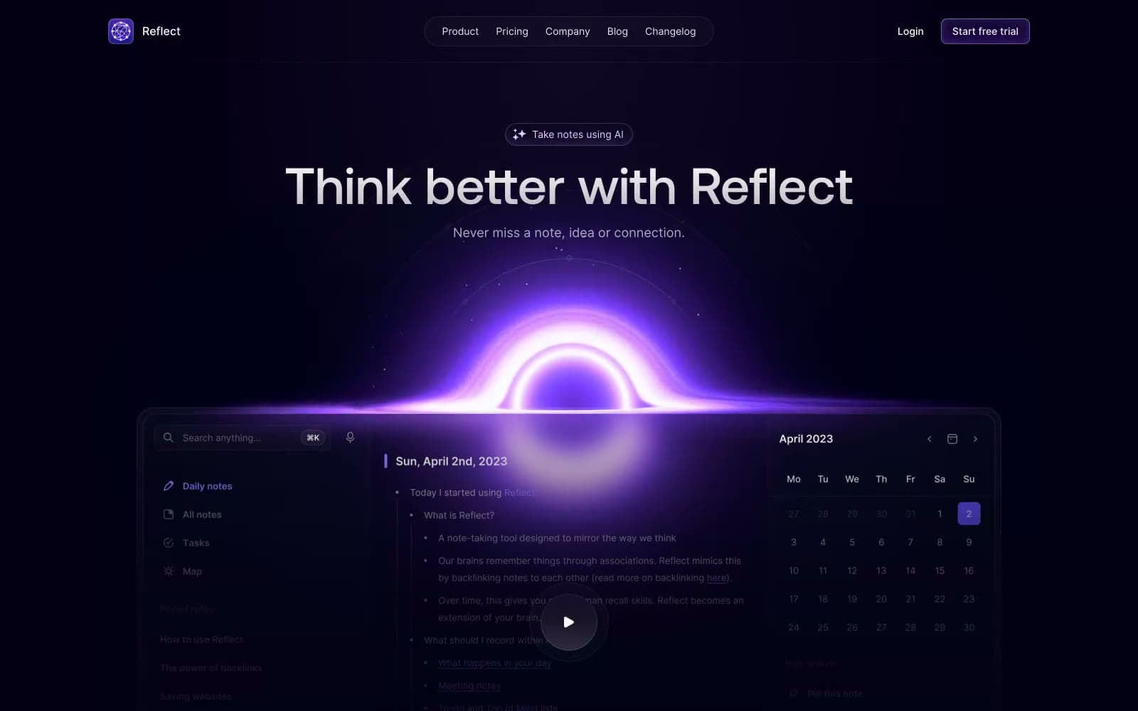
Reflect Notes
Productivity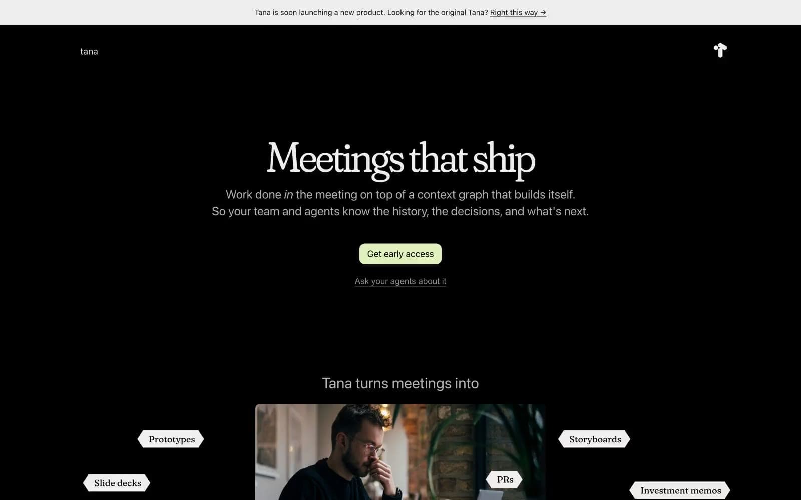
Tana
Productivity
Railway
Developer tools
Basement Studio
Studio
Stripe Press
Media


