
Changelog. Observatory console behind dark glass.
- Productivity
- Dark theme
- 14 colors
- 2 typefaces
Linear operates in a deep-space monochrome: a near-black canvas (#08090a) layered with whisper-quiet neutral surfaces, hairline borders at 4–5px radius, and almost no chromatic presence. The entire interface reads as machined precision — Inter Variable at custom weights (400, 500, 510, 590) with negative tracking, and Berkeley Mono reserved for inline code references. Elevation is implied by stacked grays and 1px strokes, never by drop shadows. Buttons are pill-shaped (9999px) outlined in white, never filled with brand color — confidence comes from contrast and restraint, not from accents. The result feels like an engineering control surface: dense, calm, and information-first.
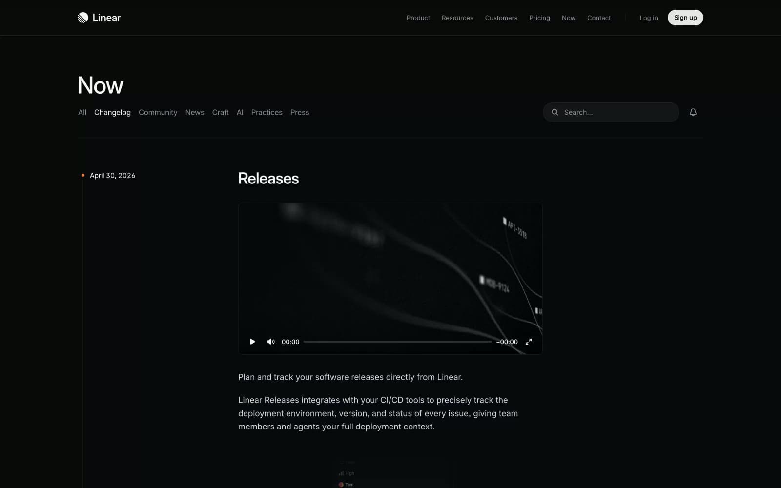
Changelog design system

Neutrals14
Deepest recess, box-shadow tint, absolute dark accent
Page background, primary surface
Elevated card, input field, subtle surface layer
Mid-elevation panels, nested surfaces
Hover state, deeper card, button surface tone
Pressed/active surface, highest tier elevation
Primary hairline border — dividers, table rows, list separators
Inner shadow stroke, focus-adjacent borders, subtle 1px outlines
Tertiary text, icon muted state, low-emphasis helper text
Disabled text, placeholder-tier secondary content
Muted body text, metadata, timestamps, nav sub-items
Secondary text, descriptions, list body, paragraph fallback
Light icon accent, rare light-tone dividers
Primary text, headings, logo, pill button border — the only near-white
Try a pairing
Pick any two colors from the palette to check whether text stays readable on top.
Aa
Snow on Void
19.29 : 1 contrast
- Body textPasses AA 4.5
- Large textPasses AA 3
- StrictPasses AAA 7
More DESIGN.md files. Same web, different personalities.
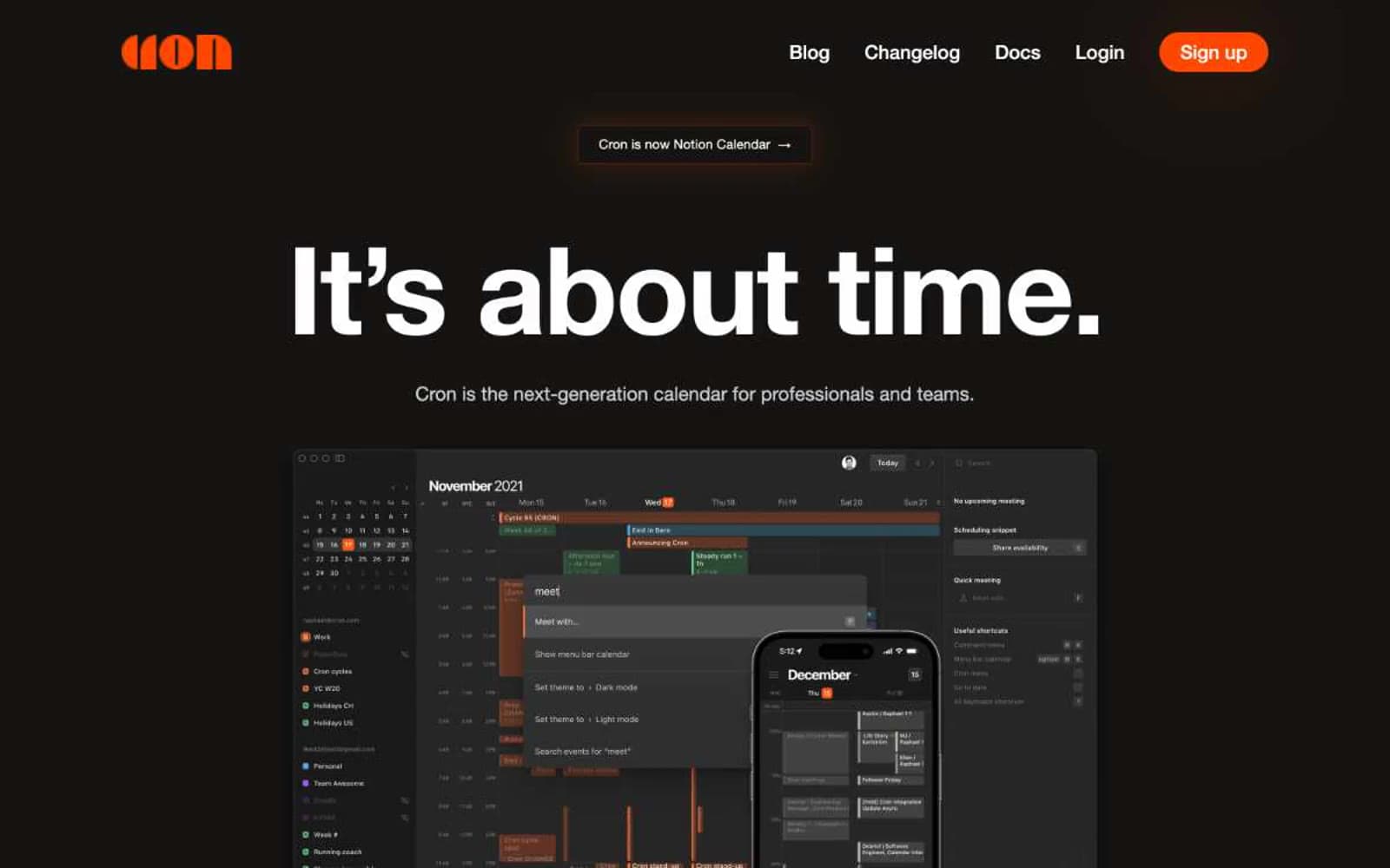
Cron Calendar
Productivity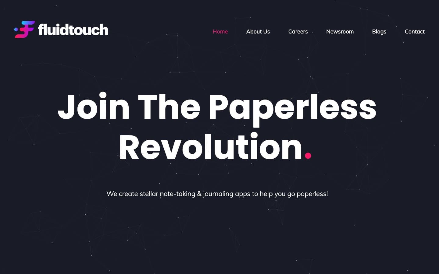
Fluidtouch
Productivity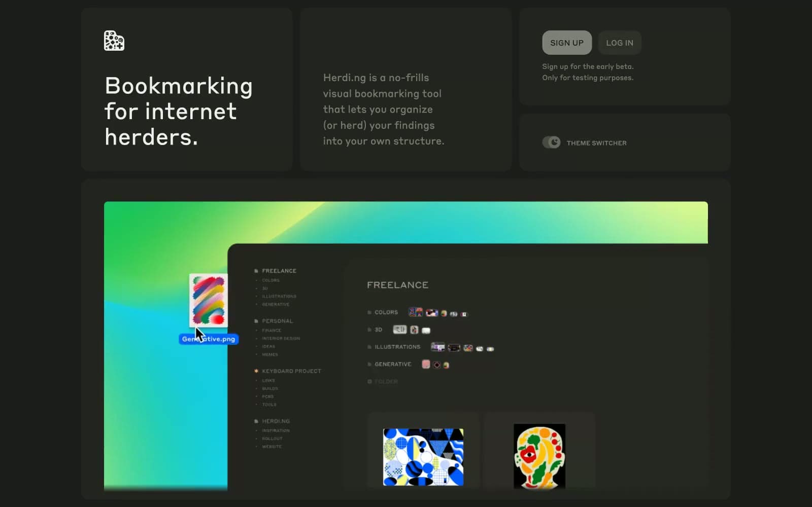
herding.app
Productivity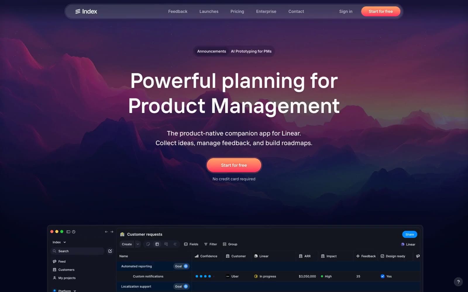
Index
Productivity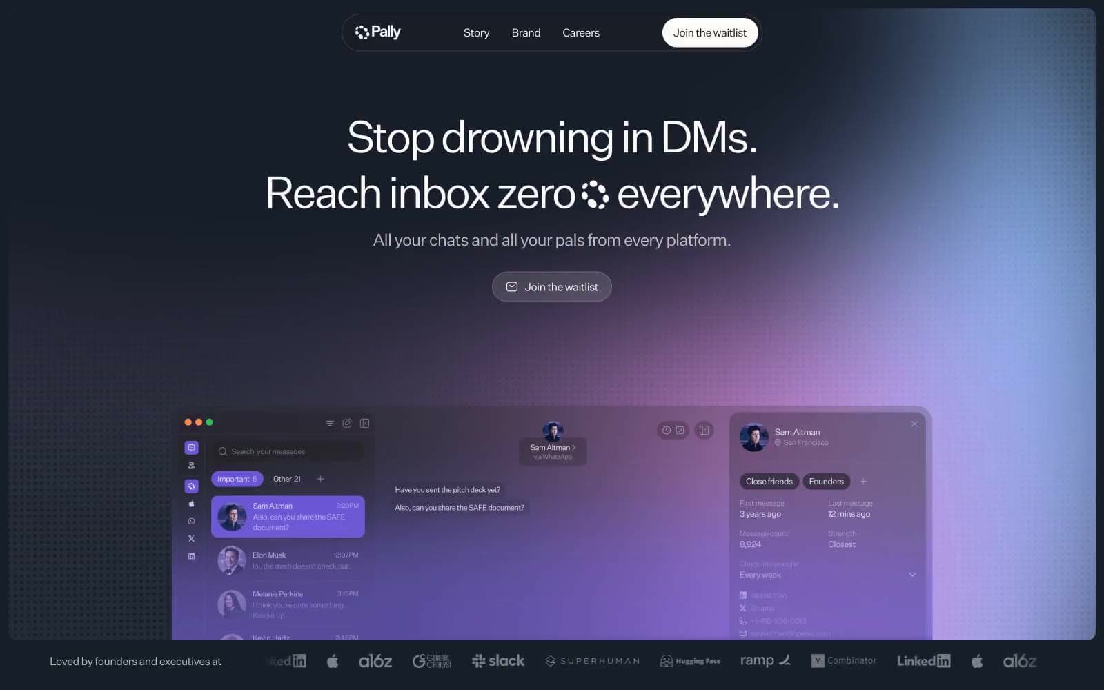
Pally
Productivity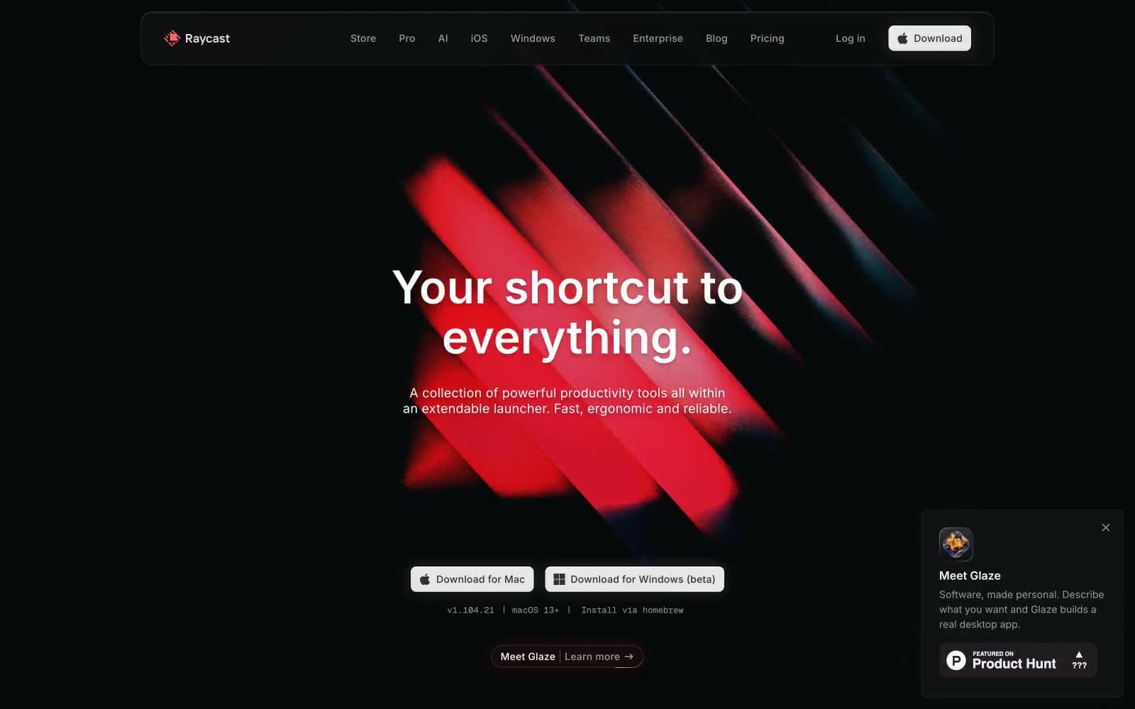
Raycast
Productivity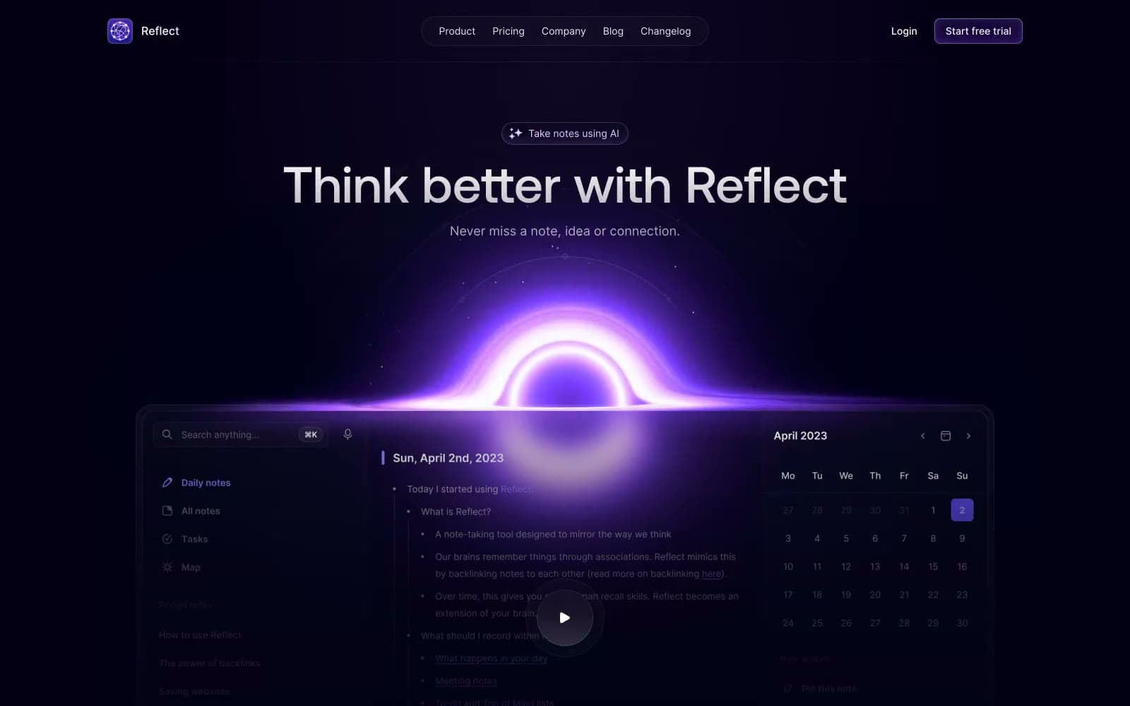
Reflect Notes
Productivity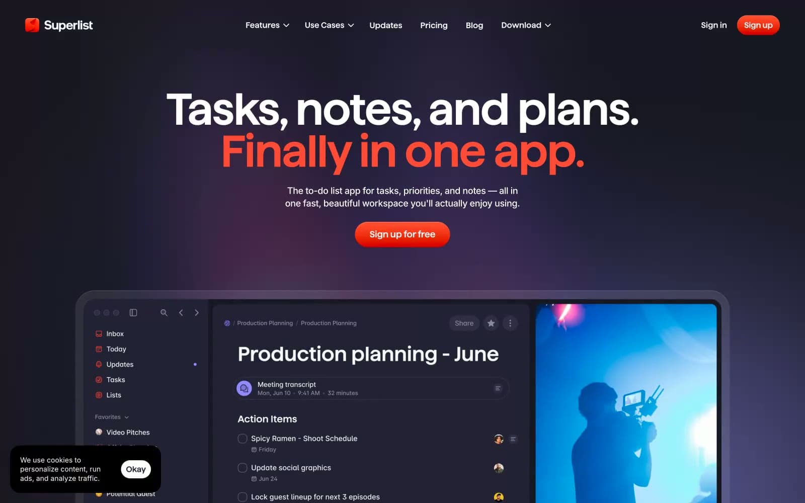
Superlist
Productivity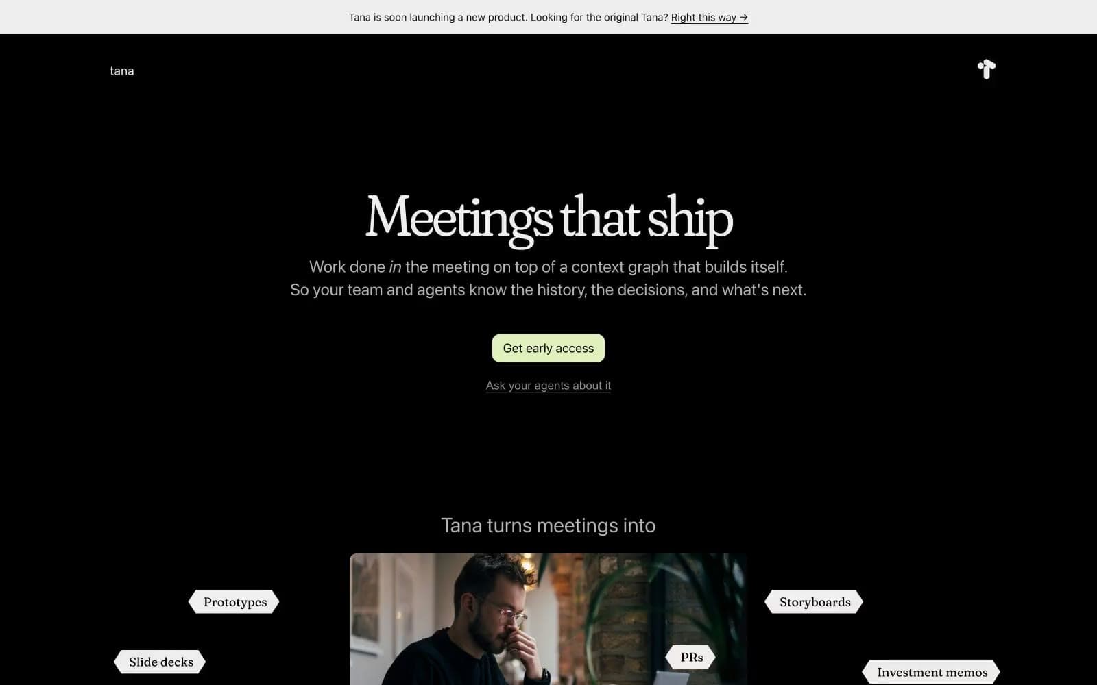
Tana
Productivity
Railway
Developer tools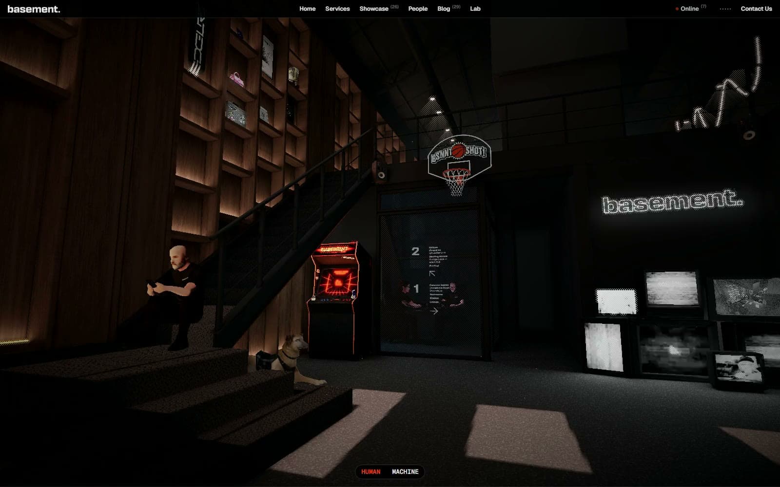
Basement Studio
Studio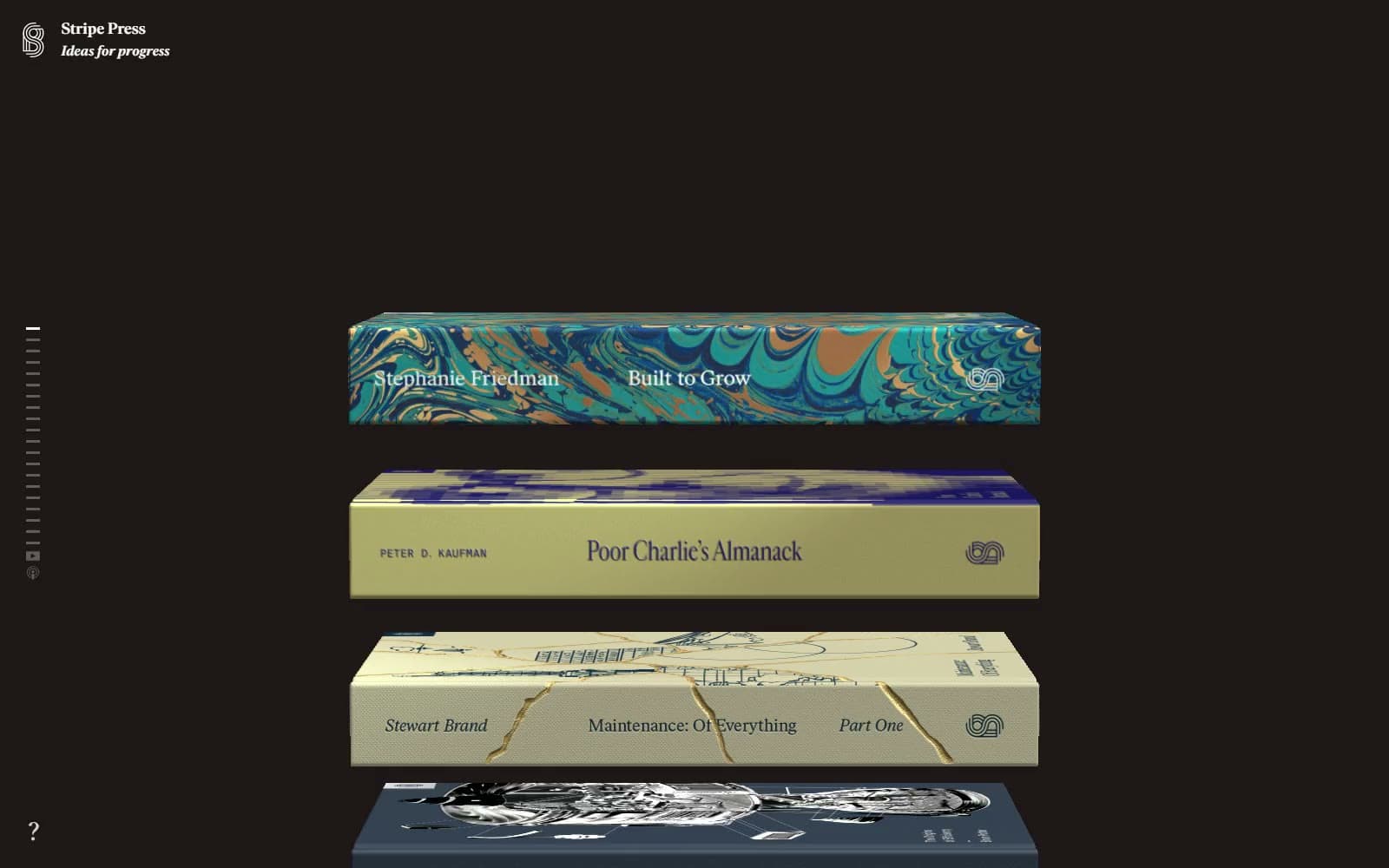
Stripe Press
Media


