
sweetgreen. Farm-stand chalkboard at golden hour.
- Commerce
- Light theme
- 9 colors
- 4 typefaces
Sweetgreen's design system is a warm, farm-stand-meets-modern-typography aesthetic: a cream canvas (#f4f3e7) rooted in natural materials, with deep forest green as the structural anchor and electric lime (#e6ff55) as a singular, high-energy action color. Photography carries the brand — saturated, overhead food shots on warm tile, ceramic, and concrete surfaces are treated as heroes, never as decoration. Typography does the heavy lifting on chrome: a custom geometric sans (SweetSans) renders oversized category labels and hero headlines at extreme weights (400 at 70–80px, with 0.85 line-height that lets letters nearly touch), while a secondary ultra-light display face (Grenette at 200) creates contrast through restraint. Components are deliberately spare — pill-shaped buttons, ghost text links with arrows, badge-free product cards — letting the food and the headline typography own every screen.
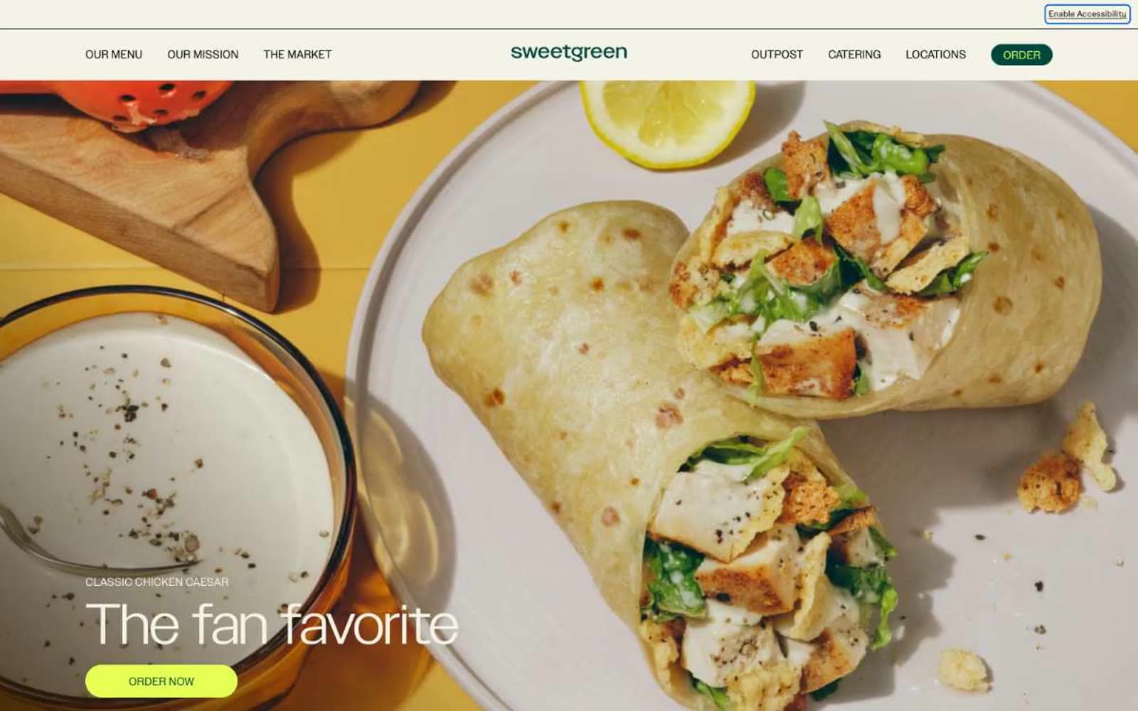
sweetgreen design system

Brand2
Primary brand color, nav logo, dark pill buttons, text accents, badge borders, link colors — the structural green that anchors the palette
Green action color for filled buttons, selected navigation states, and focused conversion moments.
Accent2
Section backgrounds, card surfaces, content band alternation — soft botanical green that signals freshness without competing with the food photography
Accent surface for alternate section bands — warm beige that pairs with food photography and adds earthy variety to the green-dominant palette
Neutrals5
Maximum-contrast text, hairlines, icon strokes — used where absolute sharpness is needed
Primary text color, borders, input strokes — near-black with a barely-perceptible green undertone that harmonizes with the brand greens
Secondary text in disabled or low-emphasis button contexts
Medium-contrast borders, control outlines, and structural separators. Do not promote it to the primary CTA color
Primary page background, the warm off-white that gives the entire system its organic, non-clinical feel
Try a pairing
Pick any two colors from the palette to check whether text stays readable on top.
Aa
Cream Canvas on Deep Forest
9.57 : 1 contrast
- Body textPasses AA 4.5
- Large textPasses AA 3
- StrictPasses AAA 7
More DESIGN.md files. Same web, different personalities.

High Protein
Commerce
Hopper
Commerce
2.AG
Commerce
A-WARE
Commerce
AATHER
Commerce
Abel
Commerce
Acme Cups New Zealand
Commerce
Acne Studios
Commerce
Adam Lippes
Commerce
Adanola
Commerce
Advene
Commerce
Aevi Wellness
Commerce


