
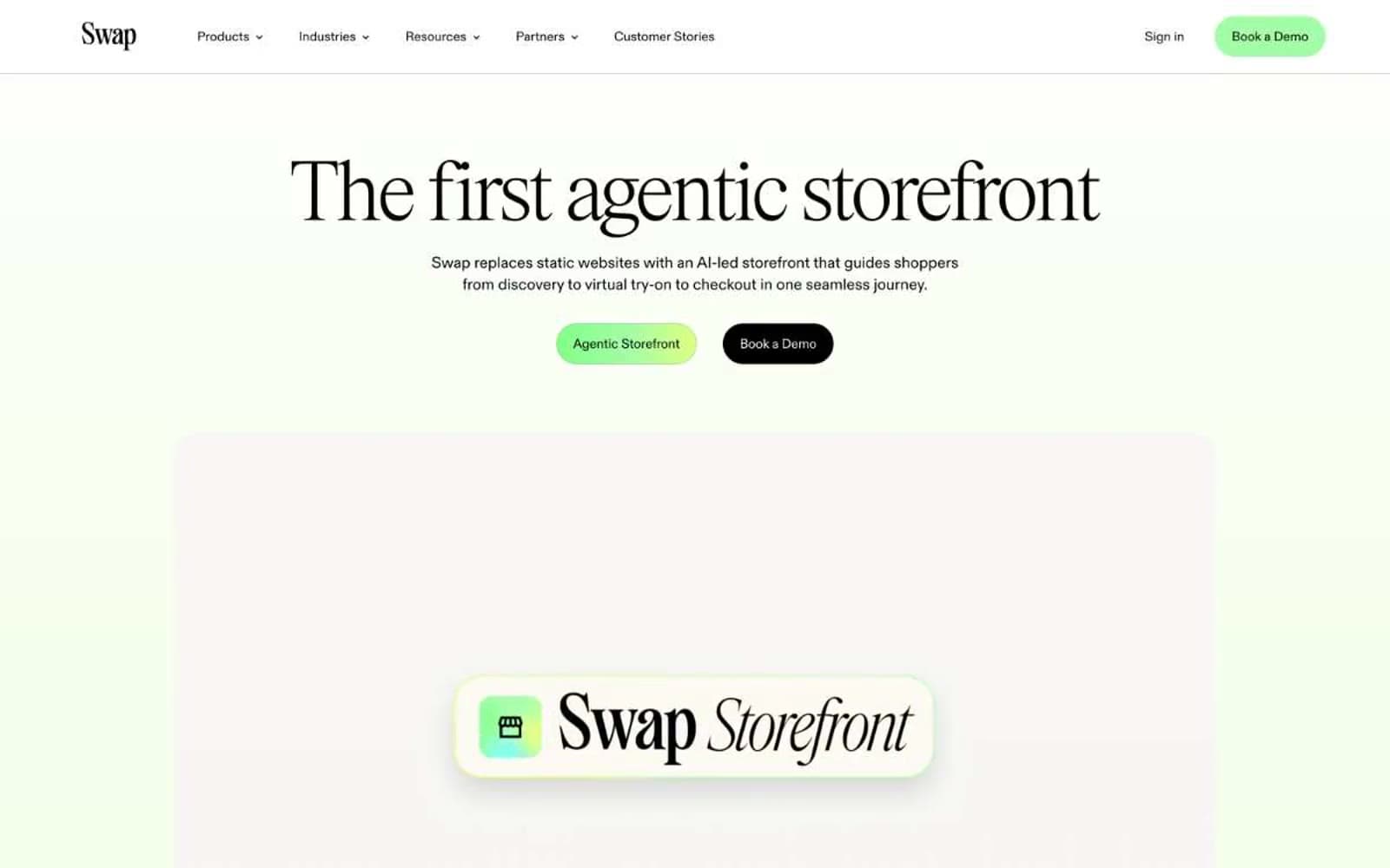
Swap. Pale sage rooms with vivid lime accents and whisper-weight serif type.
- Commerce
- Light theme
- 13 colors
- 4 typefaces
Swap's design is a pale-mint editorial canvas anchored by a high-fashion display serif and pill-shaped vivid green CTAs. The brand reads like a luxury fashion magazine spread digitized — generous whitespace, a barely-there sage wash, and lime-green accents that feel like fresh foliage against a near-white backdrop. Everything sits lightly: thin charcoal-black borders, soft 28px blur shadows, 24px card radii, and a custom display serif that shifts between ultra-thin (100) and light (300) to whisper rather than shout. The green-to-yellow gradient display text is the only moment of visual spectacle — the rest of the system stays restrained, monochrome, and editorial, with color appearing as small functional punctuation for primary actions, tags, and active states.
Swap design system

Brand5
Primary action button fill, accent highlights, gradient mid-stop, active tag backgrounds; Display text treatment — vivid lime-to-citrus gradient on hero headlines
Deep green card backgrounds, contrast surfaces, gradient anchor
Darkest green for emphasis cards, gradient endpoints, high-contrast text on light surfaces
Gradient anchor for display type and decorative washes
Gradient endpoint for display type — yellow-green warmth in hero text
Neutrals8
Primary text, hairline borders, dark action buttons, icon strokes
Secondary dark surface, icon fills, dark borders, muted dark mode text
Muted accent card backgrounds, secondary decorative surfaces
Muted sage for outlined secondary action borders, subtle green-tinted UI
Light dividers, inactive borders, subtle separators
Alternate section backgrounds, disabled states, cream-toned surfaces
Page canvas, section backgrounds, hero wash — the dominant surface tone
Card surfaces, button text on dark fills, input backgrounds, elevated overlays
Try a pairing
Pick any two colors from the palette to check whether text stays readable on top.
Aa
Cream Paper on Forest Depth
8.15 : 1 contrast
- Body textPasses AA 4.5
- Large textPasses AA 3
- StrictPasses AAA 7
More DESIGN.md files. Same web, different personalities.

High Protein
Commerce
Hopper
Commerce
2.AG
Commerce
A-WARE
Commerce
AATHER
Commerce
Abel
Commerce
Acme Cups New Zealand
Commerce
Acne Studios
Commerce
Adam Lippes
Commerce
Adanola
Commerce
Advene
Commerce
Aevi Wellness
Commerce


