
SuperMush. Sun-bleached skate ramp meets wellness billboard.
- Commerce
- Light theme
- 11 colors
- 3 typefaces
SuperMush runs on a sun-drenched DTC wellness playbook: a warm bone canvas, electric cobalt as the singular action color, and a tri-color accent system (cobalt, ember orange, volt lime) that shouts without cluttering. Layout breathes between quiet white product grids and explosive full-bleed lifestyle photography, with colored bands — a lime promo bar up top, an orange retailer strip in the middle — acting as visual exclamation points. Typography is geometric and confident, leaning on tight line-heights at large sizes so headlines feel like stickers slapped onto the page rather than typed paragraphs. Components are flat and pill-shaped; the 50px button radius and near-total absence of shadows produce a tactile, high-energy feel that mirrors the packaging itself, and the orange product body color is allowed to bleed into the brand skin (retailer bar, sale flags) without ever crossing into button territory.
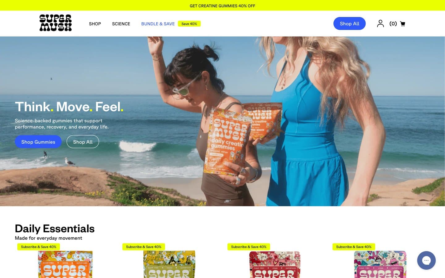
SuperMush design system

Brand2
Primary action fills, active nav links, icon accents, link underlines. The only chromatic button color in the system — cobalt against the warm bone canvas makes every CTA feel switched on
Orange outline accent for tags, dividers, and focused UI edges. Do not promote it to the primary CTA color
Accent1
Promotional and urgency surfaces: top sale bar, Subscribe & Save tags, sale-bubble accents on product cards. Reads as a highlighter against the warm canvas — use sparingly, never as a section background
Neutrals8
Primary text, hairline borders, logo, icon strokes. The structural backbone — used aggressively for borders and dividers rather than reserving it for text alone
Slightly softened near-black for headings and dark UI surfaces where pure Obsidian feels too aggressive; button hover states on dark
Muted helper text, secondary metadata, star-rating inactive state, and low-emphasis form labels
Disabled button background, out-of-stock product card state. The only neutral allowed to function as an action fill, and only for disabled
Faint borders and disabled input outlines — one step lighter than Concrete for tertiary edges
Soft borders, dividers, and secondary surface fills. Quieter than Obsidian when a hairline needs to recede
Page canvas and quiet section backgrounds. Warm off-white that gives the system its sunlit feel; never pure white at the page level
Elevated card surfaces, input fields, and any element that needs to sit forward of the bone canvas. Always a surface, never a text color
Try a pairing
Pick any two colors from the palette to check whether text stays readable on top.
Aa
Paper on Electric Cobalt
5.38 : 1 contrast
- Body textPasses AA 4.5
- Large textPasses AA 3
- StrictFails AAA 7
More DESIGN.md files. Same web, different personalities.

High Protein
Commerce
Hopper
Commerce
2.AG
Commerce
A-WARE
Commerce
AATHER
Commerce
Abel
Commerce
Acme Cups New Zealand
Commerce
Acne Studios
Commerce
Adam Lippes
Commerce
Adanola
Commerce
Advene
Commerce
Aevi Wellness
Commerce


