
Stykka. A quiet, hand-built showroom where the only voice is the photograph.
- Commerce
- Light theme
- 3 colors
- 3 typefaces
Stykka is a Scandinavian kitchen brand that treats the interface like a museum catalog: pure white canvas, black hairline borders, and full-bleed photography that carries every ounce of warmth, color, and craft. The UI is deliberately invisible — there is no accent color, no decoration, no shadow stack — so that the kitchens in the imagery feel like the only subject on screen. Typography does the talking: Inter at tight negative tracking on large display sizes, uppercase tracked labels for section openers, and a system fallback for the tiniest metadata. Spacing is compact and editorial, with 10px gaps between elements and generous white space at the section level. Everything from the nav to the feature grid to the outlined CTA assumes a black-and-white photograph will do the emotional heavy lifting — the system stays out of the way.
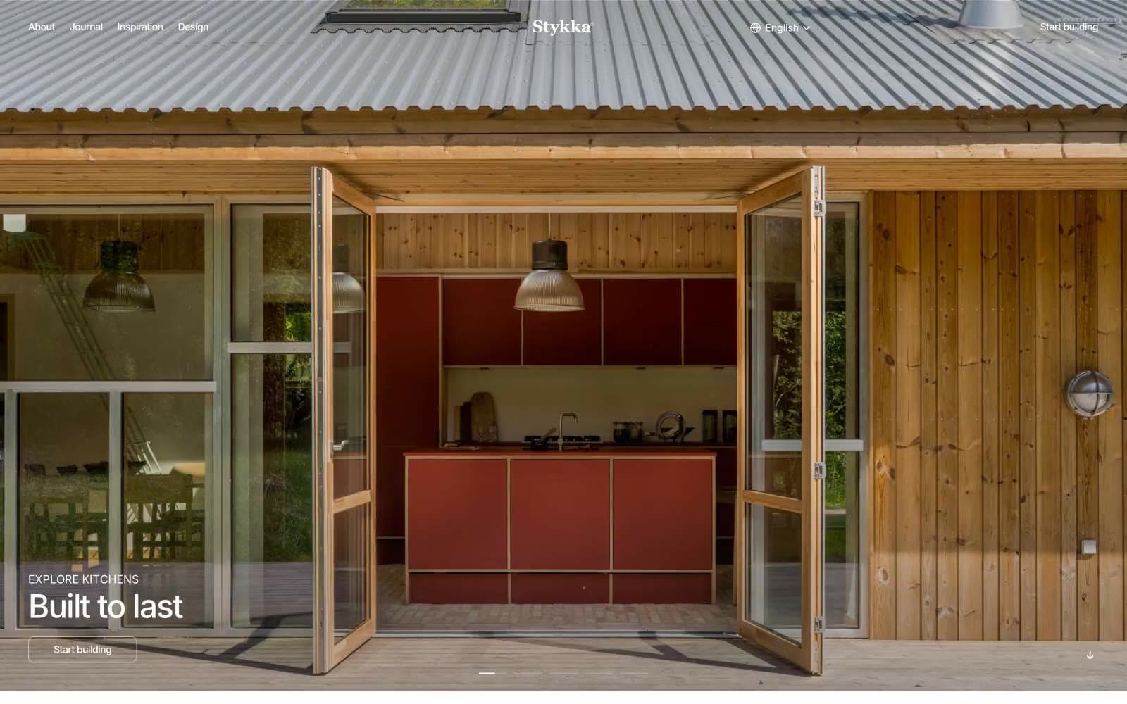
Stykka design system

Neutrals3
Primary text, 1px hairlines, icon strokes, outlined button borders. The structural ink of the entire system — every border, every label, every headline resolves to this single value
Subtle disabled state, placeholder fill, secondary metadata. Reads as 10.6:1 on black (safe for muted labels) but only 2.0:1 on white — never use as body text on the default canvas
Page canvas, card surfaces, button text on dark surfaces, inverse overlay backgrounds. The unbroken ground on which every photograph sits
Try a pairing
Pick any two colors from the palette to check whether text stays readable on top.
Aa
Gallery White on Press Black
21.00 : 1 contrast
- Body textPasses AA 4.5
- Large textPasses AA 3
- StrictPasses AAA 7
More DESIGN.md files. Same web, different personalities.

High Protein
Commerce
Hopper
Commerce
2.AG
Commerce
A-WARE
Commerce
AATHER
Commerce
Abel
Commerce
Acme Cups New Zealand
Commerce
Acne Studios
Commerce
Adam Lippes
Commerce
Adanola
Commerce
Advene
Commerce
Aevi Wellness
Commerce


